
Beispiel-CSV
| Source | Target | Amount |
|---|---|---|
| Revenue | Cost of Goods | 420000 |
| Revenue | Operating Costs | 260000 |
| Revenue | Net Profit | 180000 |
| Cost of Goods | Manufacturing | 300000 |
| Cost of Goods | Shipping | 120000 |
| Operating Costs | Salaries | 190000 |
| Operating Costs | Marketing | 70000 |
A step by step walkthrough for turning a source, target and value spreadsheet into a published Sankey diagram in PlotSet, from shaping the sheet to exporting or embedding the finished flow.
Etwa 9 MinutenThis guide shows how to create a Sankey diagram in PlotSet starting from a plain three column spreadsheet, source, target and value, with nodes named automatically from whatever text sits in those columns and link widths sized to match. We use a budget flow as the running example, but the same three columns work just as well for a website funnel, an energy balance or a customer journey.
Set aside nine minutes if your rows are already in source, target, value shape. That climbs by five if you're reconciling a spreadsheet with a totals row mixed into the real flows, or working out how to fold a dozen small categories into one node before upload.
Three columns, one row per flow: where the amount comes from, where it goes, and how much. Nodes are created automatically from whatever names appear in the source and target columns, so there is no separate list of nodes to maintain.
| Source | Target | Amount |
|---|---|---|
| Revenue | Cost of Goods | 420000 |
| Revenue | Operating Costs | 260000 |
| Revenue | Net Profit | 180000 |
| Cost of Goods | Manufacturing | 300000 |
| Cost of Goods | Shipping | 120000 |
| Operating Costs | Salaries | 190000 |
| Operating Costs | Marketing | 70000 |
Every amount is a positive number. A Sankey link has no concept of a negative flow, so a refund or a loss needs its own row and its own honestly named target, such as "Returns", rather than a minus sign.
A name that appears in both a source and a target column becomes one node with flow passing through it, which is exactly how a multi-stage diagram like the budget example above works.
Keep source and target names spelled identically everywhere they appear. "Marketing" and "marketing " with a trailing space will render as two separate nodes rather than merging into one.
If a node's inflows and outflows do not add up, PlotSet still draws it, just with a visibly lopsided shape. Reconcile the numbers in your spreadsheet before uploading rather than after.
Der genaue Klickpfad in PlotSet, von einer leeren Vorlage bis zum fertigen Diagramm.
From the PlotSet dashboard, start a new project and choose the Sankey template. It loads with sample data already bound, so you can see the exact three column shape (source, target, value) before you touch your own file.

Rework your spreadsheet into one row per flow, in that column order. A pivot table or a report with running totals will not work as is: pull out the individual transitions first, one row per movement from one stage to the next.
Import a CSV or .xlsx file from the data panel, paste rows directly from a spreadsheet, or connect a Google Sheet if you want the diagram to refresh later without a re-upload. PlotSet reads the first row as your headers.

Confirm which column feeds each role. This is usually automatic when your headers read clearly as Source, Target and Value or similar, but check it by hand if your sheet carries extra columns PlotSet might have guessed on.

PlotSet places nodes by the order flow moves through them, but if your data has a natural sequence (acquisition before conversion before retention, for instance), check the node order matches that story rather than an alphabetical default.
Rename any node whose spreadsheet name would confuse a reader, such as an internal code, to something they would recognize. Turn on the value label so hovering, or the static label itself, shows the exact number each link carries.
Colour links by their source node by default, which is what lets a reader's eye follow one path through the crossings. Reserve a distinct colour for a terminal node you want to call out, such as a loss or a drop-off, rather than colouring every node differently.
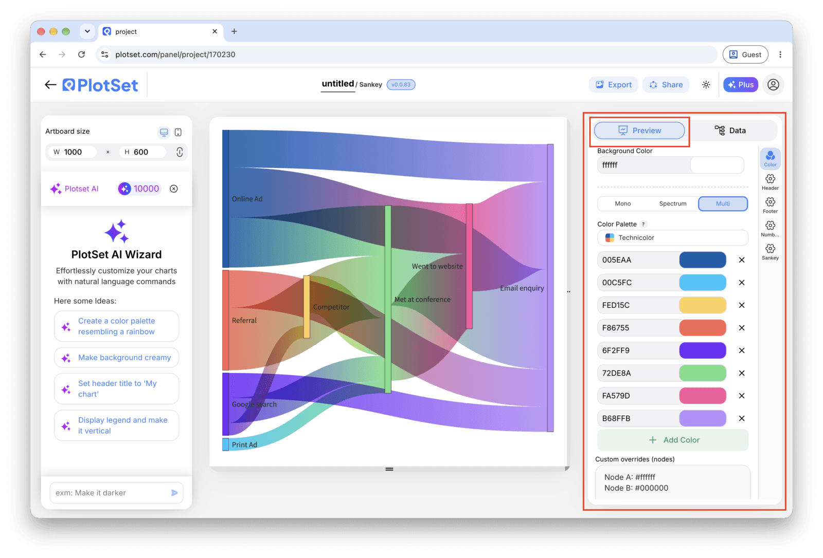
Publish for a live, interactive diagram where hovering a link shows its exact value and a shareable link, grab the embed code for a page, or export a PNG, SVG or PDF for a deck or report.
Starten Sie mit der Sankey Diagram-Vorlage samt bereits geladenen Beispieldaten und ersetzen Sie diese durch Ihre eigenen.
Vorlage öffnenDer letzte Abschnitt ist bei jedem Diagrammtyp gleich: "Share" macht aus dem Diagramm einen öffentlichen Live-Link und einen Einbettungscode, "Export" schreibt es als statische Datei heraus.
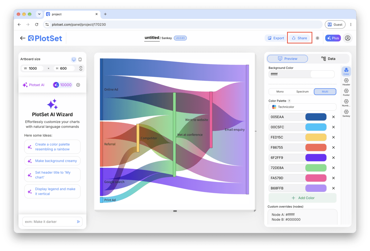
Aktivieren Sie den Einbettungscode und den öffentlichen Link, um das Diagramm zu veröffentlichen. Den Link können Sie bedenkenlos an alle weitergeben, und der Einbettungscode fügt sich als iframe in jede Seite ein. Die Tooltips beim Überfahren mit der Maus und die volle Interaktivität bleiben erhalten. Wenn Sie das Diagramm später bearbeiten, überträgt "Recreate" die Änderungen auf Link und Einbettung.

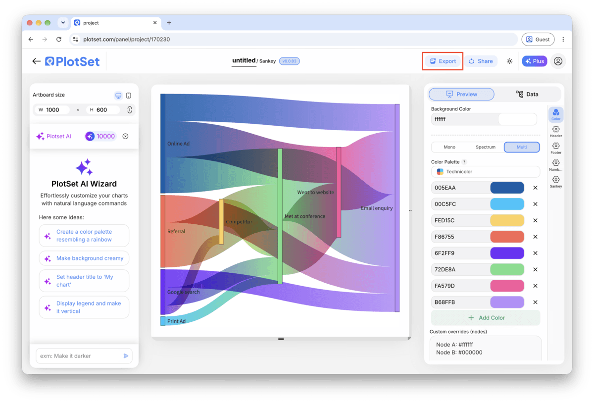
"Export" schreibt eine statische Kopie in der Größe heraus, die Sie brauchen. SVG bleibt in jeder Skalierung scharf und lässt sich weiterhin in einem Design-Tool bearbeiten; PNG und JPG sind die sichere Wahl für Folien und Dokumente. Der Skalierungsfaktor sorgt dafür, dass das Bild auf einem Retina-Display gestochen scharf wirkt.

If fifteen small categories each carry under two percent of the total, group them into one "Other" node in your spreadsheet before uploading. Ten legible links reading well beats forty threads nobody can trace, and the reader can still see what the group contains from its label.
A node where flow simply stops should say so plainly: "Churned", "Unconverted", "Written off". A vague label like "Other" at the end of a diagram hides the one part most readers came to see.
Two stages show a split, three show a journey. A fourth stage is where crossings start to dominate the picture, so if your data has more steps than that, consider whether two linked diagrams tell the story more clearly than one dense one.
Because width already encodes the amount, a separate legend explaining colour usually repeats information the diagram already shows. Put your effort into a title that states what is flowing and over what period instead.
This means the inflows and outflows for that node do not sum to the same total. Add up both sides in your spreadsheet: if quantity genuinely disappears at that step, add an explicit row sending the difference to a named node like "Loss" instead of leaving it unbalanced.
Check for a spelling or capitalization mismatch between the source and target columns, most often a trailing space or an inconsistent abbreviation. A TRIM and a consistent name in your spreadsheet before re-uploading fixes this in one pass.
This happens past roughly a dozen nodes on one stage. Go back to the spreadsheet and merge the smallest categories into a single named group, then re-upload. It is much easier to fix in the source data than to untangle visually after the fact.
Nicht sicher, ob Sankey Diagram die richtige Wahl ist? Erfahren Sie, was es ist, wann Sie es verwenden sollten und wann nicht.
Three columns: source, target and value, one row per flow. Nodes are created automatically from whatever names appear in the source and target columns, so there is no separate node list to build or maintain before uploading.
Kostenlos starten mit über 300 Vorlagen. Keine Kreditkarte erforderlich.