
Beispiel-CSV
| Country | CO2 per Capita (tonnes) |
|---|---|
| United States | 14.2 |
| Germany | 8.1 |
| China | 7.6 |
| Brazil | 2.2 |
| India | 1.9 |
| Nigeria | 0.6 |
A step by step walkthrough for turning a spreadsheet of place names and numbers into a published choropleth map in PlotSet, from matching region names to exporting or embedding the finished map.
Etwa 8 MinutenPlace names and numbers go in; how to create a choropleth map in PlotSet comes out the other side as a published, interactive map you can share or embed. You will end up with regions shaded by your own values, a color scale that actually fits the data, and a legend that tells the reader what the shading means: not a screenshot of somebody else's country list with your numbers dropped in.
If your spreadsheet already uses the exact place names PlotSet's map template recognizes, this takes about eight minutes. Add another ten if you are starting from a report full of abbreviations, ISO codes or older country names: matching those to the template's region list is the part that eats time, not the styling. Budget the eight minutes below and treat the rest as a buffer.
One row per region, two columns: the place name first, matching how the template labels its regions, and the number second. One header row, no totals row.
| Country | CO2 per Capita (tonnes) |
|---|---|
| United States | 14.2 |
| Germany | 8.1 |
| China | 7.6 |
| Brazil | 2.2 |
| India | 1.9 |
| Nigeria | 0.6 |
Use the same place names the map template uses, not abbreviations or codes. "USA" or "US" often will not match a region labeled "United States", and a mismatch drops that row's shading instead of throwing an error.
One number per region. If you want two years side by side, that calls for two separate maps or a time slider, not two columns crammed into one choropleth.
Leave regions you have no data for out of the sheet entirely, rather than filling them with a zero. PlotSet gives any region with no matching row a distinct no-data color; a zero would shade it like a real low value instead.
Delete any totals or world-aggregate row before uploading. A "Global" or "World" row has no matching region on the map, so it gets ignored, but it is cleaner to remove it at the source than to rely on that.
Der genaue Klickpfad in PlotSet, von einer leeren Vorlage bis zum fertigen Diagramm.
From the PlotSet dashboard, start a new project and choose the Choropleth Map template. It loads with a world map and sample data already in place, so you can see the place-name and value columns the template expects before swapping in your own file.

Choose world countries, or one of the state, province and county maps in the template library if your rows sit below the country level. Settling this first avoids a second round of place-name matching once you realize the template you started with is the wrong scale.
Put the region name in the first column and its number in the second, one row per region. Use standard names rather than abbreviations, ISO codes or postal codes: whatever format the map template's region list expects.
Use the data panel to import a CSV or .xlsx file, paste rows directly from a spreadsheet, or connect a Google Sheet so the map can pick up updated figures later without a re-upload.

After upload, confirm which column PlotSet read as the place name and which as the value. Then look at the unmatched list it shows: any row whose name did not find a region on the map lands there, and it is almost always a spelling or naming difference you can fix in seconds.

Use a single-hue sequential scale, light to dark, for ordinary low-to-high figures, and switch to a diverging scale only when your numbers have a real midpoint, such as zero or a national average. Set a distinct gray for regions with no matching data so missing never reads as low.
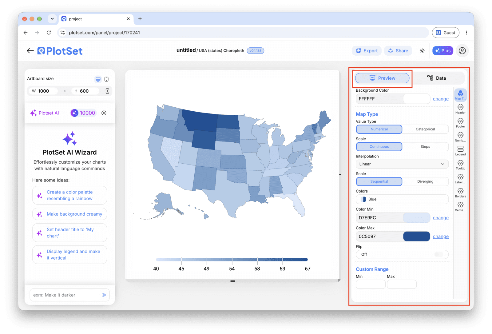
Turn on the legend so the shading has a key, and title the map with what is being measured, "CO2 emissions per capita" rather than just "Map". A reader should know what the color means before they hover over a single region.
Publish for a live, interactive map with hover tooltips and a shareable link, grab the embed code to drop it into a page, or export a PNG, SVG or PDF if you need a static image for a deck or a report.
Starten Sie mit der Choropleth Map-Vorlage samt bereits geladenen Beispieldaten und ersetzen Sie diese durch Ihre eigenen.
Vorlage öffnenDer letzte Abschnitt ist bei jedem Diagrammtyp gleich: "Share" macht aus dem Diagramm einen öffentlichen Live-Link und einen Einbettungscode, "Export" schreibt es als statische Datei heraus.
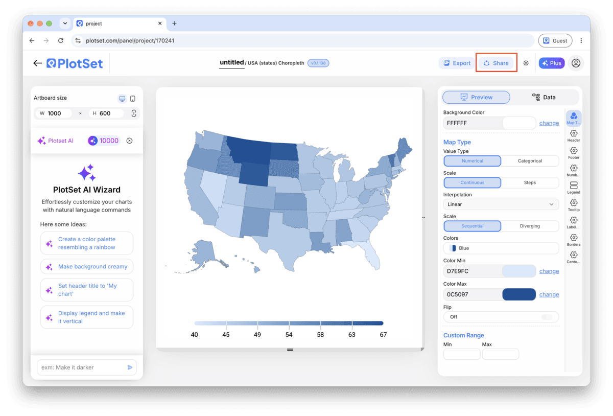
Aktivieren Sie den Einbettungscode und den öffentlichen Link, um das Diagramm zu veröffentlichen. Den Link können Sie bedenkenlos an alle weitergeben, und der Einbettungscode fügt sich als iframe in jede Seite ein. Die Tooltips beim Überfahren mit der Maus und die volle Interaktivität bleiben erhalten. Wenn Sie das Diagramm später bearbeiten, überträgt "Recreate" die Änderungen auf Link und Einbettung.

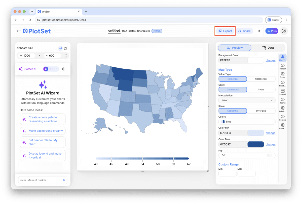
"Export" schreibt eine statische Kopie in der Größe heraus, die Sie brauchen. SVG bleibt in jeder Skalierung scharf und lässt sich weiterhin in einem Design-Tool bearbeiten; PNG und JPG sind die sichere Wahl für Folien und Dokumente. Der Skalierungsfaktor sorgt dafür, dass das Bild auf einem Retina-Display gestochen scharf wirkt.

PlotSet's map templates use a fixed list of region names per geography. Before uploading, check your trickier entries (small countries, disputed territories, recently renamed regions) against the template's own list rather than assuming your source spreadsheet's spelling counts as standard.
Land area does not track population, so a map colored by total count usually just redraws where people live. Convert to a rate, share or per-capita figure before shading, and save the raw totals for a bar chart instead.
A single choropleth should shade one scale at a time: country, or state, not both mixed together. If you need a national overview and state-level detail, build two maps rather than combining region sizes on one, which breaks the color scale's comparison.
A gray swatch with no explanation leaves the reader guessing whether it means zero or unknown. Label it "No data" directly in the legend so the distinction is stated, not inferred from context.
This is almost always a name mismatch: your sheet says "USA" or "Ivory Coast" while the map template expects "United States" or "Côte d'Ivoire". Open the unmatched-rows list PlotSet shows after upload and correct the spelling for each name it flags, then re-upload.
Check whether you uploaded a raw count instead of a rate. Totals shade almost any map the same way a population map would, since bigger, denser regions post bigger numbers regardless of what you meant to measure. Divide by population or another sensible denominator and re-upload.
If every unshaded region sits at the same pale end of the scale as your lowest real values, the no-data color was probably never set. Open the color settings, assign a distinct gray to no-data, and leave regions you have no figure for out of the sheet entirely.
Nicht sicher, ob Choropleth Map die richtige Wahl ist? Erfahren Sie, was es ist, wann Sie es verwenden sollten und wann nicht.
One column of place names and one column of numbers, with one row per region and one header row. The place names need to match the names the map template uses, standard country or state names rather than abbreviations or ISO codes, or that row's region will not get shaded.
Kostenlos starten mit über 300 Vorlagen. Keine Kreditkarte erforderlich.