| Task | Start | End | Owner | Phase |
|---|---|---|---|---|
| Discovery interviews | 2026-01-05 | 2026-01-16 | Priya | Discovery |
| Content audit | 2026-01-12 | 2026-01-23 | Marcus | Discovery |
| Wireframes | 2026-01-19 | 2026-02-06 | Priya | Design |
| Visual design | 2026-02-02 | 2026-02-20 | Sana | Design |
| Frontend build | 2026-02-16 | 2026-03-20 | Diego | Build |
| CMS integration | 2026-03-02 | 2026-03-27 | Marcus | Build |
| QA and content freeze | 2026-03-23 | 2026-04-03 | Sana | QA |
| Launch | 2026-04-06 | 2026-04-10 | Diego | Launch |

How to Create a Gantt Chart
A step by step walkthrough for turning a task list into a published Gantt chart in PlotSet, from shaping the sheet to exporting or embedding the finished timeline.
Etwa 8 MinutenA task list with a start date and an end date on every row is the raw material, and how to create a Gantt chart in PlotSet from it is what this guide walks through: one bar per task, coloured by phase, finishing in a published timeline ready to embed or hand to a client. Not a demo dataset, your own project going through the same click path a real PlotSet chart takes from upload to publish.
If your task list already has clean start and end dates, this takes about eight minutes. Add another ten if you're still pulling dates out of a project management tool's export or fixing a column that stored dates as text instead of real dates. Budget the eight minutes below and treat the rest as buffer.
Die Daten, die Sie brauchen
Five columns, one row per task: task name, start date, end date, owner, and phase. Dates in ISO format (YYYY-MM-DD), one header row, no merged cells.
Write dates in ISO format: 2026-01-05, not 1/5/26. PlotSet parses ISO dates the same way every time, while a locale ambiguous date can silently land on the wrong day.
Task name goes in its own column and stays short. It sits in a fixed row margin on the chart, so a long name gets cut off. Put the extra detail in a note elsewhere and let the tooltip carry it.
Owner and phase are optional but do real work: owner becomes the label written inside each bar, phase becomes the bar colour and the legend. Skip either and PlotSet just draws plain, uncoloured bars.
One row per task, no merged cells, no blank spacer rows between phases. A blank row uploads as an empty task with no dates, and PlotSet has nowhere to place it on the timeline.
Die Schritte
Der genaue Klickpfad in PlotSet, von einer leeren Vorlage bis zum fertigen Diagramm.
- 01
Open the Gantt chart template
From the PlotSet dashboard, start a new project and choose the Gantt Chart template, listed under Timeline. It loads with a sample project already in place (five tasks with dates, owners and phases) so you can see the exact column shape before swapping in your own.

Jede Anleitung beginnt hier. Wählen Sie erst die Kategorie, dann die Vorlage. Das Raster ist für jeden Diagrammtyp dasselbe. - 02
Lay your tasks out in five columns
Task name, start date, end date, owner, phase: one row per task. If your source is an export from a project management tool, strip out any status or ID columns you don't need. PlotSet only reads the five above.
- 03
Write every date in ISO format
Convert start and end dates to YYYY-MM-DD before you upload. If your spreadsheet still shows 04/27/2026, check what the column is actually storing: one formatted as text uploads as text, and PlotSet won't read it as a date.
- 04
Upload the file or connect a sheet
Import CSV or Excel from the data panel, paste rows directly from a spreadsheet, or connect a Google Sheet so the timeline can be refreshed later without a re-upload.

Die Datenansicht, hier in einem Balkendiagramm-Projekt. Laden Sie über "Upload CSV File" eine CSV-Datei hoch, holen Sie die Zahlen mit "Magic Import" aus einem Bild oder verbinden Sie ein Google Sheet. Der Bereich sieht bei jedem Diagrammtyp gleich aus. - 05
Bind Start, End, Y axis, Labels and Category
Start and End take the two date columns. Y axis takes the task name, which labels each row. Labels takes the text written inside the bar, usually the owner. Category takes the phase, which colours the bars and builds the legend.

Die Zuordnungen legen fest, welche Spalte zur Beschriftung wird, welche die Werte liefert und welche die Farbe steuert. "Auto Binding" errät sie anhand Ihrer Spaltenüberschriften. Prüfen Sie das Ergebnis, statt sich darauf zu verlassen. - 06
Sort tasks by start date
Order the rows by start date, either in the source sheet or in PlotSet's data table, so the chart cascades top to bottom in the order the work actually happens. A Gantt chart sorted alphabetically hides the one thing it's good at showing.
- 07
Set the axis interval to match the plan's length
A project spanning a few months reads well with week or month ticks; a multi year roadmap wants quarters. Open the axis settings and pick the interval that fits, or the labels will crowd into each other.

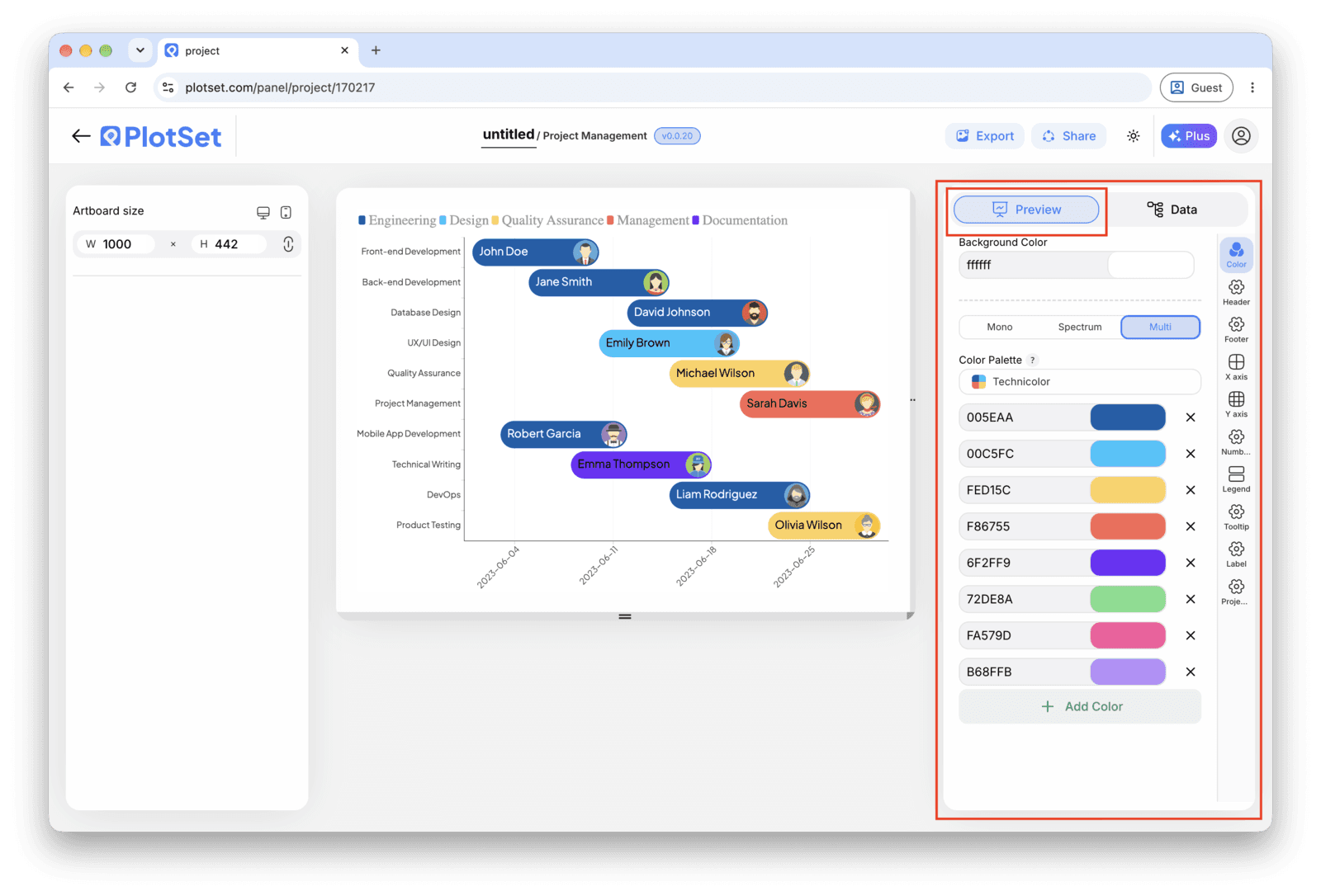
Der Tab "Preview" für ein Diagramm vom Typ "Gantt Chart". Alle Gestaltungsoptionen stecken im umrandeten Bereich: Aussehen, Kopfzeile, Fußzeile und die Optionen, die es speziell für diesen Diagrammtyp gibt, jeweils in einem eigenen Tab. - 08
Publish, embed or export the timeline
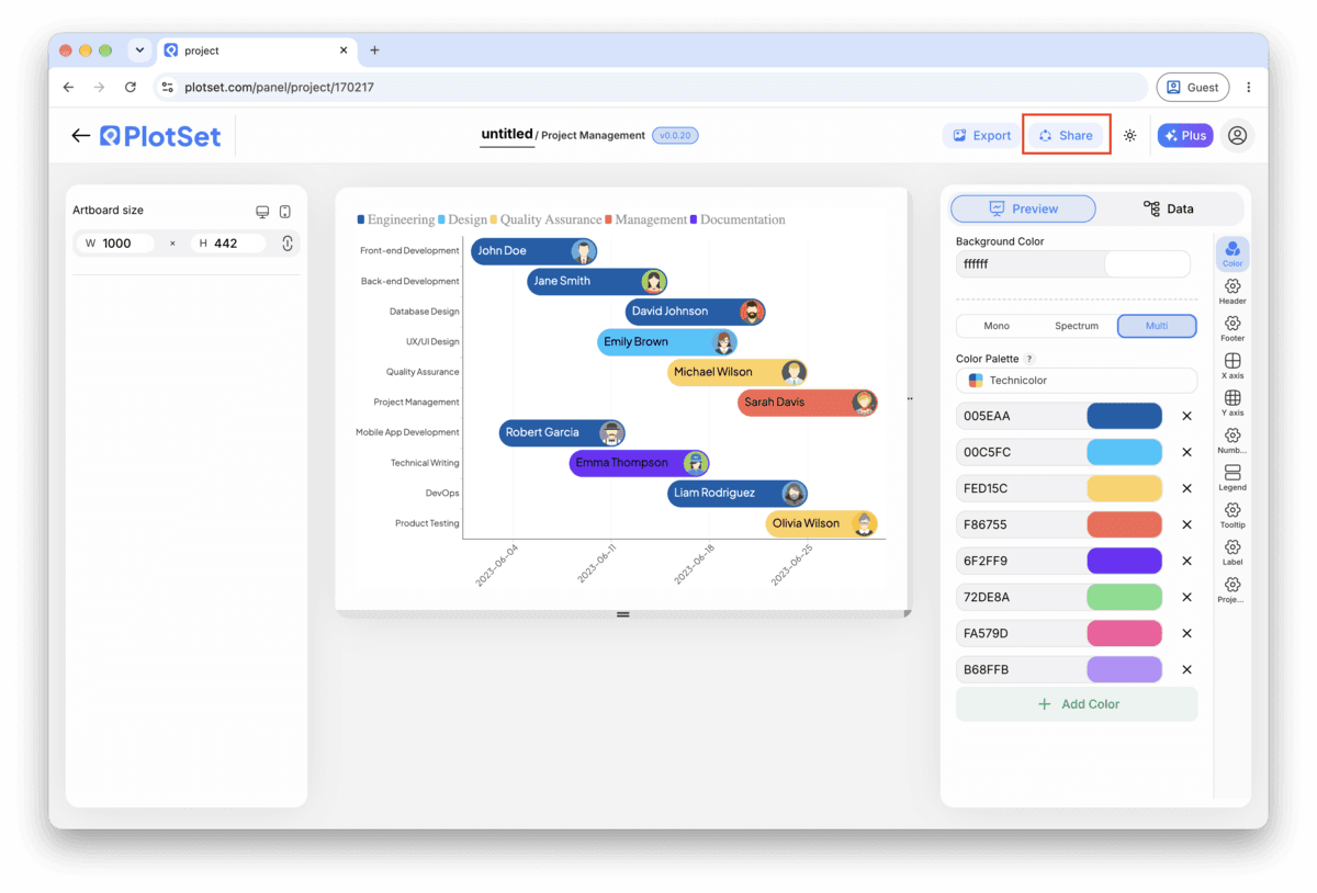
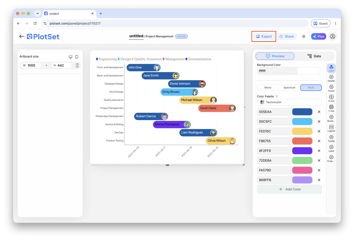
Publish for a live timeline with a tooltip on every bar and a shareable link, grab the embed code for a status page or wiki, or export a PNG, SVG or PDF for a deck.
Starten Sie mit der Gantt Chart-Vorlage samt bereits geladenen Beispieldaten und ersetzen Sie diese durch Ihre eigenen.
Vorlage öffnenStyling-Tipps für Gantt Chart
Colour by phase, not by owner
Category drives one colour scheme. Bind it to phase and everyone sees the project's structure at a glance. If owner also needs to be visible, put it in the bar label instead of fighting for a second colour dimension.
Keep task names to a few words
The row label sits in a fixed margin on the left. A short name like "Frontend build" reads fine; a full sentence gets truncated. Save the detail for the tooltip, which shows the whole row on hover.
Order rows by start date, not by phase or owner
The cascade down the chart is what makes a Gantt chart readable in two seconds. Grouping by phase or owner instead breaks that cascade and turns the chart back into a list with bars attached.
Match the axis interval to the plan's span
Day ticks on a two year roadmap are unreadable; month ticks on a three week sprint hide all the detail. Set the interval once you know how long the whole plan runs, not before.
Häufige Fehler bei Gantt Chart
All the bars start on the same day
This usually means Start and End are mapped to the same column, or the date column uploaded as text instead of a real date. Check the column bindings first, then confirm the dates are in ISO format (YYYY-MM-DD) in the source sheet.
The rows don't cascade, they look scattered
The task rows are probably still in their original spreadsheet order rather than sorted by start date. Sort the source sheet, or the data table inside PlotSet, by the start date column and check again.
Task names are cut off in the row labels
The label margin has a fixed width and doesn't wrap. Shorten the task names in the source column and move any extra detail into a separate note; the tooltip already shows the full row on hover.
Mehr über Gantt Chart erfahren
Nicht sicher, ob Gantt Chart die richtige Wahl ist? Erfahren Sie, was es ist, wann Sie es verwenden sollten und wann nicht.
Gantt Chart: häufige Fragen
Lay your data out one task per row: task name, start date, end date, owner and phase, with dates in ISO format (YYYY-MM-DD). Upload the file, bind Start and End to the date columns and Y axis to the task name, and PlotSet draws one bar per task on a shared calendar.
Jetzt Gantt Chart erstellen
Kostenlos starten mit über 300 Vorlagen. Keine Kreditkarte erforderlich.