PlotSet LogoPlotSet

How to Create a Timeline

A step by step walkthrough for turning a list of dated events into a published timeline in PlotSet, from shaping the sheet to exporting or embedding the finished chart.

Etwa 7 Minuten

This walkthrough covers how to create a timeline in PlotSet out of a sequence of dated events, each carrying a title and just enough context that a reader gets the story without pinging you for the slide deck behind it. Your own milestones go through the same click path a published PlotSet chart takes, from upload to publish, not a demo running on placeholder dates.

Seven minutes is enough once your events already have clean dates and short titles. Still deciding what precision to date things at, or pulling dates out of a spreadsheet that stored them as text, adds another five. Treat the seven minutes below as the target and the rest as buffer.

Die Daten, die Sie brauchen

Four columns, one row per event: a date, a short title, an optional note, an optional image URL. Only the date and title are required, and one header row.

Beispiel-CSV
DateTitleNoteImage
1961-05-25Kennedy commits to the MoonKennedy tells Congress the US will land a man on the Moon before the decade is out
1966-02-03Luna 9 soft-landsFirst spacecraft to land softly on the Moon
1967-01-27Apollo 1 fireCabin fire during a launch rehearsal kills the three man crew
1968-12-21Apollo 8 launchesFirst crewed mission to leave low Earth orbit and circle the Moon
1969-07-20Apollo 11 landsArmstrong and Aldrin land in the Sea of Tranquilityhttps://example.com/images/apollo-11.jpg
1970-04-11Apollo 13 launchesOxygen tank explosion forces the crew to abort the Moon landing
1972-12-14Apollo 17 endsLast crewed Moon landing mission. Cernan is the last to walk on the Moon
Hinweise

Keep date precision consistent across every row: all years, or all full dates. PlotSet renders whatever precision you give it, so a chart mixing "1969" with "1969-07-20" reads as sloppy rather than intentional.

Rows do not need to already be in date order before you upload. PlotSet sorts events chronologically once the date column is mapped, so paste them in whatever order your source document used.

The note column is for a sentence or two. Anything longer gets clipped inside the marker card, so put the extra detail in a linked document and use the note for the one line that actually matters.

Image URLs need to be public and stay live. A link into a personal drive folder or a private channel shows a broken image icon on the published chart instead of the picture.

Die Schritte

Der genaue Klickpfad in PlotSet, von einer leeren Vorlage bis zum fertigen Diagramm.

  1. 01

    Open the Timeline template

    From the PlotSet dashboard, start a new project and choose the Timeline template. It loads with a handful of sample events already bound to a date, a title, a note and an image, so you can see the exact column shape before you touch your own file.

    Die Vorlagenauswahl von PlotSet: links die Liste der Diagrammkategorien, daneben das geöffnete Raster "Bar Charts" und die Vorlagenkarte "Bar Chart" mit ihrer Schaltfläche "Select".
    Jede Anleitung beginnt hier. Wählen Sie erst die Kategorie, dann die Vorlage. Das Raster ist für jeden Diagrammtyp dasselbe.
  2. 02

    Shape your sheet into four columns

    Date first, then a short title, then an optional note, then an optional image URL, one row per event. Only the date and title columns are required. If your source is a project doc or a wiki page, pull just those four things out rather than dragging in every field you have.

  3. 03

    Get your events into PlotSet

    Import a CSV or .xlsx file from the data panel, paste rows straight from a spreadsheet, or connect a Google Sheet if you expect to add events later without a re-upload. PlotSet reads the first row as headers automatically.

    Die Datenansicht im PlotSet-Editor: ein Tabellenraster mit den Spalten "Name", "Value" und "Region", gefüllt mit Zahlen zu kanadischen Provinzen, daneben der Bereich "Data" mit "Upload CSV File", "Magic Import" und der Synchronisierung über "Google Sheet".
    Die Datenansicht, hier in einem Balkendiagramm-Projekt. Laden Sie über "Upload CSV File" eine CSV-Datei hoch, holen Sie die Zahlen mit "Magic Import" aus einem Bild oder verbinden Sie ein Google Sheet. Der Bereich sieht bei jedem Diagrammtyp gleich aus.
  4. 04

    Map the date, title, note and image columns

    Confirm which column feeds each part of the marker. This is usually automatic when your headers are named clearly, but check it manually if your sheet carries extra columns PlotSet might have guessed wrong on.

    Der Datenbereich von PlotSet mit hervorgehobenen Spaltenzuordnungen: "Label/time" auf Spalte A, "Values" auf Spalte B und "Filter/color" auf Spalte C, darunter die Schaltfläche "Auto Binding".
    Die Zuordnungen legen fest, welche Spalte zur Beschriftung wird, welche die Werte liefert und welche die Farbe steuert. "Auto Binding" errät sie anhand Ihrer Spaltenüberschriften. Prüfen Sie das Ergebnis, statt sich darauf zu verlassen.
  5. 05

    Check the order and trim to the events that matter

    PlotSet sorts events chronologically once they are mapped, so scan the result for anything that landed in the wrong place, usually a date typed in an inconsistent format. This is also the point to cut anything that does not change the story. Five to twenty events is the range that stays readable.

  6. 06

    Style the spine and markers

    Set the spine to horizontal or vertical depending on where the chart will live, then size the markers: larger for the two or three events that carry the story, default size for the rest. Leave the alternating left-right layout off unless the events are dense enough that labels start to overlap.

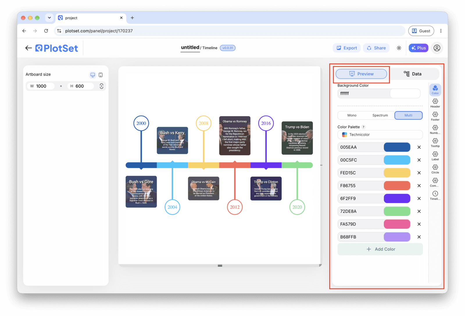
    Der PlotSet-Editor im Tab "Preview": ein fertiges Diagramm vom Typ "Timeline" auf der Arbeitsfläche und der rot umrandete Einstellungsbereich am rechten Rand.
    Der Tab "Preview" für ein Diagramm vom Typ "Timeline". Alle Gestaltungsoptionen stecken im umrandeten Bereich: Aussehen, Kopfzeile, Fußzeile und die Optionen, die es speziell für diesen Diagrammtyp gibt, jeweils in einem eigenen Tab.
  7. 07

    Write the titles like headlines

    Lead each title with what changed, not the date, since the date is already on the axis right next to it. Save the note for the sentence a reader would want if they stopped to read, and leave it blank on rows where there is nothing worth adding.

  8. 08

    Publish, embed or export the timeline

    Publish for a live, interactive timeline where each marker opens its note and image on click, grab the embed code to drop it into a page, or export a PNG, SVG or PDF if you need a static version for a deck or a report.

Starten Sie mit der Timeline-Vorlage samt bereits geladenen Beispieldaten und ersetzen Sie diese durch Ihre eigenen.

Vorlage öffnen

Veröffentlichen, einbetten oder exportieren

Der letzte Abschnitt ist bei jedem Diagrammtyp gleich: "Share" macht aus dem Diagramm einen öffentlichen Live-Link und einen Einbettungscode, "Export" schreibt es als statische Datei heraus.

"Share": öffentlicher Link und Einbettungscode

Aktivieren Sie den Einbettungscode und den öffentlichen Link, um das Diagramm zu veröffentlichen. Den Link können Sie bedenkenlos an alle weitergeben, und der Einbettungscode fügt sich als iframe in jede Seite ein. Die Tooltips beim Überfahren mit der Maus und die volle Interaktivität bleiben erhalten. Wenn Sie das Diagramm später bearbeiten, überträgt "Recreate" die Änderungen auf Link und Einbettung.

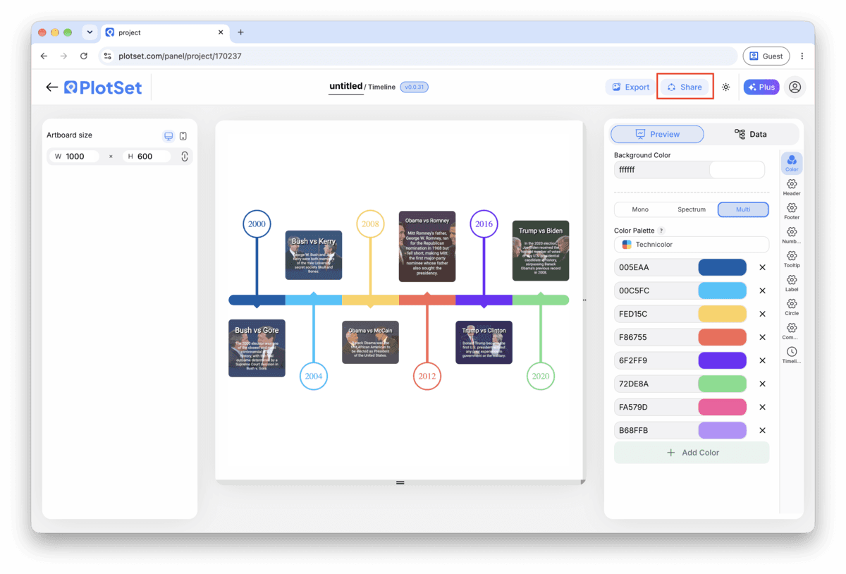
Die Werkzeugleiste des PlotSet-Editors mit der hervorgehobenen Schaltfläche "Share" direkt neben der Schaltfläche "Export".
Über "Share" werden aus dem fertigen Diagramm ein öffentlicher Link und ein Einbettungscode.
Der Dialog "Share" von PlotSet: der Schalter, der den Einbettungscode und den öffentlichen Link aktiviert, die Schaltflächen "Link", "Embed", "Facebook", "Reddit", "Twitter", "LinkedIn" und "Email" sowie der öffentliche Diagrammlink mit der Schaltfläche "Copy".
Aktivieren Sie den Einbettungscode und den öffentlichen Link, kopieren Sie dann den Link oder den iframe-Code. Mit "Recreate" erreichen spätere Änderungen alle, die den Link bereits haben.

"Export": SVG, PNG oder JPG

"Export" schreibt eine statische Kopie in der Größe heraus, die Sie brauchen. SVG bleibt in jeder Skalierung scharf und lässt sich weiterhin in einem Design-Tool bearbeiten; PNG und JPG sind die sichere Wahl für Folien und Dokumente. Der Skalierungsfaktor sorgt dafür, dass das Bild auf einem Retina-Display gestochen scharf wirkt.

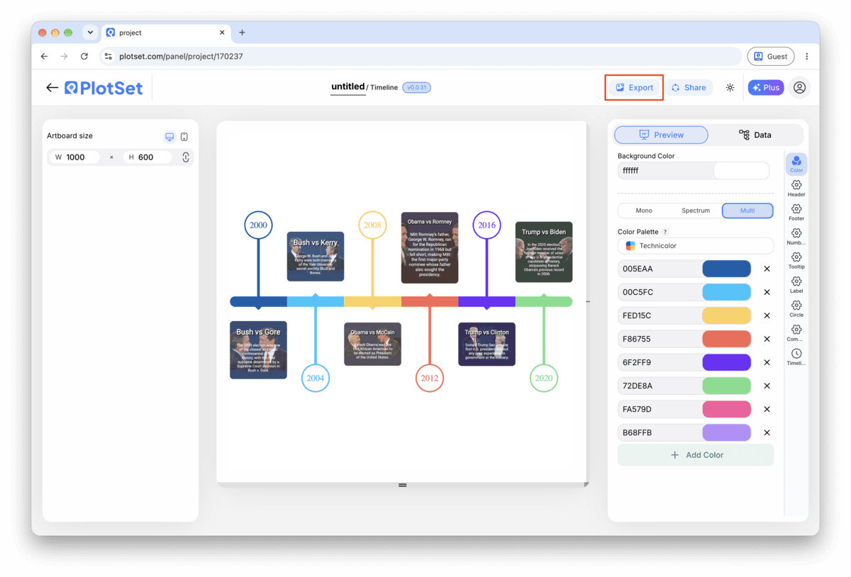
Die Werkzeugleiste des PlotSet-Editors mit der hervorgehobenen Schaltfläche "Export".
Über "Export" bekommen Sie eine statische Datei für eine Folie oder einen Bericht.
Der Dialog "Export chart" von PlotSet: die Skalierungsauswahl auf 2x, die Felder für Breite und Höhe mit 1000 mal 600 und das geöffnete Formatmenü mit "SVG", "PNG" und "JPG".
SVG bleibt in jeder Größe scharf und im Design-Tool bearbeitbar; PNG und JPG sind die sichere Wahl für eine Präsentation. Stellen Sie die Skalierung vor dem Export ein, damit das Bild auf einem Retina-Display gestochen scharf ist.

Styling-Tipps für Timeline

Keep the layout single sided under ten events

The alternating left-right layout earns its place once markers start crowding a single line, but for a short timeline it just adds movement the reader has to track. Turn it on only once labels are genuinely colliding.

Size markers by importance, not decoration

Set a larger marker for the two or three events that actually carry the story and leave the rest at the default size. A reader picks up the hierarchy before they have read a single title.

Save images for the moment they add information

An image on every marker inflates every card to the same height and turns a quick scan into a scroll. Attach one where a photo genuinely tells the reader something the title cannot (a product shot, a diagram, a screenshot) and leave the rest blank.

Match the date format to your actual precision

If your rows are years, set the chart's date format to show years only instead of defaulting to a full date. A timeline that displays a fabricated month and day for an event you only know happened sometime in 1969 is claiming a precision you do not have.

Häufige Fehler bei Timeline

Two events land on top of each other

This usually means two rows share the same date, or dates close enough together that the markers overlap and the labels collide. Check the data table for duplicate or near-duplicate dates and either merge them into one event or correct the date if the sources actually disagree.

An event goes missing from the chart

A blank cell in the date column gets skipped rather than flagged, so the row disappears with no error. Scroll through PlotSet's data table and check that every row has a date before assuming your sheet uploaded in full.

A title gets cut off mid word

This means the title is running longer than the marker card has room for, not that anything broke. Shorten it to something closer to a headline and move the rest of the sentence into the note field, which has more room to work with.

Mehr über Timeline erfahren

Nicht sicher, ob Timeline die richtige Wahl ist? Erfahren Sie, was es ist, wann Sie es verwenden sollten und wann nicht.

Über Timeline

Timeline: häufige Fragen

Four columns with one header row: a date, a short title, and two optional columns, a note and an image URL. Only the date and title are required. CSV and .xlsx both work, and a pasted range from any spreadsheet tool is fine too, as long as the date column parses as an actual date rather than text.

Jetzt Timeline erstellen

Kostenlos starten mit über 300 Vorlagen. Keine Kreditkarte erforderlich.