
Donut Chart
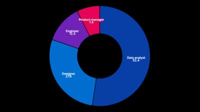
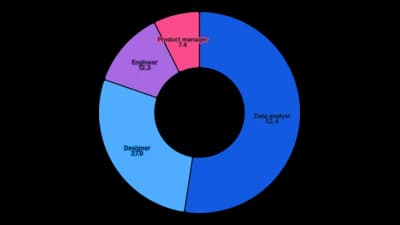
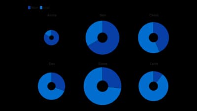
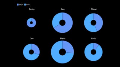
A ring split into slices that show parts of a total.

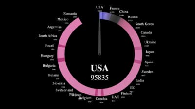
The idea
A donut chart is a pie with the centre cut out, which leaves room for the total and makes slice lengths easier to read. It works when a few parts add up to a meaningful whole. Keep the slices few and put the biggest first.
Where to use it
- Budget and revenue breakdowns
- Market share and answer shares
- Progress as a filled ring
- A total in the centre with its parts around it
Templates
Start from any of these templates and swap in your own data.
Ready to Transform Your Data Storytelling?
Join +6,000 creating stunning charts and video visuals with the all-in-one AI data visualization platform.
PlotSet helps data analysts, marketers, and designers transform complex data into clear, compelling stories. start creating today.