
示例 CSV
| Month | Organic Search | Paid Search | Direct | Referral |
|---|---|---|---|---|
| Jan | 12400 | 3200 | 5100 | 1800 |
| Feb | 13100 | 3450 | 5300 | 1750 |
| Mar | 14200 | 3600 | 5250 | 2000 |
| Apr | 15800 | 4100 | 5400 | 2100 |
| May | 16500 | 4300 | 5600 | 2050 |
| Jun | 17900 | 4550 | 5800 | 2200 |
A walkthrough for turning a spreadsheet of values over time into a published area chart in PlotSet, from shaping the columns to styling the fill and exporting the result.
约 8 分钟This walkthrough covers how to create an area chart in PlotSet, moving from a spreadsheet of values over time to a published, interactive chart you can embed or export. You'll finish with the fill styled on purpose (stacked, overlapping, or a single band), a baseline that actually sits at zero, and series names that mean something in the legend, not a screenshot of someone else's example.
If your data is already one time column plus one or two measure columns, this takes about eight minutes. Add a few more if you're deciding between stacked and percentage mode, or if your source export needs reshaping from long to wide first. Budget the eight minutes below and treat the rest as buffer.
One row per time point, one column per series: a date or period label first, one number per series after it. No merged cells, one header row.
| Month | Organic Search | Paid Search | Direct | Referral |
|---|---|---|---|---|
| Jan | 12400 | 3200 | 5100 | 1800 |
| Feb | 13100 | 3450 | 5300 | 1750 |
| Mar | 14200 | 3600 | 5250 | 2000 |
| Apr | 15800 | 4100 | 5400 | 2100 |
| May | 16500 | 4300 | 5600 | 2050 |
| Jun | 17900 | 4550 | 5800 | 2200 |
Keep the date column as an actual date, not text. If a spreadsheet stores "Jan" as a plain string, PlotSet spaces the points evenly instead of by the real gap between them.
This is wide format: one column per series. If your source data is long format, a category column and a value column with one row per date and series, pivot it in your spreadsheet tool first, or the series won't split into separate bands.
Blank cells in a measure column render as a gap in that band rather than being skipped. Fill them with zero or the last known value, whichever matches what actually happened during that period.
Keep header names short. They become the series names in the legend and in the hover tooltip, so a column called "Organic Search Sessions (All Devices)" will crowd both.
PlotSet 中从空白模板到完成图表的具体点击路径。
From the PlotSet dashboard, start a new project and choose the Area Chart template. It loads with sample data already bound, so you can see how the time column and the measure columns map onto filled bands before you touch your own file.

One row per period, with the date or time label first and one column per series after it. If your source is long format, one row per date and category rather than one row per date, pivot it into wide format before uploading.
Use the data panel to import a CSV or .xlsx file, paste rows directly from a spreadsheet, or connect a Google Sheet if you want the chart to refresh later without a re-upload. PlotSet reads the first row as headers automatically.

Confirm which column feeds the x-axis and which numeric columns feed the bands. If the points along the axis look evenly spaced even though your periods aren't, the date column is likely being read as text rather than a date.

Stack the series when the running total matters. Switch to percentage stacking when only the changing mix matters and the total would be a distraction. Reach for overlapping only with two or three series and real transparency on the fill.
Drag the series order so the one you most want understood sits at the bottom, since only the bottom band has a flat baseline to read against. Give each series its own colour; a repeated colour from the default palette makes two bands look like one.
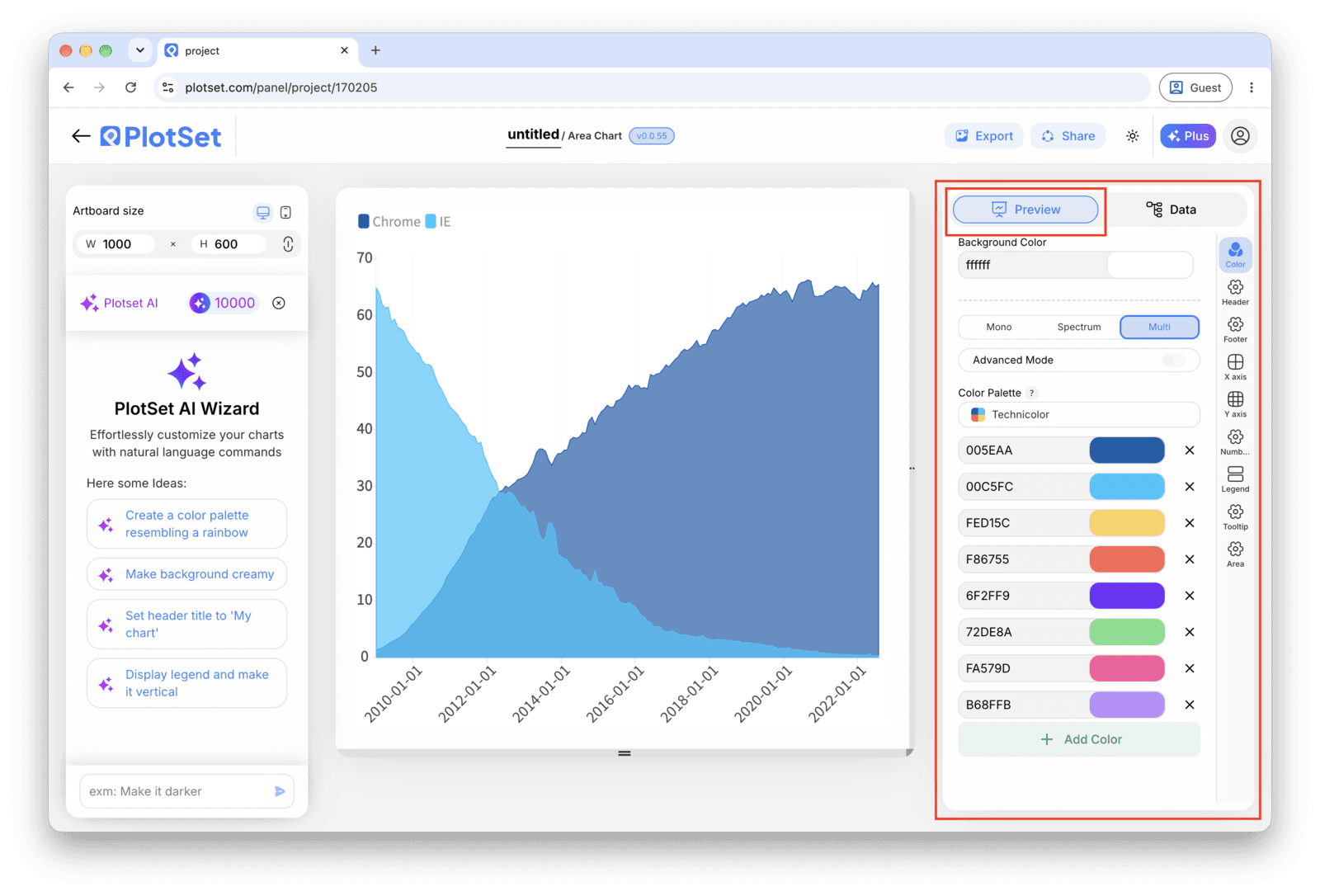
Confirm the value axis starts at zero. It should, because the fill is measured from there and a truncated axis on an area chart fills in a shape that doesn't exist. Add a title that says what's accumulating, not just the metric name.
Publish for a live, interactive chart with hover tooltips that show every series at a given date, grab the embed code to drop it into a page, or export a PNG, SVG or PDF for a deck.
从已加载示例数据的 Area Chart 模板开始,再替换成你自己的数据。
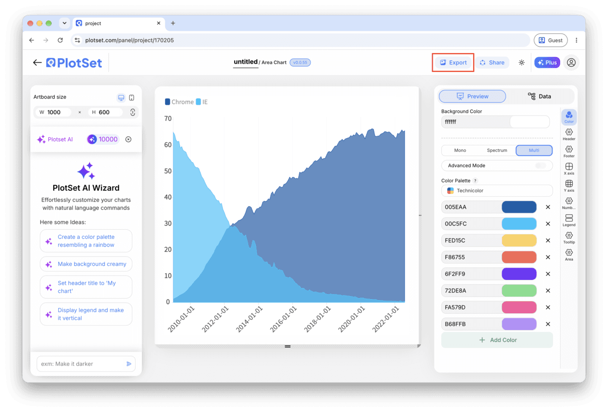
打开模板最后一段路对每种图表都一样:「Share」(分享)把图表变成一个在线的公开链接和一段嵌入代码,「Export」(导出)把它输出成静态文件。
打开嵌入代码和公开链接的开关,图表就发布出去了。链接可以放心发给任何人;嵌入代码以 iframe 的形式放进任意页面,悬停提示和交互效果都会保留。之后修改了图表,点「Recreate」就能把改动同步到链接和嵌入代码两边。
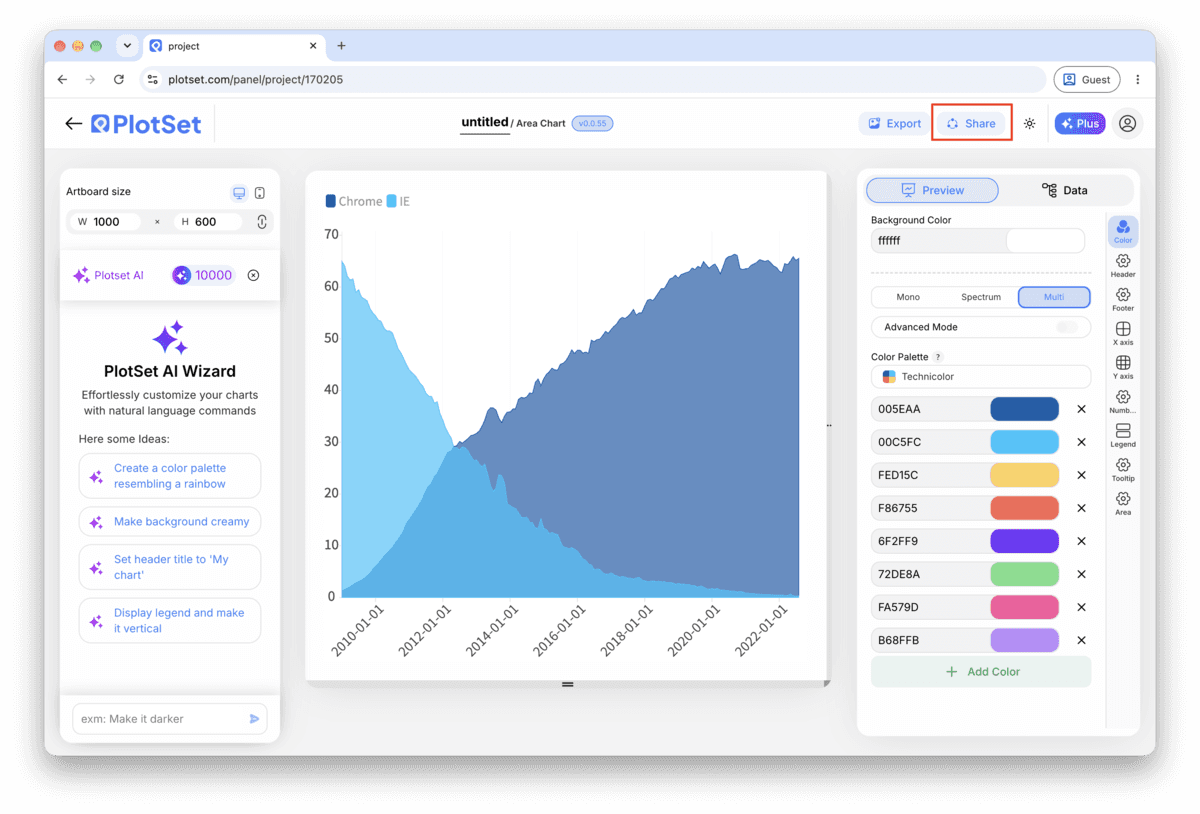

「Export」会按你需要的尺寸输出一份静态副本。SVG 放到多大都清晰,还能在设计工具里继续编辑;幻灯片和文档用 PNG 或 JPG 最稳妥。想让图片在高分屏上够锐利,关键就是那个倍数设置。

In a stacked area chart, only the bottom band sits on a flat baseline. Every band above it is judged against a wavy line, which the eye does badly, so the bottom slot should go to the series your reader most needs to track accurately.
The filled region is measured from the baseline, so shifting it exaggerates or hides volume that isn't real. If you want to zoom in on a narrow range, turn on value labels and hover tooltips instead of touching the axis.
Past that, the bands in the middle get thin, wavy and impossible to compare. Group the smaller series into an "Other" band and name it in the legend rather than letting six or seven colours fight for space.
A 100% stacked area looks perfectly stable even if the underlying total collapsed. Label the axis and add a line in the caption noting that the chart shows mix, not magnitude.
This means the time column is being read as text rather than a date, so PlotSet is placing the labels in order rather than by calendar distance. Reformat the column as an actual date in your source sheet and re-map it.
Check two things: the chart's stacking mode may still be set to overlapping, and your data may still be in long format with one series column instead of one column per series. Switch the mode to stacked and confirm each series has its own column.
A "Total" or "Average" row left at the bottom of the sheet gets read as an extra time point, not a summary, and appears as an odd extra point past your real data. Delete it from the source file or remove the row in PlotSet's data table before publishing.
不确定 Area Chart 是否是正确选择?查看它是什么、何时使用以及何时不使用。
Wide format, with one header row: a date or period label in the first column and one number per series in the columns after it. CSV and .xlsx both work, and a pasted range from any spreadsheet tool is fine too.
免费开始,300+ 模板任选。无需信用卡。