PlotSet LogoPlotSet

How to Create a Stream Graph

A step by step walkthrough for turning a spreadsheet of categories over time into a published stream graph in PlotSet, from shaping the sheet to ordering the bands and exporting the result.

约 10 分钟

How to create a stream graph in PlotSet starts with a wide CSV of dates and categories, turned into flowing bands ordered so the biggest shift in the data is what a reader notices first. This walks the same click path a real PlotSet stream graph takes from upload to publish, not a demo running on someone else's numbers.

Ten minutes, if your data is already one row per date with a column per category, most of it spent on band order and colour rather than the upload. Reshaping a long format export, one row per date and category rather than one row per date, into the wide layout this chart needs adds another ten.

你需要的数据

Wide format: one row per time point, one column per category, values are the amount for that category at that time. One header row, dates in the first column.

示例 CSV
MonthHip-HopRockPopCountryElectronic
2024-0118400152002130091007600
2024-0219100148002190088008200
2024-0320500141002260086009000
2024-0421800136002220083009900
2024-05232001300021700810010800
2024-06246001250021100790011700
备注

This is wide format, not long format. If your export instead has one row per date-and-category combination (a "Month, Genre, Streams" shape with repeated months), pivot it in your spreadsheet tool first so each category gets its own column.

Dates need to parse cleanly and stay in order. A first column of "2024-01", "Jan-24" or a real date type all work; a text column that sorts alphabetically instead of chronologically will scramble the bands.

Use even spacing where you can: weekly, monthly, quarterly. Gaps of uneven length between rows still plot, but the interpolation between a wide gap and a narrow one gets visibly less trustworthy.

Blank cells read as zero for that category at that time, not as missing. If a category genuinely did not exist yet, that is usually the correct reading; if it is a data entry gap, fill it in before uploading.


操作步骤

PlotSet 中从空白模板到完成图表的具体点击路径。

  1. 01

    Open the stream graph template

    From the PlotSet dashboard, start a new project and choose the Stream Graph template. It loads with sample data already in the wide layout, so you can see exactly how a time column and several category columns turn into bands before you touch your own file.

    PlotSet 的模板选择界面:左侧是图表分类列表,中间展开 Bar Charts 分类的模板网格,Bar Chart 模板卡片上显示「Select」按钮。
    每份指南都从这里开始:先选分类,再选模板,不管你要做哪种图表,用的都是同一个网格。
  2. 02

    Shape your sheet into wide format

    Put your time points down the first column and one column per category across the top, with values filling the grid. If your source export is long format, pivot it now: a spreadsheet pivot table with dates as rows and categories as columns gets you there in one step.

  3. 03

    Load your CSV or connect a live sheet

    Use the data panel to import a CSV or .xlsx file, paste rows directly from a spreadsheet, or connect a Google Sheet if you want the graph to refresh when the source changes. PlotSet reads the first row as headers automatically.

    PlotSet 编辑器的数据视图:表格中 Name、Value、Region 三列填着加拿大各省的数据,旁边的「Data」面板提供 CSV 上传、「Magic Import」和 Google Sheet 同步。
    这里的数据视图取自一个条形图项目。你可以上传 CSV、用「Magic Import」从图片里提取数字,或同步 Google Sheet,每种图表类型的面板都一样。
  4. 04

    Map the time column and the category columns

    Confirm which column is read as the time axis and which columns feed the individual bands. This is usually automatic when your first column is clearly a date, but check it if PlotSet has picked up an extra column, like an ID or a total, as a band of its own.

    PlotSet 数据面板中高亮的列绑定:「Label/time」对应 A 列,「Values」对应 B 列,「Filter/color」对应 C 列,下方是「Auto Binding」按钮。
    绑定决定哪一列作标签、哪一列提供数值、哪一列决定颜色。「Auto Binding」(自动绑定)会根据表头推测,所以要核对一遍,别想当然。
  5. 05

    Order the bands so the shift reads

    This is the one setting that decides whether the chart tells a story or looks like a tangle. Order by peak time so early risers sit at the outer edges and late risers sit toward the middle, or use the inside-out ordering PlotSet offers if your categories rise and fall in an unclear sequence. Try both and see which one straightens the shape out.

  6. 06

    Style the bands and label what matters

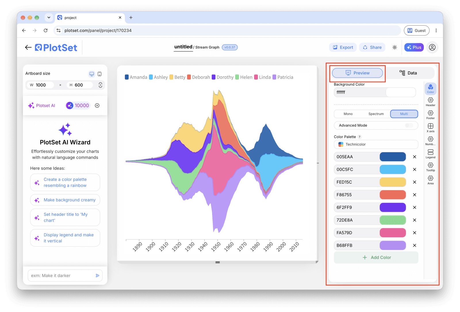
    Pick a colour scheme where related categories sit close in hue rather than a full rainbow, since with more than six or seven bands a categorical palette stops being legible. Turn on the tooltip so hovering a band shows its exact value, and skip axis labels: a stream graph has no baseline to put them against.

    PlotSet 编辑器停在「Preview」标签页:画布上是做好的 Stream Graph,右侧的设置面板用红框标出。
    Stream Graph 的「Preview」标签页。所有样式设置都在红框标出的这个面板里,每个设置各自占一个标签页:外观、标题、脚注,以及这种图表类型特有的选项。
  7. 07

    Add a title that names the shift

    Because the chart has no axis to lean on, the title is doing real work. Name the change itself, for example "Hip-hop overtakes pop in monthly streams", rather than a generic label like "Streams by genre".

  8. 08

    Send it out: publish, embed or export

    Publish for a live, interactive chart where hovering isolates a band and shows its value, grab the embed code to drop it into a page, or export a PNG, SVG or PDF if you need a static image for a deck.

从已加载示例数据的 Stream Graph 模板开始,再替换成你自己的数据。

打开模板

发布、嵌入或导出

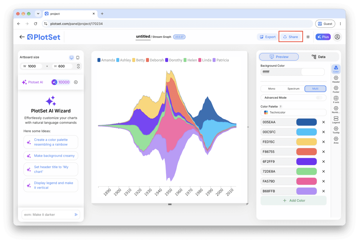
最后一段路对每种图表都一样:「Share」(分享)把图表变成一个在线的公开链接和一段嵌入代码,「Export」(导出)把它输出成静态文件。

Share:公开链接与嵌入代码

打开嵌入代码和公开链接的开关,图表就发布出去了。链接可以放心发给任何人;嵌入代码以 iframe 的形式放进任意页面,悬停提示和交互效果都会保留。之后修改了图表,点「Recreate」就能把改动同步到链接和嵌入代码两边。

PlotSet 编辑器工具栏中高亮的「Share」按钮,紧挨着「Export」按钮。
点「Share」,完成的图表就会变成一个公开链接和一段嵌入代码。
PlotSet 的「Share」对话框:用于启用嵌入代码和公开链接的开关,「Link」「Embed」「Facebook」「Reddit」「Twitter」「LinkedIn」「Email」几个按钮,以及带「Copy」按钮的图表公开链接。
打开嵌入代码和公开链接的开关,然后复制链接或取用 iframe。之后再修改图表,点「Recreate」就能把改动同步给所有已拿到链接的人。

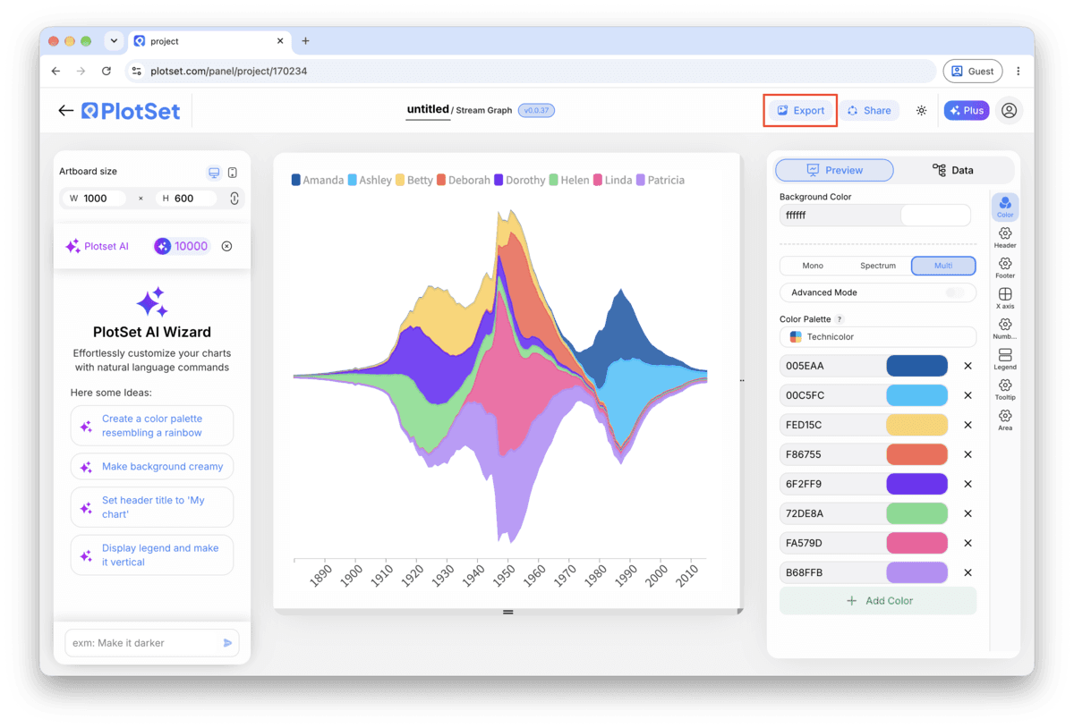
Export:SVG、PNG 或 JPG

「Export」会按你需要的尺寸输出一份静态副本。SVG 放到多大都清晰,还能在设计工具里继续编辑;幻灯片和文档用 PNG 或 JPG 最稳妥。想让图片在高分屏上够锐利,关键就是那个倍数设置。

PlotSet 编辑器工具栏中高亮的「Export」按钮。
要做成幻灯片或报告里的静态文件,就走「Export」这条路。
PlotSet 的「Export chart」对话框:倍数选择器设为 2x,宽高输入框填的是 1000 和 600,展开的格式菜单里列出 SVG、PNG 和 JPG。
SVG 放到多大都清晰,还能在设计工具里继续编辑;做幻灯片用 PNG 或 JPG 最稳妥。导出前先设好倍数,图片在高分屏上才够锐利。

Stream Graph 的样式提示

Order by peak time first, size second

Ordering categories by when each one peaks (earliest at the edges, latest toward the centre) is what turns a knot of overlapping bands into a readable sequence. Only fall back to ordering by total size if your categories genuinely all peak around the same time.

Group small categories instead of colouring all of them

Past seven or eight bands, individual colours stop being distinguishable at a glance. Combine the smallest categories into an "Other" band before upload, or use a sequential palette within a family (three shades of blue for three related genres) rather than three unrelated hues.

Turn on hover tooltips, always

There is no axis to read a value from, so the tooltip is not a nice-to-have here, it is the only way anyone gets a number off the chart. Publish it interactively rather than exporting a static image whenever the values themselves matter.

Keep the time axis dense and evenly spaced

Weekly or monthly points with no missing periods produce smooth, trustworthy curves. A handful of widely spaced points forces PlotSet to interpolate over a long gap, which can imply a smooth rise or fall that the data never actually measured.

制作 Stream Graph 时的常见错误

The bands look like a tangled knot instead of a flow

This is almost always the band order, not the data. Switch from source or alphabetical order to peak-time ordering, or try the inside-out variant. A stream graph with the wrong order is unreadable regardless of how clean the numbers underneath are.

One category shows a flat zero the whole way through

Check whether that column got read from a long-format row rather than a wide column, which leaves every cell but one blank and therefore zero. Re-pivot the source sheet so that category has its own real value at every time point.

The shape spikes sharply between two points for no reason

Look for an uneven gap in your time column, like a monthly series that skips a quarter. PlotSet interpolates across whatever gap exists, and a wide one produces a curve that looks more dramatic than the two real data points support. Fill in the missing period or shorten the interval.

深入了解 Stream Graph

不确定 Stream Graph 是否是正确选择?查看它是什么、何时使用以及何时不使用。

关于 Stream Graph

Stream Graph:常见问题

Wide format: one row per time point in the first column, one column per category, and a value in each cell. If your export is long format, one row per date-category pair, pivot it into wide format in your spreadsheet tool before uploading.

现在制作你的 Stream Graph

免费开始,300+ 模板任选。无需信用卡。