| Service | Month | Rank |
|---|---|---|
| Spotify | Jan | 1 |
| Apple Music | Jan | 2 |
| YouTube Music | Jan | 3 |
| Amazon Music | Jan | 4 |
| Spotify | Feb | 1 |
| Apple Music | Feb | 3 |
| YouTube Music | Feb | 2 |
| Amazon Music | Feb | 4 |
| Spotify | Mar | 2 |
| Apple Music | Mar | 3 |
| YouTube Music | Mar | 1 |
| Amazon Music | Mar | 4 |
| Spotify | Apr | 1 |
| Apple Music | Apr | 2 |
| YouTube Music | Apr | 3 |
| Amazon Music | Apr | 4 |
How to Create a Bump Chart
A step by step walkthrough for turning a ranked spreadsheet into a published bump chart in PlotSet, from shaping the sheet to publishing the finished tracks.
约 8 分钟Rank instead of raw value is the input here, and how to create a bump chart in PlotSet turns a spreadsheet with an item, a period and a rank column into a published, interactive chart you can embed or export. You will end up with a set of coloured tracks that cross exactly where the underlying ranking actually changed, with names attached at either end and no legend needed to read it.
If your data already has a rank column, this takes about eight minutes. Add another ten if you are starting from raw values and need to rank them within each period first: that step happens in your spreadsheet, before anything is uploaded, and it is the one most people skip by mistake.
你需要的数据
Long format, one row per item per period: the item name, the period label, and that item's rank within the period. Three columns, one header row.
The rank column has to be an integer position (1, 2, 3...), not the raw measure. If you only have subscriber counts or scores, rank them within each period first: a RANK formula in your spreadsheet, sorted per period, does this in one column.
Every item needs a row for every period. A period an item is missing from (a product not yet launched, a team relegated out of the league) leaves a gap in that track rather than a smooth line, so decide up front whether to backfill, drop the period, or leave the gap visible.
Two items cannot share a rank within the same period. A tie uploaded as-is either gets silently broken by PlotSet or draws two tracks on top of each other, so resolve ties in the sheet (alphabetical, or a tiebreaker metric) before uploading.
Keep the period column consistent: all month names, all week numbers, all match dates, not a mix. PlotSet orders periods by reading this column, and a mixed format sorts oddly.
操作步骤
PlotSet 中从空白模板到完成图表的具体点击路径。
- 01
Open the Bump Chart template
From the PlotSet dashboard, start a new project and choose the Bump Chart template. It loads with a small ranked dataset already bound to it, so you can see the item, period and rank columns in place before you touch your own file.

每份指南都从这里开始:先选分类,再选模板,不管你要做哪种图表,用的都是同一个网格。 - 02
Shape your sheet as item, period, rank
Rework your source data into three columns in long format: one row per item per period, with that item's integer rank for the period in the third column. If you are starting from raw values, rank them within each period in your spreadsheet first.
- 03
Upload your sheet or connect it live
Use the data panel to import a CSV or .xlsx file, paste rows straight from a spreadsheet, or connect a Google Sheet if new periods will keep arriving and you want the chart to pick them up without a re-upload.

这里的数据视图取自一个条形图项目。你可以上传 CSV、用「Magic Import」从图片里提取数字,或同步 Google Sheet,每种图表类型的面板都一样。 - 04
Map the item, period and rank columns
Tell PlotSet which column is the item, which is the period, and which is the rank. Clear headers like Service, Month and Rank usually get mapped automatically; check this manually if your sheet carries extra columns PlotSet had to guess between.

绑定决定哪一列作标签、哪一列提供数值、哪一列决定颜色。「Auto Binding」(自动绑定)会根据表头推测,所以要核对一遍,别想当然。 - 05
Set the period order
Confirm the periods run left to right in the order you intend, not alphabetically. This matters most with month abbreviations or match weeks that do not sort correctly as plain text.
- 06
Label the ends of each track
Turn on end labels so item names sit at the first and last period rather than in a separate legend. With names anchored at both edges, a reader can trace any single track through the crossings in the middle without losing their place.
- 07
Highlight the tracks that matter
Pick one or two items to keep in full colour and set the rest to a muted grey. Past about eight tracks a fully coloured chart turns into a tangle, and a highlighted track reads clearly against a grey field in a way it never does against seven other bright ones.

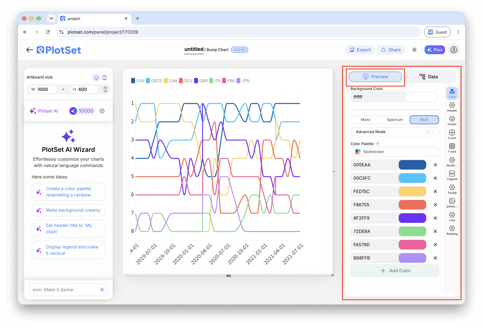
Bump Chart 的「Preview」标签页。所有样式设置都在红框标出的这个面板里,每个设置各自占一个标签页:外观、标题、脚注,以及这种图表类型特有的选项。 - 08
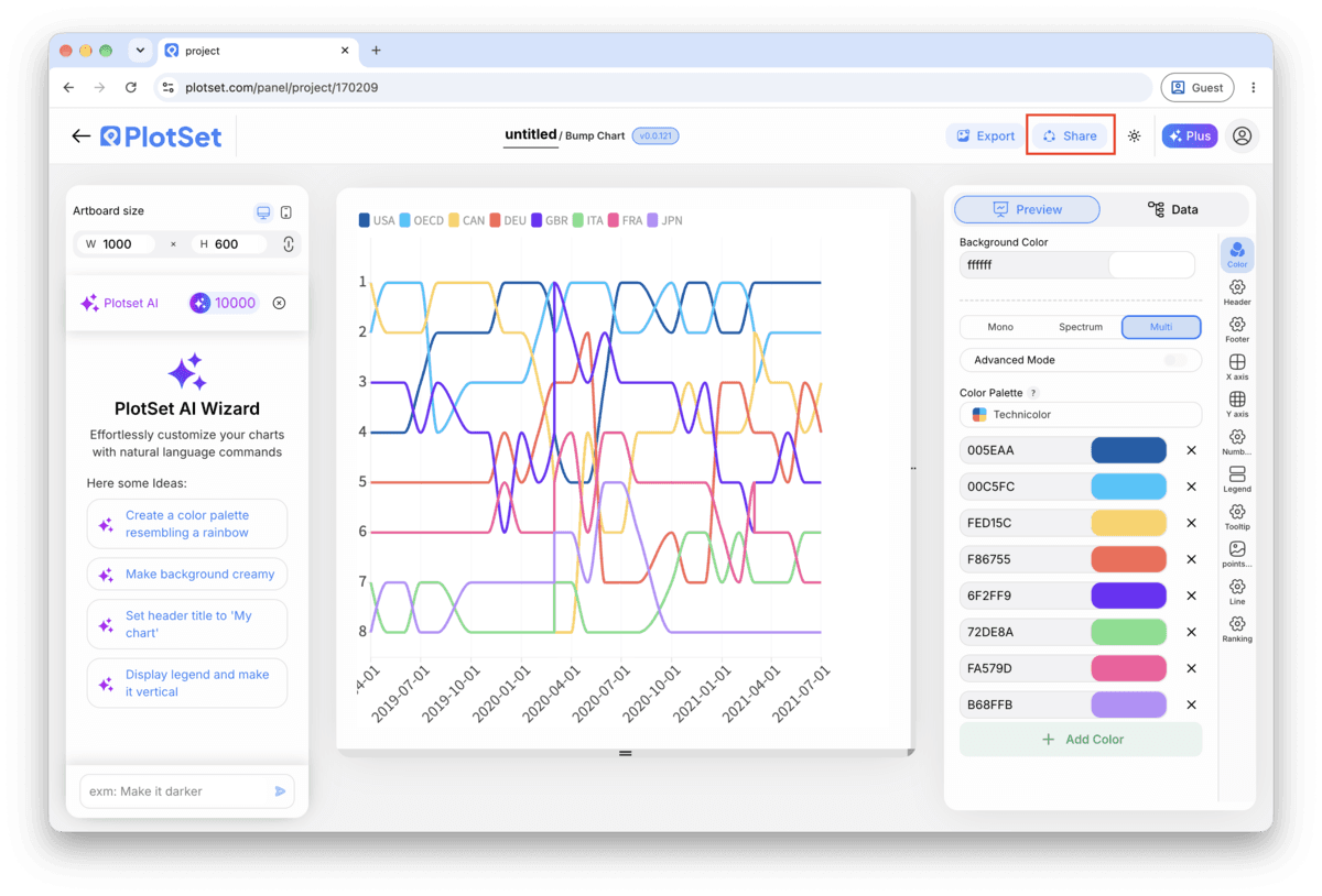
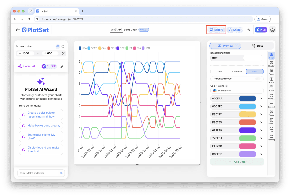
Publish, embed or export the tracks
Publish for a live chart where hovering a track highlights it against the rest with a tooltip at each node, grab the embed code to drop it into a page, or export a PNG, SVG or PDF if you need a static image for a deck.
从已加载示例数据的 Bump Chart 模板开始,再替换成你自己的数据。
打开模板Bump Chart 的样式提示
Put the real value in the tooltip
Rank alone hides magnitude: first and second can be neck and neck or worlds apart, and the chart looks the same either way. Add the underlying measure (subscribers, points, votes) to the tooltip so a hover fills in what the rank axis cannot show.
Label the top of the rank axis '1st', not '1'
An axis that goes up as rank improves is a convention people have to learn, not one they arrive with. Spelling out 1st at the top removes the one moment a reader might mistake a rise for a fall.
Space periods evenly
Bump charts read the horizontal axis as evenly spaced steps. If your periods are irregular, quarters of different lengths, seasons with byes, gaps read as meaningful when they are just calendar noise. Fill in a placeholder period rather than skip it.
Cap it at two or three highlighted colours
One highlight colour makes a clear point. Two makes a comparison. Past three, even with the rest greyed out, a reader loses track of which line is which by the second crossing.
制作 Bump Chart 时的常见错误
Two tracks sit exactly on top of each other
This means two items share the same rank in at least one period, usually from an unresolved tie in the source data. Go back to the sheet and break the tie with a secondary sort key, then re-upload.
A track has a visible gap or jumps oddly
A missing row for that item in one period leaves a hole in the line rather than a smooth connection. Check your data table for the period in question and add the missing row, or accept the gap and say so in a caption.
The chart looks huge and jagged instead of clean parallel tracks
This usually means raw values were uploaded into the rank column instead of ranks. Open the sheet, rank each period's values from 1 to N, and replace the value column with the rank before re-uploading.
深入了解 Bump Chart
不确定 Bump Chart 是否是正确选择?查看它是什么、何时使用以及何时不使用。
Bump Chart:常见问题
A long-format sheet with one row per item per period: an item column, a period column, and an integer rank column for that item within the period. Three columns and one header row is enough. If you only have raw values, rank them within each period before uploading.
现在制作你的 Bump Chart
免费开始,300+ 模板任选。无需信用卡。