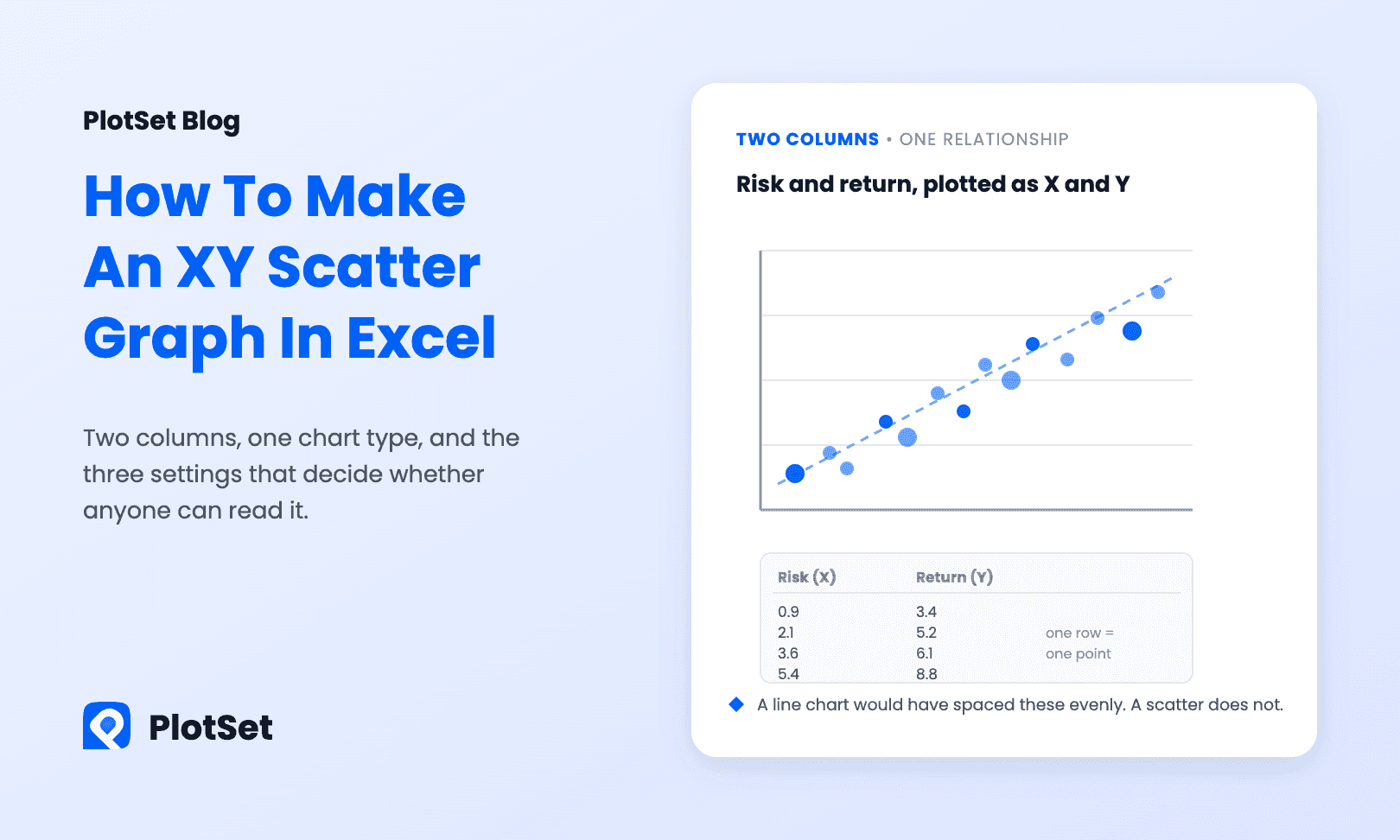
If you want to know how to make an XY graph in Excel, the short version is: two numeric columns, Insert → Scatter, then three settings Excel gets wrong by default. An XY graph (Excel calls it a scatter chart) is the chart you use when both columns are numbers and you want to see whether one moves with the other: advertising spend against revenue, hours studied against exam score, fertility rate against life expectancy.
Here is the whole job: the layout Excel expects, the clicks, the settings worth changing, a trendline you can trust, and the one chart type people pick by mistake.
How to make an XY graph in Excel, in short
Put X values in one column and Y values in the column to its right, one row per observation, both stored as numbers. Select both columns with headers and choose Insert → Insert Scatter (X, Y) or Bubble Chart → Scatter. Then set the axis bounds, add axis titles and resize the markers.
Lay the data out first
An XY scatter plots one point per row, using two numeric columns:
| Fertility rate (X) | Life expectancy (Y) |
|---|---|
| 0.72 | 83.4 |
| 1.62 | 78.4 |
| 3.40 | 65.5 |
| 6.12 | 55.1 |
Those four rows are South Korea, the United States, Ghana and Chad in 2023, from the World Bank's World Development Indicators. Three rules for the range:
- X goes in the left column, Y in the column to its right. Excel reads the leftmost selected column as the horizontal axis. If your sheet has them the other way round, move the column; fixing it later in Select Data works but is slower.
- One row per observation. Do not pre-average or group. A scatter is a chart of individual cases, and summarising them away is how a real relationship turns into four dots.
- Both columns must actually be numbers. Values imported as text sit left-aligned in the cell and plot as zero or not at all. If your numbers hug the left edge of the column, that is the bug.
Make the chart
- Select both columns, including the header row.
- Go to Insert → Charts, click the Insert Scatter (X, Y) or Bubble Chart icon, and choose the first option, Scatter.
- Excel drops a chart on the sheet. (Alt+F1 does the same with the default chart type, and F11 puts it on its own sheet.)
On a Mac the path is the same: Insert → Chart → X Y (Scatter). Microsoft's own walkthrough, Present your data in a scatter chart or a line chart, shows the same ribbon steps with screenshots.
If you have more than one series, do not select a third column and hope. Right-click the chart, choose Select Data → Add, then set Series X values and Series Y values by range for each series in turn. It is tedious, and it is the only way that reliably gets two series with different X values onto one chart.
Fix the three defaults that hurt
The axes start in the wrong place. Excel picks bounds that leave the cloud of points floating in a corner. Click the axis, open Format Axis → Bounds, and set a minimum near your smallest value. Unlike a bar chart, a scatter does not have to start at zero: nothing about the encoding depends on it, and forcing zero often squeezes the whole pattern into a fifth of the plot.
Nobody knows what the axes are. Click the chart, press the + (Chart Elements) button, tick Axis Titles, and write the units in. "Ad spend ($000)" takes five seconds and saves every reader ten.
The markers are wrong for the number of points. With 20 points, make them bigger. With 2,000, make them smaller and add transparency: Format Data Series → Marker → Fill → Solid fill, then push transparency to 60 or 70 percent so density shows instead of one black blob.
While you are in Chart Elements, if you want the points labelled, tick Data Labels, then open Format Data Labels and choose Value From Cells to point at a column of names. That is how you label points with a text column rather than with their own coordinates.
Add a trendline, carefully
Chart Elements (+) → Trendline → More Options gives you the fit types plus two checkboxes worth ticking: Display Equation on chart and Display R-squared value on chart.
Here is what that looks like on real data: 160 countries with at least a million people, fertility rate across, life expectancy up.
The linear fit is roughly life expectancy = 85.1 − 4.8 × fertility rate, with R² ≈ 0.71: each extra birth per woman goes with about 4.8 fewer years of life expectancy across these countries. Two cautions matter more than the clicks:
- A high R² says the line fits these points, not that X causes Y. Fertility and life expectancy both track income, healthcare and education; neither drives the other on its own.
- The Forecast boxes in the same panel extend your line beyond the data, which is exactly where a fitted line is least trustworthy.
The mistake almost everyone makes
Picking Line instead of Scatter.
A line chart treats the first column as labels, not numbers. It spaces them evenly along the axis whatever their values, so measurements taken at 1, 2, 4 and 40 minutes appear at four equal steps. The shape it draws is not the shape of your data. If your X column is numeric and irregularly spaced, and it usually is, you want a scatter; add connecting lines afterwards from Format Data Series → Line if you need them. Save the line chart for evenly spaced time series.
The rest of the usual list:
- Blank cells inside the range. Excel skips the row silently. Filter the blanks out before you chart.
- Too many opaque points. 5,000 identical markers is an inkblot, not a distribution. Use transparency, smaller markers, or a sample, and read why your scatterplot may be hiding half its data.
- A category on the X axis. Regions, months and product names are not numbers. That is a bar chart or a line chart, not a scatter.
- One outlier setting the scale. A single point at 40 times the others flattens everything against the axis. Annotate it and keep it, or split it out and say why.
Which Excel chart to use instead
| Your data | Use |
|---|---|
| Two numeric columns, looking for a relationship | Scatter (XY) |
| Two numeric columns plus a third measure | Bubble chart, sized by the third column |
| One measure over evenly spaced time | Line chart |
| One number per category | Bar or column chart |
For a wider tour, see the types of charts in Excel and when each one works. If a third numeric column matters, a bubble chart adds it as marker size without a second axis.
When Excel stops being the right tool
Excel is fine for looking. The trouble starts when the chart has to leave the workbook: what you can take out is a picture that cannot be hovered, has to be regenerated by hand every time a number changes, and carries Office styling onto your page.
If the scatter is going into a post, a report or a dashboard, build it somewhere designed for publishing. The scatter plot maker takes the same two columns from a CSV export of your sheet or a Google Sheets link, gives every point a tooltip, colours points by group, draws the trendline, and hands you an embed snippet or a clean SVG for print. The chart above was built that way. The step-by-step scatter plot guide walks through each click.
FAQ
What is the difference between a scatter chart and a line chart in Excel?
A scatter chart plots X and Y as two numeric coordinates, so horizontal spacing reflects the actual values. A line chart treats the first column as evenly spaced categories. If your X values are numbers with uneven gaps, a line chart draws a shape your data does not have.
How do I add labels to each point in an Excel scatter plot?
Select the series, tick Data Labels under Chart Elements, then open Format Data Labels and choose Value From Cells. Point it at the column holding your names, and untick X Value and Y Value unless you want the coordinates too.
Why is my scatter chart showing only one point, or none?
Almost always because the values are stored as text rather than numbers, or because the range includes blank rows. Check the cell alignment: numbers sit right, text sits left.
How do I switch the X and Y axes on an Excel scatter chart?
Right-click the chart, choose Select Data, select the series and click Edit, then swap the ranges in Series X values and Series Y values. Moving the columns in the sheet and re-inserting the chart does the same thing.
Should the axes on a scatter plot start at zero?
Not necessarily. Bar charts must start at zero because bar length is the encoding; on a scatter, position is what matters, so the axes should frame the data. Zoom in enough to see the pattern and label the axes so nobody misreads the range.