
Colorir cada região
A intensidade da cor carrega o valor. A escolha certa para taxas, proporções e números per capita, já ajustados ao tamanho ou à população.
Abrir o modeloA blank Ohio county map to print, and a builder to fill it with your own data. Download the free outline of all 88 counties, or upload a spreadsheet and publish an interactive Ohio map you can embed anywhere.
Todos os 88 counties, em traço limpo. Imprima, pinte ou insira em um documento — sem conta e sem atribuição.
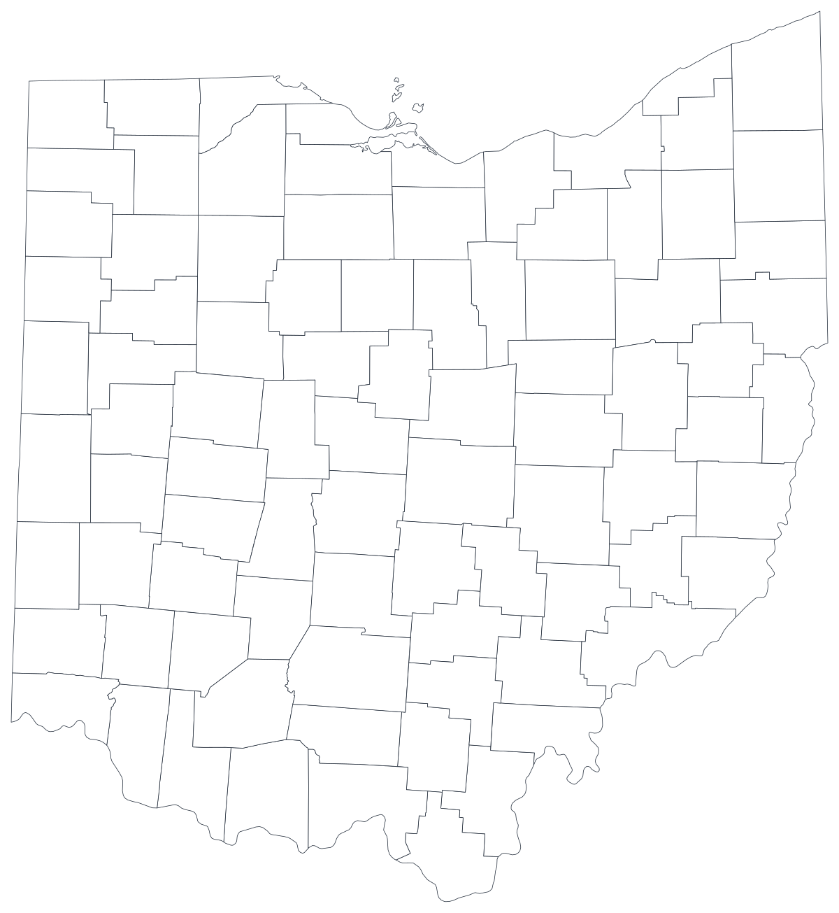
Livre para qualquer uso, inclusive comercial e escolar. Gerado a partir dos mesmos limites usados pelo editor.
Baixar SVGOhio divides into 88 counties, and it is one of the better-behaved states to map. The counties are compact and fairly even in size, so no single shape swallows the picture, and 88 is few enough that a reader can take in the whole state at a glance. What the geography shows is a state with several centres rather than one. Franklin County holds Columbus in the middle, Cuyahoga holds Cleveland in the north-east and Hamilton holds Cincinnati in the south-west — the three Cs that most Ohio statistics end up being about — while the Appalachian counties along the Ohio River in the south-east consistently sit at the other end of almost every measure the state publishes. That contrast is the argument a county map of Ohio is usually making, and it is invisible in any statewide average.
Colora as regiões quando o número for uma taxa; dimensione um marcador quando for uma contagem. Inverter isso é a maneira mais comum de um mapa enganar.
A intensidade da cor carrega o valor. A escolha certa para taxas, proporções e números per capita, já ajustados ao tamanho ou à população.
Abrir o modeloUm símbolo por região, escalado pelo valor. Use para contagens e totais, em que colorir a área apenas redesenharia o mapa da população.
Abrir o modeloCírculos dimensionados pelo valor sobre o contorno. Funciona bem quando poucas regiões dominam e as pequenas sumiriam em uma cor chapada.
Abrir o modeloOhio Department of Health indicators, ODJFS labour and caseload figures, Department of Education report cards and Secretary of State election returns are all published by county.
Unemployment rate, overdose deaths per 100,000, graduation rate, share of the vote. Rates are already adjusted for population, which is what shading a region needs.
The gap between the metro counties and the 32 counties of Appalachian Ohio runs through health, income, broadband and school funding alike. On a county map it reads as one shape on the page instead of a footnote.
Classroom exercises, campaign planning, colour-by-hand sessions. The free outline above prints cleanly at any size.
Shade by a raw count and Franklin, Cuyahoga and Hamilton win every time — they hold roughly a third of the state between them. Use symbols or bubbles sized by the count instead.
Ohio has more than 600 school districts and its municipalities annex across county lines. Mapping either onto 88 counties will misplace the thing you are describing.
Cuyahoga County is one shape whether Cleveland's east side and its western suburbs look alike or nothing alike. Below the county line, use ZIP codes or census tracts.
A map with sixty grey shapes and twenty-eight coloured ones is a worse bar chart. If coverage is patchy, rank the counties you do have.
Da planilha ao mapa publicado, passo a passo.
The free outline above is a plain SVG of all 88 counties — print it, or drop it into a document. To build with data, open the PlotSet Ohio (counties) template, which comes with sample data already bound.
One row per county: the county name or its five-digit FIPS code in the first column, your number in the second. FIPS codes for Ohio all begin 39.
Import a CSV or Excel file, paste from a spreadsheet, or connect a Google Sheet so the map can be refreshed when the source updates.
Shade the counties for a rate, or switch to symbols or bubbles for a count. Same geography, same data, different encoding.
Sequential for a low-to-high measure, diverging only when a real midpoint exists — the state average, zero change, a 50 per cent line. Four to six steps read more precisely than a smooth gradient.
Publish for a live interactive map with a tooltip on every county, or export a PNG, SVG or PDF for a report or a deck.
Comece pelo modelo de Ohio com os dados de exemplo e depois troque pelos seus.
Abrir o modeloComo deve ser a coluna de lugares e onde encontrar dados que já combinam.
Watch the ones that break a join: Wyandot has no final 'te', Tuscarawas, Ashtabula, Coshocton, Guernsey, Champaign and Licking all get typed from memory and mistyped. Matching on FIPS avoids every one of these.
39001 is Adams, 39175 is Wyandot. Store the column as text so the leading digits survive, and note that the county part is odd-numbered rather than sequential.
Adams, Union, Washington, Monroe, Jackson, Franklin, Clark and Warren all appear in a dozen states. If your table covers more than Ohio, join on FIPS or you will import somebody else's county.
The Ohio Department of Health, the Department of Job and Family Services, the Department of Education and Workforce, the Secretary of State and ODNR all publish county tables, as does the Census Bureau's ACS.
It produces a population map every time. Anything that grows simply because more people live there should be a sized symbol, not a shade.
Franklin, Cuyahoga and Hamilton are loud on any map because that is where the people are. If your story is about rural Ohio, say which counties you mean and consider mapping them on their own.
Wyandot and Wyandotte are different counties in different states, and a silent mismatch leaves a blank shape rather than an error. Join on FIPS where you can.
A sequence of hues has no natural order, so readers cannot tell high from low without checking the legend on every county. Use one hue, light to dark.
Yes. The outline above is a free SVG of all 88 Ohio counties — right-click to save it, print it, or drop it into a worksheet or document. No account needed.
Envie uma planilha e publique um mapa interativo em poucos minutos — grátis, sem cartão de crédito.