PlotSet LogoPlotSet

How to Create a Bump Chart

A step by step walkthrough for turning a ranked spreadsheet into a published bump chart in PlotSet, from shaping the sheet to publishing the finished tracks.

Cerca de 8 minutos

Rank instead of raw value is the input here, and how to create a bump chart in PlotSet turns a spreadsheet with an item, a period and a rank column into a published, interactive chart you can embed or export. You will end up with a set of coloured tracks that cross exactly where the underlying ranking actually changed, with names attached at either end and no legend needed to read it.

If your data already has a rank column, this takes about eight minutes. Add another ten if you are starting from raw values and need to rank them within each period first: that step happens in your spreadsheet, before anything is uploaded, and it is the one most people skip by mistake.

Os dados que você precisa

Long format, one row per item per period: the item name, the period label, and that item's rank within the period. Three columns, one header row.

CSV de exemplo
ServiceMonthRank
SpotifyJan1
Apple MusicJan2
YouTube MusicJan3
Amazon MusicJan4
SpotifyFeb1
Apple MusicFeb3
YouTube MusicFeb2
Amazon MusicFeb4
SpotifyMar2
Apple MusicMar3
YouTube MusicMar1
Amazon MusicMar4
SpotifyApr1
Apple MusicApr2
YouTube MusicApr3
Amazon MusicApr4
Anotações

The rank column has to be an integer position (1, 2, 3...), not the raw measure. If you only have subscriber counts or scores, rank them within each period first: a RANK formula in your spreadsheet, sorted per period, does this in one column.

Every item needs a row for every period. A period an item is missing from (a product not yet launched, a team relegated out of the league) leaves a gap in that track rather than a smooth line, so decide up front whether to backfill, drop the period, or leave the gap visible.

Two items cannot share a rank within the same period. A tie uploaded as-is either gets silently broken by PlotSet or draws two tracks on top of each other, so resolve ties in the sheet (alphabetical, or a tiebreaker metric) before uploading.

Keep the period column consistent: all month names, all week numbers, all match dates, not a mix. PlotSet orders periods by reading this column, and a mixed format sorts oddly.


Os passos

O caminho exato no PlotSet, de um modelo em branco até o gráfico finalizado.

  1. 01

    Open the Bump Chart template

    From the PlotSet dashboard, start a new project and choose the Bump Chart template. It loads with a small ranked dataset already bound to it, so you can see the item, period and rank columns in place before you touch your own file.

    O seletor de modelos do PlotSet: as categorias de gráficos listadas à esquerda, a grade Bar Charts aberta e o card do modelo Bar Chart mostrando o botão Select.
    Todo guia começa aqui. Escolha a categoria e depois o modelo: a grade é a mesma, seja qual for o tipo de gráfico que você quer.
  2. 02

    Shape your sheet as item, period, rank

    Rework your source data into three columns in long format: one row per item per period, with that item's integer rank for the period in the third column. If you are starting from raw values, rank them within each period in your spreadsheet first.

  3. 03

    Upload your sheet or connect it live

    Use the data panel to import a CSV or .xlsx file, paste rows straight from a spreadsheet, or connect a Google Sheet if new periods will keep arriving and you want the chart to pick them up without a re-upload.

    A visualização de dados do editor do PlotSet: uma planilha com as colunas Name, Value e Region preenchidas com números de províncias canadenses, ao lado do painel Data, que oferece envio de CSV, Magic Import e sincronização com o Google Sheet.
    A visualização de dados, aqui em um projeto de gráfico de barras. Envie um CSV, extraia os números de uma imagem com o Magic Import ou sincronize um Google Sheet. O painel é idêntico para todos os tipos de gráfico.
  4. 04

    Map the item, period and rank columns

    Tell PlotSet which column is the item, which is the period, and which is the rank. Clear headers like Service, Month and Rank usually get mapped automatically; check this manually if your sheet carries extra columns PlotSet had to guess between.

    O painel Data do PlotSet com os vínculos de colunas em destaque: Label/time apontando para a coluna A, Values para a coluna B e Filter/color para a coluna C, com o botão Auto Binding logo abaixo.
    Os vínculos definem qual coluna vira o rótulo, qual fornece os valores e qual comanda a cor. O Auto Binding tenta adivinhá-los a partir dos seus cabeçalhos, então confira o resultado em vez de dar como certo.
  5. 05

    Set the period order

    Confirm the periods run left to right in the order you intend, not alphabetically. This matters most with month abbreviations or match weeks that do not sort correctly as plain text.

  6. 06

    Label the ends of each track

    Turn on end labels so item names sit at the first and last period rather than in a separate legend. With names anchored at both edges, a reader can trace any single track through the crossings in the middle without losing their place.

  7. 07

    Highlight the tracks that matter

    Pick one or two items to keep in full colour and set the rest to a muted grey. Past about eight tracks a fully coloured chart turns into a tangle, and a highlighted track reads clearly against a grey field in a way it never does against seven other bright ones.

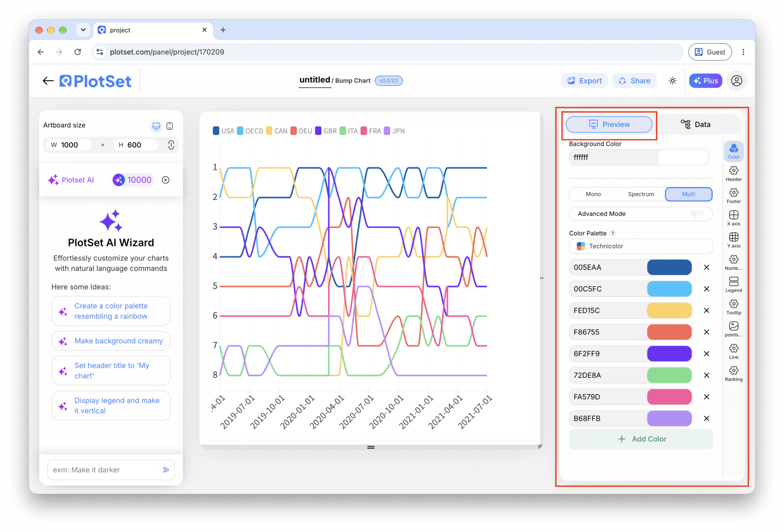
    O editor do PlotSet na aba Preview: um gráfico do tipo Bump Chart já finalizado na área de edição e, na lateral direita, o painel de configurações contornado em vermelho.
    A aba Preview de um gráfico do tipo Bump Chart. Todos os controles de estilo ficam no painel contornado em vermelho: aparência, cabeçalho, rodapé e as opções específicas desse tipo de gráfico. Cada grupo fica em sua própria aba.
  8. 08

    Publish, embed or export the tracks

    Publish for a live chart where hovering a track highlights it against the rest with a tooltip at each node, grab the embed code to drop it into a page, or export a PNG, SVG or PDF if you need a static image for a deck.

Comece pelo modelo de Bump Chart com dados de exemplo já carregados, depois substitua-os pelos seus.

Abrir o modelo

Publique, incorpore ou exporte

A reta final é igual para todo tipo de gráfico: o Share transforma o gráfico em um link público interativo e em um código de incorporação; o Export gera um arquivo estático.

Share: link público e código de incorporação

Ativar o código de incorporação e o link público é o que publica o gráfico. O link pode ser enviado com segurança para qualquer pessoa, e o código de incorporação entra em qualquer página como um iframe que mantém a interatividade e os tooltips ao passar o mouse. Edite o gráfico depois e clique em Recreate para levar essas mudanças aos dois.

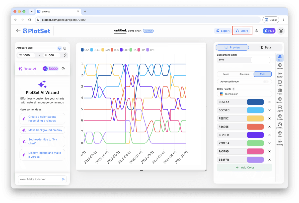
A barra de ferramentas do editor do PlotSet com o botão Share em destaque, ao lado do botão Export.
É pelo Share que um gráfico finalizado vira um link público e um código de incorporação.
A janela Share do PlotSet: a chave que ativa o código de incorporação e o link público, os botões Link, Embed, Facebook, Reddit, Twitter, LinkedIn e Email, e o link público do gráfico com um botão Copy.
Ative o código de incorporação e o link público, depois copie o link ou pegue o iframe. O Recreate leva as edições seguintes a todo mundo que já tem o link.

Export: SVG, PNG ou JPG

O Export grava uma cópia estática no tamanho que você precisar. O SVG continua nítido em qualquer escala e ainda pode ser editado em uma ferramenta de design; PNG e JPG são as escolhas seguras para slides e documentos. É o multiplicador de escala que garante uma imagem nítida em uma tela retina.

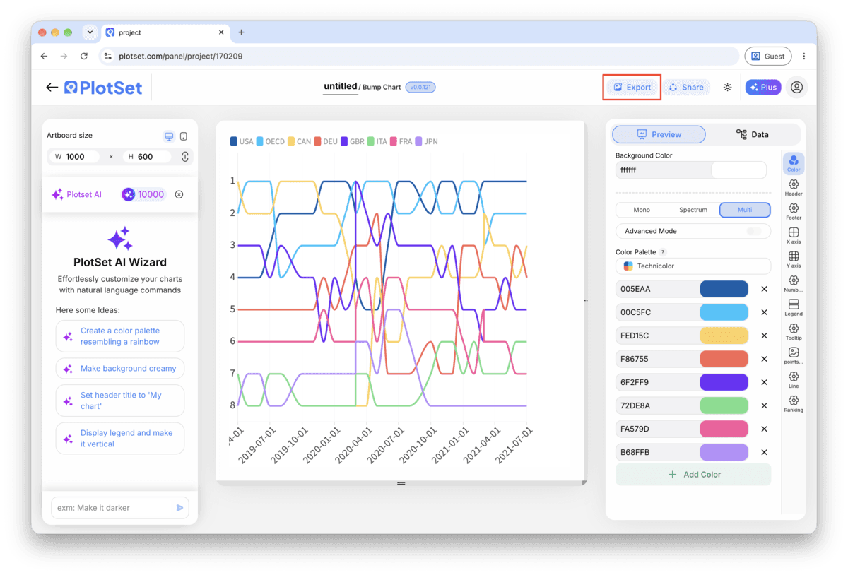
A barra de ferramentas do editor do PlotSet com o botão Export em destaque.
O Export é o caminho para gerar um arquivo estático para um slide ou um relatório.
A janela Export chart do PlotSet: um seletor de escala em 2x, campos de largura e altura definidos como 1000 por 600 e o menu de formatos aberto com SVG, PNG e JPG.
O SVG continua nítido em qualquer tamanho e editável em uma ferramenta de design; PNG e JPG são as escolhas seguras para uma apresentação. Defina a escala antes de exportar para que a imagem fique nítida em uma tela retina.

Dicas de estilo para um Bump Chart

Put the real value in the tooltip

Rank alone hides magnitude: first and second can be neck and neck or worlds apart, and the chart looks the same either way. Add the underlying measure (subscribers, points, votes) to the tooltip so a hover fills in what the rank axis cannot show.

Label the top of the rank axis '1st', not '1'

An axis that goes up as rank improves is a convention people have to learn, not one they arrive with. Spelling out 1st at the top removes the one moment a reader might mistake a rise for a fall.

Space periods evenly

Bump charts read the horizontal axis as evenly spaced steps. If your periods are irregular, quarters of different lengths, seasons with byes, gaps read as meaningful when they are just calendar noise. Fill in a placeholder period rather than skip it.

Cap it at two or three highlighted colours

One highlight colour makes a clear point. Two makes a comparison. Past three, even with the rest greyed out, a reader loses track of which line is which by the second crossing.

Erros comuns ao fazer um Bump Chart

Two tracks sit exactly on top of each other

This means two items share the same rank in at least one period, usually from an unresolved tie in the source data. Go back to the sheet and break the tie with a secondary sort key, then re-upload.

A track has a visible gap or jumps oddly

A missing row for that item in one period leaves a hole in the line rather than a smooth connection. Check your data table for the period in question and add the missing row, or accept the gap and say so in a caption.

The chart looks huge and jagged instead of clean parallel tracks

This usually means raw values were uploaded into the rank column instead of ranks. Open the sheet, rank each period's values from 1 to N, and replace the value column with the rank before re-uploading.

Saiba mais sobre o Bump Chart

Não tem certeza se o Bump Chart é a escolha certa? Veja o que é, quando usar e quando evitar.

Sobre o Bump Chart

Bump Chart: perguntas frequentes

A long-format sheet with one row per item per period: an item column, a period column, and an integer rank column for that item within the period. Three columns and one header row is enough. If you only have raw values, rank them within each period before uploading.

Crie seu Bump Chart agora

Grátis para começar com mais de 300 modelos. Sem cartão de crédito.