At 7:30 on the evening of November 8, 2016, the most-watched object in American journalism was a small quivering gauge on the New York Times homepage. The paper called it the needle. It opened the night favoring Hillary Clinton at about 85 percent, jittering left and right to signal that the number was not exact. Millions of people had it open in a tab. Over the next few hours the needle swung across even odds and settled toward a Trump victory. One of its own designers, Gregor Aisch, had built the jitter on purpose, so that a single steady value would not imply certainty. It became, in the Times' own later phrasing, the most hated data visualization in politics.
The needle did not get the election wrong. It had always said Trump could win. Almost nobody read it that way.
For a decade now, 2016 has been filed under polling failure. It belongs somewhere else. The failure was a failure of pictures. A row of confident percentages, a gauge, a dial, a bold number laid over a candidate's face, and a nation of readers who looked at all of it and concluded the race was already decided. The polls feeding those pictures were fine. What we built on top of them was not.
Six forecasts, one race, twenty-seven points apart
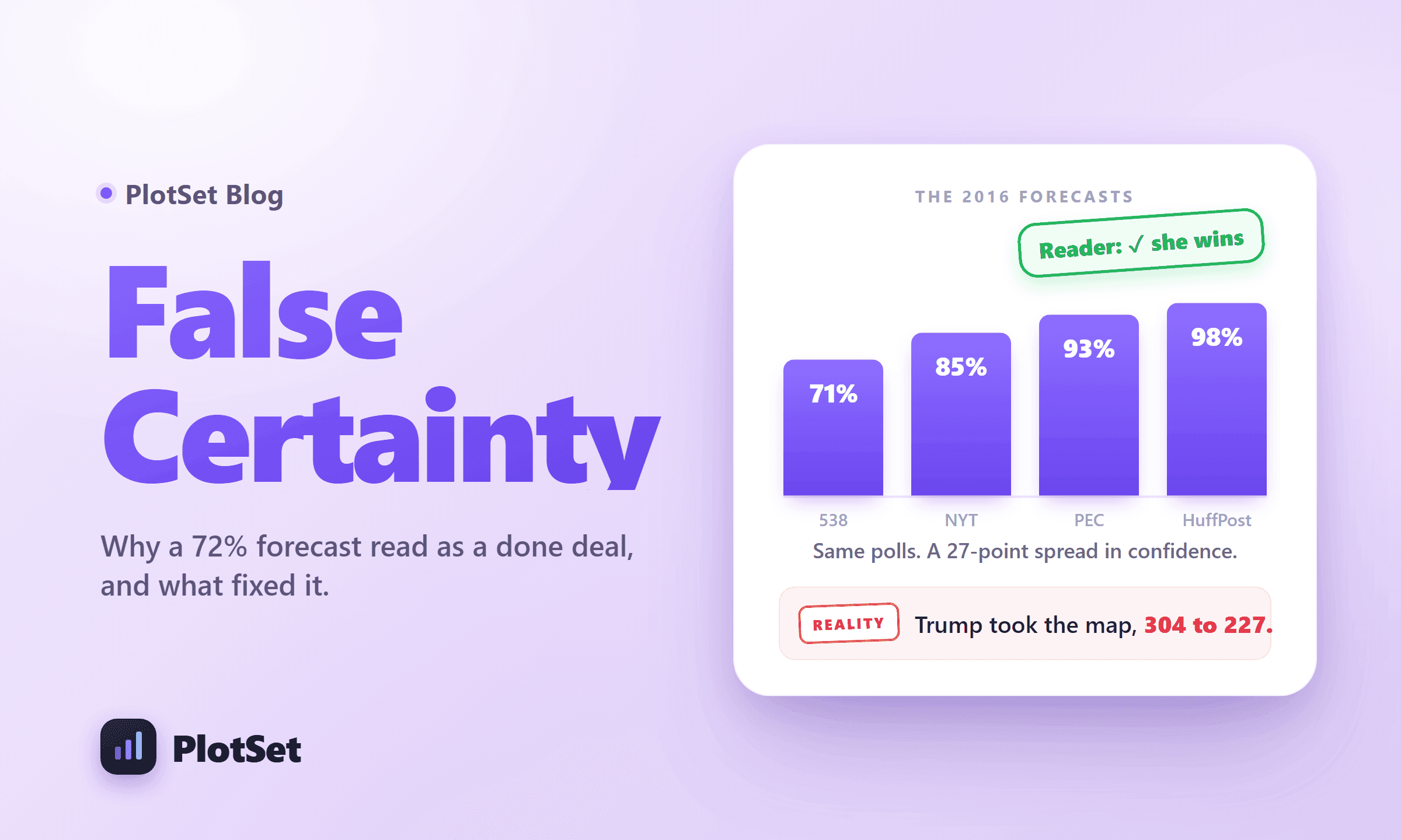
Start with the numbers everyone stared at. On the morning of the election, the major forecasters published their final odds of a Clinton win, and they did not agree.
FiveThirtyEight, the most cautious of the group, gave Clinton 71 percent. The New York Times Upshot put her at 85. PredictWise said 89, Daily Kos 92. Sam Wang's Princeton Election Consortium listed 93 percent on its own final page, though the figure Wang is remembered for is the 99 percent from his longer-run model, the one he tied to a public promise to eat a bug on television if Trump won. The Huffington Post's model landed at 98. Its politics editor, Ryan Grim, publicly accused Nate Silver of putting a thumb on the scale by being too generous to Trump.
Hold onto that spread. Six forecasts of the same event, drawing on the same public polls, ranging across 27 percentage points. The gap did not come from different data. It came from one modeling question: how likely is it that the polls are all wrong in the same direction at once? Silver's model treated that as a live danger and kept its distance. Wang's treated it as nearly impossible and collapsed toward certainty. The polls underneath were almost identical. The confidence on top was a choice.
That is the whole game, and it is worth saying plainly, because the Grim-versus-Silver spat was not really about who had better data. They had the same data. It was about how loudly to display doubt. Grim's model, the confident one, called the winner wrong. Silver's cautious one gave Trump better than a one-in-four shot. Things that happen one time in four are not upsets. They are Tuesdays.
Here is the trap. To a statistician, 71 percent and 93 percent are different amounts of doubt. To a reader thumbing past on a phone, they are the same word: yes. Both look like Clinton wins. The distance between a careful forecast and a reckless one, the distance that held the entire story of election night, was invisible to the eye.
Why a win probability fools the eye
There is a specific reason a win probability misleads, and researchers have measured it.
Sean Westwood, Solomon Messing, and Yphtach Lelkes ran experiments, later published in the Journal of Politics, on how these displays land. In one study of more than four thousand people, they showed some participants a candidate's chance of winning as a probability and others the same lead as a projected vote share. The probability format did something the vote-share format did not: it made people substantially more certain the leader would win. Same race, different picture, different belief.
Worse, the probability display confused people about what they were even looking at. After seeing a win-probability forecast, 8.6 percent of respondents turned around and reported the number as a vote share, treating a 71 percent chance of winning as though the candidate would take 71 percent of the ballots. After a vote-share display, only 0.6 percent made that error, roughly fourteen times fewer. The picture did two things at once. It inflated confidence, and it scrambled the very quantity being reported.
And the confusion may have a cost at the ballot box. In the behavioral games, people shown a comfortable win probability for their side grew likelier to sit out a simulated election. Messing extrapolated the effect to a possible turnout dip of around 6 percent at the confidence level the Times was showing for Clinton. That is a lab projection, not a measured drop in real votes, and it competes with everything else that moves turnout on a given day. Take the number lightly. The direction is the uncomfortable part: the reassuring gauge may have whispered to the leader's own supporters that they could stay home.
Why does the format carry so much weight? Because a win probability and a vote share are different quantities wearing the same costume. Andrew Gelman and colleagues drew the line in a 2023 paper: "A vote share of 60% is a landslide win, but a win probability of 60% corresponds to an essentially tied election." Their example sticks. In September 2020, the Economist's model showed Joe Biden at 54 percent of the vote, a genuine squeaker, and at 87 percent to win. One of those numbers looks like a knife-edge. The other looks settled. They describe the same forecast.
This is not an American quirk, and it did not stop in 2016. A 2025 study in Public Opinion Quarterly reran the test on the 2022 French presidential election with nearly three thousand voters and found the same pattern: vote-share forecasts sharpened people's expectations, while the identical forecast in probability form sometimes made those expectations less accurate and less precise. The flaw rides with the format, not the country.
The national polls were fine. The state polls weren't. The picture was worse than both.
Now the part that still surprises people. Pull up the official record, and the great polling catastrophe of 2016 mostly evaporates.
The American Association for Public Opinion Research convened a committee, chaired by Pew's Courtney Kennedy, to grade the 2016 polls. Its verdict on the national polls was not faint praise. The national polls missed the final popular-vote margin by an average of 2.2 points, which the committee called among the most accurate popular-vote estimates since 1936. They said Clinton would win the popular vote. She won it by 2.1 points and nearly three million ballots. The topline did its job.
The error lived one level down, in the states, and the chart shows the split. Compare the two cycles it plots. In 2012, national polls missed by an average of 2.9 points and state polls by 3.5, close cousins. In 2016 the two came apart: national error fell to 2.2, actually improving, while state error jumped to 5.1. So the state polls did fail, and that failure was real. But it was a specific, modest failure. The committee traced it to two ordinary causes: late-deciding voters who broke hard for Trump in the final week, and state pollsters who did not weight their samples by education, which left too many college graduates in the mix and inflated Clinton's numbers.
The chart shows magnitude. It cannot show the property that actually flipped the presidency, which was direction. The state misses were correlated, all tilting the same way across Pennsylvania, Michigan, and Wisconsin at once, so a few points of polite, education-weighting error in three states were enough to invert the Electoral College while the national numbers stayed honest. A larger but random scatter of errors would have washed out. A small, aligned one did not.
So the machine worked and the readout worked, roughly. What failed sat between them and after them: the translation of a close race with a real fat tail into a picture that said, without qualification, she has this. Nate Silver has pressed this point for years, and it is hard to rebut. Speaking at Harvard a few months later, he said he did not think the polls got it wrong, that the national polls were very close to where the race ended up, and that he had no patience for journalists who could not handle probability. His model gave Trump nearly three chances in ten. Three-in-ten things happen all the time.
Trust was already draining before 2016
The shock did not land on solid ground. It landed on a foundation that had been eroding for half a century.
Gallup has asked Americans how much they trust the mass media since the early 1970s, at intervals rather than every year, and the readings only bend one way. Trust sat around 68 to 72 percent in the Nixon and Ford years, when a reader could assume the person beside them shared roughly the same facts. It fell to 44 percent by 2004. It hit a then-record low of 32 percent in 2016 itself, recovered briefly to 45 in 2018, then slid to 31 percent in 2024 and 28 in 2025. This tracks trust in media broadly, not polls in particular, a distinction worth keeping, since no clean long-run series exists for trust in polls alone. But polls live inside the media people have stopped trusting, and they inherit the fall.
The collapse is not evenly shared, and the fault line is the same one running under everything else here. By 2025, 51 percent of Democrats told Gallup they trusted the media, against 27 percent of independents and just 8 percent of Republicans. When a forecast surprises the country, it does not surprise a country. It surprises tribes, who then reach for whichever explanation flatters them.
And for the cruelest irony, look at 2020, the election almost nobody remembers as a polling disaster. It was worse than 2016. The AAPOR task force found the 2020 polls posted the largest national error in 40 years. Pew, comparing the two cycles, found 93 percent of national polls overstated the Democrat, up from 88 percent in 2016. The likeliest culprit was differential nonresponse: Trump's supporters, the people least inclined to trust an institution calling their phone, were also the least likely to pick up. Distrust had become a polling error in its own right. The polls got shakier partly because people had stopped believing in them, which gave people fresh reason to stop believing in them.
The fix is not a better dial. It is a different kind of picture.
For a long time the story ended here, with a shrug about probability being hard and readers being innumerate. Then researchers ran the actual experiment.
In 2024, a team from Northwestern led by Fumeng Yang and Matthew Kay published a study at the field's top human-computer interaction conference with a title that shows they knew the stakes: "In Dice We Trust." They built forecast displays in four styles, showed them to 498 people, and did something clever. They ran everyone through ten rounds of forecast-then-outcome, sometimes letting the forecast be wrong, and watched which display people chose to return to. Trust was not a survey answer. It was a behavior: which forecaster would you check again after this one burned you?
The winners were the plainest things on the table, and even they won only at the margin, as we will get to. A simple text summary and a quantile dotplot, a display that renders the range of outcomes as a scatter of countable dots instead of one number, held their audience far better than a histogram of intervals. In the first experiment's final round, readers chose the text summary 44 percent of the time and the dotplot 37, leaving the interval display at 18. A dotplot beat a fancier animated version two to one. What the winners share is exactly what the 2016 dials lacked: they show the whole spread of what could happen and let you count it, instead of compressing the future into one authoritative-looking digit.
Older work points the same way. Quantile dotplots, first tested for something as mundane as bus arrival times, help people make steadier estimates than smooth probability curves do. Animated displays that flash one possible outcome at a time, called hypothetical outcome plots, beat error bars so badly that in one estimation task error-bar users answered 95 percent and 23 percent when the correct answer was 59. People reason better about uncertainty when they can see it as discrete, countable possibilities than when they see it as a single smooth line of authority.
Now the caveat the same paper insists on, and honesty demands. The display is not the biggest lever. Yang and Kay found that swapping in a better chart moved trust only a little. What moved it a lot was whether the forecast turned out right, and whether the reader was already inclined by partisanship to believe it. A separate 2024 study of the 2022 midterms reached a matching warning: forecast visualizations can widen the emotional gap between partisans, especially when the chart predicts a Republican win. No dotplot survives a reader who has already decided the whole enterprise is rigged. A better picture is necessary. It is not a cure.
The needles return for 2026
None of this is academic, because the machine is warming up again. The 2026 midterms fall on November 3, with all 435 House seats, 35 Senate seats, and 39 governorships in play. The forecasts are already here. In early July 2026, Nate Silver's generic-ballot average put Democrats up about 6 points, with pollsters scattered from a 3-point edge to an 11-point one. That scatter is the same uncertainty from 2016, waiting for a picture.
Somebody is going to render that spread as a gauge, or a dial, or a single glowing number, and a great many people are going to read it as a promise. When the result diverges from the promise, as it sometimes will, the same reflex will fire: the polls lied. They mostly will not have. The picture will have.
The repair is not complicated, only hard to sell. Show the whole range, not the single point. Let readers count outcomes rather than squint at a needle. Say the odds in words a person can hold, three in ten rather than 29 percent, because a fraction of a real thing resists the illusion of certainty in a way a bare percentage never will. And retire the theater of precision, the jitter that was built to convey doubt and instead conveyed dread.
The polls in 2016 told the truth, roughly. We drew the wrong picture on top of them, then blamed the data for the drawing. Four months out from the next big night, the question is not whether the polls will be exactly right. They will not be, because they never are, and that was never the promise. The question is whether we will finally draw a picture honest enough to say so.
Want to turn your own data into charts that show uncertainty honestly, on a clean black canvas? PlotSet builds publication-ready visualizations, from dotplots to distributions, that you can embed anywhere.
References
- Grading The 2016 Election Forecasts: BuzzFeed News compilation of each forecaster's final Clinton and Trump win probabilities.
- Final Election Update: There's A Wide Range Of Outcomes: FiveThirtyEight's final 71 percent Clinton forecast and its own uncertainty framing.
- Final Projections 2016: Princeton Election Consortium's own final page listing a 93 percent Clinton win probability.
- 2016 President Forecast: HuffPost Pollster's 98 percent Clinton forecast page.
- Lost in a Gallup: Revisiting the final hours of the 2016 campaign: UC Press retrospective compiling the final forecast probabilities and the 2.1-point popular-vote result.
- Projecting Confidence: How the Probabilistic Horse Race Confuses and Demobilizes the Public: Westwood, Messing & Lelkes, Journal of Politics, on probability versus vote-share perception and turnout.
- Use of election forecasts in campaign coverage can confuse voters and may lower turnout: Pew Research Center summary of the confusion and turnout findings.
- So . . . what about that claim that probabilistic election forecasts depress voter turnout?: Gelman's blog, source of the 8.6 versus 0.6 percent confusion figures and the turnout-extrapolation caveat.
- Information, incentives, and goals in election forecasts: Gelman, Hullman, Wlezien & Morris, Judgment and Decision Making, on win probability versus vote share.
- The Effects of Forecasts on the Accuracy and Precision of Voter Expectations: Barnfield et al., Public Opinion Quarterly, 2025 French-election replication of the format effect.
- An Evaluation of 2016 Election Polls in the United States: AAPOR committee report on national versus state poll error and its causes.
- Nate Silver says conventional wisdom, not data, killed 2016 election forecasts: Harvard Gazette account of Silver's argument that the polls were not wrong.
- Task Force on 2020 Pre-Election Polling: An Evaluation: AAPOR finding that 2020 was the largest national polling error in 40 years.
- Confronting 2016 and 2020 Polling Limitations: Pew on the 88 versus 93 percent Democratic overstatement across the two cycles.
- Trust in media at an all-time low according to latest Gallup poll: Poynter's report of the Gallup trust-in-media time series.
- Gen Z, millennials, and Republicans drive trust in media to new low: Fortune's report of the 2025 partisan trust breakdown.
- In Dice We Trust: Uncertainty Displays for Maintaining Trust in Election Forecasts Over Time: Yang, Mortenson, Nisbet, Diakopoulos & Kay, CHI 2024, the study of which displays sustain trust.
- In Dice We Trust (author PDF): the final-round display-choice figures.
- When (ish) is My Bus? User-centered Visualizations of Uncertainty in Everyday Life: Kay et al., CHI 2016, introducing quantile dotplots.
- Hypothetical Outcome Plots Outperform Error Bars and Violin Plots: Hullman, Resnick & Adar, PLOS ONE, on animated uncertainty displays.
- Swaying the Public? Impacts of Election Forecast Visualizations: IEEE VIS 2024 study of forecast visualizations and partisan trust in the 2022 midterms.
- Gauging election reaction: designer commentary on the intent behind the New York Times election needle.
- The most hated data visualization in politics is back: Fast Company on the needle's reception and election-night swing.
- Generic Congressional Ballot: 2026 average: Silver Bulletin's July 2026 generic-ballot average and pollster spread.