
Cada gráfico empezó como una hoja de cálculo.
Mapas, bar chart races, treemaps, pictogramas y más. Abre uno y rehazlo con tus datos.
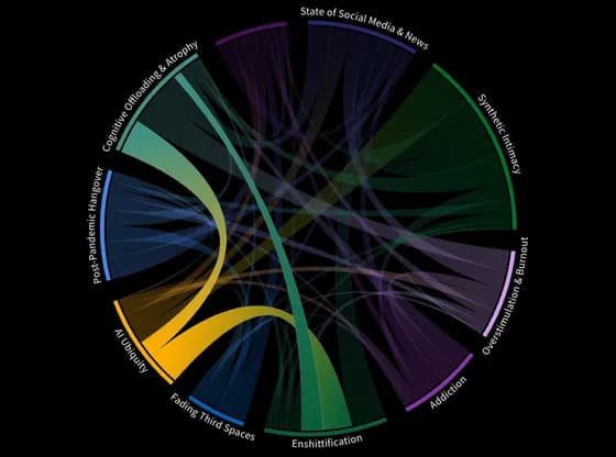 Network graphSeptember+disconnect, loneliness, state of social
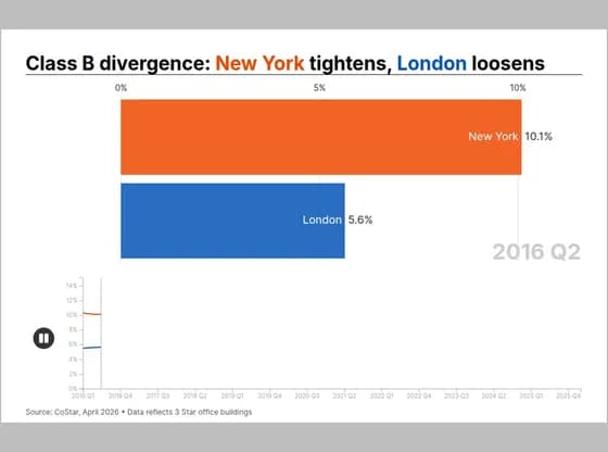 Animated chartsClass B divergence: New York tightens, London loosens
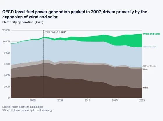 Line, bar and pie chartsOECD fossil fuel power generation peaked in 2007, driven primarily by the expansion of wind and…
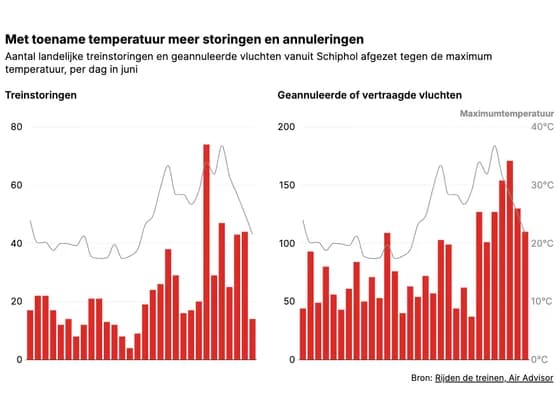 Line, bar and pie chartsMet toename temperatuur meer storingen en annuleringen
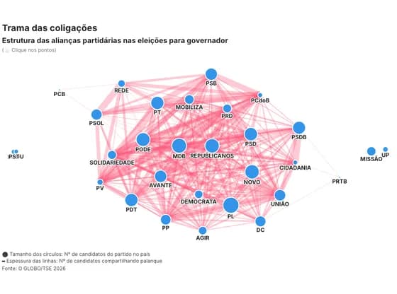 Network graphTrama das coligações
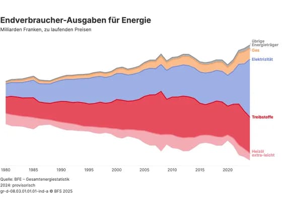 Line, bar and pie chartsEndverbraucher-Ausgaben für Energie
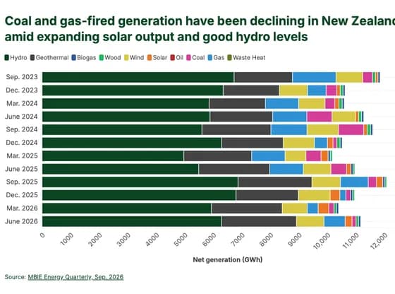 Line, bar and pie chartsCoal and gas-fired generation have been declining in New Zealand amid expanding solar output and…
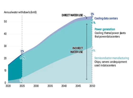 Interactive SVGWater demand for AI is projected to more than double between now and 2050, with the majority of…
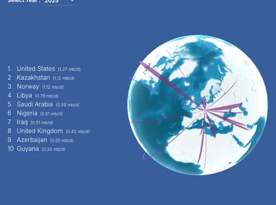 Connections and flow mapsEU-27 External Crude Oil Imports (2019–2025)
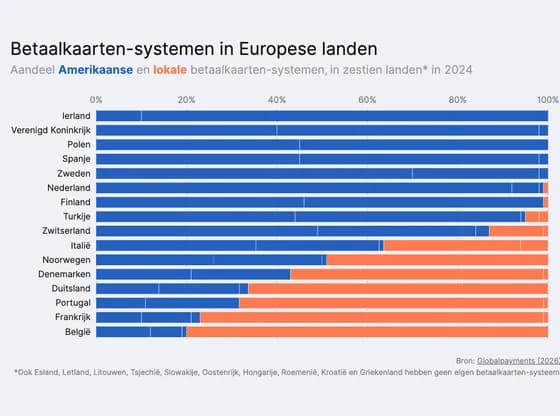 Line, bar and pie chartsBetaalkaarten-systemen in Europese landen
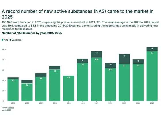 Line, bar and pie chartsA record number of new active substances (NAS) came to the market in 2025
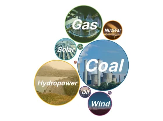 Distribution chartsInstalled capacity of global power plants financed by Chinese foreign direct investment and/or…
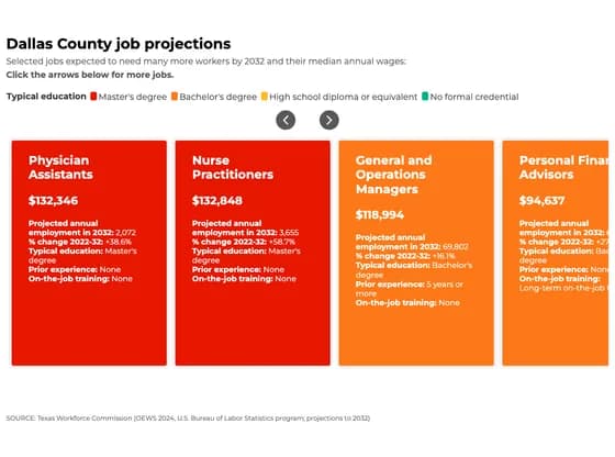 CardsDallas County job projections
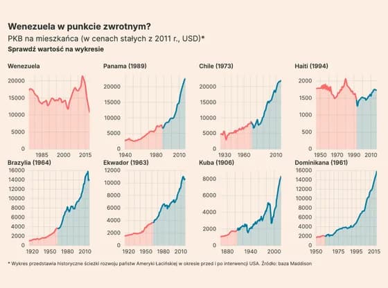 Line, bar and pie chartsWenezuela w punkcie zwrotnym?
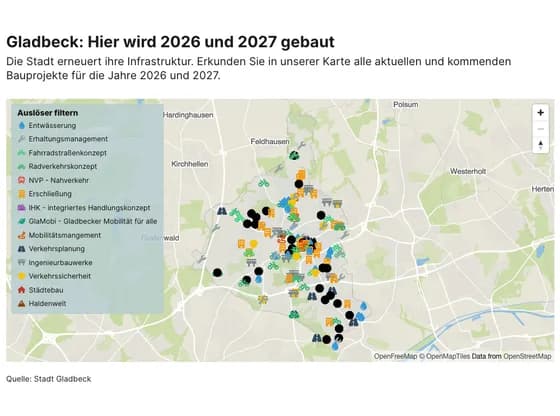 3D mapGladbeck: Hier wird 2026 und 2027 gebaut
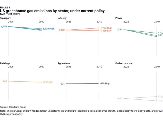 Slope chartFIGURE 2 US greenhouse gas emissions by sector, under current policy
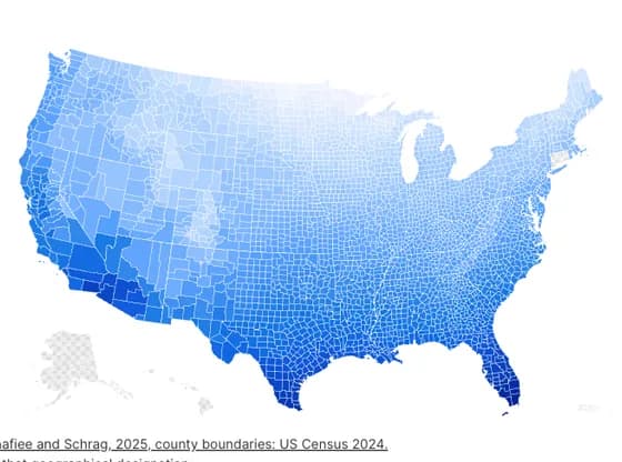 MapsAir-source heat pumps are better at heating in warmer areas
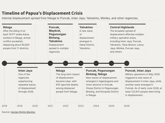 TimelineTimeline of Papua's Displacement Crisis
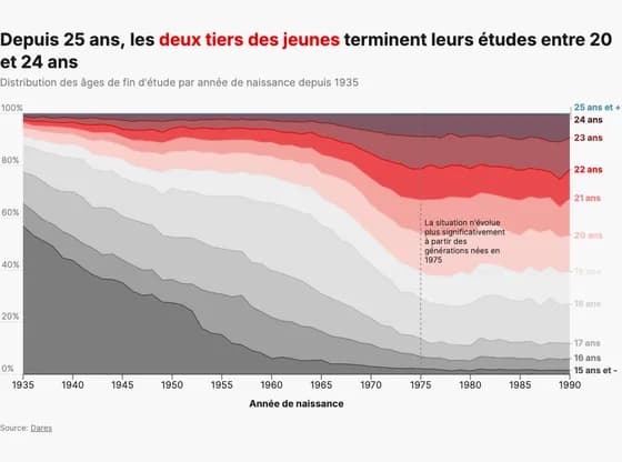 Line, bar and pie chartsDepuis 25 ans, les deux tiers des jeunes terminent leurs études entre 20 et 24 ans
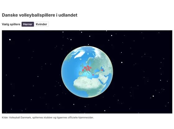 3D globeDanske volleyballspillere i udlandet