
Plantillas de gráficos, organizadas por lo que intentas mostrar
15 categorías extraídas del catálogo completo de plantillas de PlotSet, más las versiones animadas en video donde existen.
Elige la categoría que coincida con tus datos, luego abre cualquier plantilla dentro de ella: los datos de ejemplo ya están cargados, así que puedes ver cómo se ve antes de subir tu propio archivo.
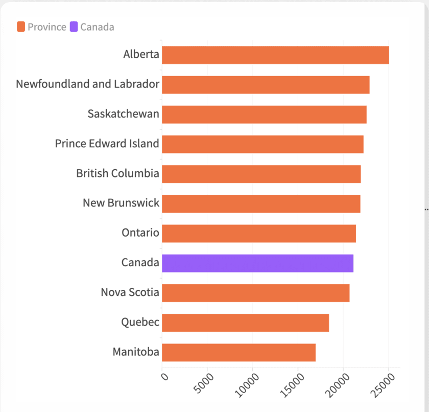
Featured Charts
Not a category in the strict sense, more a hand-picked shortlist. If you're not sure which chart type fits your data, start here and work outward.
Explorar Featured Charts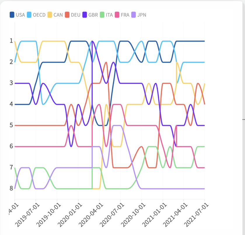
Animated Charts
Charts that move to show change over time: a rank shifting, a shape flowing, a sequence of dated events. Pick the format that fits your data, then decide whether it belongs on the page or in a video.
Explorar Animated Charts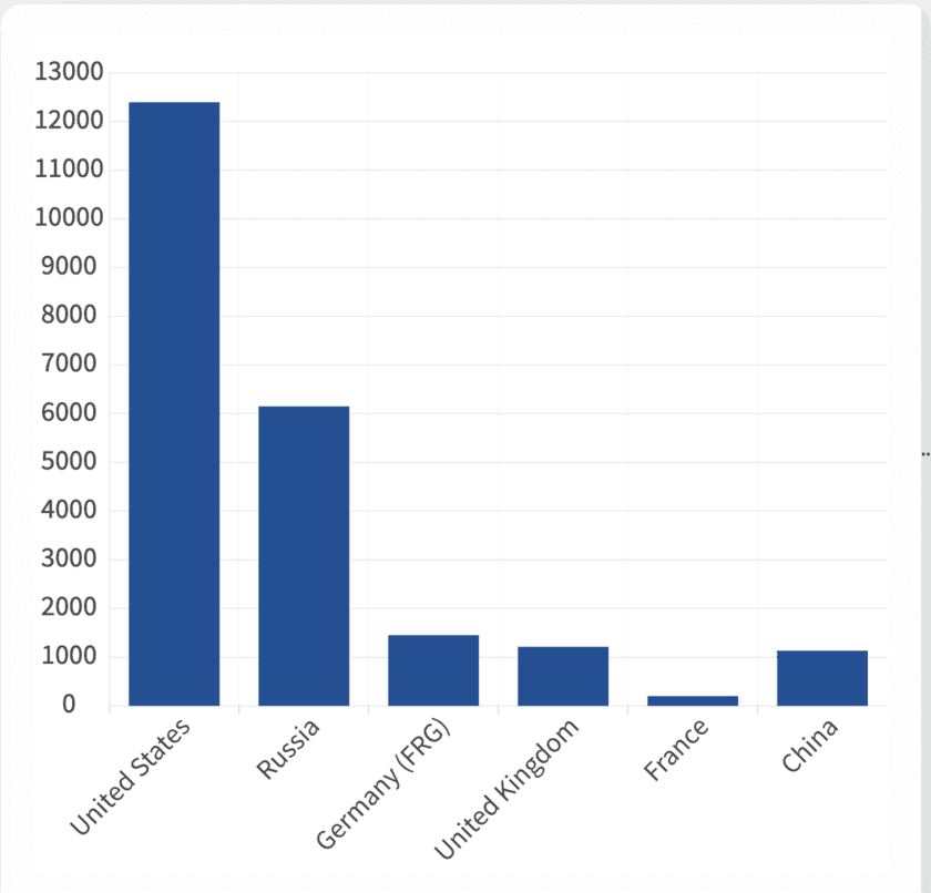
Bar Charts
Nine ways to compare values across categories, from a plain ranked bar to grouped, stacked and back-to-back layouts. Pick the one that matches your data shape and start from a working template.
Explorar Bar Charts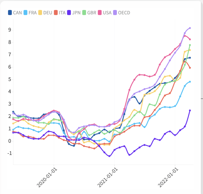
Line and Area Charts
Line, area, stream graph, bump chart: four templates for a number moving through time, distinguished mostly by what happens to the space under the line. Match the shape to what you're actually measuring, then start from a working template.
Explorar Line and Area Charts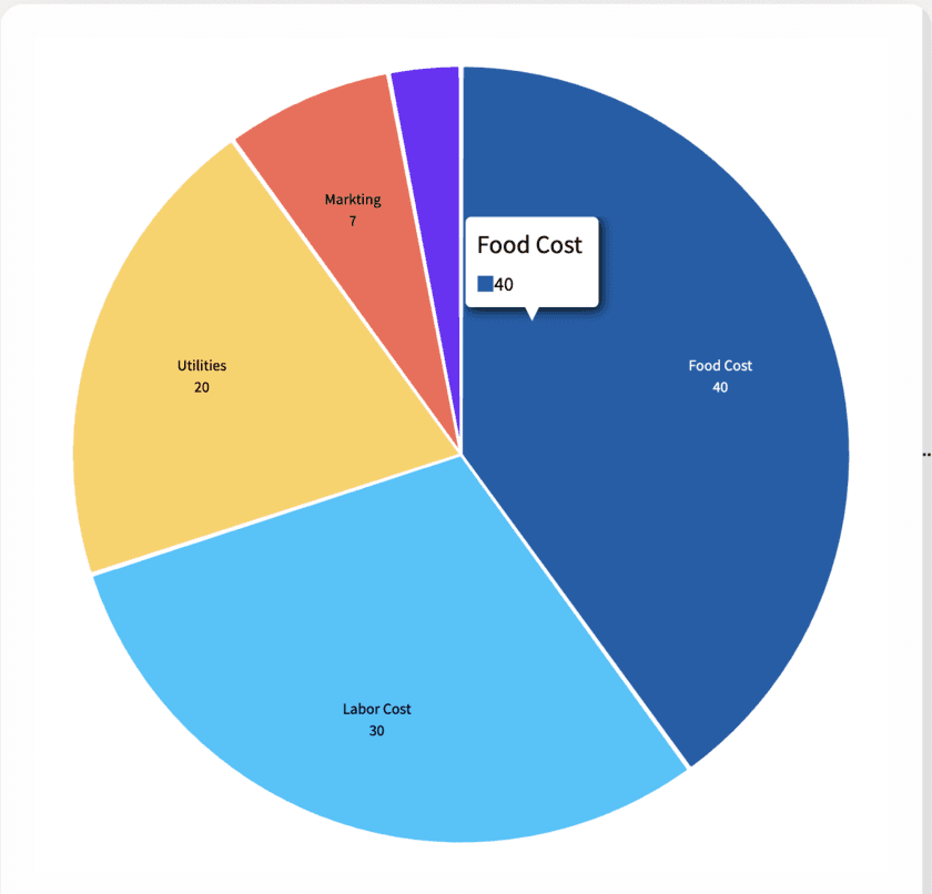
Pie Charts
Pie, donut, polar area, Marimekko: four takes on the same question, how a whole breaks into its parts, each suited to a different category count. Pick the one that fits your data and start from a working template.
Explorar Pie Charts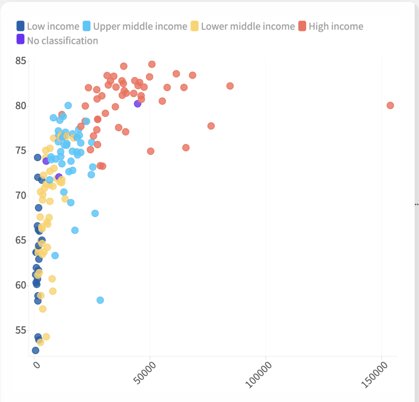
Scatter Plots
Three ways to plot two numbers against each other and see whether they move together. Start with a plain scatter, add a size dimension with a bubble chart, or add reference lines with a quadrant chart.
Explorar Scatter PlotsRacing Charts
Five animated formats for watching a ranking reshuffle over time: bars, lines, columns, pie slices and swarming dots. Every one exports as an MP4 built for social.
Explorar Racing Charts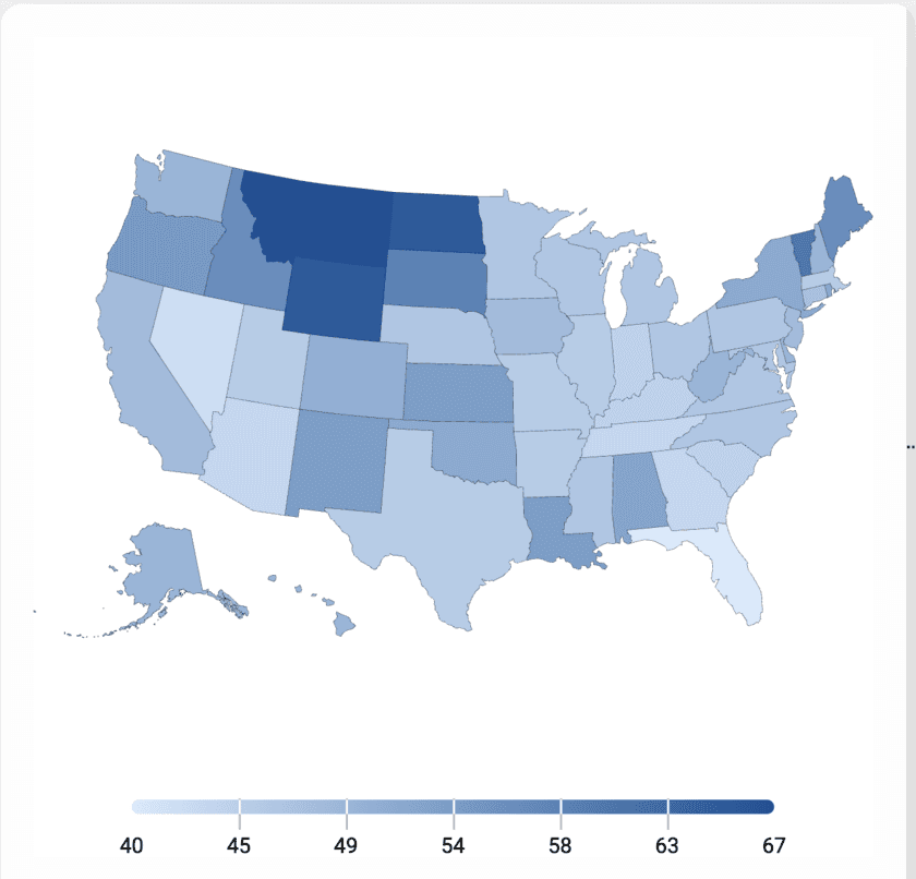
Maps
Turn location-tagged data into a shaded map people can actually read correctly. Start from a template built around countries, states or regions and skip the part where you fight a mapping library.
Explorar Maps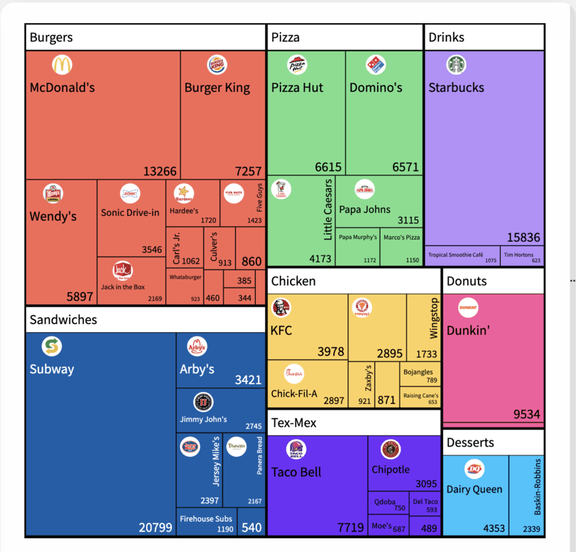
Hierarchy
Three ways to show nested part-to-whole data: treemap, sunburst and marimekko, for budgets, org spend and category trees. Pick the layout that matches how many levels you actually need to show.
Explorar Hierarchy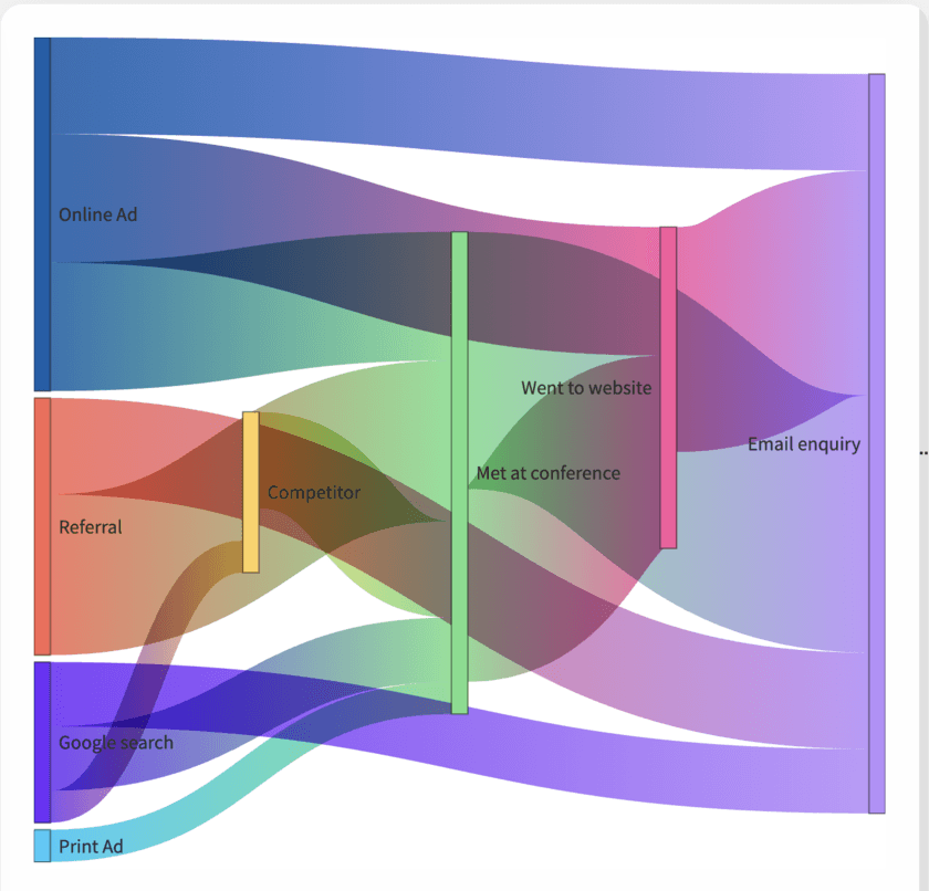
Graphs and flows
Five templates for showing movement instead of a snapshot: a quantity splitting across paths, a sequence narrowing to a result, or work and events laid out against a calendar. Pick the one that matches what's actually moving in your data.
Explorar Graphs and flows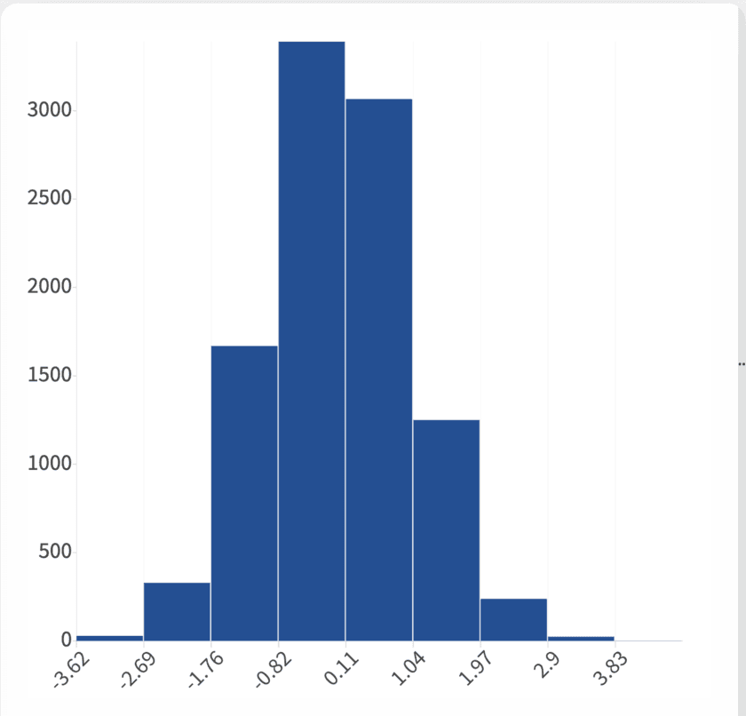
Distribution Charts
Four ways to show shape and spread instead of a single average: histogram, box plot, violin plot and population pyramid. Pick the one that matches how much detail your data, and your reader, actually needs.
Explorar Distribution Charts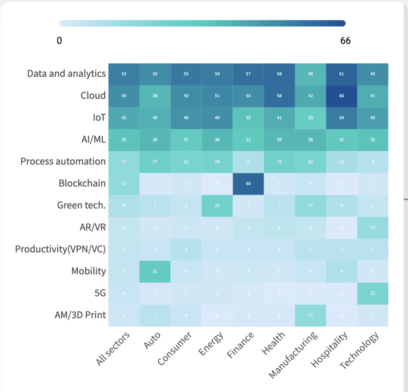
Heatmaps
Color-coded grids for spotting density across two categories at once: hour against weekday, cohort against month. Start from a working template and shape your own data into it.
Explorar Heatmaps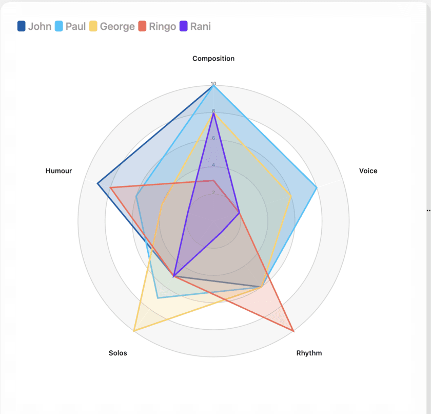
Radar Charts
Two ways to lay several attributes out around a shared center: a radar chart for comparing items across the same axes, a polar area chart for one series split into categories. Pick the one your comparison actually needs.
Explorar Radar Charts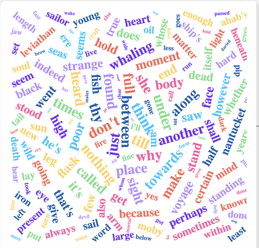
Word Clouds
Turn any block of text (survey answers, speech transcripts, support tickets) into a single image where the words people used most are the words you see first. One template, tuned for how you clean the text before it renders.
Explorar Word Clouds3D Plots
Three chart types that add a third axis: 3D scatter, 3D bar and 3D surface. Read on for when the extra dimension earns its place, and when a 2D scatter plot or heatmap will actually show your data more clearly.
Explorar 3D Plots¿Aún no decides cuál usar?
Cada tipo de gráfico tiene su propio generador gratuito, o ve directamente al editor e intenta algunos.