
Beispiel-CSV
| Term | Mentions |
|---|---|
| customer service | 142 |
| shipping delay | 98 |
| refund | 76 |
| packaging | 54 |
| out of stock | 41 |
| size chart | 33 |
| live chat | 29 |
| return label | 22 |
A step by step walkthrough for turning a list of words and counts into a published word cloud in PlotSet, from counting the terms to exporting the finished image.
Etwa 8 MinutenThis guide walks through how to create a word cloud in PlotSet from your own list of terms, not a demo dataset: sized on purpose, rotated on purpose, then embedded on a page or exported as an image once you're happy with it. What actually trips people up is not PlotSet itself, it is what happens before you ever open the template, so this guide spends real time on that step.
Five minutes if you already have a clean two-column list, word and count. Starting from raw text, survey answers, support tickets, a stack of comments, anything not yet counted, adds another five to ten. Treat the eight minutes below as the ceiling and counting as the part that decides whether the cloud is any good.
Two columns, one row per term: the word or phrase first, its weight second. No running text, no duplicate terms, one header row.
| Term | Mentions |
|---|---|
| customer service | 142 |
| shipping delay | 98 |
| refund | 76 |
| packaging | 54 |
| out of stock | 41 |
| size chart | 33 |
| live chat | 29 |
| return label | 22 |
The template wants terms already counted. If your source is raw text (a column of open-ended survey answers, say), run a pivot table or COUNTIF on it first: PlotSet sizes words by the number you give it, it does not read paragraphs and tally them for you.
Keep multi-word phrases as single cells, like "customer service" or "out of stock". If you split them into separate words before counting, you lose the phrase and end up with two vaguer terms instead of one useful one.
Remove stop words ("the", "and", "a") and any filler specific to your dataset before you count, not after. In support tickets, words like "issue" or "problem" are usually as empty as "the" and worth stripping too.
One row per term. If "refund" appears twice with two different counts, PlotSet will chart both rows rather than merging them, so combine duplicates in your spreadsheet first.
Der genaue Klickpfad in PlotSet, von einer leeren Vorlage bis zum fertigen Diagramm.
This is the step that actually determines the quality of the cloud. Take your raw text, whether it is survey responses, ticket subjects or comments, and produce a two-column count: term, then how many times it appears. A pivot table or a COUNTIF formula does this in a few minutes for most spreadsheets.
Remove "the", "and", "a" and their relatives, then look at your top ten terms again. Every corpus has its own version of filler: in product reviews it might be "item" or "product", words that appear everywhere and mean nothing on their own.
From the PlotSet dashboard, start a new project and choose the Word Cloud template. It loads with sample terms and weights already in place, so you can see the exact two-column shape it expects before your own file goes anywhere near it.

Import a CSV or .xlsx file, paste the rows straight from your spreadsheet, or connect a Google Sheet if you want the cloud to stay live as you keep counting. PlotSet reads the first row as headers automatically.

Bind the text column to the term and the number column to the size. This is usually correct on its own when your headers say something like "Term" and "Mentions", but check it if your sheet carries extra columns PlotSet had to guess between.

The minimum and maximum size decide how dramatic the contrast is between your smallest and largest term. Widen the gap if one or two terms genuinely dominate; narrow it if your counts are closer together and a wide range would just look noisy.
Rotation angles trade a tighter layout for slower reading, so 0 and 90 degrees only, or no rotation at all, is the easier choice to read. Pick a colour gradient; unless you are mapping a second value to it, treat it as decoration and keep it simple.
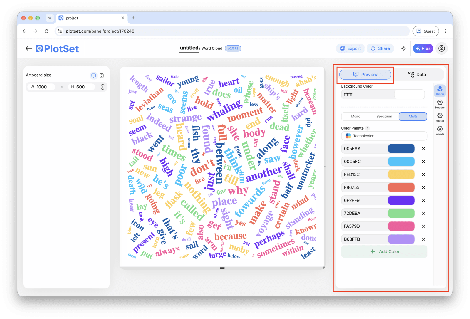
Publish for a live, shareable cloud, grab the embed code for a page, or export a PNG, SVG or PDF for a deck. Choose SVG if the image is going into print or will be scaled up, since the words stay sharp instead of pixelating.
Starten Sie mit der Word Cloud-Vorlage samt bereits geladenen Beispieldaten und ersetzen Sie diese durch Ihre eigenen.
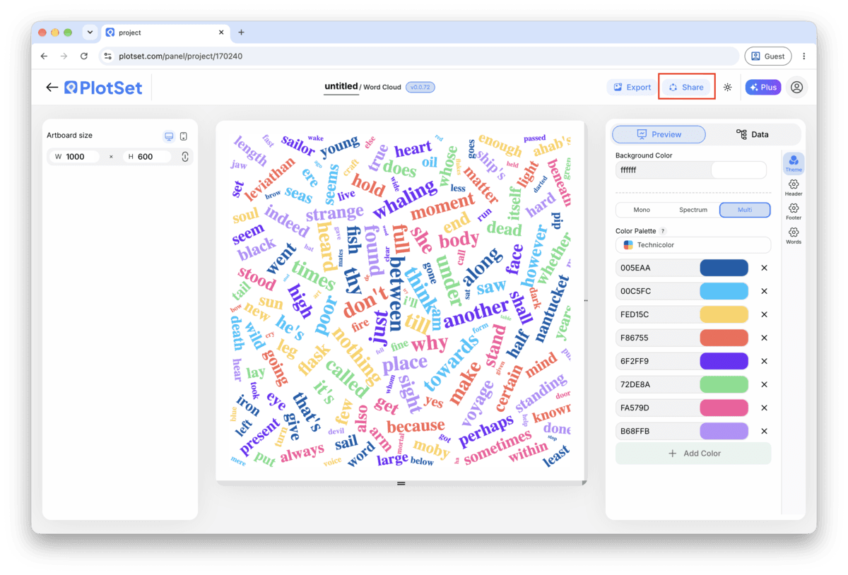
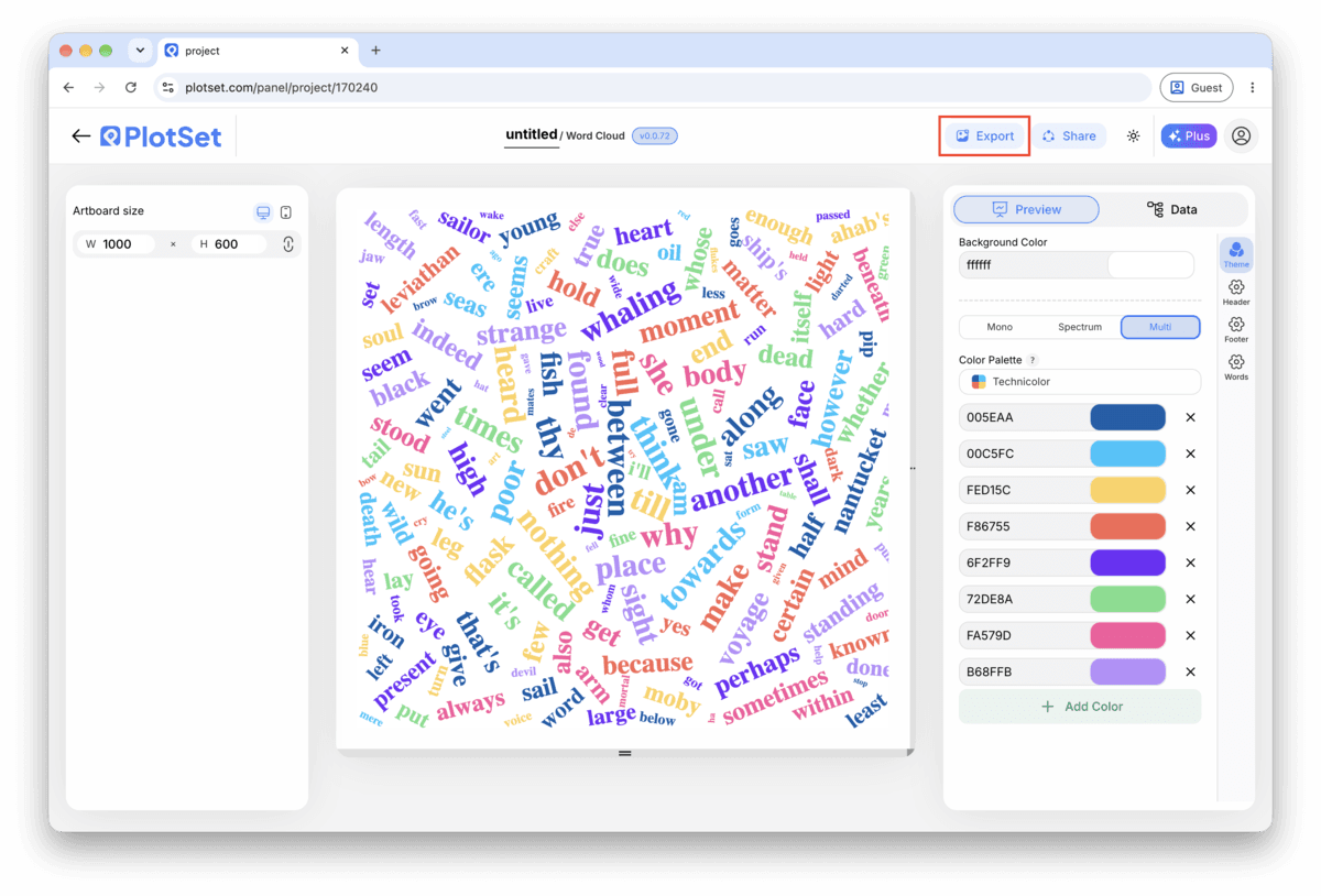
Vorlage öffnenDer letzte Abschnitt ist bei jedem Diagrammtyp gleich: "Share" macht aus dem Diagramm einen öffentlichen Live-Link und einen Einbettungscode, "Export" schreibt es als statische Datei heraus.
Aktivieren Sie den Einbettungscode und den öffentlichen Link, um das Diagramm zu veröffentlichen. Den Link können Sie bedenkenlos an alle weitergeben, und der Einbettungscode fügt sich als iframe in jede Seite ein. Die Tooltips beim Überfahren mit der Maus und die volle Interaktivität bleiben erhalten. Wenn Sie das Diagramm später bearbeiten, überträgt "Recreate" die Änderungen auf Link und Einbettung.

"Export" schreibt eine statische Kopie in der Größe heraus, die Sie brauchen. SVG bleibt in jeder Skalierung scharf und lässt sich weiterhin in einem Design-Tool bearbeiten; PNG und JPG sind die sichere Wahl für Folien und Dokumente. Der Skalierungsfaktor sorgt dafür, dass das Bild auf einem Retina-Display gestochen scharf wirkt.

"Climate change" counted as one term carries a different, more useful signal than "climate" and "change" counted apart. Decide which phrases matter to you before you count, not after you have already split everything into single words.
Free-angle rotation packs more words into the same space, but every rotated word costs the reader a beat to read. Start with rotation off, look at how much white space is left, and only add angles if the layout genuinely needs them.
Somewhere past a hundred, the smallest words are too tiny to read and are only there to fill gaps. Trim your count list to the terms that carry the story, usually the top fifty to a hundred by weight, before uploading.
A cloud cannot tell a reader that "refund" appeared 76 times versus 74, and it should not try to. Keep a caption, a footnote or a linked table with the real numbers for anyone who wants to check the sizing rather than just feel it.
A stop word made it into your count list before you filtered it out. Go back to the source spreadsheet, remove the stop words and any dataset-specific filler, and re-upload rather than trying to fix it inside PlotSet.
This means your count list has duplicate rows for one term, usually from inconsistent capitalization ("Refund" versus "refund") or a trailing space. Merge the rows in your spreadsheet, ideally with a TRIM and a case-normalizing formula, then re-upload.
Your counts are too close together for font size to show any real difference, which usually means your top terms are all within a factor of two of each other. Either widen the size range in the chart settings, or accept that this dataset is better shown as a ranked bar chart.
Nicht sicher, ob Word Cloud die richtige Wahl ist? Erfahren Sie, was es ist, wann Sie es verwenden sollten und wann nicht.
Count your terms into two columns first, word and weight, since PlotSet sizes words by the number you give it rather than counting raw text itself. Then open the Word Cloud template, upload or paste the file, confirm the column mapping, and publish.
Kostenlos starten mit über 300 Vorlagen. Keine Kreditkarte erforderlich.