| Month | Hip-Hop | Rock | Pop | Country | Electronic |
|---|---|---|---|---|---|
| 2024-01 | 18400 | 15200 | 21300 | 9100 | 7600 |
| 2024-02 | 19100 | 14800 | 21900 | 8800 | 8200 |
| 2024-03 | 20500 | 14100 | 22600 | 8600 | 9000 |
| 2024-04 | 21800 | 13600 | 22200 | 8300 | 9900 |
| 2024-05 | 23200 | 13000 | 21700 | 8100 | 10800 |
| 2024-06 | 24600 | 12500 | 21100 | 7900 | 11700 |
How to Create a Stream Graph
A step by step walkthrough for turning a spreadsheet of categories over time into a published stream graph in PlotSet, from shaping the sheet to ordering the bands and exporting the result.
Etwa 10 MinutenHow to create a stream graph in PlotSet starts with a wide CSV of dates and categories, turned into flowing bands ordered so the biggest shift in the data is what a reader notices first. This walks the same click path a real PlotSet stream graph takes from upload to publish, not a demo running on someone else's numbers.
Ten minutes, if your data is already one row per date with a column per category, most of it spent on band order and colour rather than the upload. Reshaping a long format export, one row per date and category rather than one row per date, into the wide layout this chart needs adds another ten.
Die Daten, die Sie brauchen
Wide format: one row per time point, one column per category, values are the amount for that category at that time. One header row, dates in the first column.
This is wide format, not long format. If your export instead has one row per date-and-category combination (a "Month, Genre, Streams" shape with repeated months), pivot it in your spreadsheet tool first so each category gets its own column.
Dates need to parse cleanly and stay in order. A first column of "2024-01", "Jan-24" or a real date type all work; a text column that sorts alphabetically instead of chronologically will scramble the bands.
Use even spacing where you can: weekly, monthly, quarterly. Gaps of uneven length between rows still plot, but the interpolation between a wide gap and a narrow one gets visibly less trustworthy.
Blank cells read as zero for that category at that time, not as missing. If a category genuinely did not exist yet, that is usually the correct reading; if it is a data entry gap, fill it in before uploading.
Die Schritte
Der genaue Klickpfad in PlotSet, von einer leeren Vorlage bis zum fertigen Diagramm.
- 01
Open the stream graph template
From the PlotSet dashboard, start a new project and choose the Stream Graph template. It loads with sample data already in the wide layout, so you can see exactly how a time column and several category columns turn into bands before you touch your own file.

Jede Anleitung beginnt hier. Wählen Sie erst die Kategorie, dann die Vorlage. Das Raster ist für jeden Diagrammtyp dasselbe. - 02
Shape your sheet into wide format
Put your time points down the first column and one column per category across the top, with values filling the grid. If your source export is long format, pivot it now: a spreadsheet pivot table with dates as rows and categories as columns gets you there in one step.
- 03
Load your CSV or connect a live sheet
Use the data panel to import a CSV or .xlsx file, paste rows directly from a spreadsheet, or connect a Google Sheet if you want the graph to refresh when the source changes. PlotSet reads the first row as headers automatically.

Die Datenansicht, hier in einem Balkendiagramm-Projekt. Laden Sie über "Upload CSV File" eine CSV-Datei hoch, holen Sie die Zahlen mit "Magic Import" aus einem Bild oder verbinden Sie ein Google Sheet. Der Bereich sieht bei jedem Diagrammtyp gleich aus. - 04
Map the time column and the category columns
Confirm which column is read as the time axis and which columns feed the individual bands. This is usually automatic when your first column is clearly a date, but check it if PlotSet has picked up an extra column, like an ID or a total, as a band of its own.

Die Zuordnungen legen fest, welche Spalte zur Beschriftung wird, welche die Werte liefert und welche die Farbe steuert. "Auto Binding" errät sie anhand Ihrer Spaltenüberschriften. Prüfen Sie das Ergebnis, statt sich darauf zu verlassen. - 05
Order the bands so the shift reads
This is the one setting that decides whether the chart tells a story or looks like a tangle. Order by peak time so early risers sit at the outer edges and late risers sit toward the middle, or use the inside-out ordering PlotSet offers if your categories rise and fall in an unclear sequence. Try both and see which one straightens the shape out.
- 06
Style the bands and label what matters
Pick a colour scheme where related categories sit close in hue rather than a full rainbow, since with more than six or seven bands a categorical palette stops being legible. Turn on the tooltip so hovering a band shows its exact value, and skip axis labels: a stream graph has no baseline to put them against.

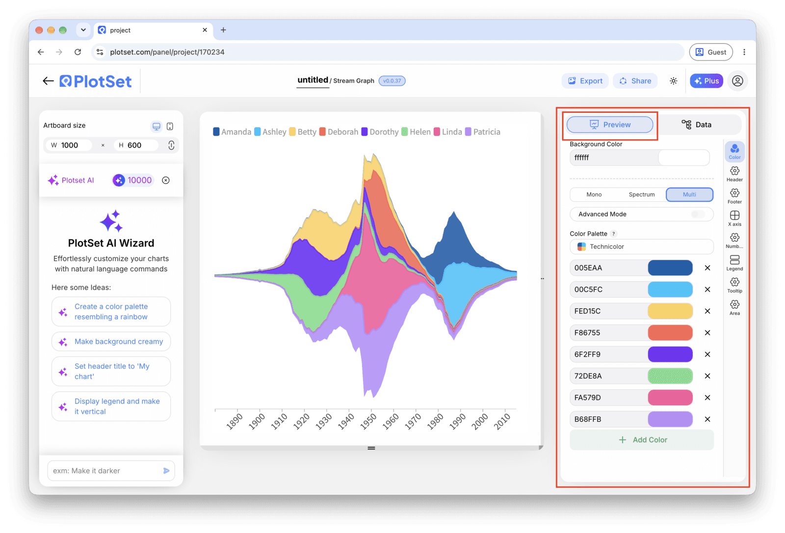
Der Tab "Preview" für ein Diagramm vom Typ "Stream Graph". Alle Gestaltungsoptionen stecken im umrandeten Bereich: Aussehen, Kopfzeile, Fußzeile und die Optionen, die es speziell für diesen Diagrammtyp gibt, jeweils in einem eigenen Tab. - 07
Add a title that names the shift
Because the chart has no axis to lean on, the title is doing real work. Name the change itself, for example "Hip-hop overtakes pop in monthly streams", rather than a generic label like "Streams by genre".
- 08
Send it out: publish, embed or export
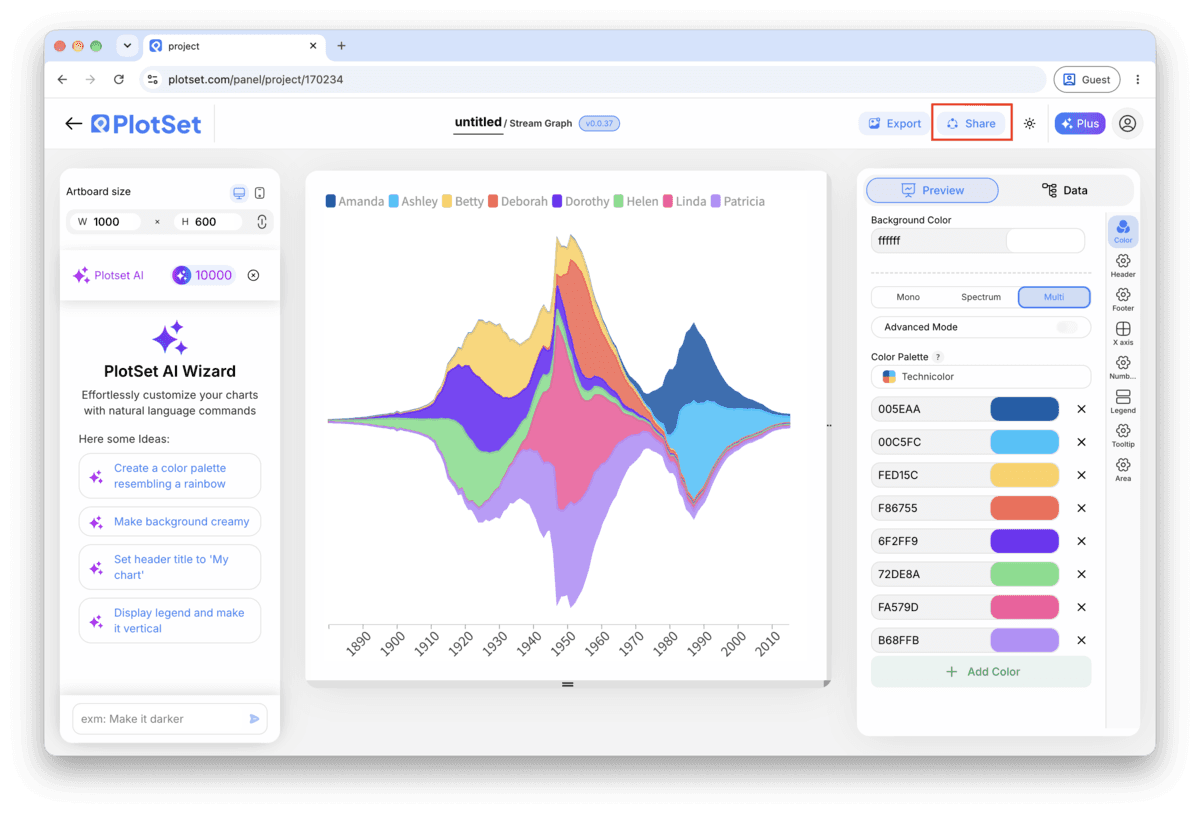
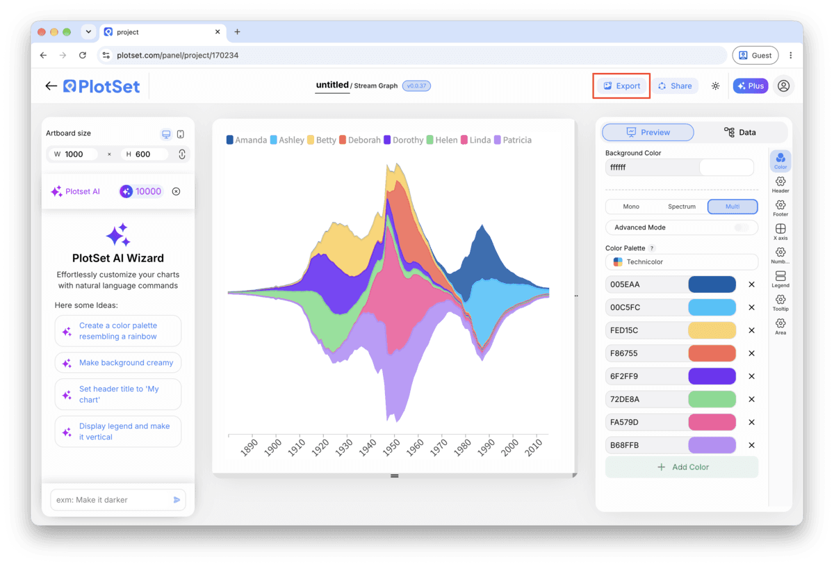
Publish for a live, interactive chart where hovering isolates a band and shows its value, grab the embed code to drop it into a page, or export a PNG, SVG or PDF if you need a static image for a deck.
Starten Sie mit der Stream Graph-Vorlage samt bereits geladenen Beispieldaten und ersetzen Sie diese durch Ihre eigenen.
Vorlage öffnenStyling-Tipps für Stream Graph
Order by peak time first, size second
Ordering categories by when each one peaks (earliest at the edges, latest toward the centre) is what turns a knot of overlapping bands into a readable sequence. Only fall back to ordering by total size if your categories genuinely all peak around the same time.
Group small categories instead of colouring all of them
Past seven or eight bands, individual colours stop being distinguishable at a glance. Combine the smallest categories into an "Other" band before upload, or use a sequential palette within a family (three shades of blue for three related genres) rather than three unrelated hues.
Turn on hover tooltips, always
There is no axis to read a value from, so the tooltip is not a nice-to-have here, it is the only way anyone gets a number off the chart. Publish it interactively rather than exporting a static image whenever the values themselves matter.
Keep the time axis dense and evenly spaced
Weekly or monthly points with no missing periods produce smooth, trustworthy curves. A handful of widely spaced points forces PlotSet to interpolate over a long gap, which can imply a smooth rise or fall that the data never actually measured.
Häufige Fehler bei Stream Graph
The bands look like a tangled knot instead of a flow
This is almost always the band order, not the data. Switch from source or alphabetical order to peak-time ordering, or try the inside-out variant. A stream graph with the wrong order is unreadable regardless of how clean the numbers underneath are.
One category shows a flat zero the whole way through
Check whether that column got read from a long-format row rather than a wide column, which leaves every cell but one blank and therefore zero. Re-pivot the source sheet so that category has its own real value at every time point.
The shape spikes sharply between two points for no reason
Look for an uneven gap in your time column, like a monthly series that skips a quarter. PlotSet interpolates across whatever gap exists, and a wide one produces a curve that looks more dramatic than the two real data points support. Fill in the missing period or shorten the interval.
Mehr über Stream Graph erfahren
Nicht sicher, ob Stream Graph die richtige Wahl ist? Erfahren Sie, was es ist, wann Sie es verwenden sollten und wann nicht.
Stream Graph: häufige Fragen
Wide format: one row per time point in the first column, one column per category, and a value in each cell. If your export is long format, one row per date-category pair, pivot it into wide format in your spreadsheet tool before uploading.
Jetzt Stream Graph erstellen
Kostenlos starten mit über 300 Vorlagen. Keine Kreditkarte erforderlich.