
Beispiel-CSV
| Feature | Impact | Effort |
|---|---|---|
| One-click export | 8 | 2 |
| Dark mode | 4 | 3 |
| Bulk CSV import | 7 | 5 |
| Custom branding | 6 | 7 |
| Slack notifications | 5 | 4 |
| API rate limit increase | 3 | 6 |
| Onboarding checklist | 8 | 4 |
| Advanced permissions | 6 | 8 |
A step by step walkthrough for turning a list of items and two scores into a published quadrant chart in PlotSet, from shaping the sheet to labelling the boxes and exporting the result.
Etwa 8 MinutenFour labelled boxes, built from your own items and your own two scores, not the sample impact and effort numbers PlotSet loads by default: that's the end point for how to create a quadrant chart from your own spreadsheet. You will shape the sheet, map the columns, set the dividing lines on purpose, and publish a chart where hovering a point shows exactly what it is.
If your sheet already lists one item per row with two numbers next to it, this takes about eight minutes. Add another ten if you are still deciding where the dividing lines should sit or cleaning up a source report that has extra columns you do not need. The eight minutes below assumes the scores are already settled.
One row per item: a label, then two numeric measures (x, then y). An optional fourth column carries a group name if you want the points coloured.
| Feature | Impact | Effort |
|---|---|---|
| One-click export | 8 | 2 |
| Dark mode | 4 | 3 |
| Bulk CSV import | 7 | 5 |
| Custom branding | 6 | 7 |
| Slack notifications | 5 | 4 |
| API rate limit increase | 3 | 6 |
| Onboarding checklist | 8 | 4 |
| Advanced permissions | 6 | 8 |
Keep the label column as plain text. A feature name that looks like a date or a formula result to your spreadsheet tool will upload as that value, not the text you see on screen.
Both measures need to be numbers on their own scales. They do not have to start at zero and they do not have to share a scale with each other, since the two axes are read independently.
Add a group column only if you want point colour to mean something, such as a team or a category. Skip it if every point should read the same way.
One row per item. If the same feature appears twice with different scores, PlotSet plots both dots, which usually means a duplicate export rather than two real items.
Der genaue Klickpfad in PlotSet, von einer leeren Vorlage bis zum fertigen Diagramm.
From the PlotSet dashboard, start a new project and choose the Quadrant Chart template. It loads with sample impact and effort scores already bound to the axes and the four quadrant labels, so you can see exactly how the columns map before you touch your own file.

Put the item name in the first column, then its two numeric scores in the next two columns, one row per item. Strip out any subtotal or notes column your source report added; the upload should be items and numbers only.
Use the data panel to import a CSV or .xlsx file, paste rows straight from a spreadsheet, or connect a Google Sheet if you want the chart to pick up new scores later without a re-upload.

Confirm which column feeds the point label, which feeds the horizontal axis, and which feeds the vertical one. PlotSet usually gets this right when your headers are clear, but check it manually if your sheet carries extra columns it might have guessed wrong on.

Open the line controls and type in the actual threshold, a budget figure, a target score, whatever the boundary really is. If nothing like that exists, switch to the median option instead of eyeballing a line by dragging it.
Click into each of the four labels and replace the placeholder text with the action it represents: do first, plan, maybe later, drop. Keep each one short enough to sit inside the shaded box without crowding a nearby point.
Switch on direct labels so every dot carries its item name without a separate legend. If your sheet included a group column, map it to point colour now; if not, leave every point the same colour so it does not imply a grouping you did not intend.
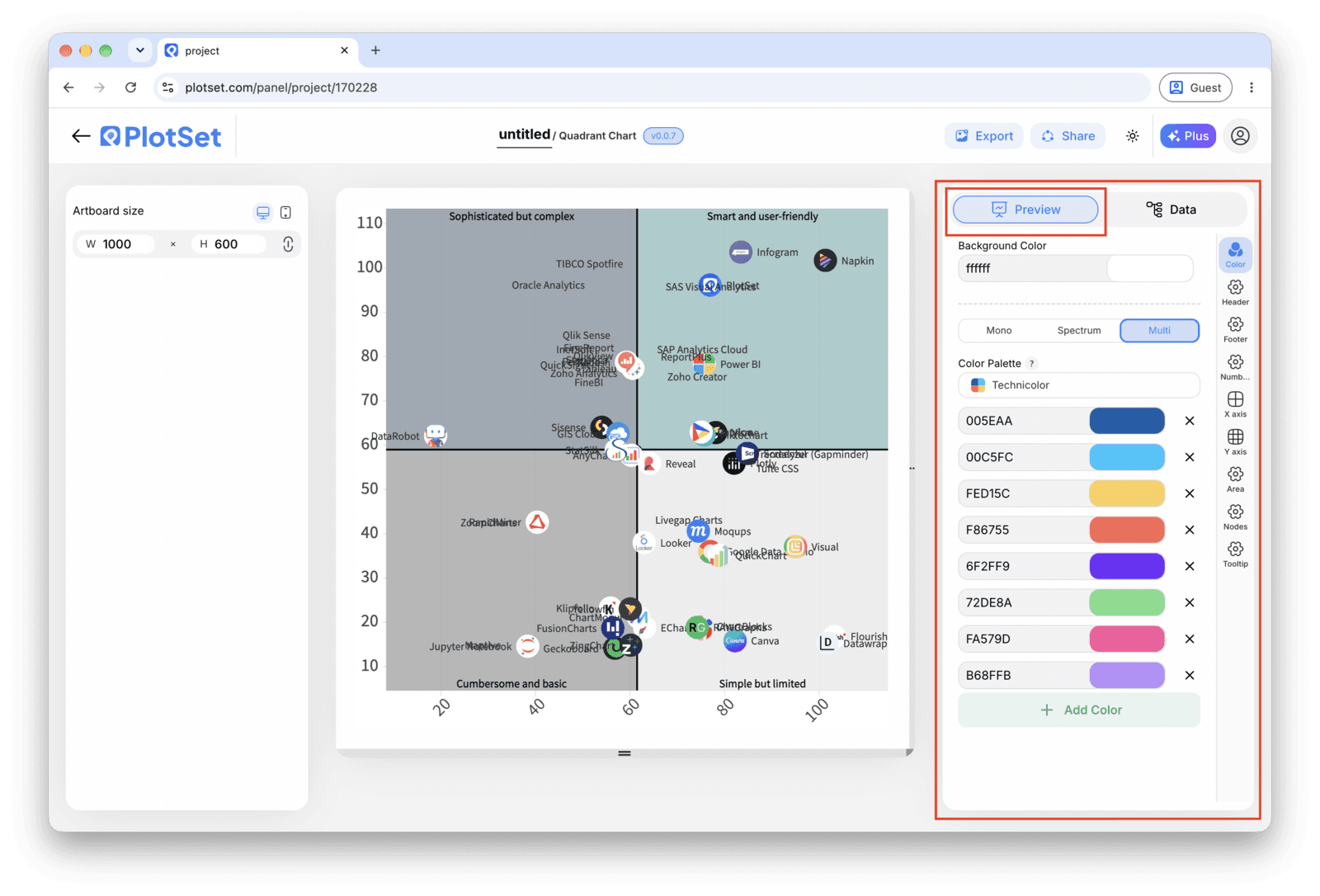
Publish for a live, interactive chart with hover tooltips and a shareable link, grab the embed code to drop it into a page, or export a PNG, SVG or PDF for a slide.
Starten Sie mit der Quadrant Chart-Vorlage samt bereits geladenen Beispieldaten und ersetzen Sie diese durch Ihre eigenen.
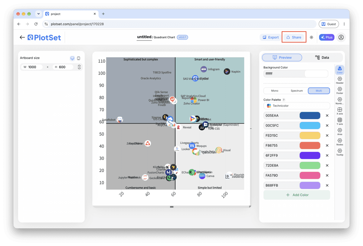
Vorlage öffnenDer letzte Abschnitt ist bei jedem Diagrammtyp gleich: "Share" macht aus dem Diagramm einen öffentlichen Live-Link und einen Einbettungscode, "Export" schreibt es als statische Datei heraus.
Aktivieren Sie den Einbettungscode und den öffentlichen Link, um das Diagramm zu veröffentlichen. Den Link können Sie bedenkenlos an alle weitergeben, und der Einbettungscode fügt sich als iframe in jede Seite ein. Die Tooltips beim Überfahren mit der Maus und die volle Interaktivität bleiben erhalten. Wenn Sie das Diagramm später bearbeiten, überträgt "Recreate" die Änderungen auf Link und Einbettung.

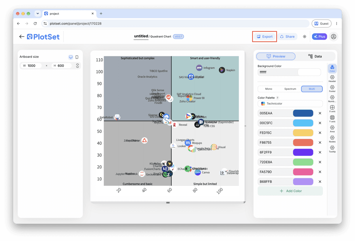
"Export" schreibt eine statische Kopie in der Größe heraus, die Sie brauchen. SVG bleibt in jeder Skalierung scharf und lässt sich weiterhin in einem Design-Tool bearbeiten; PNG und JPG sind die sichere Wahl für Folien und Dokumente. Der Skalierungsfaktor sorgt dafür, dass das Bild auf einem Retina-Display gestochen scharf wirkt.

PlotSet's line control takes a numeric value and prints it next to the line. Enter the real figure there instead of dragging the line until it looks about right, so anyone reading the chart can see what the boundary actually is.
A quadrant chart with unlabelled points forces the reader to hover every dot to know what they are looking at. Switch on labels early in the process so you are judging the real chart, not a cloud of anonymous circles.
If your sheet has a category column, map it to colour. If you also have a third number worth showing, such as budget or headcount, map that to point size instead of adding a second colour scheme on top.
PlotSet lets you tint each of the four background regions separately. Keep the tint faint and consistent with the label, a soft green behind "do first" reads faster than four identically grey boxes with text doing all the work.
This usually means the dividing lines are still sitting at the default zero crossing instead of the median or your real threshold. Open the line controls and switch to the median option, which recentres both lines on your actual data.
This happens when a label is too long for the region at the current chart size. Shorten the label to two or three words, or widen the chart; PlotSet does not wrap quadrant label text automatically.
Check the two measure columns for text values PlotSet cannot plot, a stray "N/A" or a unit typed into a number cell is the usual cause. Fix the cell in your source sheet and re-upload rather than editing it in PlotSet's data table.
Nicht sicher, ob Quadrant Chart die richtige Wahl ist? Erfahren Sie, was es ist, wann Sie es verwenden sollten und wann nicht.
One row per item with a label and two numeric scores, plus an optional group column for colour. Both scores need their own numeric scale; PlotSet cannot plot a text category on either axis of a quadrant chart.
Kostenlos starten mit über 300 Vorlagen. Keine Kreditkarte erforderlich.