PlotSet LogoPlotSet

How to Create a Bump Chart

A step by step walkthrough for turning a ranked spreadsheet into a published bump chart in PlotSet, from shaping the sheet to publishing the finished tracks.

Etwa 8 Minuten

Rank instead of raw value is the input here, and how to create a bump chart in PlotSet turns a spreadsheet with an item, a period and a rank column into a published, interactive chart you can embed or export. You will end up with a set of coloured tracks that cross exactly where the underlying ranking actually changed, with names attached at either end and no legend needed to read it.

If your data already has a rank column, this takes about eight minutes. Add another ten if you are starting from raw values and need to rank them within each period first: that step happens in your spreadsheet, before anything is uploaded, and it is the one most people skip by mistake.

Die Daten, die Sie brauchen

Long format, one row per item per period: the item name, the period label, and that item's rank within the period. Three columns, one header row.

Beispiel-CSV
ServiceMonthRank
SpotifyJan1
Apple MusicJan2
YouTube MusicJan3
Amazon MusicJan4
SpotifyFeb1
Apple MusicFeb3
YouTube MusicFeb2
Amazon MusicFeb4
SpotifyMar2
Apple MusicMar3
YouTube MusicMar1
Amazon MusicMar4
SpotifyApr1
Apple MusicApr2
YouTube MusicApr3
Amazon MusicApr4
Hinweise

The rank column has to be an integer position (1, 2, 3...), not the raw measure. If you only have subscriber counts or scores, rank them within each period first: a RANK formula in your spreadsheet, sorted per period, does this in one column.

Every item needs a row for every period. A period an item is missing from (a product not yet launched, a team relegated out of the league) leaves a gap in that track rather than a smooth line, so decide up front whether to backfill, drop the period, or leave the gap visible.

Two items cannot share a rank within the same period. A tie uploaded as-is either gets silently broken by PlotSet or draws two tracks on top of each other, so resolve ties in the sheet (alphabetical, or a tiebreaker metric) before uploading.

Keep the period column consistent: all month names, all week numbers, all match dates, not a mix. PlotSet orders periods by reading this column, and a mixed format sorts oddly.


Die Schritte

Der genaue Klickpfad in PlotSet, von einer leeren Vorlage bis zum fertigen Diagramm.

  1. 01

    Open the Bump Chart template

    From the PlotSet dashboard, start a new project and choose the Bump Chart template. It loads with a small ranked dataset already bound to it, so you can see the item, period and rank columns in place before you touch your own file.

    Die Vorlagenauswahl von PlotSet: links die Liste der Diagrammkategorien, daneben das geöffnete Raster "Bar Charts" und die Vorlagenkarte "Bar Chart" mit ihrer Schaltfläche "Select".
    Jede Anleitung beginnt hier. Wählen Sie erst die Kategorie, dann die Vorlage. Das Raster ist für jeden Diagrammtyp dasselbe.
  2. 02

    Shape your sheet as item, period, rank

    Rework your source data into three columns in long format: one row per item per period, with that item's integer rank for the period in the third column. If you are starting from raw values, rank them within each period in your spreadsheet first.

  3. 03

    Upload your sheet or connect it live

    Use the data panel to import a CSV or .xlsx file, paste rows straight from a spreadsheet, or connect a Google Sheet if new periods will keep arriving and you want the chart to pick them up without a re-upload.

    Die Datenansicht im PlotSet-Editor: ein Tabellenraster mit den Spalten "Name", "Value" und "Region", gefüllt mit Zahlen zu kanadischen Provinzen, daneben der Bereich "Data" mit "Upload CSV File", "Magic Import" und der Synchronisierung über "Google Sheet".
    Die Datenansicht, hier in einem Balkendiagramm-Projekt. Laden Sie über "Upload CSV File" eine CSV-Datei hoch, holen Sie die Zahlen mit "Magic Import" aus einem Bild oder verbinden Sie ein Google Sheet. Der Bereich sieht bei jedem Diagrammtyp gleich aus.
  4. 04

    Map the item, period and rank columns

    Tell PlotSet which column is the item, which is the period, and which is the rank. Clear headers like Service, Month and Rank usually get mapped automatically; check this manually if your sheet carries extra columns PlotSet had to guess between.

    Der Datenbereich von PlotSet mit hervorgehobenen Spaltenzuordnungen: "Label/time" auf Spalte A, "Values" auf Spalte B und "Filter/color" auf Spalte C, darunter die Schaltfläche "Auto Binding".
    Die Zuordnungen legen fest, welche Spalte zur Beschriftung wird, welche die Werte liefert und welche die Farbe steuert. "Auto Binding" errät sie anhand Ihrer Spaltenüberschriften. Prüfen Sie das Ergebnis, statt sich darauf zu verlassen.
  5. 05

    Set the period order

    Confirm the periods run left to right in the order you intend, not alphabetically. This matters most with month abbreviations or match weeks that do not sort correctly as plain text.

  6. 06

    Label the ends of each track

    Turn on end labels so item names sit at the first and last period rather than in a separate legend. With names anchored at both edges, a reader can trace any single track through the crossings in the middle without losing their place.

  7. 07

    Highlight the tracks that matter

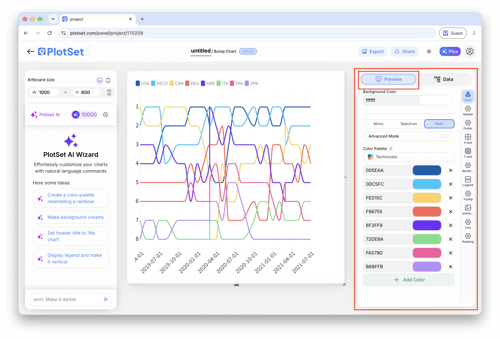
    Pick one or two items to keep in full colour and set the rest to a muted grey. Past about eight tracks a fully coloured chart turns into a tangle, and a highlighted track reads clearly against a grey field in a way it never does against seven other bright ones.

    Der PlotSet-Editor im Tab "Preview": ein fertiges Diagramm vom Typ "Bump Chart" auf der Arbeitsfläche und der rot umrandete Einstellungsbereich am rechten Rand.
    Der Tab "Preview" für ein Diagramm vom Typ "Bump Chart". Alle Gestaltungsoptionen stecken im umrandeten Bereich: Aussehen, Kopfzeile, Fußzeile und die Optionen, die es speziell für diesen Diagrammtyp gibt, jeweils in einem eigenen Tab.
  8. 08

    Publish, embed or export the tracks

    Publish for a live chart where hovering a track highlights it against the rest with a tooltip at each node, grab the embed code to drop it into a page, or export a PNG, SVG or PDF if you need a static image for a deck.

Starten Sie mit der Bump Chart-Vorlage samt bereits geladenen Beispieldaten und ersetzen Sie diese durch Ihre eigenen.

Vorlage öffnen

Veröffentlichen, einbetten oder exportieren

Der letzte Abschnitt ist bei jedem Diagrammtyp gleich: "Share" macht aus dem Diagramm einen öffentlichen Live-Link und einen Einbettungscode, "Export" schreibt es als statische Datei heraus.

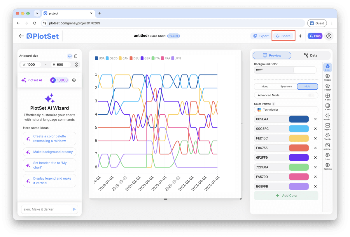
"Share": öffentlicher Link und Einbettungscode

Aktivieren Sie den Einbettungscode und den öffentlichen Link, um das Diagramm zu veröffentlichen. Den Link können Sie bedenkenlos an alle weitergeben, und der Einbettungscode fügt sich als iframe in jede Seite ein. Die Tooltips beim Überfahren mit der Maus und die volle Interaktivität bleiben erhalten. Wenn Sie das Diagramm später bearbeiten, überträgt "Recreate" die Änderungen auf Link und Einbettung.

Die Werkzeugleiste des PlotSet-Editors mit der hervorgehobenen Schaltfläche "Share" direkt neben der Schaltfläche "Export".
Über "Share" werden aus dem fertigen Diagramm ein öffentlicher Link und ein Einbettungscode.
Der Dialog "Share" von PlotSet: der Schalter, der den Einbettungscode und den öffentlichen Link aktiviert, die Schaltflächen "Link", "Embed", "Facebook", "Reddit", "Twitter", "LinkedIn" und "Email" sowie der öffentliche Diagrammlink mit der Schaltfläche "Copy".
Aktivieren Sie den Einbettungscode und den öffentlichen Link, kopieren Sie dann den Link oder den iframe-Code. Mit "Recreate" erreichen spätere Änderungen alle, die den Link bereits haben.

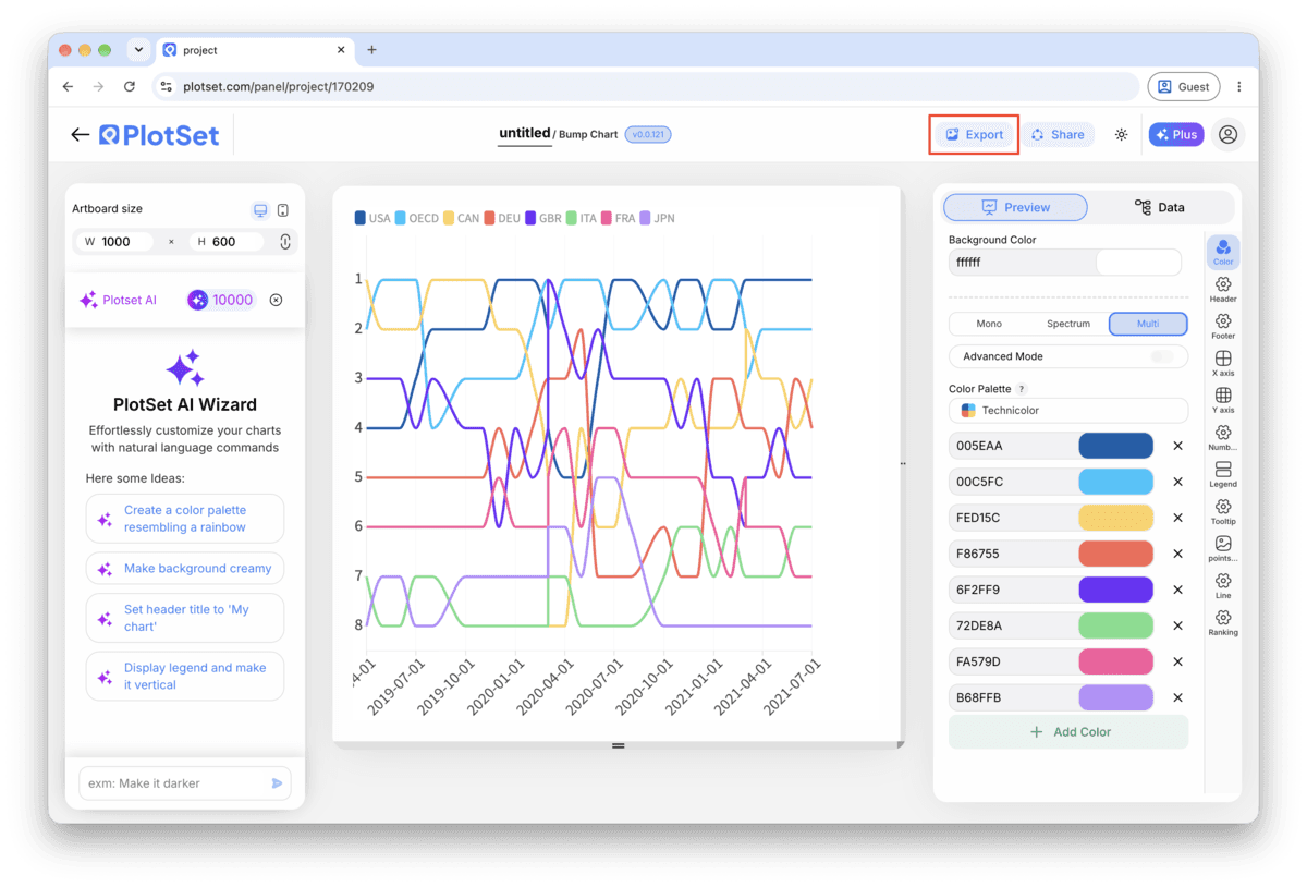
"Export": SVG, PNG oder JPG

"Export" schreibt eine statische Kopie in der Größe heraus, die Sie brauchen. SVG bleibt in jeder Skalierung scharf und lässt sich weiterhin in einem Design-Tool bearbeiten; PNG und JPG sind die sichere Wahl für Folien und Dokumente. Der Skalierungsfaktor sorgt dafür, dass das Bild auf einem Retina-Display gestochen scharf wirkt.

Die Werkzeugleiste des PlotSet-Editors mit der hervorgehobenen Schaltfläche "Export".
Über "Export" bekommen Sie eine statische Datei für eine Folie oder einen Bericht.
Der Dialog "Export chart" von PlotSet: die Skalierungsauswahl auf 2x, die Felder für Breite und Höhe mit 1000 mal 600 und das geöffnete Formatmenü mit "SVG", "PNG" und "JPG".
SVG bleibt in jeder Größe scharf und im Design-Tool bearbeitbar; PNG und JPG sind die sichere Wahl für eine Präsentation. Stellen Sie die Skalierung vor dem Export ein, damit das Bild auf einem Retina-Display gestochen scharf ist.

Styling-Tipps für Bump Chart

Put the real value in the tooltip

Rank alone hides magnitude: first and second can be neck and neck or worlds apart, and the chart looks the same either way. Add the underlying measure (subscribers, points, votes) to the tooltip so a hover fills in what the rank axis cannot show.

Label the top of the rank axis '1st', not '1'

An axis that goes up as rank improves is a convention people have to learn, not one they arrive with. Spelling out 1st at the top removes the one moment a reader might mistake a rise for a fall.

Space periods evenly

Bump charts read the horizontal axis as evenly spaced steps. If your periods are irregular, quarters of different lengths, seasons with byes, gaps read as meaningful when they are just calendar noise. Fill in a placeholder period rather than skip it.

Cap it at two or three highlighted colours

One highlight colour makes a clear point. Two makes a comparison. Past three, even with the rest greyed out, a reader loses track of which line is which by the second crossing.

Häufige Fehler bei Bump Chart

Two tracks sit exactly on top of each other

This means two items share the same rank in at least one period, usually from an unresolved tie in the source data. Go back to the sheet and break the tie with a secondary sort key, then re-upload.

A track has a visible gap or jumps oddly

A missing row for that item in one period leaves a hole in the line rather than a smooth connection. Check your data table for the period in question and add the missing row, or accept the gap and say so in a caption.

The chart looks huge and jagged instead of clean parallel tracks

This usually means raw values were uploaded into the rank column instead of ranks. Open the sheet, rank each period's values from 1 to N, and replace the value column with the rank before re-uploading.

Mehr über Bump Chart erfahren

Nicht sicher, ob Bump Chart die richtige Wahl ist? Erfahren Sie, was es ist, wann Sie es verwenden sollten und wann nicht.

Über Bump Chart

Bump Chart: häufige Fragen

A long-format sheet with one row per item per period: an item column, a period column, and an integer rank column for that item within the period. Three columns and one header row is enough. If you only have raw values, rank them within each period before uploading.

Jetzt Bump Chart erstellen

Kostenlos starten mit über 300 Vorlagen. Keine Kreditkarte erforderlich.