
Beispiel-CSV
| KPI | Actual | Target | Poor | Satisfactory | Good |
|---|---|---|---|---|---|
| Revenue ($K) | 275 | 250 | 150 | 225 | 300 |
| Profit Margin (%) | 18 | 22 | 10 | 16 | 24 |
| Marketing ROI (x) | 3.2 | 4.0 | 2 | 3.5 | 5 |
A step by step walkthrough for turning a table of KPIs, targets and thresholds into a published bullet chart scorecard in PlotSet, with target ticks and performance bands.
Etwa 6 MinutenA column of horizontal bars, each with a target tick and shaded performance bands behind it, one per KPI: that is what you will have. It is a scorecard that shows how each measure compares with its goal and whether the result is poor, fair or good.
If your actuals and targets are already in a spreadsheet, it takes about six minutes. The one thing worth deciding up front is whether your rows share a unit, because that sets the scale mode.
One row per KPI with a name, the actual value, an optional target, and up to three optional band thresholds, each the upper bound of its band.
| KPI | Actual | Target | Poor | Satisfactory | Good |
|---|---|---|---|---|---|
| Revenue ($K) | 275 | 250 | 150 | 225 | 300 |
| Profit Margin (%) | 18 | 22 | 10 | 16 | 24 |
| Marketing ROI (x) | 3.2 | 4.0 | 2 | 3.5 | 5 |
The band columns are upper limits measured from zero, not widths. Poor 150, Satisfactory 225 and Good 300 draw nested bands to 150, 225 and 300.
Use between one and three band columns. The darkest band sits nearest zero.
The target column is optional and draws a vertical tick across the bar.
Keep the row order the way you want it read, since rows appear top to bottom in sheet order.
Der genaue Klickpfad in PlotSet, von einer leeren Vorlage bis zum fertigen Diagramm.
From the PlotSet dashboard, start a new project and choose Bullet Chart from the Bar Charts category. It loads with a ten-KPI sample so you can see how each row becomes a bullet.

Put one KPI on each row with its actual value, then a target and band thresholds if you have them. Decide whether the rows share a unit, because that drives the scale.
Import a CSV or .xlsx file from the data panel, paste rows from a spreadsheet, or connect a Google Sheet so the scorecard updates when the sheet does. The first row is read as the headers.

Confirm which column is the label, the value, the target and each band range. This is usually right automatically when the headers are clear.

Open the Value axis tab. Per row, the default, gives each KPI its own scale and suits mixed units. Shared uses one axis and suits rows in the same unit where comparing across them matters.
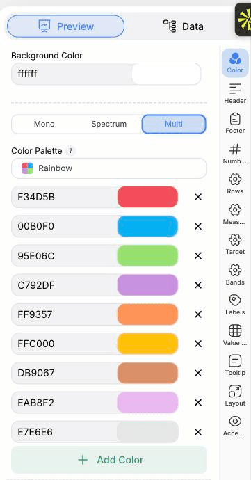
Use the Measure and Target tabs to set bar thickness and tick width, and the Color tab for the bar, target and band colours. The Bands tab can switch the background ranges off.
In the Labels tab choose whether values sit inside the bar, outside it or are hidden. The Rows tab sets row height and the gap between rows.
Publish for an interactive embed with tooltips, or use Export to download a PNG or SVG for a report or slide.
Starten Sie mit der Bullet Chart-Vorlage samt bereits geladenen Beispieldaten und ersetzen Sie diese durch Ihre eigenen.
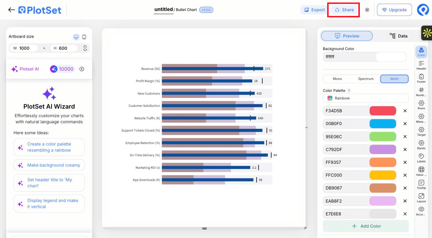
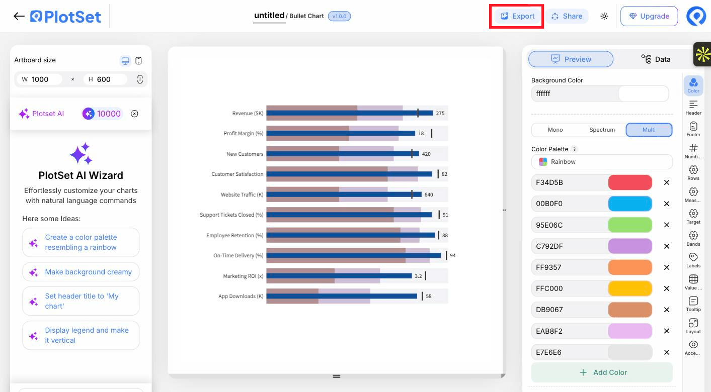
Vorlage öffnenDer letzte Abschnitt ist bei jedem Diagrammtyp gleich: "Share" macht aus dem Diagramm einen öffentlichen Live-Link und einen Einbettungscode, "Export" schreibt es als statische Datei heraus.
Aktivieren Sie den Einbettungscode und den öffentlichen Link, um das Diagramm zu veröffentlichen. Den Link können Sie bedenkenlos an alle weitergeben, und der Einbettungscode fügt sich als iframe in jede Seite ein. Die Tooltips beim Überfahren mit der Maus und die volle Interaktivität bleiben erhalten. Wenn Sie das Diagramm später bearbeiten, überträgt "Recreate" die Änderungen auf Link und Einbettung.

"Export" schreibt eine statische Kopie in der Größe heraus, die Sie brauchen. SVG bleibt in jeder Skalierung scharf und lässt sich weiterhin in einem Design-Tool bearbeiten; PNG und JPG sind die sichere Wahl für Folien und Dokumente. Der Skalierungsfaktor sorgt dafür, dass das Bild auf einem Retina-Display gestochen scharf wirkt.

Shades of one colour, darkest nearest zero, keep the bands quiet so the bar and tick stand out.
Add a footer note such as target shown as a vertical tick, so a first-time reader does not have to guess.
Rows read top to bottom in sheet order, so put the KPIs that matter most first.
Ten rows need height. Increase the artboard height or reduce row height before the labels start to shrink.
You are probably on a shared scale with mixed units. Switch Value axis to Per row.
Check that the band columns hold upper bounds, not widths, and that they increase from left to right.
The target column may be unbound or blank for that row, or the Target tab has the tick switched off.
Labels shrink to fit before any are dropped. Shorten the KPI names or give the chart more width.
Nicht sicher, ob Bullet Chart die richtige Wahl ist? Erfahren Sie, was es ist, wann Sie es verwenden sollten und wann nicht.
A name and an actual value for each KPI. A target and up to three band thresholds are optional.
Kostenlos starten mit über 300 Vorlagen. Keine Kreditkarte erforderlich.