What is a footer
The purpose of data visualization is to provide concise and comprehensive information for your viewer. One essential element that is often overlooked in the process of making visuals is the footer.
The footer gives the viewer a deeper understanding of the data presented by providing additional information, links, and data sources.

Is it neccessary to add a footer
You might wonder what is the big deal about the footer. The answer would be: context. A clear-cut context helps your audience to understand the data better.
In addition, it is highly recommended to mention links and sources for your data to increase the credibility of your work and respect those who have gathered and collected the data (Unless you've gathered the data personally).
You can add a footer to your chart with a few clicks in the PlotSet panel. If you are wondering how, don't miss the following instruction as it explores the footer section of the panel completely.

How to apply footer
Open the 'Footer' tab inside the PlotSet panel. With the Alignment option, you may decide where to place the footer; on the right, center, or left. It's better to decide on the place when you are done with the design. Of course, you can change it anytime you want during your charting journey.
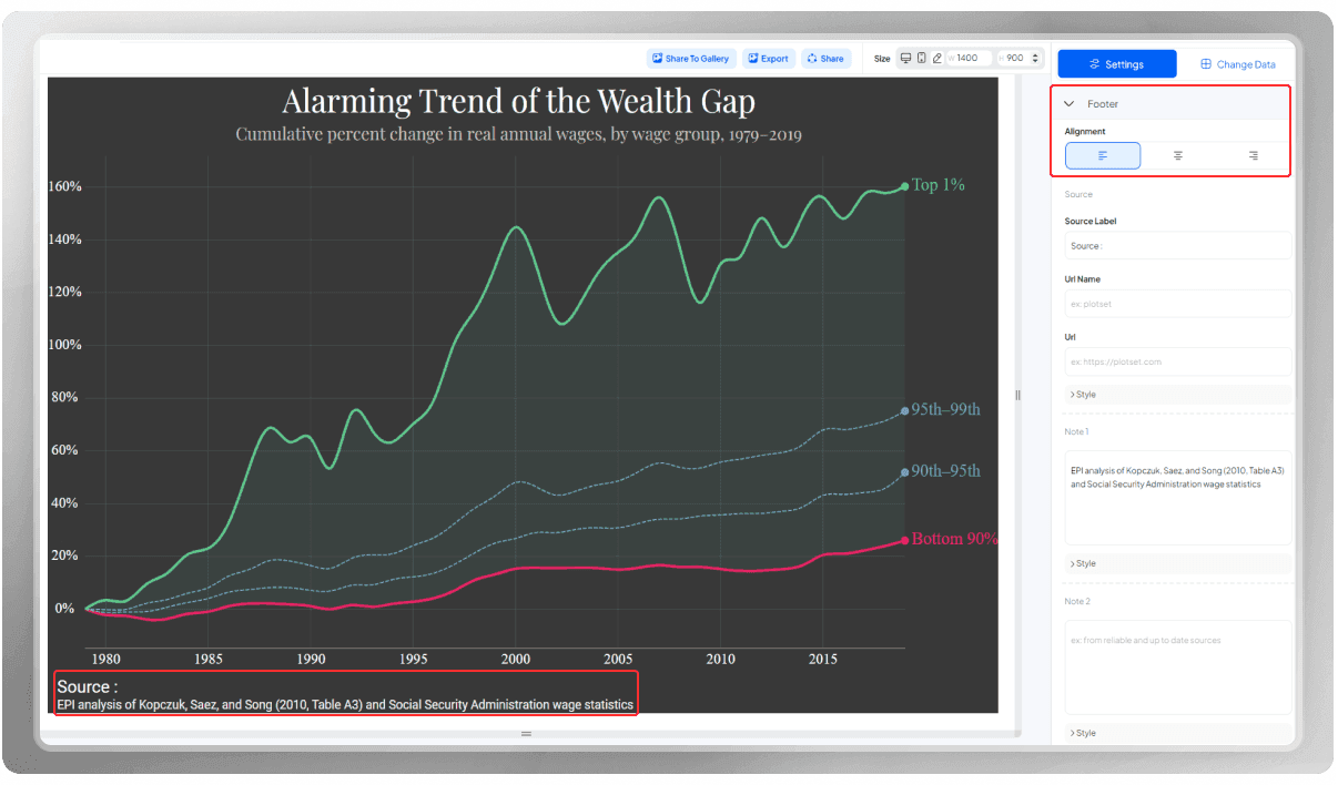
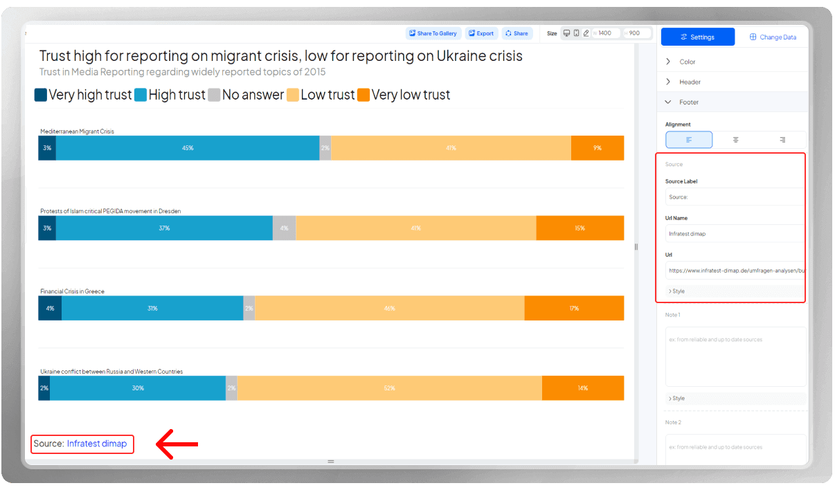
Indicate the source of your data using the following three options:
- Source Label: The Source label is the word or phrase that you want to indicate as 'Source.' For instance, the word 'Fuente' is the Spanish alternative for this word.
- URL Name: Would you like to add a title for the URL link you're about to provide? Here's the place to do so.
- URL: This is where you place the link to the source of your data. Remember that you have the option to change the font and color of them.
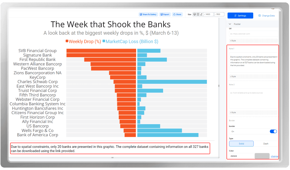
In case you need to add more explanation, 'Note 1' and 'Note 2' are here to help you with that. Just add your explanation in either box and then they will automatically be added to your design. You can also change the font and color.
Does the footer look a bit crowded? Separate it from the main plot, using a border.
And you are done with the footer. Wasn't it easy?
Working with PlotSet is fast and straightforward. With just a few clicks, you can create a beautiful data visualization.
Learn more about the header with the following blog: How to Make the Most of Your Chart’s Header