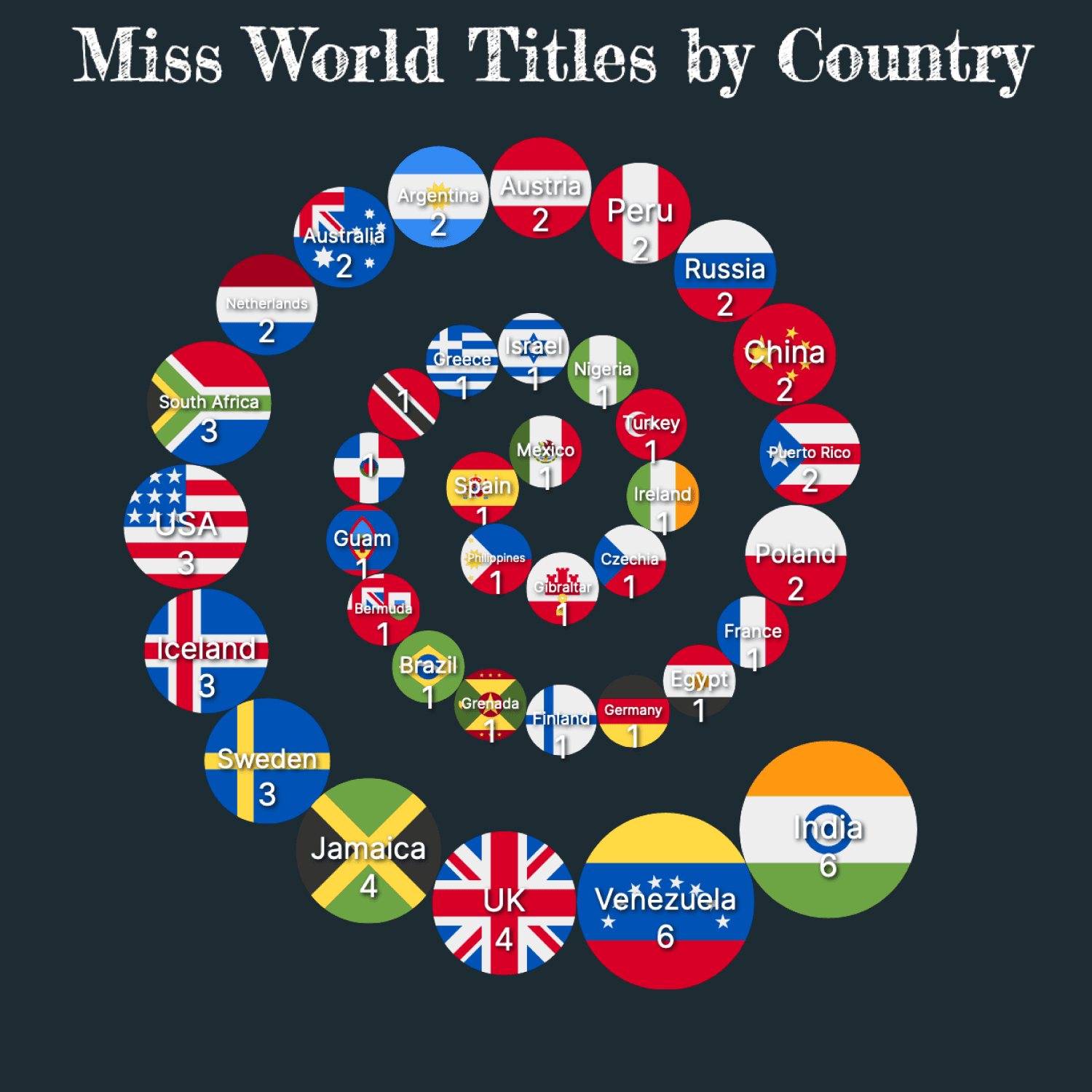
What is a Spiral Bubble Chart
A Spiral Bubble represents quantitative data using concentric circles or spirals. The circles are placed along the spiral based on their respective values, creating a visual representation that emphasizes the progression or change in values over time or other continuous dimensions. Each circle displays a data point or a category, and the size is determined based on its value.
Do you like to display a hierarchical relationship between the data points or categories? Then, you should check out the Spiral Bubble Chart! The following chart represents the Miss World Titles obtained by different countries.
How to create this chart
Let's review the steps to creating the Spiral Bubble Chart above.
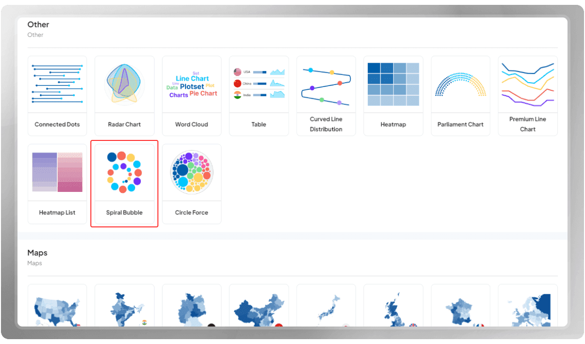
You need to get into your account first and go to your dashboard. After hitting the 'New chart' button, you will be directed to our template list. Under the category listed as 'Other,' find the 'Spiral Bubble' template. Then, you will be taken to the plotting area.
The next steps would be:
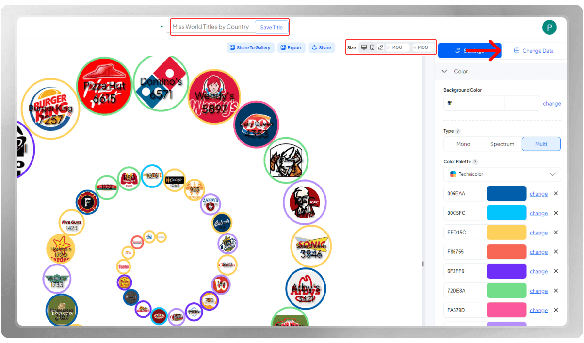
- Set a title for your project.
- Set the dimensions according to your preferences.
- Insert your data.
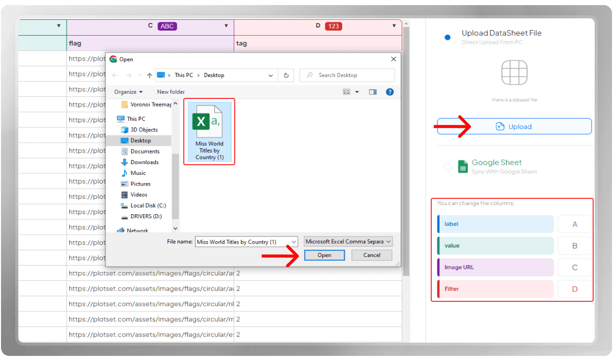
Time to insert your data! You can do so by uploading the CSV file, Importing data from Google Sheets. or entering the data points manually. Note that after inserting the data, you still have the ability to delete, insert, or edit rows and columns. Make sure to assign the correct column to categories, labels, values, and images.
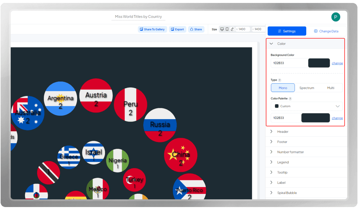
Select a background color that complements your design. Next, choose an appropriate color palette.
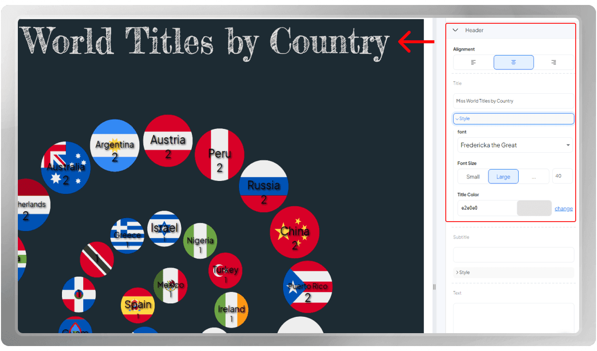
The Header is the core of your visualization as it displays the primary theme it represents. A thought-provoking title has the ability to forge a powerful connection in the viewer's mind, allowing you to effectively convey your intended message.
Ensure to customize the font, size, and color of the Header to your liking! If you wish to include extra details, you may opt to include a subtitle or note within this section.
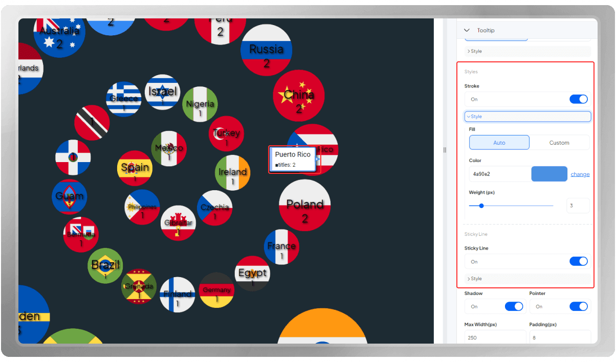
Tooltips offer supplementary information about the data, appearing as small pop-up windows near the cursor when the viewer hovers over the data points. You have the option to enhance these windows by adding borders and colorful sticky lines, making the information more prominent.
Feel free to discover other options.
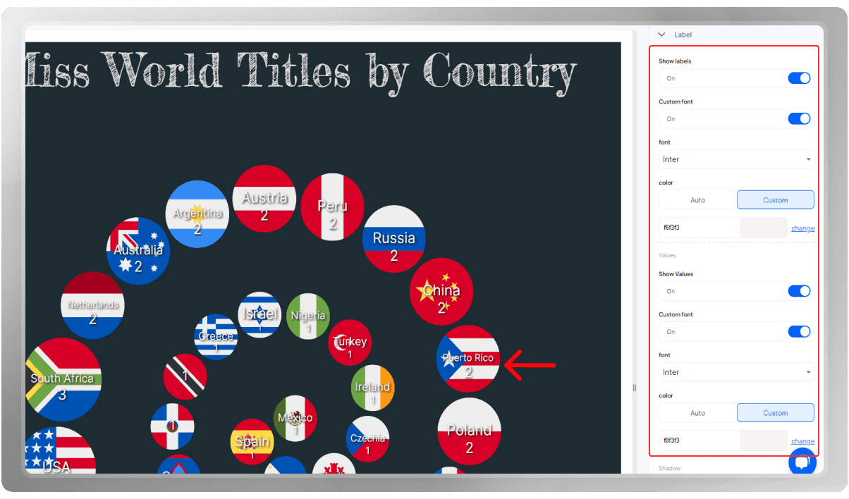
The labels over the circles contribute a lot to the design of this spiral. Hence, you can use the options in the 'Label' section to figure out the best set-up for your chart.
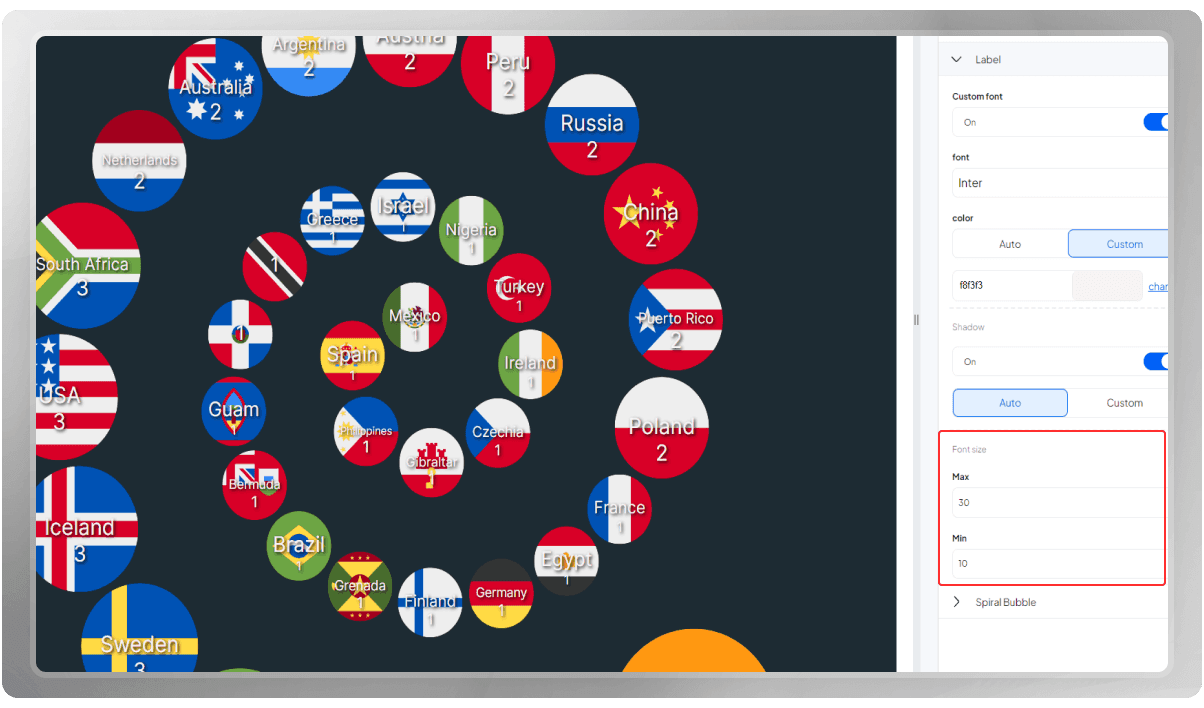
As you can see, the size of each circle is different based on its value. Choose the Min and Max font sizes based on the circle sizes so that the result ends up visually pleasing.
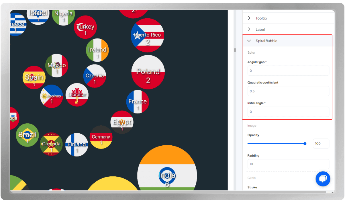
The angular gap refers to the spacing or angle between consecutive circles in the spiral. It determines the distance between the data points as they progress along the spiral. A smaller angular gap will result in circles that are closer together, while a larger angular gap will create more space between the circles.
The quadratic coefficient determines whether the spiral circle packing is compact or wide. A larger coefficient leads to wider spacing between circles, resulting in a more spread-out arrangement. Conversely, a smaller coefficient generates a denser packing, with circles positioned closer to each other. By adjusting the quadratic coefficient, the desired level of compactness or wideness can be achieved, allowing for flexible arrangements of the circles within the spiral.
The initial angle sets the starting point or orientation of the spiral. It defines where the first circle begins on the spiral. By changing the initial angle, you can rotate the entire spiral around its center, which can be useful for aligning the visualization with a specific reference point or for aesthetic purposes.
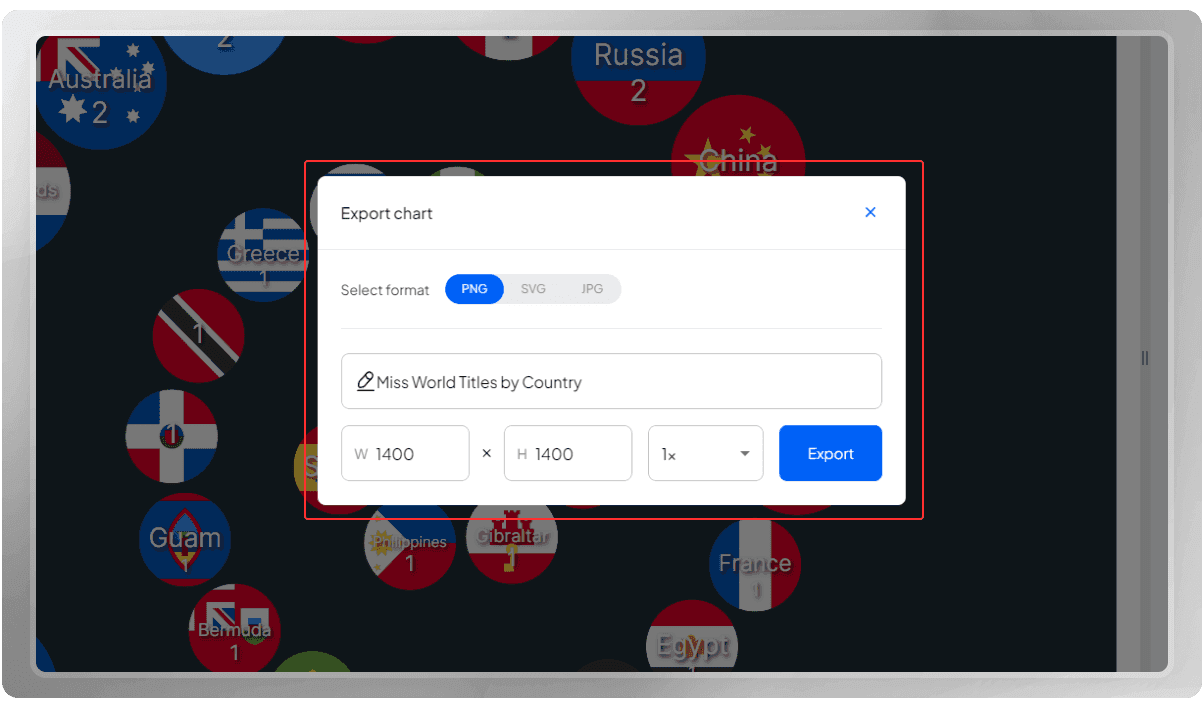
You have the option to export the final design in PNG, SVG, or JPG format. It's important to note that you can modify the dimensions before exporting it again, if needed.
Do you wish to share your final design with others? You can easily do that by clicking on the 'Share' button.
If you are interested, you can watch the tutorial video of this Spiral Bubble Chart on our YouTube channel: Creating an Impressive Spiral Bubble (Miss World Titles by Country)