
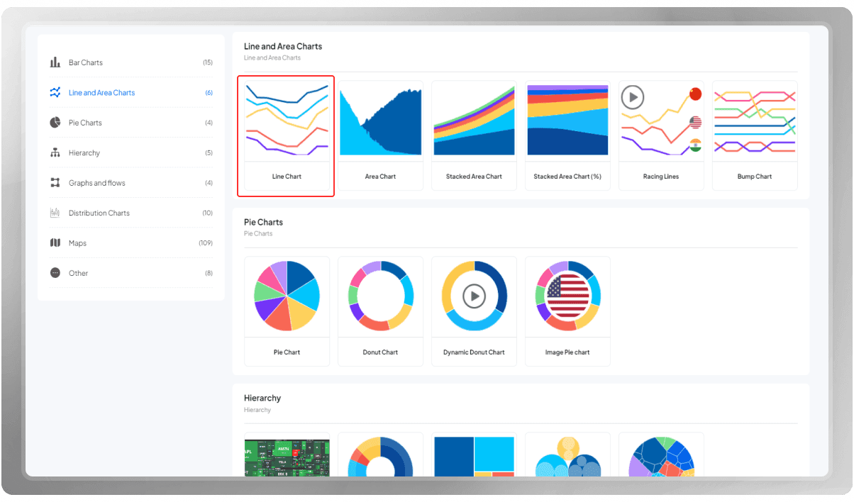
A line chart displays information as a series of data points connected by straight lines.
Line charts are commonly used to show trends over time or to compare the relationship between two variables.
Let's make one together. To begin, go to your panel and select "New Chart", then choose Line Chart as your template.
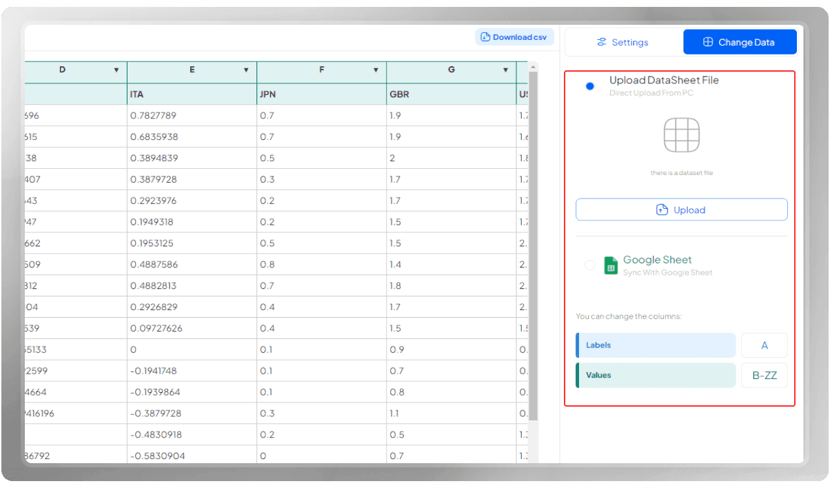
Insert your data by uploading a CSV or importing your data from a Google Sheet. Keep in mind that you can change or edit the data points manually as well.
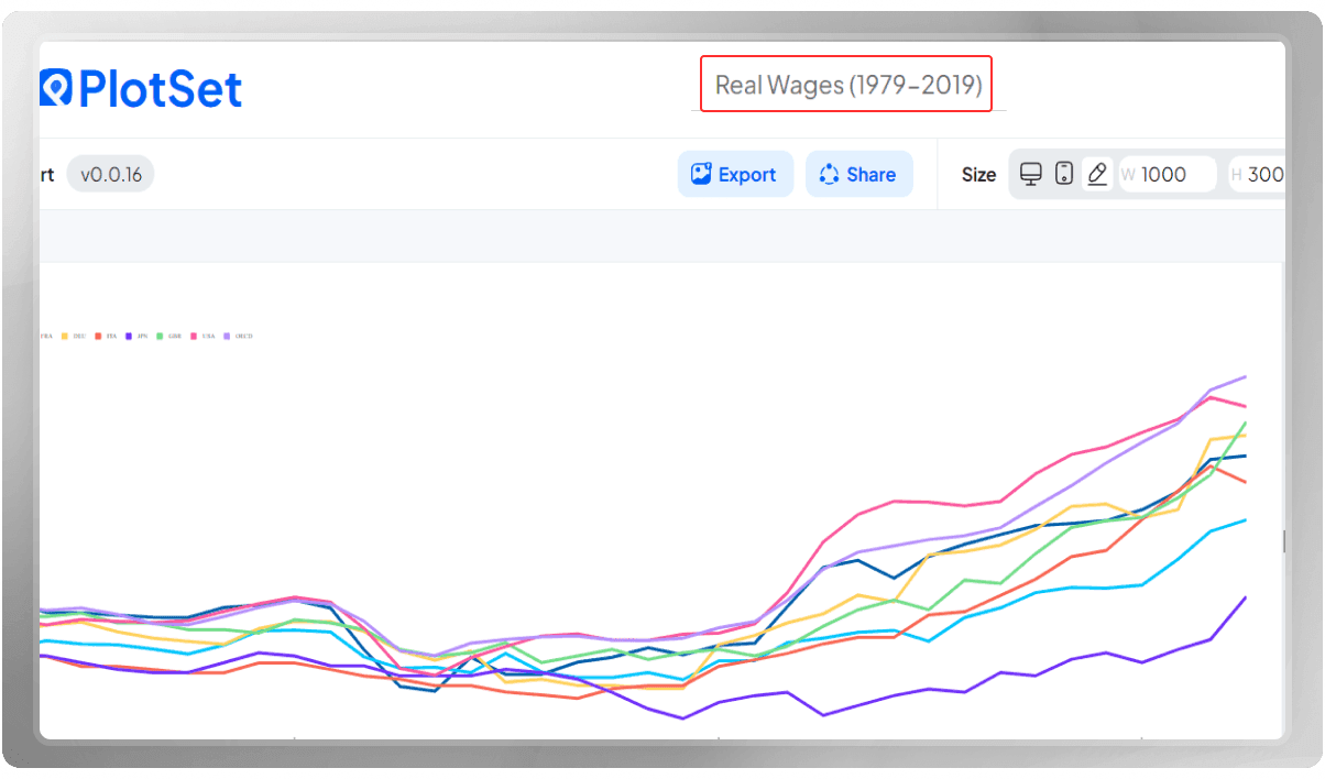
Choose a title for this chart. This title is only visible to you in the panel.
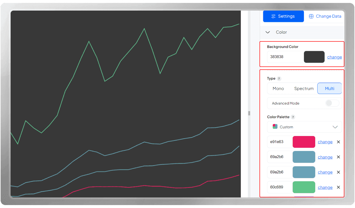
Customize the background and the color of the lines according to your preferences.
You can choose among our mono, spectrum, and multi color palettes.
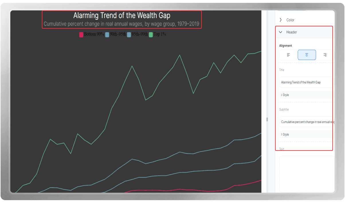
Time to choose a header. You can add a subtitle and some notes to the header section as well.
If you like, you can use a border to separate this section from the plotting area.
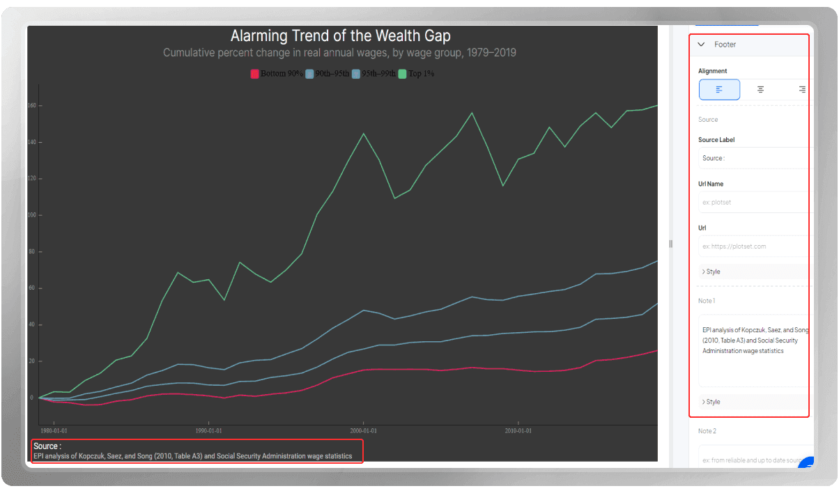
The footer is available for you to mention further information, such as your data source, notes, and necessary links.
You can add a border here in the footer section like the header.
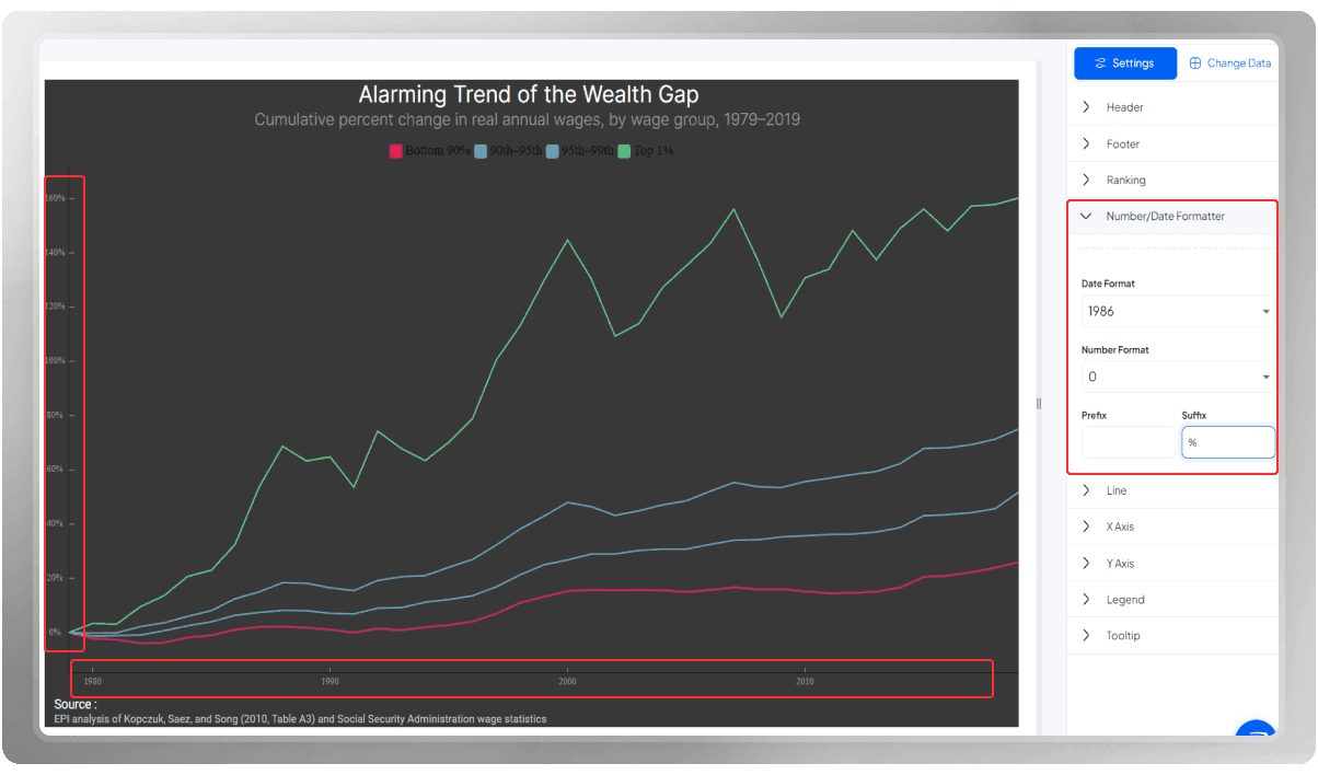
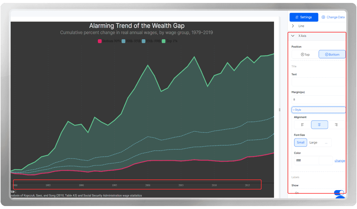
The numbers on my x-axis represent the years, so on the data format, choose 1986. As you can see, all the points will be shown in the years only.
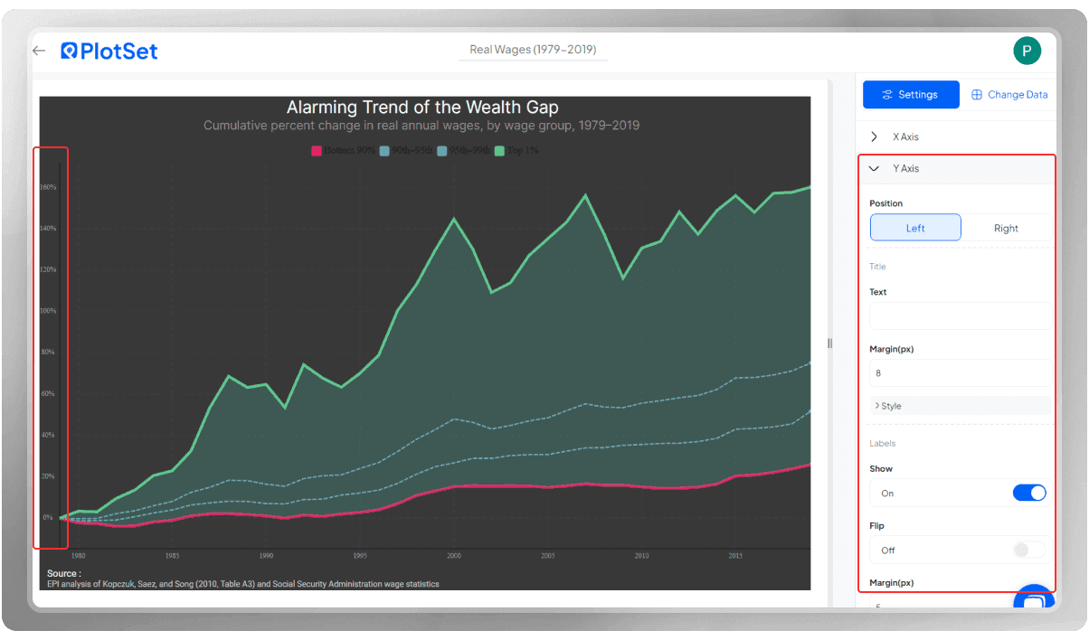
The numbers on the y-axis represent the percentage, so in the suffix section, I write the sign for the percentage
The opacity changes the transparency of the lines.
You can choose a type for their curves here; for instance, curve linear makes the data points pointier, Curve step displays the points in steps, and Curve natural gives the points a smoother look. Let’s go with curve natural for now.
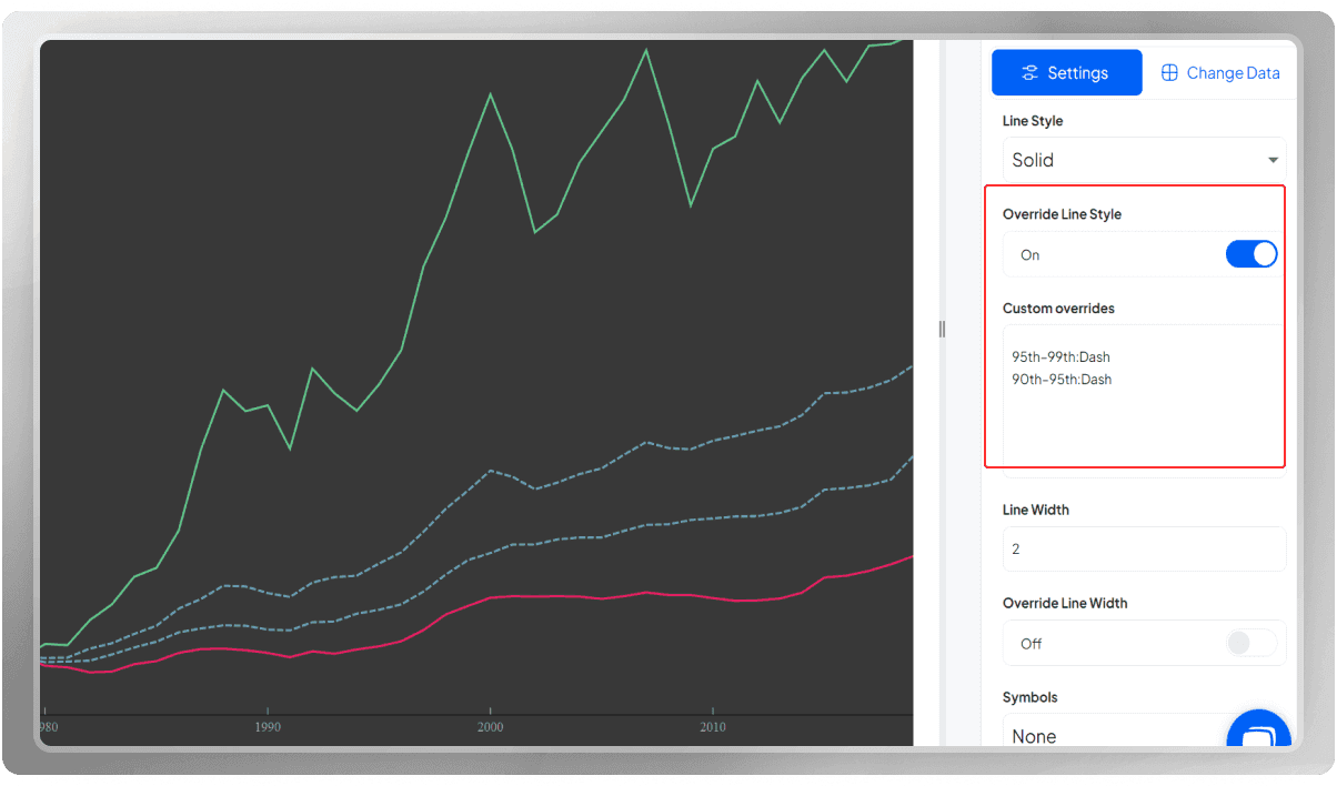
You can pick a different style for the lines. They can be displayed in solid shape, dashed or dotted.

If you wish for specific lines to be in different styles, you should enable “override line styles.”
Write the columns you wish to have different styles, a colon, and the style you have in mind.
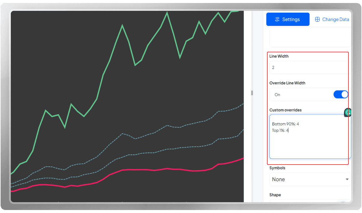
You can customize the width if you want.
If you wish to apply different line width for one or more of the lines (not applied to all), enable "Override Line Width."
Then, write the columns you have in mind, a colon, and your desired width.
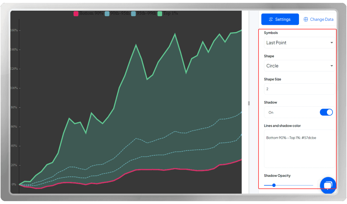
The symbols represent a shape for the data points.
If you’d like to add shadow from one line to the other to make the area darker than the rest of the plot, enable the shadow option, go to the lines and shadow color, choose the columns you want to apply shadow to, write the first one, then two en-dashes, the second column, a colon and then the hex code for the color you have in mind.
With the Opacity option, you can control the transparency of the shadow.
In the X-axis section, put the sampling on custom mode, change the color and size of the labels, and turn off the tick lines.
If you like, you can display the grid lines.
You can decide where to place the Y-axis. Change the color and font of the labels.
Add a margin and grid lines if you like.
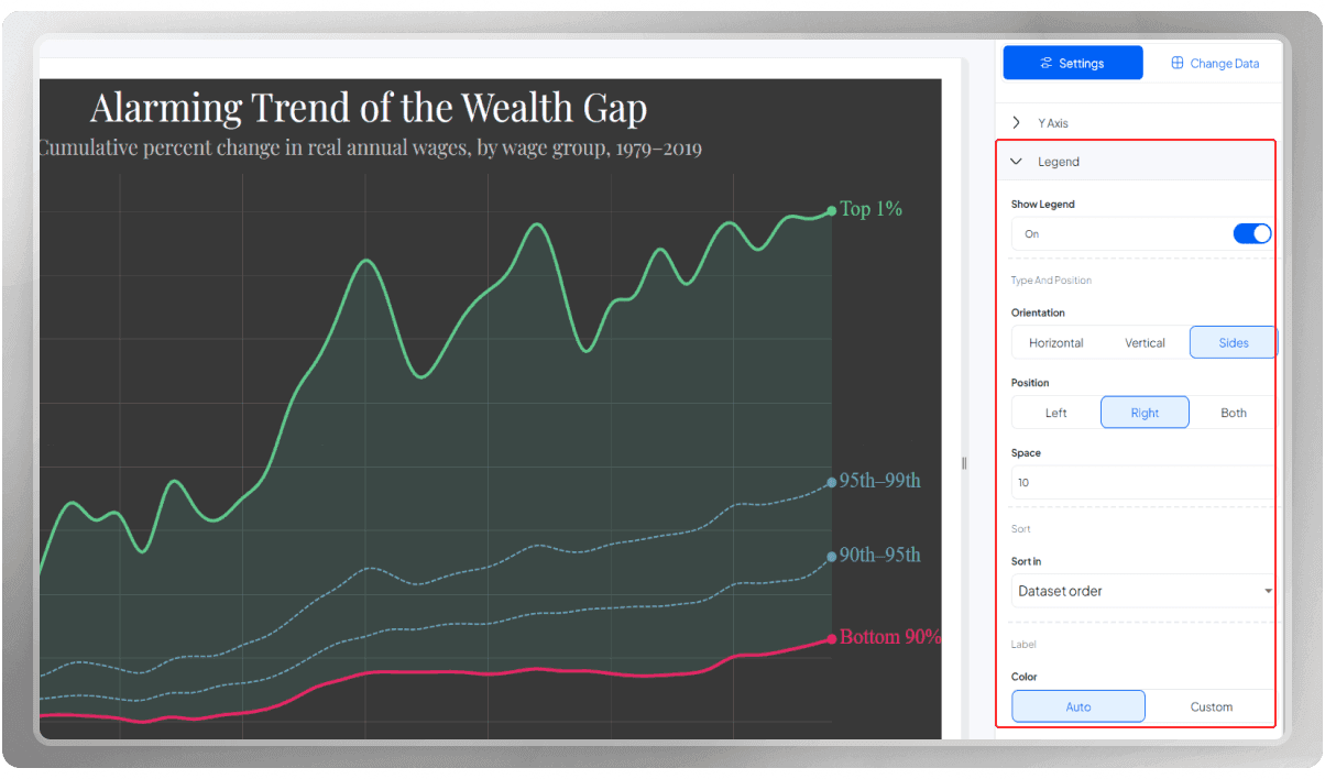
Place the legends on the right side so that they are placed beside their targeted lines.
As you can see, each legend is now representative of its own line.
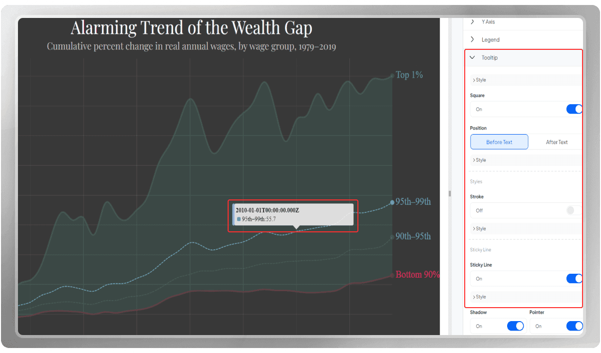
Customize the tooltips by displaying them, adding a stroke option, and changing the color and width of the sticky line and the background color.
Export the chart in PNG, SVG, or JPG format.
You can watch this chart's YouTube tutorial to learn more.
Enjoy charting with PlotSet.