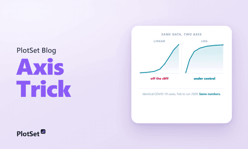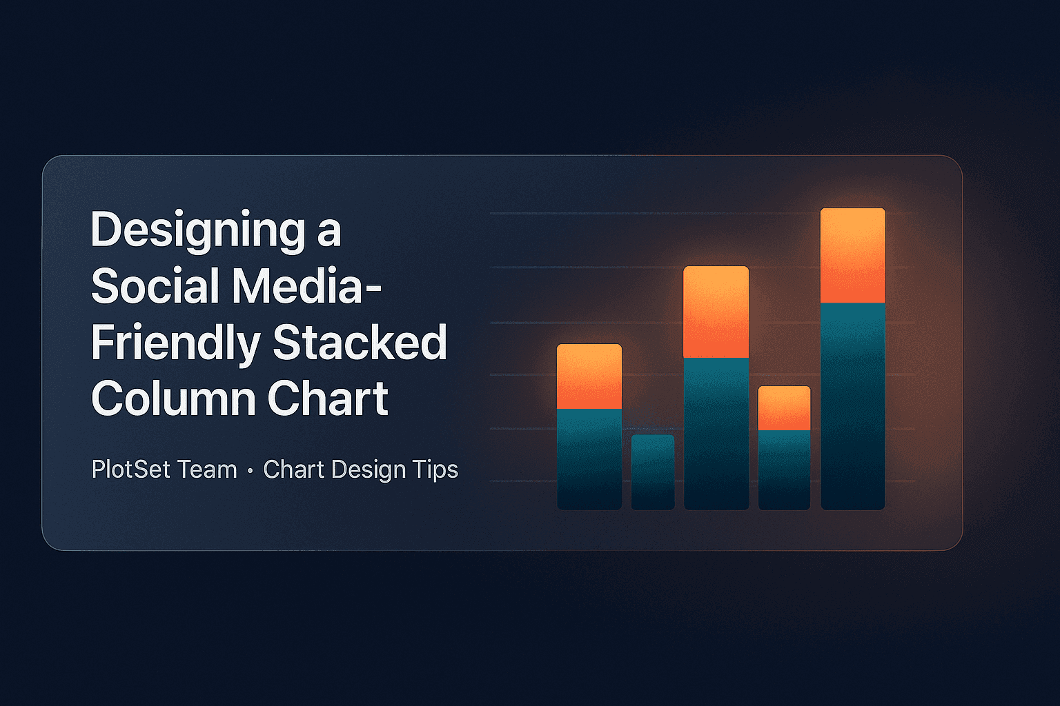
Let's create a stacked column chart worthy of social media attention.
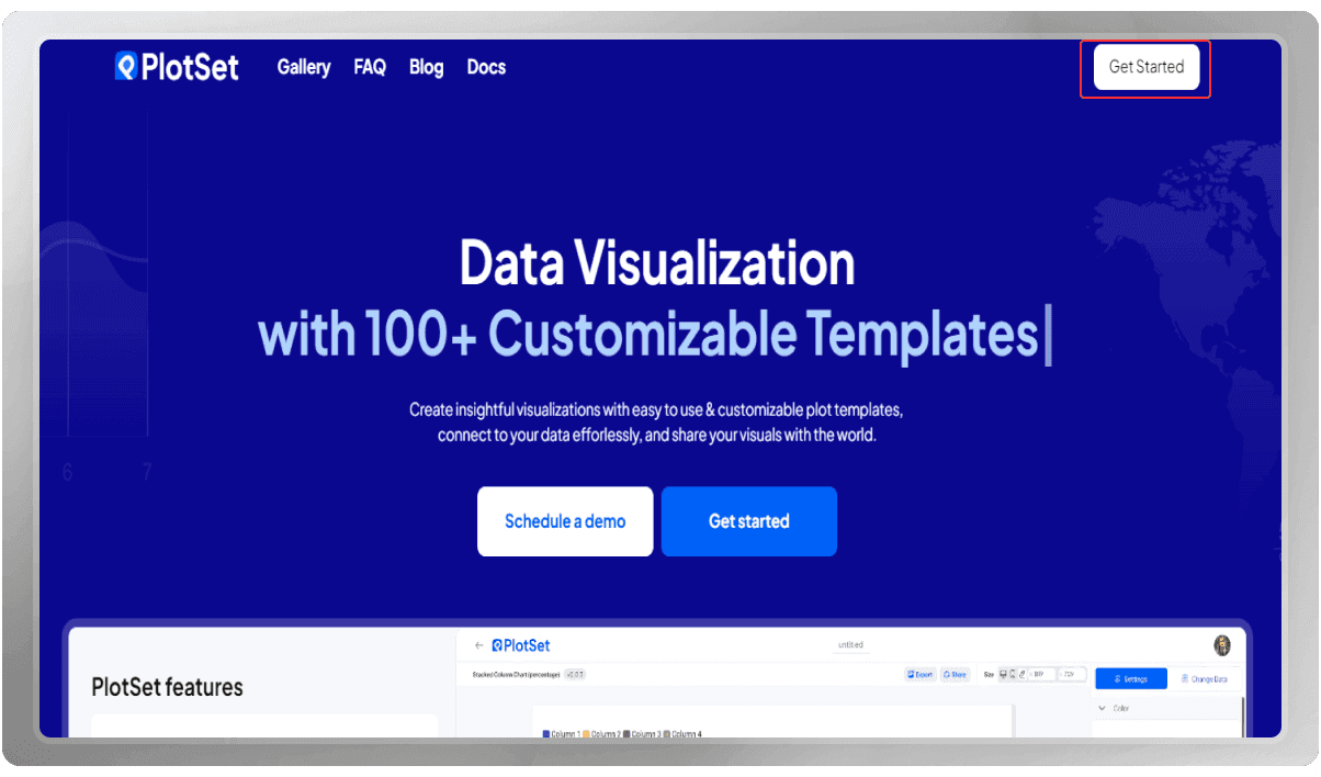
To start, open the PlotSet website and enter your account by clicking the "Get visual" button. If you don't have an account, click the "Register" button and create one for yourself.
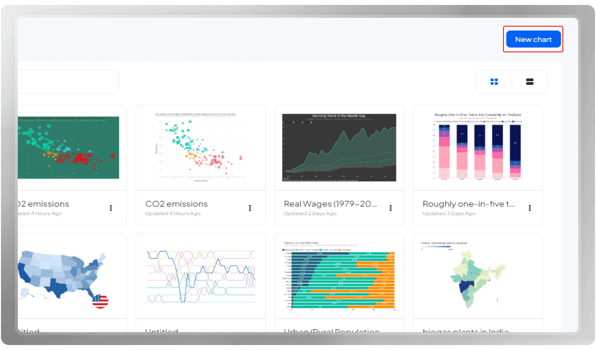
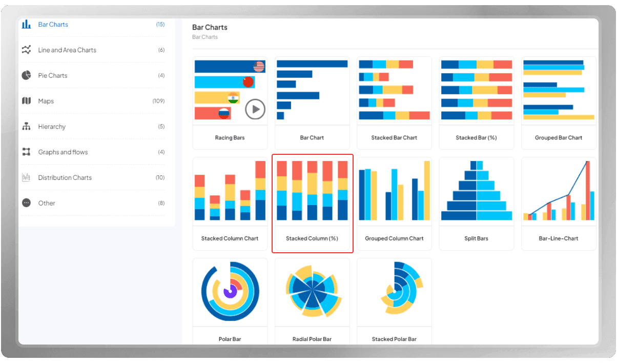
Now, go to your panel and hit "New chart." This will lead you to our template list, where you can choose a template for your data.
Select "Bar Charts" and choose the "Stacked Column Chart (Percentage)" template. This specific chart allows you to convert and represent your data in percentage form.
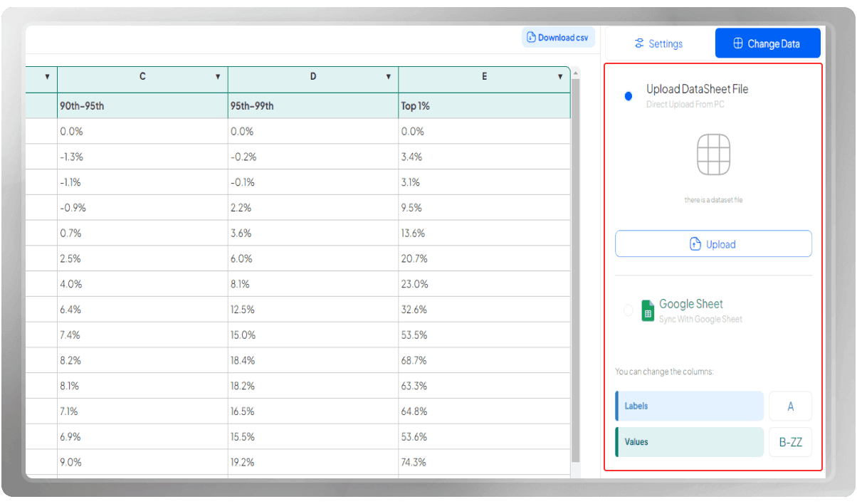
The next thing you need to do is enter the data, which you can do by manually entering the data, uploading a CSV file, or inserting your Google Sheets.
If you are uploading Google Sheets, enable public access for anyone with the link. Copy the link to your Google Sheet and paste it into the "Google Sheets URL" field on the PlotSet panel.
If your data is on a specific sheet, you can specify the sheet name in the "Sheet Name" field. When you are done, hit "Import."
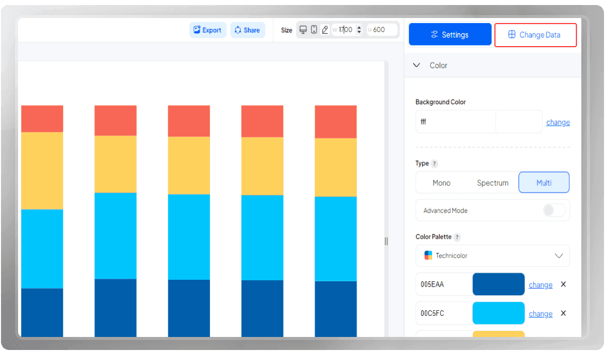
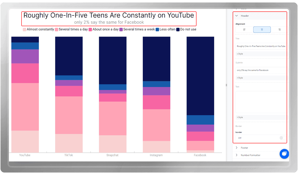
Time to customize your chart. First, add a title for this chart. This title allows you to identify the charts in the panel more easily.
Then, you can go to the color section and customize the color of this template. You can change the background and the color of the bars.
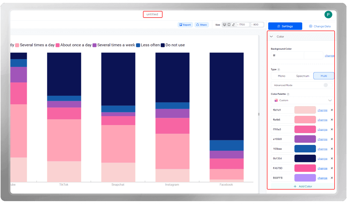
According to your data, you can add a header and a footer to this chart. You can customize the font, size and color of all these information pieces.
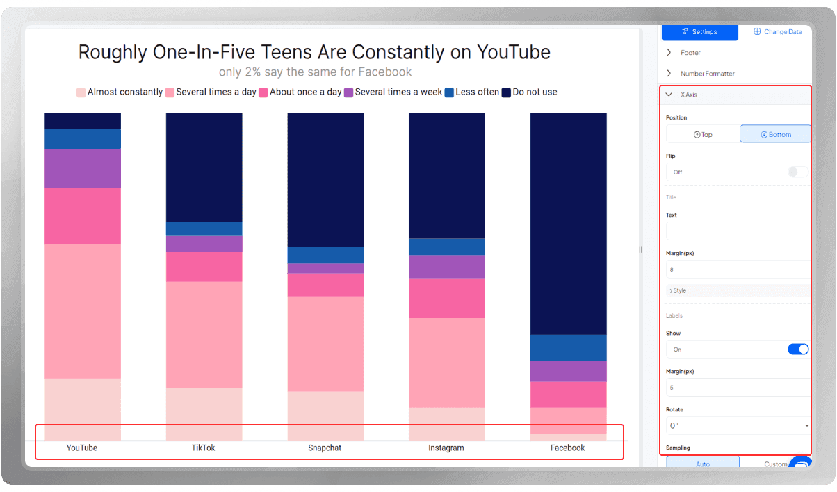
In the X-axis section, you can customize the font, size, and color of the labels and lines and use other features.
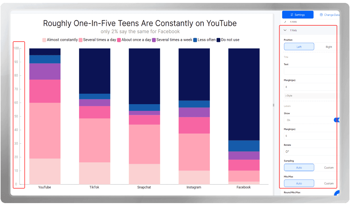
The same thing goes for the Y-axis as well.
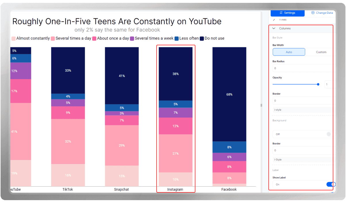
Customize the columns in the chart by activating labels and choosing their font, size, and color.
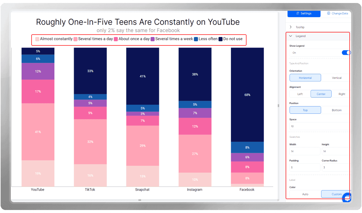
Finally, customize the legends by choosing the position and padding.
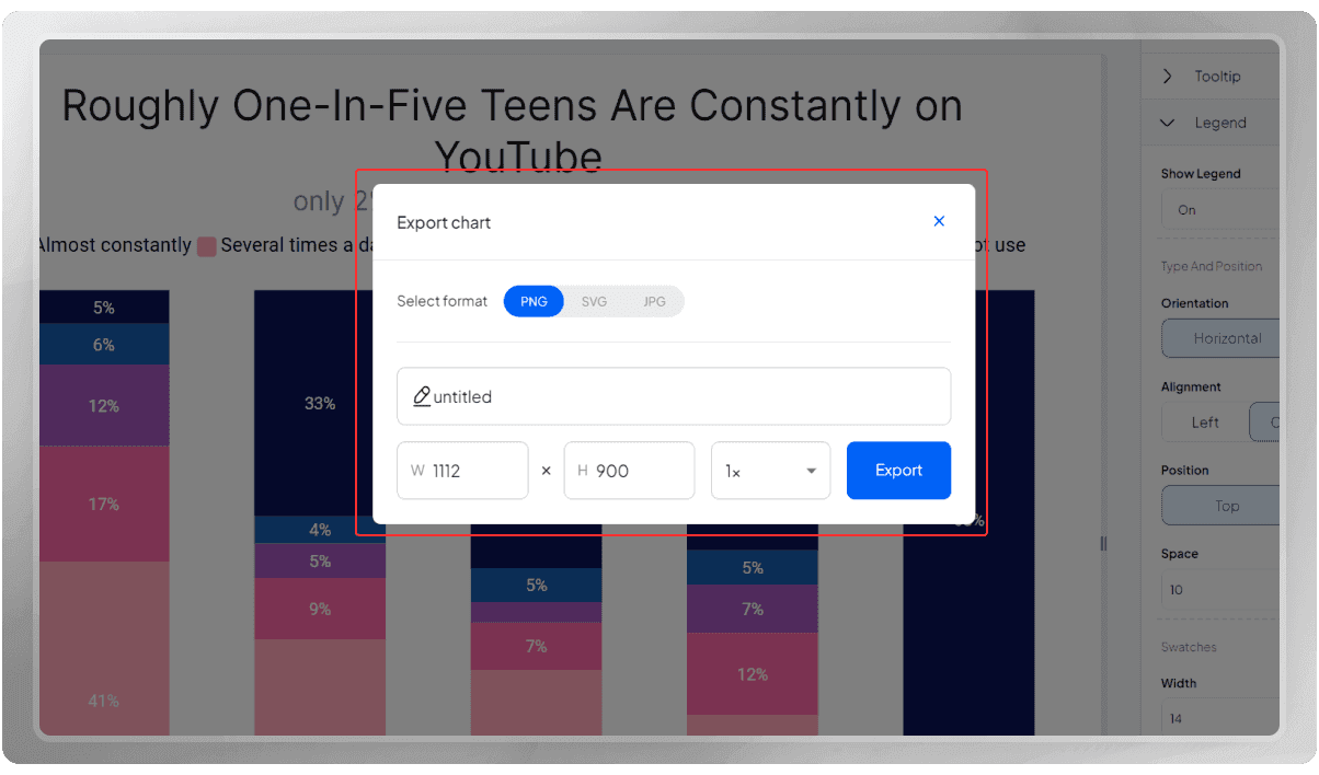
When a chart is completely drawn, you can obtain an export in either PNG, SVG, or JPG format. Choose the one you prefer and hit "export."
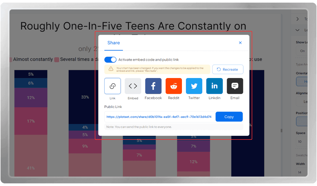
You can also share this chart with someone, publish it on your website, or share it on social media with others.
If you like, you can watch this chart's Tutorial video on our YouTube channel: How to Create a Viral Chart: A Step-by-Step Tutorial
Creating chart is really easy with PlotSet, isn't it?