PlotSet LogoPlotSet

How to Create an Arc Map

A step by step walkthrough for turning a sheet of origins and destinations into a published arc map in PlotSet, from placing coordinates to filtering, publishing and embedding.

约 8 分钟

One curved line per route, drawn across a world map from your own origins and destinations: that is how to create an arc map from a spreadsheet, with thickness showing volume, colour showing a category, and a filter so viewers can isolate one group. It runs through the same click path any published PlotSet chart takes, with your own routes rather than placeholder rows.

If your sheet already has latitude and longitude for both ends of every route, it takes about eight minutes. Allow longer if you only have place names, since the template needs coordinates and looking them up is the one chore an arc map adds.

你需要的数据

One row per route with six required columns: origin name, origin latitude, origin longitude, destination name, destination latitude, destination longitude. Optional columns add arc size, a colour category and a filter group.

示例 CSV
OriginOrigin latOrigin lngDestinationDestination latDestination lngPassengers (000s)Region
London51.5074-0.1278New York40.7128-74.0060620Transatlantic
London51.5074-0.1278Dubai25.204855.2708550Europe-Middle East
London51.5074-0.1278Singapore1.3521103.8198480Europe-Asia
Tokyo35.6762139.6503Los Angeles34.0522-118.2437410Transpacific
备注

Use decimal degrees. Latitude runs from -90 to 90 and longitude from -180 to 180; southern and western places are negative.

Do not swap the columns. If a route lands in the ocean or on the wrong continent, latitude and longitude are almost always reversed.

Keep coordinates as plain numbers with no degree symbols or N/S suffixes, or the row cannot be placed.

The size column should be numeric. The colour and filter columns are text categories, so keep the spelling consistent or one group will split in two.

操作步骤

PlotSet 中从空白模板到完成图表的具体点击路径。

  1. 01

    Open the Arc Map template

    From the PlotSet dashboard, start a new project and choose Arc Map, listed under Maps. It loads with sample world air routes already bound, so you can see the column layout before using your own file.

    PlotSet 的模板选择界面:左侧是图表分类列表,中间展开 Bar Charts 分类的模板网格,Bar Chart 模板卡片上显示「Select」按钮。
    每份指南都从这里开始:先选分类,再选模板,不管你要做哪种图表,用的都是同一个网格。
  2. 02

    Arrange one route per row

    Put the origin and destination names and coordinates on the same row. If you only have city names, look up their coordinates first and add them as columns.

  3. 03

    Upload the file, or connect it live

    Import a CSV or .xlsx file from the data panel, paste rows from a spreadsheet, or connect a Google Sheet so the map can be refreshed later. The first row is read as the column headers.

    PlotSet 编辑器的数据视图:表格中 Name、Value、Region 三列填着加拿大各省的数据,旁边的「Data」面板提供 CSV 上传、「Magic Import」和 Google Sheet 同步。
    这里的数据视图取自一个条形图项目。你可以上传 CSV、用「Magic Import」从图片里提取数字,或同步 Google Sheet,每种图表类型的面板都一样。
  4. 04

    Bind the columns

    Confirm which columns are the origin, destination and coordinates. Then bind the optional size column to arc thickness, the category column to colour, and a filter column if you want viewers to isolate a group.

    PlotSet 数据面板中高亮的列绑定:「Label/time」对应 A 列,「Values」对应 B 列,「Filter/color」对应 C 列,下方是「Auto Binding」按钮。
    绑定决定哪一列作标签、哪一列提供数值、哪一列决定颜色。「Auto Binding」(自动绑定)会根据表头推测,所以要核对一遍,别想当然。
  5. 05

    Pick a projection and base map

    Open the Map tab to choose a flat Mercator view or a rotatable globe, and a light, dark or muted base map. A quiet base makes the arcs stand out.

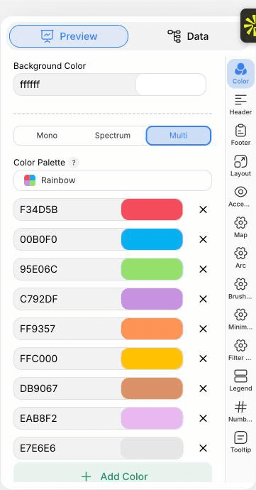
    PlotSet 编辑器停在「Preview」标签页:画布上是做好的 Arc Map,右侧的设置面板用红框标出。
    Arc Map 的「Preview」标签页。所有样式设置都在红框标出的这个面板里,每个设置各自占一个标签页:外观、标题、脚注,以及这种图表类型特有的选项。
  6. 06

    Style the arcs

    In the Arc tab set how curved the routes are, how thickness scales with your size column, and whether colour comes from a category or a gradient. Turn on arrowheads if direction matters.

  7. 07

    Add the filter and legend

    Enable the filter control to show a dropdown or buttons, and place the legend so the colour categories are explained.

  8. 08

    Publish it, embed it, or export it

    Publish for a live, zoomable map where hovering an endpoint highlights its routes, copy the embed code for your page, or export a PNG, SVG or PDF for a static image.

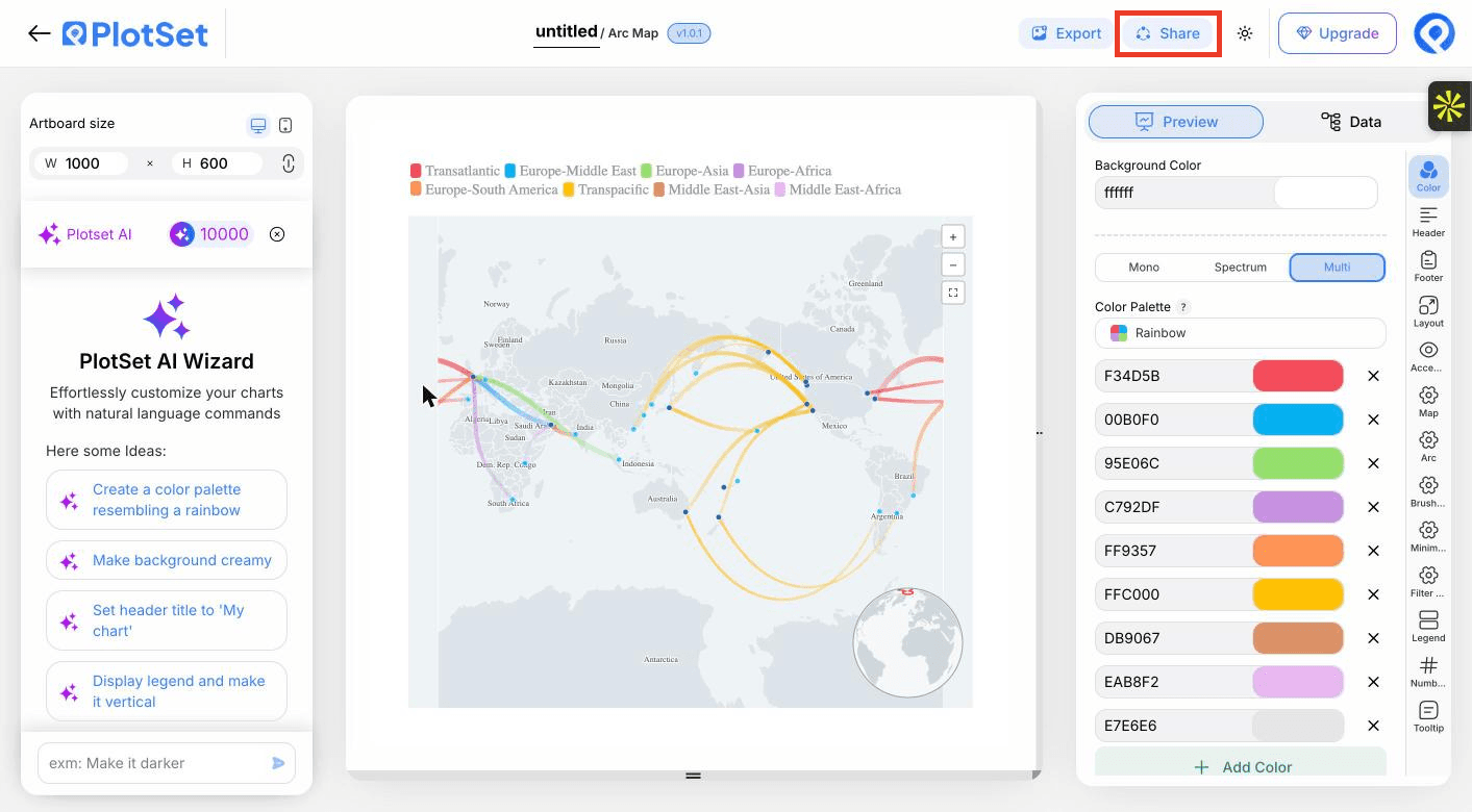
    PlotSet 编辑器工具栏中高亮的「Share」按钮,紧挨着「Export」按钮。
    点「Share」,完成的图表就会变成一个公开链接和一段嵌入代码。

从已加载示例数据的 Arc Map 模板开始,再替换成你自己的数据。

打开模板

发布、嵌入或导出

最后一段路对每种图表都一样:「Share」(分享)把图表变成一个在线的公开链接和一段嵌入代码,「Export」(导出)把它输出成静态文件。

Share:公开链接与嵌入代码

打开嵌入代码和公开链接的开关,图表就发布出去了。链接可以放心发给任何人;嵌入代码以 iframe 的形式放进任意页面,悬停提示和交互效果都会保留。之后修改了图表,点「Recreate」就能把改动同步到链接和嵌入代码两边。

PlotSet 编辑器工具栏中高亮的「Share」按钮,紧挨着「Export」按钮。
点「Share」,完成的图表就会变成一个公开链接和一段嵌入代码。
PlotSet 的「Share」对话框:用于启用嵌入代码和公开链接的开关,「Link」「Embed」「Facebook」「Reddit」「Twitter」「LinkedIn」「Email」几个按钮,以及带「Copy」按钮的图表公开链接。
打开嵌入代码和公开链接的开关,然后复制链接或取用 iframe。之后再修改图表,点「Recreate」就能把改动同步给所有已拿到链接的人。

Export:SVG、PNG 或 JPG

「Export」会按你需要的尺寸输出一份静态副本。SVG 放到多大都清晰,还能在设计工具里继续编辑;幻灯片和文档用 PNG 或 JPG 最稳妥。想让图片在高分屏上够锐利,关键就是那个倍数设置。

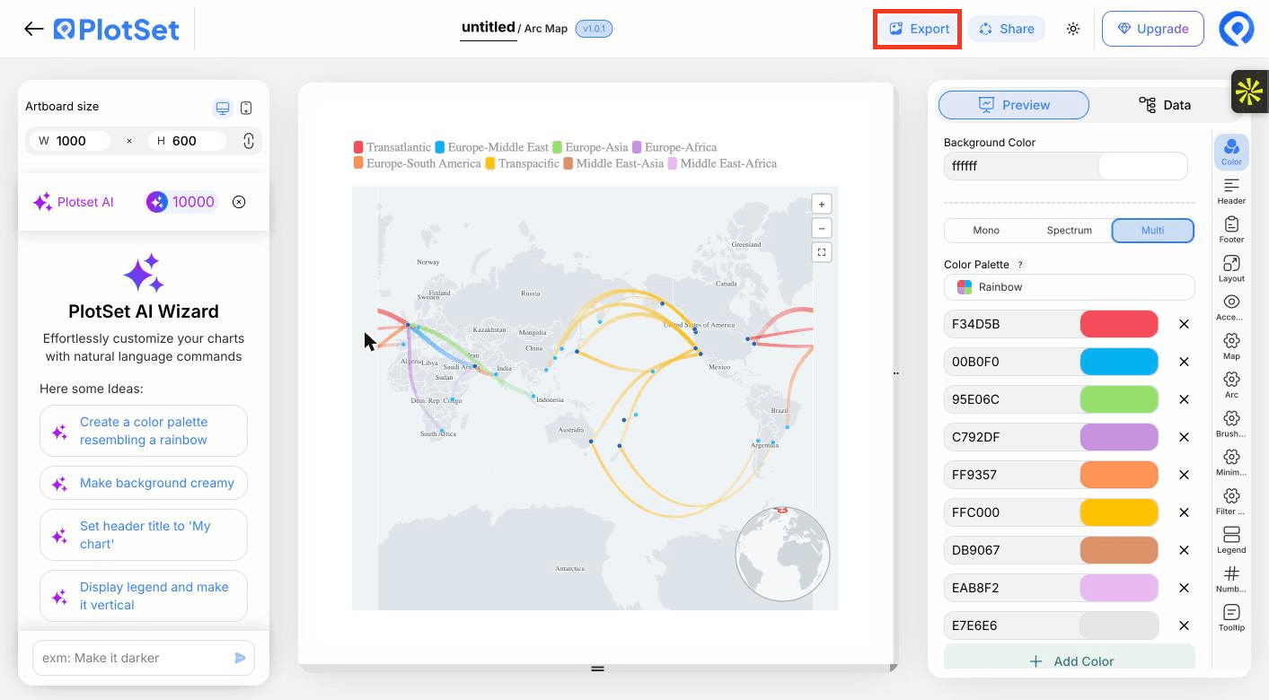
PlotSet 编辑器工具栏中高亮的「Export」按钮。
要做成幻灯片或报告里的静态文件,就走「Export」这条路。
PlotSet 的「Export chart」对话框:倍数选择器设为 2x,宽高输入框填的是 1000 和 600,展开的格式菜单里列出 SVG、PNG 和 JPG。
SVG 放到多大都清晰,还能在设计工具里继续编辑;做幻灯片用 PNG 或 JPG 最稳妥。导出前先设好倍数,图片在高分屏上才够锐利。

Arc Map 的样式提示

Let thickness carry the value

Scaling arc width by passengers or tonnes shows which routes matter. Choose a square-root or log scale when a few routes dwarf the rest.

Use a muted base map

A pale, low-contrast base keeps attention on the routes. Save dark bases for light arcs.

Filter instead of thinning the data

Rather than dropping routes, give them a group column and let viewers switch between them.

Say what thickness means

Add a line to the header or legend, such as thickness shows passengers in thousands, so nobody reads width as distance.

制作 Arc Map 时的常见错误

Routes end up in the ocean

Latitude and longitude are probably swapped. Latitude is the north to south number and must stay between -90 and 90.

Some rows are missing from the map

A coordinate was probably read as text, often from a degree symbol or a stray space. Clean the cell to a plain number and re-upload.

The map is an unreadable tangle

Too many routes at equal weight. Bind a size column, add a filter group, or aggregate to region pairs.

深入了解 Arc Map

不确定 Arc Map 是否是正确选择?查看它是什么、何时使用以及何时不使用。

关于 Arc Map

Arc Map:常见问题

Origin name, origin latitude and longitude, destination name, and destination latitude and longitude, one route per row. Size, colour and filter columns are optional.

现在制作你的 Arc Map

免费开始,300+ 模板任选。无需信用卡。