
示例 CSV
| Source | Target | GWh |
|---|---|---|
| Norway | Sweden | 842 |
| Sweden | Norway | 613 |
| Sweden | Finland | 410 |
| Finland | Sweden | 295 |
| Sweden | Denmark | 378 |
| Denmark | Sweden | 201 |
| Denmark | Germany | 530 |
| Germany | Denmark | 344 |
| Norway | Denmark | 156 |
| Denmark | Norway | 98 |
A step by step walkthrough for turning a source, target and value spreadsheet into a published chord diagram in PlotSet, from the three-column matrix to the ordering that keeps the ribbons readable.
约 9 分钟A matrix of flows between entities is the starting point, and how to create a chord diagram in PlotSet from it, not the sample data that ships with the template, is what this guide covers. You will end up with entities arranged around a circle, ribbons sized to the amounts moving between them, and either a live embed with hover highlighting or a PNG, SVG or PDF you can drop into a deck. The click path is the same one a real PlotSet project follows from upload to publish.
If your data is already three columns, source, target and value, this takes about eight or nine minutes. Add another five if you are pulling the matrix out of a wider report or a pivot table, since that reshaping is the part people usually get stuck on before they ever open PlotSet.
Three columns, one row per directed pair: source entity, target entity, and the amount flowing from source to target. Include a separate row for the reverse direction when the flows are not equal.
| Source | Target | GWh |
|---|---|---|
| Norway | Sweden | 842 |
| Sweden | Norway | 613 |
| Sweden | Finland | 410 |
| Finland | Sweden | 295 |
| Sweden | Denmark | 378 |
| Denmark | Sweden | 201 |
| Denmark | Germany | 530 |
| Germany | Denmark | 344 |
| Norway | Denmark | 156 |
| Denmark | Norway | 98 |
This is long format, not a wide matrix. If your source data looks like a grid with countries down the side and across the top, you need to unpivot it into source, target, value rows before uploading. A spreadsheet's UNPIVOT or a quick PIVOT-to-long formula handles this faster than retyping by hand.
A pair with flow in both directions needs two rows, one each way. Uploading only "Norway,Sweden,842" with nothing for the return trip renders as a one-way ribbon, which is fine if that is genuinely the case, but wrong if you just forgot the other row.
Keep the value column as plain numbers, no thousand separators and no currency symbols. A cell like "1,234" or "$1,234" sometimes imports as text rather than a number, and a text value cannot size a ribbon.
Rows where source and target are the same entity (a self-loop) do not draw a ribbon in a chord layout. Drop them before uploading rather than leaving them in as dead rows.
PlotSet 中从空白模板到完成图表的具体点击路径。
From the PlotSet dashboard, start a new project and choose the Chord Diagram template. It loads with sample data already bound, which is the fastest way to see the three-column shape, source, target, value, before you bring in your own file.

One row per directed pair. If a report gave you a wide matrix instead, with entities down the side and across the top, unpivot it into these three columns first. This is usually the slowest part of the whole process and the one worth doing carefully.
Import a CSV or .xlsx file from the data panel, paste rows directly, or connect a Google Sheet if you want the diagram to pick up new numbers later without a re-upload. PlotSet reads your first row as headers automatically.

Confirm which column feeds each end of the ribbon and which one sets its width. PlotSet usually guesses correctly when your headers are named clearly, but check it manually if your sheet carries extra columns it might have picked up by mistake.

Drag entities in the editor so ones that trade heavily with each other sit next to each other, rather than leaving them in upload or alphabetical order. This single change does more to cut down crossing ribbons than any styling option.
If a handful of entities carry almost no volume, group them into a single "Other" row in your source sheet before re-uploading. Thin ribbons from minor entities add visual noise without adding information, and removing them is usually what turns a knot into a readable diagram.
Ribbon colour is inherited from the source arc by default, which is the setting to keep so a reader can trace where a ribbon started. Turn on hover highlighting so pointing at one entity dims every ribbon except its own; this is what actually makes a dense chord diagram usable rather than decorative.
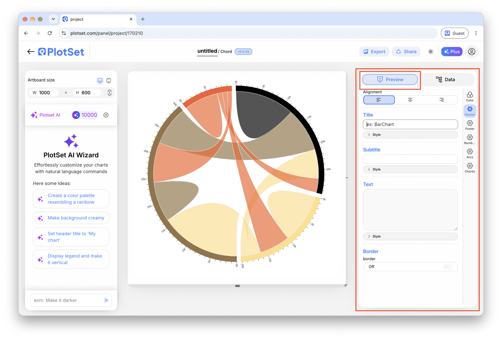
Publish for a live, interactive diagram with the hover highlighting intact and a shareable link, grab the embed code for a page on your own site, or export a static PNG, SVG or PDF if you need an image for a report.
从已加载示例数据的 Chord Diagram 模板开始,再替换成你自己的数据。
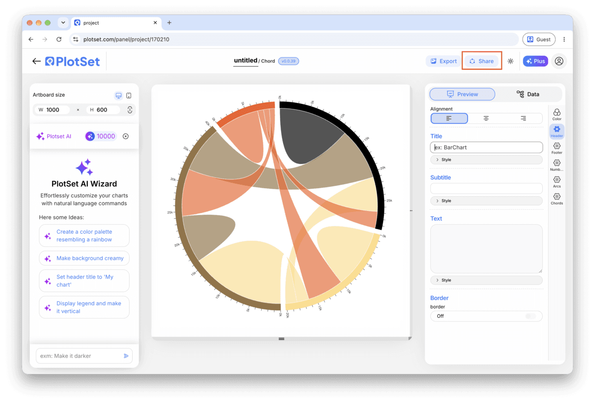
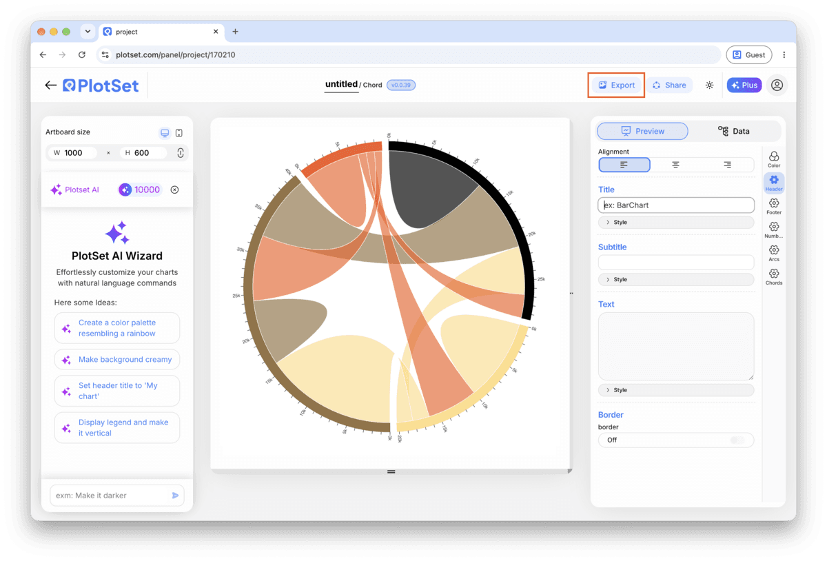
打开模板最后一段路对每种图表都一样:「Share」(分享)把图表变成一个在线的公开链接和一段嵌入代码,「Export」(导出)把它输出成静态文件。
打开嵌入代码和公开链接的开关,图表就发布出去了。链接可以放心发给任何人;嵌入代码以 iframe 的形式放进任意页面,悬停提示和交互效果都会保留。之后修改了图表,点「Recreate」就能把改动同步到链接和嵌入代码两边。

「Export」会按你需要的尺寸输出一份静态副本。SVG 放到多大都清晰,还能在设计工具里继续编辑;幻灯片和文档用 PNG 或 JPG 最稳妥。想让图片在高分屏上够锐利,关键就是那个倍数设置。

Ordering by total flow puts the busiest entities together automatically, but clustering by relationship, region, category, whatever groups things that actually trade with each other, usually cuts crossings further. Try both and keep whichever produces fewer ribbons crossing the centre.
The default spacing keeps each entity's total flow readable as an arc length. Shrinking the gap to fit more entities in usually backfires: past a point, the arcs blur into a single ring and the totals stop being legible at all.
Decide once whether a row means "source sent to target" and stick to it across every row. Mixing conventions partway through a sheet, so one row means "exports" and the next means "imports", produces a diagram that is internally inconsistent even though every number in it is correct.
If you grouped a long tail of small entities into "Other", say so in the title or a caption. A reader who assumes "Other" is a real single entity will misread its arc as one busy participant rather than twelve quiet ones.
This almost always means the sheet only had one row per pair. Check your source data for the return-direction row, Target back to Source, and add it if the underlying flow is genuinely asymmetric or reciprocal.
The value column probably imported as text rather than a number, usually because a cell had a thousand separator, a currency symbol, or a trailing space. Strip formatting from the value column in your spreadsheet and re-upload.
This is what happens past roughly fifteen entities, or with fewer entities left in upload order instead of clustered. Aggregate the smallest entities into an "Other" group and reorder the remaining ones so related entities sit adjacent on the circle.
不确定 Chord Diagram 是否是正确选择?查看它是什么、何时使用以及何时不使用。
Three columns in long format: source, target and value, with one row per directed pair. If your data currently sits in a wide matrix with entities down the side and across the top, unpivot it into these three columns before uploading.
免费开始,300+ 模板任选。无需信用卡。