PlotSet LogoPlotSet

How to Create a Population Pyramid

A step by step walkthrough for turning an age and sex breakdown into a published population pyramid in PlotSet, from shaping the sheet to exporting the finished chart.

约 9 分钟

Your own age and sex breakdown, not the sample data the template ships with, is the input for how to create a population pyramid in PlotSet. You will upload your sheet, get the bands running in the right order with male and female mirrored around a shared centre line, and publish it as a live embed or export it as an image for a report.

If your data already comes as one row per age band with a count for each side, this takes about eight or nine minutes. Add a few more if you are pulling the numbers out of a census table or a statistics office spreadsheet that has extra rows and columns you do not need. The steps below assume a single point in time; if you want the shape to change year by year, that is a separate animated build.

你需要的数据

One row per age band, three columns: the band label first, then one value column for each side. No merged cells, no totals row, one header row.

示例 CSV
Age GroupMaleFemale
0-423202210
5-924102290
10-1424802350
15-1925102390
20-2423902330
25-2922802260
30-3423402350
35-3925602610
40-4427902850
45-4930203110
50-5429403080
55-5926802900
60-6424102710
65-6921502540
70-7417802280
75-7912201780
80+9801890
备注

Keep the age band column as text labels like "0-4" or "80+", not a number range or a date. If a spreadsheet auto-converts "0-4" into a date, PlotSet will read the converted value instead of the band you meant.

Both value columns should hold plain positive counts. Do not pre-negate one side to make it point left; PlotSet mirrors the second column itself, and a negative input just gets mirrored again.

Keep every band the same width. Mixing five-year bands with a wider "80+" bucket is fine at the very top of the pyramid, but a mix of five-year and ten-year bands anywhere else in the middle will distort the silhouette.

If you are working from percentages of the total population instead of raw counts, that is fine too: keep the same three-column shape and just say in the chart title that the axis is a share, not a headcount.


操作步骤

PlotSet 中从空白模板到完成图表的具体点击路径。

  1. 01

    Open the Population Pyramid template

    From the PlotSet dashboard, start a new project and choose the Population Pyramid template. It loads with sample age and sex data already bound, so you can see the exact band, left value, right value layout before you touch your own file.

    PlotSet 的模板选择界面:左侧是图表分类列表,中间展开 Bar Charts 分类的模板网格,Bar Chart 模板卡片上显示「Select」按钮。
    每份指南都从这里开始:先选分类,再选模板,不管你要做哪种图表,用的都是同一个网格。
  2. 02

    Lay out the age band, male and female columns

    Put the age band in the first column, one side's count in the second, and the other side's count in the third, one row per band. Pull this straight out of a census table or statistics office export if that is your source, and drop any rows for totals or age groups you are not covering.

  3. 03

    Upload your file or connect a sheet

    Use the data panel to import a CSV or .xlsx file, paste rows directly from a spreadsheet, or connect a Google Sheet so the pyramid can be refreshed when a new year's figures come out without a full re-upload.

    PlotSet 编辑器的数据视图:表格中 Name、Value、Region 三列填着加拿大各省的数据,旁边的「Data」面板提供 CSV 上传、「Magic Import」和 Google Sheet 同步。
    这里的数据视图取自一个条形图项目。你可以上传 CSV、用「Magic Import」从图片里提取数字,或同步 Google Sheet,每种图表类型的面板都一样。
  4. 04

    Map the band and the two side columns

    Confirm which column is the shared age axis and which two columns feed the left and right sides. PlotSet usually guesses right when your headers say "Male" and "Female" or similar, but check it manually if your sheet has extra columns it might have picked up by mistake.

    PlotSet 数据面板中高亮的列绑定:「Label/time」对应 A 列,「Values」对应 B 列,「Filter/color」对应 C 列,下方是「Auto Binding」按钮。
    绑定决定哪一列作标签、哪一列提供数值、哪一列决定颜色。「Auto Binding」(自动绑定)会根据表头推测,所以要核对一遍,别想当然。
  5. 05

    Check the band order and the side assignment

    The bands should run from youngest at the bottom to oldest at the top; if your source data listed them the other way, or alphabetically, fix the sort in the chart settings rather than re-sorting the spreadsheet. Confirm which column landed on the left and which on the right, since convention puts male on the left and female on the right, and swapping them without saying so will confuse anyone who knows the form.

  6. 06

    Choose counts or percentages, and set the axis

    Decide whether the value axis shows raw counts or each band's share of the total population, then set that axis maximum manually so it is identical on both sides. An automatic axis can pick a slightly different scale for each side and make a symmetric population look lopsided.

  7. 07

    Style the bars and label the centre axis

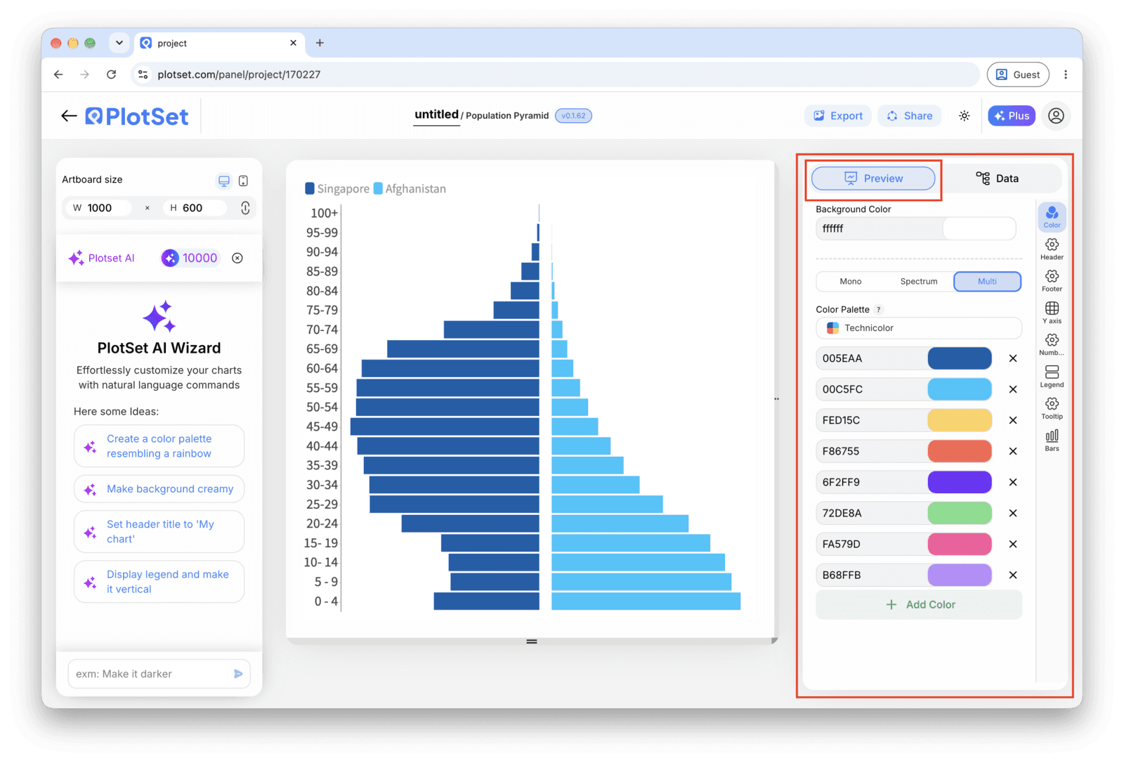
    Pick one colour per side, something distinguishable that is not the pink-and-blue default, and turn on a light gridline at every second or third band if you have more than fifteen rows, so the eye has something to track across from left to right. Add a chart title that states what the pyramid is showing, counts or percentages, and for what year.

    PlotSet 编辑器停在「Preview」标签页:画布上是做好的 Population Pyramid,右侧的设置面板用红框标出。
    Population Pyramid 的「Preview」标签页。所有样式设置都在红框标出的这个面板里,每个设置各自占一个标签页:外观、标题、脚注,以及这种图表类型特有的选项。
  8. 08

    Publish, embed or export the finished pyramid

    Publish for a live, interactive chart where hovering a band shows both values, grab the embed code to drop it into a page, or export a PNG, SVG or PDF if you need a static image for a report or a slide deck.

从已加载示例数据的 Population Pyramid 模板开始,再替换成你自己的数据。

打开模板

发布、嵌入或导出

最后一段路对每种图表都一样:「Share」(分享)把图表变成一个在线的公开链接和一段嵌入代码,「Export」(导出)把它输出成静态文件。

Share:公开链接与嵌入代码

打开嵌入代码和公开链接的开关,图表就发布出去了。链接可以放心发给任何人;嵌入代码以 iframe 的形式放进任意页面,悬停提示和交互效果都会保留。之后修改了图表,点「Recreate」就能把改动同步到链接和嵌入代码两边。

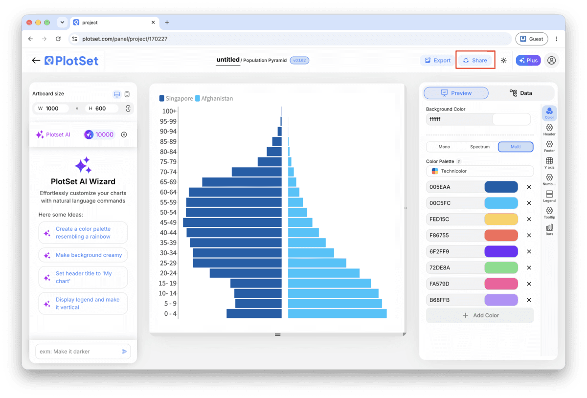
PlotSet 编辑器工具栏中高亮的「Share」按钮,紧挨着「Export」按钮。
点「Share」,完成的图表就会变成一个公开链接和一段嵌入代码。
PlotSet 的「Share」对话框:用于启用嵌入代码和公开链接的开关,「Link」「Embed」「Facebook」「Reddit」「Twitter」「LinkedIn」「Email」几个按钮,以及带「Copy」按钮的图表公开链接。
打开嵌入代码和公开链接的开关,然后复制链接或取用 iframe。之后再修改图表,点「Recreate」就能把改动同步给所有已拿到链接的人。

Export:SVG、PNG 或 JPG

「Export」会按你需要的尺寸输出一份静态副本。SVG 放到多大都清晰,还能在设计工具里继续编辑;幻灯片和文档用 PNG 或 JPG 最稳妥。想让图片在高分屏上够锐利,关键就是那个倍数设置。

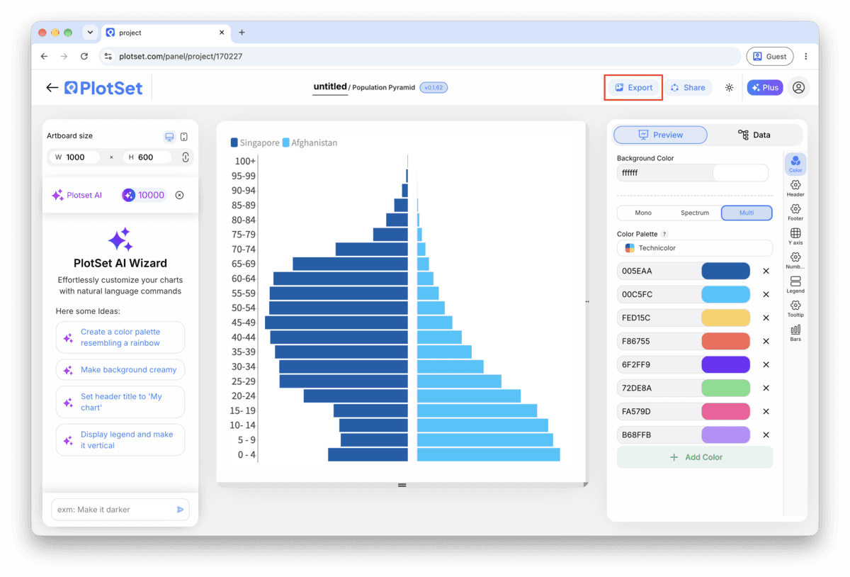
PlotSet 编辑器工具栏中高亮的「Export」按钮。
要做成幻灯片或报告里的静态文件,就走「Export」这条路。
PlotSet 的「Export chart」对话框:倍数选择器设为 2x,宽高输入框填的是 1000 和 600,展开的格式菜单里列出 SVG、PNG 和 JPG。
SVG 放到多大都清晰,还能在设计工具里继续编辑;做幻灯片用 PNG 或 JPG 最稳妥。导出前先设好倍数,图片在高分屏上才够锐利。

Population Pyramid 的样式提示

Lock the band order before you style anything

If the age band column is read as text, PlotSet may default to sorting it alphabetically, which puts "5-9" ahead of "10-14". Set a manual or numeric sort on the band column first, then move on to colour and labels, so you are not restyling a chart that reorders itself underneath you.

Set one axis maximum, not two

Find the larger of your two biggest band values, round it up, and enter that as the fixed maximum for both sides in the axis settings. Typing two separate numbers, even close ones, is the most common way a symmetric pyramid ends up looking tilted.

Thin out labels once you pass fifteen bands

Value labels on every single band get cramped once you are past about fifteen rows, particularly with five-year bands running from 0 to 80+. Switch to labelling every second band, or rely on the hover tooltip in the published version and skip permanent labels altogether.

Add a total population note if you're using percentages

A percentage axis is the right call for comparing two populations, but on its own it hides how big either one actually is. Add a subtitle or caption with the total headcount each side represents, so the shape and the scale of it are both on the page.

制作 Population Pyramid 时的常见错误

Both sides come out on the same side of the centre line

This is a column mapping problem, not a data problem: the second value column got assigned to the same side as the first instead of the mirrored side. Reopen the column mapping step and confirm one value column feeds the left series and the other feeds the right.

The bands run in the wrong order, or out of sequence

If "10-14" appears before "5-9", the band column is being sorted as text rather than by age. Switch the sort on that column to manual or numeric order in the chart settings instead of trying to fix it by renaming the bands in your spreadsheet.

One side looks mirrored twice, or the bars point the wrong way

This happens when a value column was pre-negated in the spreadsheet on the assumption that a pyramid needs negative numbers to point left. PlotSet already mirrors the second series for you, so feed it plain positive counts and let the chart handle the direction.

深入了解 Population Pyramid

不确定 Population Pyramid 是否是正确选择?查看它是什么、何时使用以及何时不使用。

关于 Population Pyramid

Population Pyramid:常见问题

Three columns and one header row: the age band in the first column, then one count column for each side, usually male and female. Keep counts as plain positive numbers; PlotSet mirrors the second column automatically, so you should not pre-negate anything.

现在制作你的 Population Pyramid

免费开始,300+ 模板任选。无需信用卡。