There is a piece of advice in data storytelling that nobody argues with. Do not show ten thousand deaths as a bar. Show ten thousand little human figures, so the reader remembers these are people. The technique has a name, anthropographics, and it has been recommended in conference talks, style guides and nonprofit design decks for a decade.
It has also been measured. Nine experiments, two independent research programs, roughly 1,100 participants. The honest summary is narrower than my headline, so let me correct my own title before going further: these studies never measured "caring." They measured donations, fund allocations, reported empathy, valence and arousal. On the ones about behaviour, the effect is somewhere between nothing and very small. On the ones about reported feeling, there is a real, measurable effect, and it runs in a direction that surprises people.
The same numbers, twice
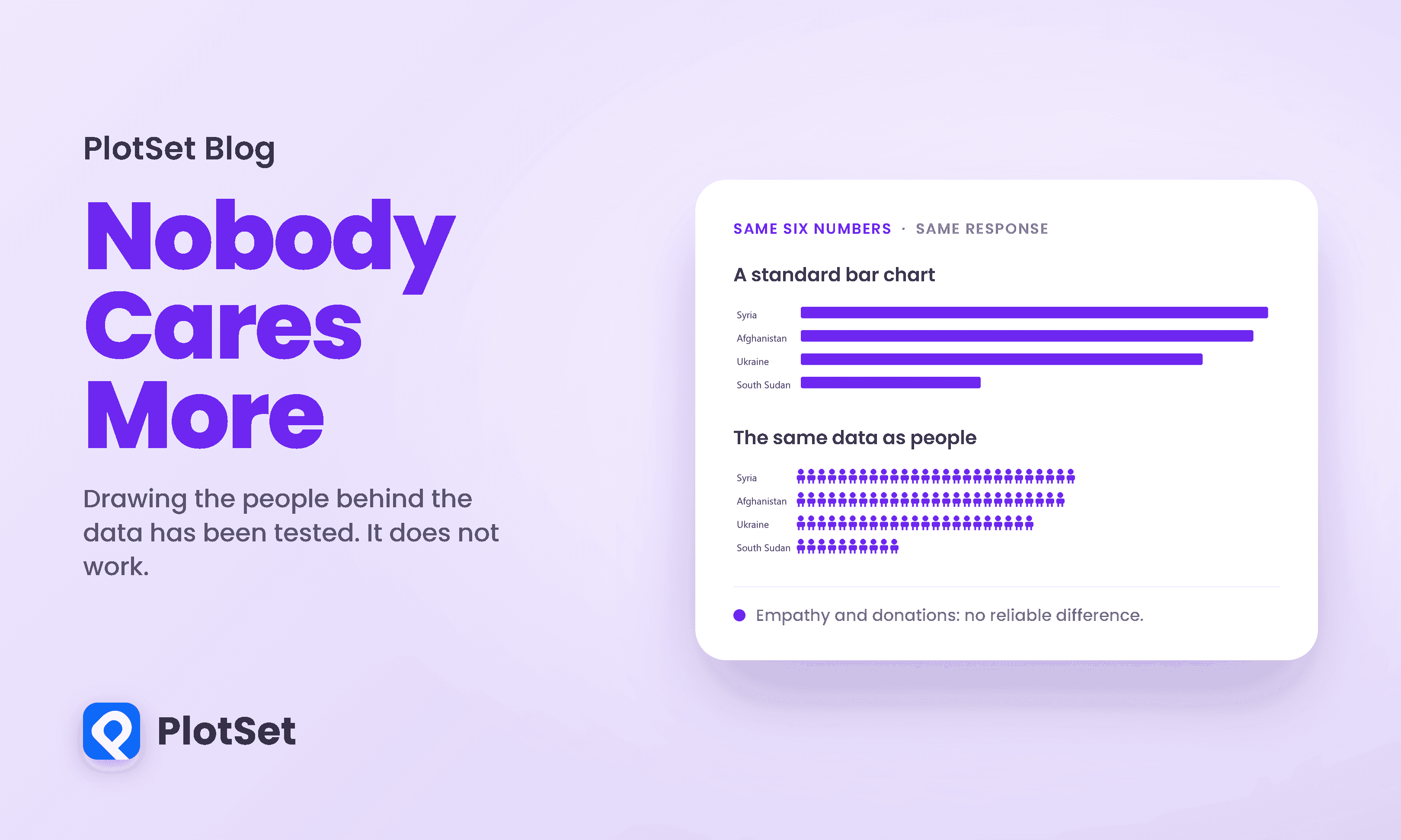
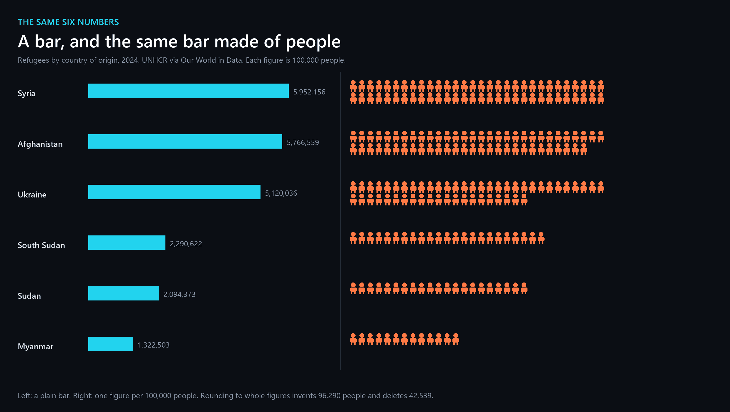
Here is real data: refugees by country of origin in 2024, from UNHCR via Our World in Data. Syria 5,952,156. Afghanistan 5,766,559. Ukraine 5,120,036. This is the same domain both research teams used, which is not a coincidence, since human displacement is where the advice feels most obviously right.
Now the same six numbers as units, one block per hundred thousand people.
And here it is with the units drawn as people, next to the bar, which is the comparison the advice is really about.
What the icon grid costs before anyone reads it
Before the psychology, one mechanical point that gets no attention at all.
A bar can be any length. A person cannot be two thirds of a person, so an icon array has to round to whole figures. At one figure per hundred thousand, drawing those six countries invents 96,290 people who do not exist and deletes 42,539 who do.
Syria gains 47,844 figures' worth of people it does not have. Myanmar loses 22,503. Net, the picture shows 53,751 more refugees than there were, and in gross terms 138,829 people are in the wrong place, which is 0.62 percent of the six-country total.
That is not a large error and I am not going to pretend it is. But it is worth noticing that the chart designed to honour individual people is the one that cannot represent them individually, and quietly relocates a hundred and thirty thousand of them to make the grid come out even.
The first test, and why it could not settle anything
In 2017 Jeremy Boy, Anshul Vikram Pandey, John Emerson, Margaret Satterthwaite, Oded Nov and Enrico Bertini ran seven experiments on this, published at CHI. Participants read a human-rights story with either an anthropographic or a standard chart, then allocated a real ten-dollar bonus between two charities.
Their own summary, verbatim: "Contrary to our expectations, we consistently find that anthropomorphized data graphics and standard charts have very similar effects on empathy and prosocial behavior." They concluded that anthropographics "are neither truly beneficial, nor detrimental" for human-rights narratives.
Here is what those experiments actually looked like as evidence.
Every one of those intervals is about twenty-seven points wide, on samples of 40 to 49 people. An interval that wide is compatible with the anthropographic being modestly better, modestly worse, or making no difference. The study did not find that the technique does nothing. It found that it could not tell.
One interval does exclude a coin flip, and it points the wrong way. Experiment 2, the iconic-individuals design, ran 34.8 percent with an upper bound of 49.2. The authors say there is some evidence that design "actually attracted less donations than the pie chart." Read that with care: it is one interval out of five, it clears the line by less than a point, and with five comparisons you should expect roughly one to wander across a boundary by chance.
The bigger test, and the number everyone gets wrong
Four years later Luiz Morais, Yvonne Jansen, Nazareno Andrade and Pierre Dragicevic ran the study properly: pre-registered, powered for a small effect, 786 valid participants in the main experiment.
The pre-registered primary result is +3.4 percentage points, 95% interval [0.021, 6.8]. That interval excludes zero. By 21 thousandths of a percentage point, but it excludes it.
This is the detail almost every retelling of this literature gets wrong, in both directions. People who want anthropographics to work quote the point estimate and stop. People who want them debunked call the study a null result, which it is not. And the same effect expressed as a standardised difference, Cohen's d of 0.14 with an interval of [−0.0011, 0.28], lands on the other side of zero. One effect, two scales, opposite verdicts, decided by a rounding error.
The honest reading is that the best-powered study ever run on this question found an effect that is either very slightly positive or zero, and cannot distinguish between those two.
There is a distinction worth stating plainly here, because the whole argument turns on it. A study can fail to find an effect because there is none, or because it was too small to see one. A third kind of study, an equivalence test, is designed to show positively that any effect is smaller than some threshold you care about. No equivalence test has been run in this literature. The word does not appear in either paper. So nobody has demonstrated that anthropographics do nothing. What has been demonstrated is that if they do something to behaviour, it is small enough to have escaped 1,100 people.
Where the effect actually is
Something did move, and it is not the thing the advice promises.
In the same experiment, the humanised version significantly changed how people felt. Reported valence shifted by −0.059 on a scale centred at 0.5, with an interval of [−0.088, −0.031] that clearly excludes zero. Readers felt worse looking at the information-rich, personalised version. Arousal did not move: −0.015, interval [−0.058, 0.025].
So the technique works on affect and does not reliably convert affect into money. That is a coherent finding rather than a disappointing one, and it matches a much older result in psychology: people respond to a single identified victim far more strongly than to statistics, and the response does not scale with the number of people involved.
The advice that replaces it is also unsupported
The usual constructive close, and the one I was expecting to write, is that the story around the chart matters more than the shape of the icons. Spend your effort on the sentence.
The same study tested that, and it did not hold either. Morais and colleagues randomised whether the regions in their scenario were anonymised or named, which is exactly a framing manipulation of the kind that advice recommends. The effect on donations was +0.14 percentage points, interval [−3.3, 3.5]. Dead centre on zero, and a tighter interval than most of the others.
I am flagging that because the tidy ending was available and it is not true in these data. If you want to claim narrative framing moves giving, you need a source that tested narrative framing and found something, and this is not it.
What to actually do
Use an icon array when counting is the point. Its real advantage is not empathy, it is that discrete units are countable and communicate small whole numbers well. One in a hundred is easier to grasp as a hundred figures than as a one percent bar.
Do not use it when precision matters. The grid rounds. On the six countries above it relocated 138,829 people. If your numbers do not divide evenly by a sensible unit, the bar is more honest.
Do not expect it to raise donations. Nine experiments and roughly 1,100 people say the effect on giving is somewhere between nothing and about three percentage points, and the best measurement cannot separate that from zero.
Do expect it to change the mood of the page. That is the one effect that has been measured cleanly, and it is worth having on its own terms. Feeling something is not nothing; it is just not the same as doing something.
Be careful what you claim in a pitch. The evidence does not support "humanising the data will increase donations," and there is now enough published work that somebody may check.
Building this in PlotSet
The five charts above use four different PlotSet templates: a bar chart, a unit chart, a column chart of the rounding error, and two dumbbell plots carrying confidence intervals. The dumbbells are the ones doing the real work, because the entire argument of this article is about interval width rather than point estimates, and a chart that plots only the estimate would have hidden the thing worth seeing.
That is the practical lesson for anyone building charts about research. If you find yourself drawing bars for effect sizes, you are throwing away the uncertainty that decides whether the effect is real, and a dumbbell or interval plot costs nothing extra to build.
One honest note about our own tool. The wee-people figure in this article is a generated image, not a PlotSet chart, because our pictogram templates draw square unit blocks and do not currently offer a human-figure glyph. That is a real gap and this article is a decent argument for filling it, with the caveat that the research says the figures will change how the page feels rather than what readers do.
What we are not going to tell you is that any chart type makes people generous. Nine experiments say otherwise, and the most useful thing a chart tool can do here is make it cheap to show the uncertainty alongside the estimate, so that claims like the one in this article's title can be checked rather than repeated.
References
- ACM CHI. Showing People Behind Data. Boy, Pandey, Emerson, Satterthwaite, Nov & Bertini, CHI 2017, 5462-5474 — https://doi.org/10.1145/3025453.3025512
- ACM CHI. Can Anthropographics Promote Prosociality? Morais, Jansen, Andrade & Dragicevic, CHI 2021 — https://doi.org/10.1145/3411764.3445637
- IEEE TVCG. Showing Data About People: A Design Space of Anthropographics. Morais et al., 28(3):1661-1679, 2022 — https://doi.org/10.1109/TVCG.2020.3023013
- OSF. Analysis code and data for the large-sample study — https://osf.io/xqae2/
- Big Data and Society. Anthropographics in COVID-19 simulations. Sorapure, 9(1), 2022 — https://doi.org/10.1177/20539517221098414
- Built In. Human-Looking Data Visualizations Don't Boost Empathy, Yet. Gossett, 28 April 2021 — https://builtin.com/data-science/anthropographics-visualization-empathy
- Organizational Behavior and Human Decision Processes. Sympathy and callousness. Small, Loewenstein & Slovic, 102(2):143-153, 2007 — https://doi.org/10.1016/j.obhdp.2006.01.005
- Judgment and Decision Making. If I look at the mass I will never act. Slovic, 2(2):79-95, 2007 — https://doi.org/10.1017/S1930297500000061
- PNAS. No evidence for nudging after adjusting for publication bias. Maier et al., 119(31), 2022 — https://doi.org/10.1073/pnas.2200300119
- Computer Graphics Forum. Structure and Empathy in Visual Data Storytelling. Liem, Perin & Wood, 39(3):277-289, 2020 — https://doi.org/10.1111/cgf.13980
- Our World in Data. Refugee population by country or territory of origin (UNHCR) — https://ourworldindata.org/grapher/refugee-population-by-country-or-territory-of-origin
- Sociology. The Feeling of Numbers. Kennedy & Hill, 52(4):830-848, 2018 — https://doi.org/10.1177/0038038516674675
- Information Visualization. Feeling Numbers. Campbell & Offenhuber, 18(2), 2019 — https://doi.org/10.1177/1473871619892166
- ACM CHI. Data is Personal. Peck, Ayuso & El-Etr, CHI 2019 — https://doi.org/10.1145/3290605.3300474