
Colorer chaque région
L'intensité de la couleur porte la valeur. Le bon choix pour les taux, les parts et les données par habitant, déjà ajustés à la taille ou à la population.
Ouvrir le modèleA blank Washington State county map to print, and a builder to fill it with your own data. Download the free outline of all 39 counties, or upload a spreadsheet and publish an interactive Washington map you can embed anywhere.
Les 39 counties, en tracé net. Imprimez-le, coloriez-le ou insérez-le dans un document — sans compte et sans attribution.
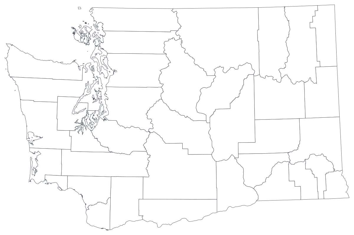
Libre pour tout usage, y compris commercial et scolaire. Généré à partir des mêmes contours que l'éditeur.
Télécharger le SVGWashington divides into 39 counties, and the Cascade Range divides those counties into two states that happen to share a legislature. West of the crest sit the Puget Sound counties — King, Pierce, Snohomish and Kitsap — wet, dense and holding well over half the state's population between them and their neighbours. East of it the land turns dry and agricultural: Grant, Adams, Franklin and Douglas run on irrigation, and Okanogan and Ferry are mostly forest and range. That split is the reason a Washington county map is worth drawing rather than quoting a state average, because almost every measure the state publishes — rainfall, farm output, income, insurance coverage, turnout — changes character somewhere around the Cascade crest. The map's difficulty is the mirror of that: King County alone holds close to three in ten Washingtonians, so any total will draw Seattle and call it a state.
Colorez les régions pour un taux, dimensionnez un marqueur pour un effectif. Inverser les deux est la façon la plus courante de tromper le lecteur.
L'intensité de la couleur porte la valeur. Le bon choix pour les taux, les parts et les données par habitant, déjà ajustés à la taille ou à la population.
Ouvrir le modèleUn symbole par région, mis à l'échelle selon la valeur. À utiliser pour les effectifs et les totaux, là où colorer la surface ne ferait que redessiner la carte de la population.
Ouvrir le modèleDes cercles dimensionnés par la valeur, posés sur le tracé. Efficace quand quelques régions dominent et que les petites disparaîtraient dans un aplat.
Ouvrir le modèleDepartment of Health indicators, Employment Security Department labour figures, OSPI school data, Office of Financial Management population estimates and Secretary of State election returns are all published by county.
Unemployment rate, vaccination coverage, median rent burden, share of the vote. Rates are already adjusted for population, which is what shading a region needs.
The difference between the wet west and the dry east runs through agriculture, water rights, income and politics alike. On a county map it appears as a line down the middle instead of a caveat in the text.
Classroom exercises, field and route planning, colour-by-hand sessions. The free outline above prints cleanly at any size.
Shade by a raw count and King County wins every time — it holds roughly 29 per cent of the state, and the three Puget Sound counties together hold about half. Use symbols or bubbles sized by the count instead.
King County is one shape whether Bellevue and White Center look alike or nothing alike, and it is larger by population than the twenty smallest counties combined. Below the county line, use ZIP codes or census tracts.
Washington has around 295 school districts and its water-resource inventory areas follow rivers, not county lines. Forcing either onto 39 counties will misplace what you are describing.
Small eastern counties are frequently suppressed in health statistics because the numbers are too small to publish. A map that is a third grey is a worse ranked list.
Du tableur à la carte publiée, étape par étape.
The free outline above is a plain SVG of all 39 counties — print it, or drop it into a document. To build with data, open the PlotSet Washington (counties) template, which comes with sample data already bound.
One row per county: the county name or its five-digit FIPS code in the first column, your number in the second. FIPS codes for Washington all begin 53.
Import a CSV or Excel file, paste from a spreadsheet, or connect a Google Sheet so the map can be refreshed when the source updates.
Shade the counties for a rate, or switch to symbols or bubbles for a count. Same geography, same data, different encoding.
Sequential for a low-to-high measure, diverging only when a real midpoint exists — the state average, zero change, a 50 per cent line. Four to six steps read more precisely than a smooth gradient.
Publish for a live interactive map with a tooltip on every county, or export a PNG, SVG or PDF for a report or a deck.
Partez du modèle Washington avec ses données d'exemple, puis remplacez-les par les vôtres.
Ouvrir le modèleÀ quoi doit ressembler la colonne des lieux, et où trouver des données déjà compatibles.
Thirty states have one; this state does not. If a national table gives you a row for 'Washington County, Washington' something upstream has gone wrong, and if you filter a national file on the name 'Washington' you will collect counties in Oregon, Pennsylvania and two dozen other states instead.
The Washington county is Okanogan; the Canadian valley across the border is the Okanagan. They are one letter apart and constantly swapped, and the wrong spelling joins to nothing.
Grays Harbor has no apostrophe, Walla Walla is two words, Pend Oreille is two words with the French spelling, and San Juan covers the islands. Kitsap and Kittitas are different counties on opposite sides of the Cascades.
53001 is Adams, 53077 is Yakima. Store the column as text so the digits survive, and note that the county part is odd-numbered rather than sequential.
The Department of Health, the Employment Security Department, the Office of Superintendent of Public Instruction, the Office of Financial Management, the Secretary of State and the Department of Ecology all publish county tables, as does the Census Bureau's ACS.
It produces a map of Puget Sound every time. Anything that grows simply because more people live there should be a sized symbol, not a shade.
It sounds like a joke until a national dataset joins your state rows to the District of Columbia. Check whether your source uses the state FIPS 53 or the district's 11 before you trust the join.
Okanogan, Yakima, Chelan and Ferry are enormous and lightly populated, so on a shaded map the dry east occupies most of the page while holding a minority of the people. That is worth stating rather than leaving implied.
Health and education datasets routinely withhold counts for small counties like Garfield, Wahkiakum and Columbia. If your import turns a suppression marker into 0, those counties will read as the healthiest in the state.
A sequence of hues has no natural order, so readers cannot tell high from low without checking the legend on every county. Use one hue, light to dark.
Yes. The outline above is a free SVG of all 39 Washington State counties — right-click to save it, print it, or drop it into a worksheet or document. No account needed.
Importez un tableur et publiez une carte interactive en quelques minutes — gratuit, sans carte bancaire.