PlotSet LogoPlotSet

How to Create a Timeline

A step by step walkthrough for turning a list of dated events into a published timeline in PlotSet, from shaping the sheet to exporting or embedding the finished chart.

Environ 7 minutes

This walkthrough covers how to create a timeline in PlotSet out of a sequence of dated events, each carrying a title and just enough context that a reader gets the story without pinging you for the slide deck behind it. Your own milestones go through the same click path a published PlotSet chart takes, from upload to publish, not a demo running on placeholder dates.

Seven minutes is enough once your events already have clean dates and short titles. Still deciding what precision to date things at, or pulling dates out of a spreadsheet that stored them as text, adds another five. Treat the seven minutes below as the target and the rest as buffer.

Les données dont vous avez besoin

Four columns, one row per event: a date, a short title, an optional note, an optional image URL. Only the date and title are required, and one header row.

Exemple de CSV
DateTitleNoteImage
1961-05-25Kennedy commits to the MoonKennedy tells Congress the US will land a man on the Moon before the decade is out
1966-02-03Luna 9 soft-landsFirst spacecraft to land softly on the Moon
1967-01-27Apollo 1 fireCabin fire during a launch rehearsal kills the three man crew
1968-12-21Apollo 8 launchesFirst crewed mission to leave low Earth orbit and circle the Moon
1969-07-20Apollo 11 landsArmstrong and Aldrin land in the Sea of Tranquilityhttps://example.com/images/apollo-11.jpg
1970-04-11Apollo 13 launchesOxygen tank explosion forces the crew to abort the Moon landing
1972-12-14Apollo 17 endsLast crewed Moon landing mission. Cernan is the last to walk on the Moon
Remarques

Keep date precision consistent across every row: all years, or all full dates. PlotSet renders whatever precision you give it, so a chart mixing "1969" with "1969-07-20" reads as sloppy rather than intentional.

Rows do not need to already be in date order before you upload. PlotSet sorts events chronologically once the date column is mapped, so paste them in whatever order your source document used.

The note column is for a sentence or two. Anything longer gets clipped inside the marker card, so put the extra detail in a linked document and use the note for the one line that actually matters.

Image URLs need to be public and stay live. A link into a personal drive folder or a private channel shows a broken image icon on the published chart instead of the picture.

Les étapes

Le parcours exact dans PlotSet, d'un modèle vierge à un graphique terminé.

  1. 01

    Open the Timeline template

    From the PlotSet dashboard, start a new project and choose the Timeline template. It loads with a handful of sample events already bound to a date, a title, a note and an image, so you can see the exact column shape before you touch your own file.

    Le sélecteur de modèles de PlotSet : les catégories de graphiques listées à gauche, la grille 'Bar Charts' ouverte et la carte du modèle 'Bar Chart' affichant son bouton 'Select'.
    Chaque guide commence ici. Choisissez la catégorie, puis le modèle : c'est la même grille quel que soit le type de graphique visé.
  2. 02

    Shape your sheet into four columns

    Date first, then a short title, then an optional note, then an optional image URL, one row per event. Only the date and title columns are required. If your source is a project doc or a wiki page, pull just those four things out rather than dragging in every field you have.

  3. 03

    Get your events into PlotSet

    Import a CSV or .xlsx file from the data panel, paste rows straight from a spreadsheet, or connect a Google Sheet if you expect to add events later without a re-upload. PlotSet reads the first row as headers automatically.

    La vue données de l'éditeur PlotSet : une grille de tableur dont les colonnes 'Name', 'Value' et 'Region' sont remplies de chiffres par province canadienne, à côté du panneau 'Data' qui propose l'import d'un CSV, 'Magic Import' et la synchronisation d'une Google Sheet.
    La vue données, ici sur un projet de graphique en barres. Importez un CSV, extrayez les chiffres d'une image avec 'Magic Import' ou synchronisez une Google Sheet. Le panneau est identique pour tous les types de graphique.
  4. 04

    Map the date, title, note and image columns

    Confirm which column feeds each part of the marker. This is usually automatic when your headers are named clearly, but check it manually if your sheet carries extra columns PlotSet might have guessed wrong on.

    Le panneau de données de PlotSet avec les associations de colonnes mises en évidence : 'Label/time' affecté à la colonne A, 'Values' à la colonne B et 'Filter/color' à la colonne C, et le bouton 'Auto Binding' juste en dessous.
    Les associations déterminent quelle colonne devient l'étiquette, laquelle fournit les valeurs et laquelle pilote la couleur. 'Auto Binding' les devine à partir de vos en-têtes : vérifiez-les plutôt que de les tenir pour acquises.
  5. 05

    Check the order and trim to the events that matter

    PlotSet sorts events chronologically once they are mapped, so scan the result for anything that landed in the wrong place, usually a date typed in an inconsistent format. This is also the point to cut anything that does not change the story. Five to twenty events is the range that stays readable.

  6. 06

    Style the spine and markers

    Set the spine to horizontal or vertical depending on where the chart will live, then size the markers: larger for the two or three events that carry the story, default size for the rest. Leave the alternating left-right layout off unless the events are dense enough that labels start to overlap.

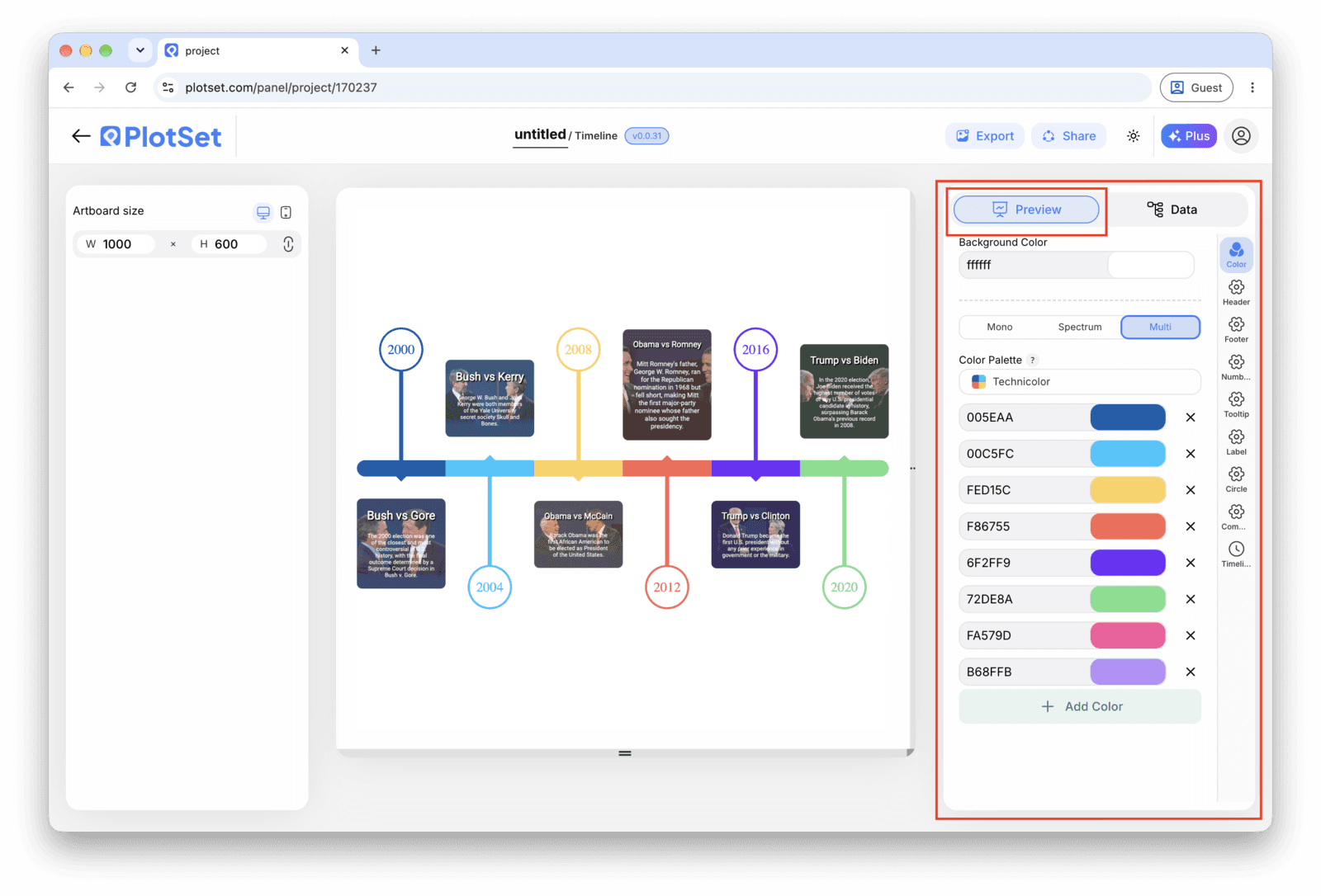
    L'éditeur PlotSet sur l'onglet 'Preview' : un graphique Timeline terminé sur le canevas, avec le panneau de réglages entouré en rouge le long du bord droit.
    L'onglet 'Preview' pour un graphique Timeline. Tous les réglages de style se trouvent dans le panneau entouré en rouge : apparence, en-tête, pied de page et les options propres à ce type de graphique, chacun dans un onglet distinct.
  7. 07

    Write the titles like headlines

    Lead each title with what changed, not the date, since the date is already on the axis right next to it. Save the note for the sentence a reader would want if they stopped to read, and leave it blank on rows where there is nothing worth adding.

  8. 08

    Publish, embed or export the timeline

    Publish for a live, interactive timeline where each marker opens its note and image on click, grab the embed code to drop it into a page, or export a PNG, SVG or PDF if you need a static version for a deck or a report.

Partez du modèle Timeline avec des données d'exemple déjà chargées, puis remplacez-les par les vôtres.

Ouvrir le modèle

Publier, intégrer ou exporter

La dernière ligne droite est la même pour tous les types de graphique : 'Share' transforme le graphique en lien public actif et en code d'intégration, 'Export' l'enregistre sous forme de fichier statique.

Share : lien public et code d'intégration

Activer le code d'intégration et le lien public revient à publier le graphique. Le lien peut être envoyé à qui vous voulez sans risque, et le code d'intégration s'insère dans n'importe quelle page sous la forme d'une iframe qui conserve les infobulles au survol et l'interactivité. Si vous modifiez le graphique par la suite, cliquez sur 'Recreate' pour répercuter ces changements sur le lien comme sur le code.

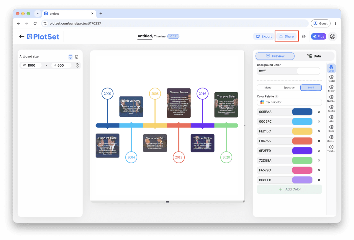
La barre d'outils de l'éditeur PlotSet avec le bouton 'Share' mis en évidence, juste à côté du bouton 'Export'.
C'est par 'Share' qu'un graphique terminé devient un lien public et un code d'intégration.
La fenêtre 'Share' de PlotSet : l'interrupteur qui active le code d'intégration et le lien public, les boutons 'Link', 'Embed', Facebook, Reddit, Twitter, LinkedIn et Email, et le lien public du graphique avec un bouton 'Copy'.
Activez le code d'intégration et le lien public, puis copiez le lien ou récupérez l'iframe. 'Recreate' répercute vos modifications ultérieures sur le lien et le code déjà partagés.

Export : SVG, PNG ou JPG

Le bouton 'Export' génère une copie statique à la taille dont vous avez besoin. Le SVG reste net à toutes les échelles et peut encore être modifié dans un outil de design ; PNG et JPG sont les choix sûrs pour les présentations et les documents. C'est le multiplicateur d'échelle qui vous donne une image nette sur un écran retina.

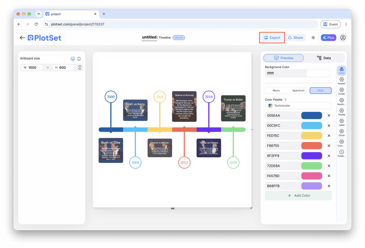
La barre d'outils de l'éditeur PlotSet avec le bouton 'Export' mis en évidence.
C'est par 'Export' que vous obtenez un fichier statique pour une diapositive ou un rapport.
La fenêtre 'Export chart' de PlotSet : un sélecteur d'échelle réglé sur 2x, les champs de largeur et de hauteur à 1000 × 600, et le menu des formats ouvert, affichant SVG, PNG et JPG.
Le SVG reste net à toutes les tailles et modifiable dans un outil de design ; PNG et JPG sont les choix sûrs pour une présentation. Réglez l'échelle avant d'exporter pour que l'image soit nette sur un écran retina.

Conseils de style pour un Timeline

Keep the layout single sided under ten events

The alternating left-right layout earns its place once markers start crowding a single line, but for a short timeline it just adds movement the reader has to track. Turn it on only once labels are genuinely colliding.

Size markers by importance, not decoration

Set a larger marker for the two or three events that actually carry the story and leave the rest at the default size. A reader picks up the hierarchy before they have read a single title.

Save images for the moment they add information

An image on every marker inflates every card to the same height and turns a quick scan into a scroll. Attach one where a photo genuinely tells the reader something the title cannot (a product shot, a diagram, a screenshot) and leave the rest blank.

Match the date format to your actual precision

If your rows are years, set the chart's date format to show years only instead of defaulting to a full date. A timeline that displays a fabricated month and day for an event you only know happened sometime in 1969 is claiming a precision you do not have.

Erreurs courantes en créant un Timeline

Two events land on top of each other

This usually means two rows share the same date, or dates close enough together that the markers overlap and the labels collide. Check the data table for duplicate or near-duplicate dates and either merge them into one event or correct the date if the sources actually disagree.

An event goes missing from the chart

A blank cell in the date column gets skipped rather than flagged, so the row disappears with no error. Scroll through PlotSet's data table and check that every row has a date before assuming your sheet uploaded in full.

A title gets cut off mid word

This means the title is running longer than the marker card has room for, not that anything broke. Shorten it to something closer to a headline and move the rest of the sentence into the note field, which has more room to work with.

En savoir plus sur le Timeline

Vous n'êtes pas sûr que le Timeline soit le bon choix ? Découvrez ce que c'est, quand l'utiliser et quand l'éviter.

À propos du Timeline

Timeline : questions fréquentes

Four columns with one header row: a date, a short title, and two optional columns, a note and an image URL. Only the date and title are required. CSV and .xlsx both work, and a pasted range from any spreadsheet tool is fine too, as long as the date column parses as an actual date rather than text.

Créez votre Timeline maintenant

Gratuit pour commencer avec plus de 300 modèles. Aucune carte bancaire requise.