PlotSet LogoPlotSet

How to Create a Gantt Chart

A step by step walkthrough for turning a task list into a published Gantt chart in PlotSet, from shaping the sheet to exporting or embedding the finished timeline.

Environ 8 minutes

A task list with a start date and an end date on every row is the raw material, and how to create a Gantt chart in PlotSet from it is what this guide walks through: one bar per task, coloured by phase, finishing in a published timeline ready to embed or hand to a client. Not a demo dataset, your own project going through the same click path a real PlotSet chart takes from upload to publish.

If your task list already has clean start and end dates, this takes about eight minutes. Add another ten if you're still pulling dates out of a project management tool's export or fixing a column that stored dates as text instead of real dates. Budget the eight minutes below and treat the rest as buffer.

Les données dont vous avez besoin

Five columns, one row per task: task name, start date, end date, owner, and phase. Dates in ISO format (YYYY-MM-DD), one header row, no merged cells.

Exemple de CSV
TaskStartEndOwnerPhase
Discovery interviews2026-01-052026-01-16PriyaDiscovery
Content audit2026-01-122026-01-23MarcusDiscovery
Wireframes2026-01-192026-02-06PriyaDesign
Visual design2026-02-022026-02-20SanaDesign
Frontend build2026-02-162026-03-20DiegoBuild
CMS integration2026-03-022026-03-27MarcusBuild
QA and content freeze2026-03-232026-04-03SanaQA
Launch2026-04-062026-04-10DiegoLaunch
Remarques

Write dates in ISO format: 2026-01-05, not 1/5/26. PlotSet parses ISO dates the same way every time, while a locale ambiguous date can silently land on the wrong day.

Task name goes in its own column and stays short. It sits in a fixed row margin on the chart, so a long name gets cut off. Put the extra detail in a note elsewhere and let the tooltip carry it.

Owner and phase are optional but do real work: owner becomes the label written inside each bar, phase becomes the bar colour and the legend. Skip either and PlotSet just draws plain, uncoloured bars.

One row per task, no merged cells, no blank spacer rows between phases. A blank row uploads as an empty task with no dates, and PlotSet has nowhere to place it on the timeline.

Les étapes

Le parcours exact dans PlotSet, d'un modèle vierge à un graphique terminé.

  1. 01

    Open the Gantt chart template

    From the PlotSet dashboard, start a new project and choose the Gantt Chart template, listed under Timeline. It loads with a sample project already in place (five tasks with dates, owners and phases) so you can see the exact column shape before swapping in your own.

    Le sélecteur de modèles de PlotSet : les catégories de graphiques listées à gauche, la grille 'Bar Charts' ouverte et la carte du modèle 'Bar Chart' affichant son bouton 'Select'.
    Chaque guide commence ici. Choisissez la catégorie, puis le modèle : c'est la même grille quel que soit le type de graphique visé.
  2. 02

    Lay your tasks out in five columns

    Task name, start date, end date, owner, phase: one row per task. If your source is an export from a project management tool, strip out any status or ID columns you don't need. PlotSet only reads the five above.

  3. 03

    Write every date in ISO format

    Convert start and end dates to YYYY-MM-DD before you upload. If your spreadsheet still shows 04/27/2026, check what the column is actually storing: one formatted as text uploads as text, and PlotSet won't read it as a date.

  4. 04

    Upload the file or connect a sheet

    Import CSV or Excel from the data panel, paste rows directly from a spreadsheet, or connect a Google Sheet so the timeline can be refreshed later without a re-upload.

    La vue données de l'éditeur PlotSet : une grille de tableur dont les colonnes 'Name', 'Value' et 'Region' sont remplies de chiffres par province canadienne, à côté du panneau 'Data' qui propose l'import d'un CSV, 'Magic Import' et la synchronisation d'une Google Sheet.
    La vue données, ici sur un projet de graphique en barres. Importez un CSV, extrayez les chiffres d'une image avec 'Magic Import' ou synchronisez une Google Sheet. Le panneau est identique pour tous les types de graphique.
  5. 05

    Bind Start, End, Y axis, Labels and Category

    Start and End take the two date columns. Y axis takes the task name, which labels each row. Labels takes the text written inside the bar, usually the owner. Category takes the phase, which colours the bars and builds the legend.

    Le panneau de données de PlotSet avec les associations de colonnes mises en évidence : 'Label/time' affecté à la colonne A, 'Values' à la colonne B et 'Filter/color' à la colonne C, et le bouton 'Auto Binding' juste en dessous.
    Les associations déterminent quelle colonne devient l'étiquette, laquelle fournit les valeurs et laquelle pilote la couleur. 'Auto Binding' les devine à partir de vos en-têtes : vérifiez-les plutôt que de les tenir pour acquises.
  6. 06

    Sort tasks by start date

    Order the rows by start date, either in the source sheet or in PlotSet's data table, so the chart cascades top to bottom in the order the work actually happens. A Gantt chart sorted alphabetically hides the one thing it's good at showing.

  7. 07

    Set the axis interval to match the plan's length

    A project spanning a few months reads well with week or month ticks; a multi year roadmap wants quarters. Open the axis settings and pick the interval that fits, or the labels will crowd into each other.

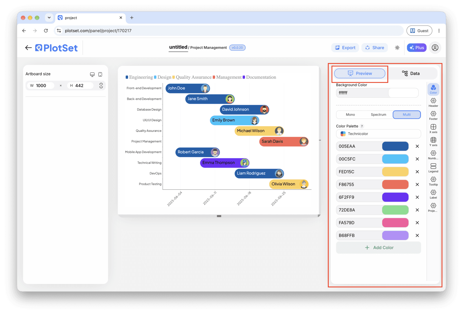
    L'éditeur PlotSet sur l'onglet 'Preview' : un graphique Gantt Chart terminé sur le canevas, avec le panneau de réglages entouré en rouge le long du bord droit.
    L'onglet 'Preview' pour un graphique Gantt Chart. Tous les réglages de style se trouvent dans le panneau entouré en rouge : apparence, en-tête, pied de page et les options propres à ce type de graphique, chacun dans un onglet distinct.
  8. 08

    Publish, embed or export the timeline

    Publish for a live timeline with a tooltip on every bar and a shareable link, grab the embed code for a status page or wiki, or export a PNG, SVG or PDF for a deck.

Partez du modèle Gantt Chart avec des données d'exemple déjà chargées, puis remplacez-les par les vôtres.

Ouvrir le modèle

Publier, intégrer ou exporter

La dernière ligne droite est la même pour tous les types de graphique : 'Share' transforme le graphique en lien public actif et en code d'intégration, 'Export' l'enregistre sous forme de fichier statique.

Share : lien public et code d'intégration

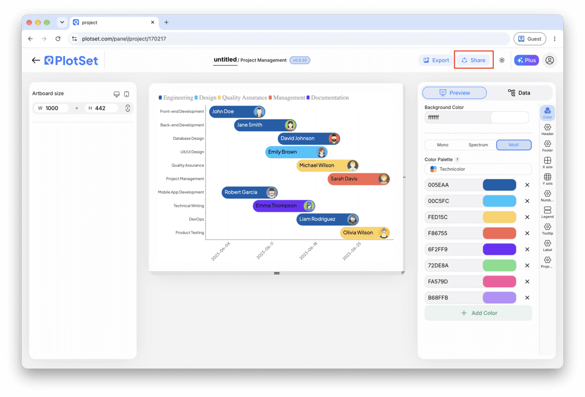
Activer le code d'intégration et le lien public revient à publier le graphique. Le lien peut être envoyé à qui vous voulez sans risque, et le code d'intégration s'insère dans n'importe quelle page sous la forme d'une iframe qui conserve les infobulles au survol et l'interactivité. Si vous modifiez le graphique par la suite, cliquez sur 'Recreate' pour répercuter ces changements sur le lien comme sur le code.

La barre d'outils de l'éditeur PlotSet avec le bouton 'Share' mis en évidence, juste à côté du bouton 'Export'.
C'est par 'Share' qu'un graphique terminé devient un lien public et un code d'intégration.
La fenêtre 'Share' de PlotSet : l'interrupteur qui active le code d'intégration et le lien public, les boutons 'Link', 'Embed', Facebook, Reddit, Twitter, LinkedIn et Email, et le lien public du graphique avec un bouton 'Copy'.
Activez le code d'intégration et le lien public, puis copiez le lien ou récupérez l'iframe. 'Recreate' répercute vos modifications ultérieures sur le lien et le code déjà partagés.

Export : SVG, PNG ou JPG

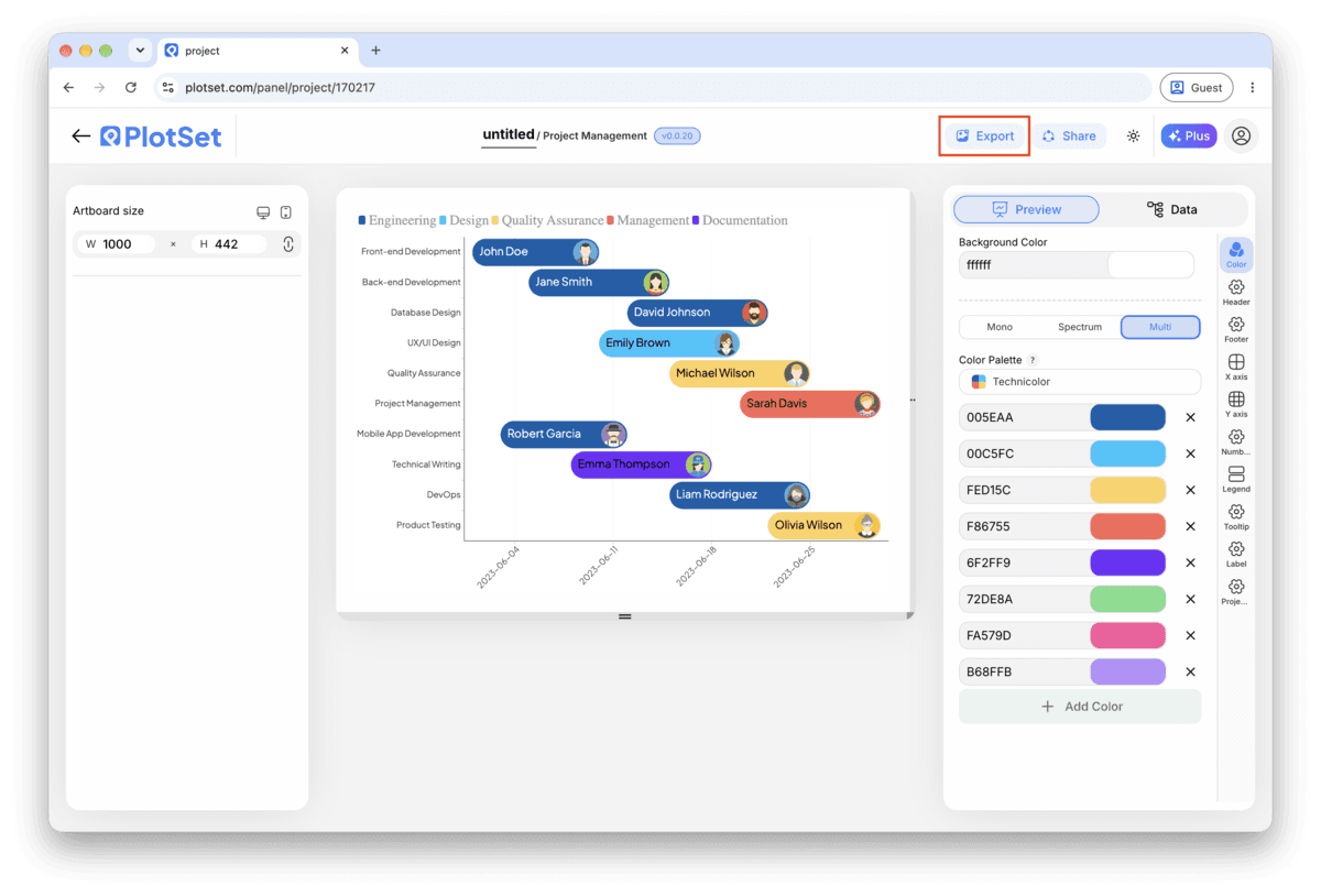
Le bouton 'Export' génère une copie statique à la taille dont vous avez besoin. Le SVG reste net à toutes les échelles et peut encore être modifié dans un outil de design ; PNG et JPG sont les choix sûrs pour les présentations et les documents. C'est le multiplicateur d'échelle qui vous donne une image nette sur un écran retina.

La barre d'outils de l'éditeur PlotSet avec le bouton 'Export' mis en évidence.
C'est par 'Export' que vous obtenez un fichier statique pour une diapositive ou un rapport.
La fenêtre 'Export chart' de PlotSet : un sélecteur d'échelle réglé sur 2x, les champs de largeur et de hauteur à 1000 × 600, et le menu des formats ouvert, affichant SVG, PNG et JPG.
Le SVG reste net à toutes les tailles et modifiable dans un outil de design ; PNG et JPG sont les choix sûrs pour une présentation. Réglez l'échelle avant d'exporter pour que l'image soit nette sur un écran retina.

Conseils de style pour un Gantt Chart

Colour by phase, not by owner

Category drives one colour scheme. Bind it to phase and everyone sees the project's structure at a glance. If owner also needs to be visible, put it in the bar label instead of fighting for a second colour dimension.

Keep task names to a few words

The row label sits in a fixed margin on the left. A short name like "Frontend build" reads fine; a full sentence gets truncated. Save the detail for the tooltip, which shows the whole row on hover.

Order rows by start date, not by phase or owner

The cascade down the chart is what makes a Gantt chart readable in two seconds. Grouping by phase or owner instead breaks that cascade and turns the chart back into a list with bars attached.

Match the axis interval to the plan's span

Day ticks on a two year roadmap are unreadable; month ticks on a three week sprint hide all the detail. Set the interval once you know how long the whole plan runs, not before.

Erreurs courantes en créant un Gantt Chart

All the bars start on the same day

This usually means Start and End are mapped to the same column, or the date column uploaded as text instead of a real date. Check the column bindings first, then confirm the dates are in ISO format (YYYY-MM-DD) in the source sheet.

The rows don't cascade, they look scattered

The task rows are probably still in their original spreadsheet order rather than sorted by start date. Sort the source sheet, or the data table inside PlotSet, by the start date column and check again.

Task names are cut off in the row labels

The label margin has a fixed width and doesn't wrap. Shorten the task names in the source column and move any extra detail into a separate note; the tooltip already shows the full row on hover.

En savoir plus sur le Gantt Chart

Vous n'êtes pas sûr que le Gantt Chart soit le bon choix ? Découvrez ce que c'est, quand l'utiliser et quand l'éviter.

À propos du Gantt Chart

Gantt Chart : questions fréquentes

Lay your data out one task per row: task name, start date, end date, owner and phase, with dates in ISO format (YYYY-MM-DD). Upload the file, bind Start and End to the date columns and Y axis to the task name, and PlotSet draws one bar per task on a shared calendar.

Créez votre Gantt Chart maintenant

Gratuit pour commencer avec plus de 300 modèles. Aucune carte bancaire requise.