PlotSet LogoPlotSet

How to Create a Scatter Plot

A step by step walkthrough for plotting two numeric columns from your own spreadsheet in PlotSet, grouping the points by category, and publishing, embedding or exporting the result.

Environ 7 minutes

This guide covers how to create a scatter plot in PlotSet from your own numbers, not a demo dataset: two numeric columns bound to X and Y, an optional category column colouring the points into groups, and axes and labels that actually say what the numbers mean. By the end you will have gone through the same click path a published PlotSet chart takes, from a raw spreadsheet to something you can embed or drop into a deck.

Seven minutes covers it when your sheet already has two clean numeric columns, most of that spent on labelling and styling rather than wrestling the data itself. Pulling numbers out of a wider report, or cleaning up a category column for grouping, adds another five to ten.

Les données dont vous avez besoin

One row per record, with two numeric columns for the axes plus an optional label column and an optional category column for colour grouping. Just one header row, no merged cells.

Exemple de CSV
CampaignChannelSpendRevenue
Spring LaunchPaid Search420018900
Summer SalePaid Search610024300
Back to SchoolPaid Social380011200
Holiday PushPaid Social720019800
Retargeting Q1Email12009800
Newsletter PromoEmail9006200
Influencer CollabPaid Social540015100
Display RetargetPaid Search260010400
Remarques

Both axis columns need to be numbers, not text that merely looks numeric. A currency symbol or a thousands separator left in as text will stop the column from binding to an axis, so strip formatting before uploading.

The label column (here, Campaign) is optional but worth keeping: it is what shows up in the tooltip and in any point labels you turn on later, instead of a bare coordinate.

The category column (here, Channel) is optional too. Skip it for a plain single-colour scatter plot, or keep it if you want the points grouped and coloured by that channel, region or segment.

One row per record, not per aggregate. If your source is already a pivot table of averages, decide whether you actually want the underlying rows plotted or a smaller, pre-aggregated table instead.


Les étapes

Le parcours exact dans PlotSet, d'un modèle vierge à un graphique terminé.

  1. 01

    Open the scatter plot template

    From the PlotSet dashboard, start a new project and choose the Scatter Plot template. It loads as a scatter plot with groups and comes with sample data already bound, so you can see the exact column layout it expects before touching your own file.

    Le sélecteur de modèles de PlotSet : les catégories de graphiques listées à gauche, la grille 'Bar Charts' ouverte et la carte du modèle 'Bar Chart' affichant son bouton 'Select'.
    Chaque guide commence ici. Choisissez la catégorie, puis le modèle : c'est la même grille quel que soit le type de graphique visé.
  2. 02

    Shape your sheet into the right columns

    Put your two numeric measures in their own columns, add a label column if you want readable tooltips, and add a category column only if you plan to colour the points by group. Drop any subtotal or average row before uploading.

  3. 03

    Bring in your file or link a sheet

    Import a CSV or .xlsx file from the data panel, paste rows straight from a spreadsheet, or connect a Google Sheet if you want later edits to flow through without a re-upload. PlotSet reads the first row as headers automatically.

    La vue données de l'éditeur PlotSet : une grille de tableur dont les colonnes 'Name', 'Value' et 'Region' sont remplies de chiffres par province canadienne, à côté du panneau 'Data' qui propose l'import d'un CSV, 'Magic Import' et la synchronisation d'une Google Sheet.
    La vue données, ici sur un projet de graphique en barres. Importez un CSV, extrayez les chiffres d'une image avec 'Magic Import' ou synchronisez une Google Sheet. Le panneau est identique pour tous les types de graphique.
  4. 04

    Map the X and Y columns

    Assign one numeric column to the X axis and the other to Y. PlotSet usually guesses correctly when your headers are clear, but check the mapping manually if your sheet carries extra numeric columns it might have picked the wrong one from.

    Le panneau de données de PlotSet avec les associations de colonnes mises en évidence : 'Label/time' affecté à la colonne A, 'Values' à la colonne B et 'Filter/color' à la colonne C, et le bouton 'Auto Binding' juste en dessous.
    Les associations déterminent quelle colonne devient l'étiquette, laquelle fournit les valeurs et laquelle pilote la couleur. 'Auto Binding' les devine à partir de vos en-têtes : vérifiez-les plutôt que de les tenir pour acquises.
  5. 05

    Turn on grouping by category

    If you included a category column, bind it to colour so each group gets its own shade and its own entry in the legend. Skip this step entirely for a single-series scatter plot: one colour is correct when there is nothing to group.

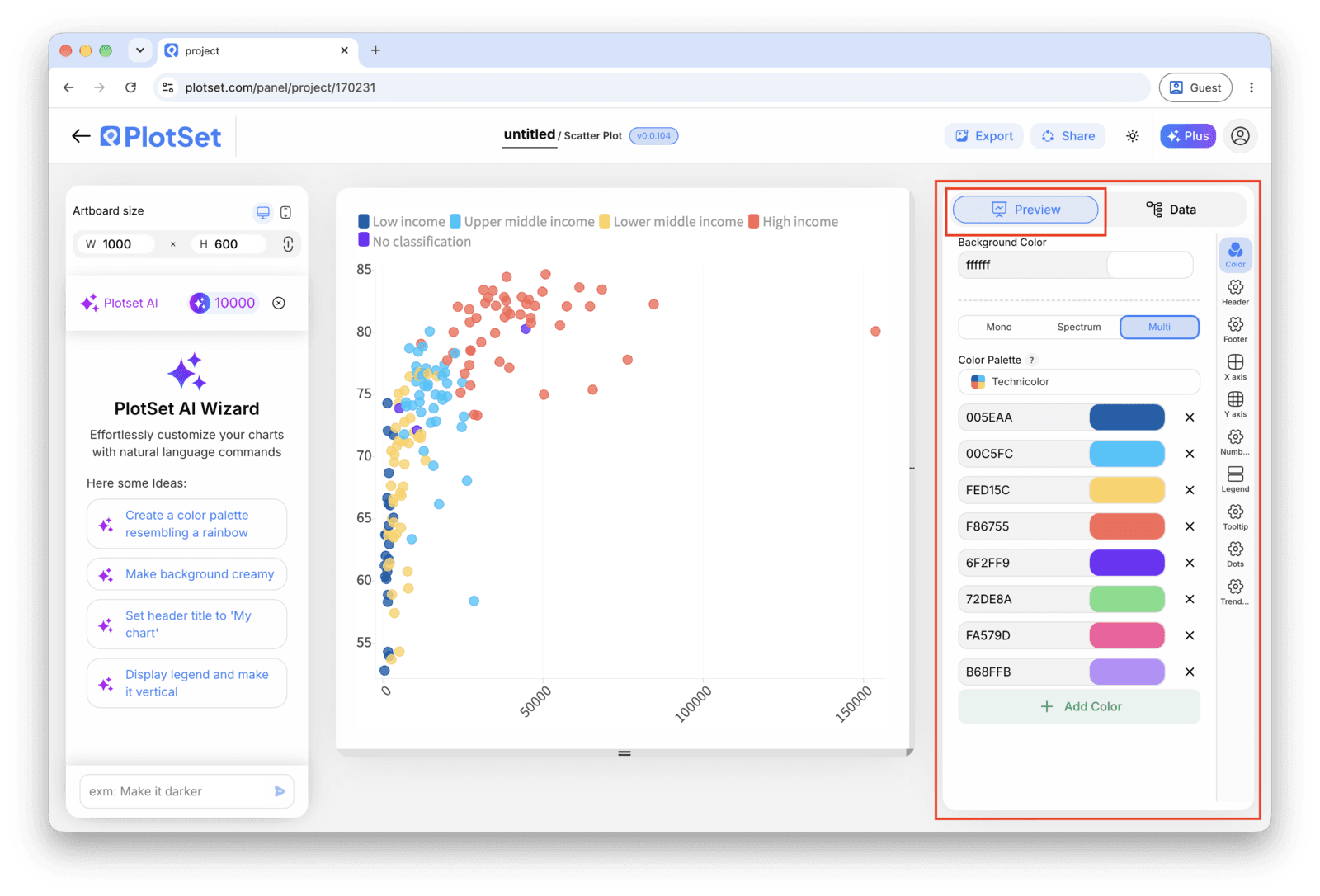
    L'éditeur PlotSet sur l'onglet 'Preview' : un graphique Scatter Plot terminé sur le canevas, avec le panneau de réglages entouré en rouge le long du bord droit.
    L'onglet 'Preview' pour un graphique Scatter Plot. Tous les réglages de style se trouvent dans le panneau entouré en rouge : apparence, en-tête, pied de page et les options propres à ce type de graphique, chacun dans un onglet distinct.
  6. 06

    Label the axes and the outliers

    Name both axes with real units, not just the column header. Turn on point labels for the handful of records that matter, usually the outliers, and leave the rest to the hover tooltip so the chart does not turn into a wall of text.

  7. 07

    Adjust point size, opacity and the trend line

    Reduce mark size or add transparency if points are stacking into a solid blob. Only turn on the fitted trend line once you have actually looked at the shape of the cloud, since a straight line through a curved or clustered relationship reports a pattern that is not there.

  8. 08

    Publish the chart, or export it as an image

    Publish for a live interactive chart with hover tooltips and a shareable link, copy the embed code to drop it into a page, or export a PNG, SVG or PDF if you need a static image for a deck or report.

Partez du modèle Scatter Plot avec des données d'exemple déjà chargées, puis remplacez-les par les vôtres.

Ouvrir le modèle

Publier, intégrer ou exporter

La dernière ligne droite est la même pour tous les types de graphique : 'Share' transforme le graphique en lien public actif et en code d'intégration, 'Export' l'enregistre sous forme de fichier statique.

Share : lien public et code d'intégration

Activer le code d'intégration et le lien public revient à publier le graphique. Le lien peut être envoyé à qui vous voulez sans risque, et le code d'intégration s'insère dans n'importe quelle page sous la forme d'une iframe qui conserve les infobulles au survol et l'interactivité. Si vous modifiez le graphique par la suite, cliquez sur 'Recreate' pour répercuter ces changements sur le lien comme sur le code.

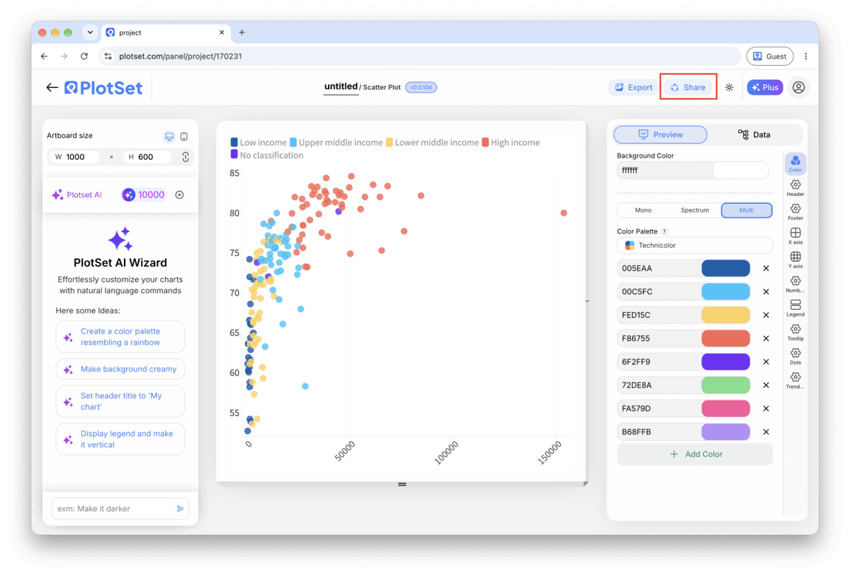
La barre d'outils de l'éditeur PlotSet avec le bouton 'Share' mis en évidence, juste à côté du bouton 'Export'.
C'est par 'Share' qu'un graphique terminé devient un lien public et un code d'intégration.
La fenêtre 'Share' de PlotSet : l'interrupteur qui active le code d'intégration et le lien public, les boutons 'Link', 'Embed', Facebook, Reddit, Twitter, LinkedIn et Email, et le lien public du graphique avec un bouton 'Copy'.
Activez le code d'intégration et le lien public, puis copiez le lien ou récupérez l'iframe. 'Recreate' répercute vos modifications ultérieures sur le lien et le code déjà partagés.

Export : SVG, PNG ou JPG

Le bouton 'Export' génère une copie statique à la taille dont vous avez besoin. Le SVG reste net à toutes les échelles et peut encore être modifié dans un outil de design ; PNG et JPG sont les choix sûrs pour les présentations et les documents. C'est le multiplicateur d'échelle qui vous donne une image nette sur un écran retina.

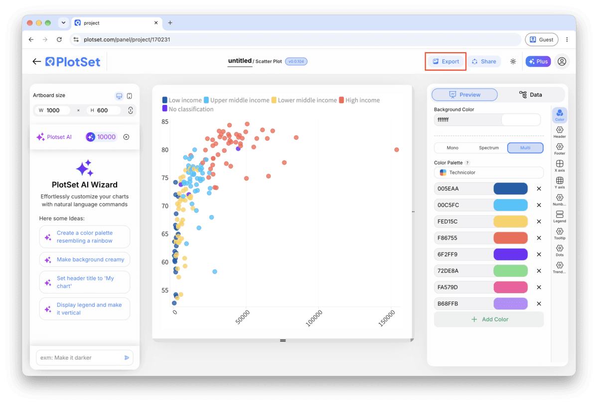
La barre d'outils de l'éditeur PlotSet avec le bouton 'Export' mis en évidence.
C'est par 'Export' que vous obtenez un fichier statique pour une diapositive ou un rapport.
La fenêtre 'Export chart' de PlotSet : un sélecteur d'échelle réglé sur 2x, les champs de largeur et de hauteur à 1000 × 600, et le menu des formats ouvert, affichant SVG, PNG et JPG.
Le SVG reste net à toutes les tailles et modifiable dans un outil de design ; PNG et JPG sont les choix sûrs pour une présentation. Réglez l'échelle avant d'exporter pour que l'image soit nette sur un écran retina.

Conseils de style pour un Scatter Plot

Cap grouping at six or seven colours

Past that, the legend and the eye both lose track of which shade is which. If your category column has more groups than that, filter to the ones that matter for the story or fall back to a single colour and call out one group with a label instead.

Fight overplotting before you fight the layout

If the cloud reads as one dark shape, the fix is almost never a bigger chart. Drop the mark opacity to around 50 to 70 percent, or shrink the point size, so overlapping records show up as darker patches instead of one flat blob.

Let the axis range reflect the real spread

Do not zoom the axis in to make a weak relationship look tighter. Start from the full range of your data and only narrow it if you are explicitly calling out a subset, with a caption saying so.

Label outliers by hand, not by category

The point worth a label is usually the one that breaks the pattern, not every point in a given group. Turn on manual point labels and pick the two or three records that carry the story, leaving the rest to the tooltip.

Erreurs courantes en créant un Scatter Plot

Every point comes out the same colour despite mapping a category

This usually means the category column was read as a number rather than text, so PlotSet tried to bind it to size or a colour scale instead of discrete groups. Check the column type in the data panel and force it to text if a category name looks like a code or an ID.

The chart is a solid blob with no visible pattern

This is overplotting: too many points landing on top of each other at the resolution you are viewing. Lower the mark opacity, shrink the point size, or filter to a date range or subset before assuming the two variables have no relationship at all.

The trend line does not match what the cloud actually looks like

A linear trend line forces a straight line through data that might be curved, clustered into two groups, or dominated by one outlier. Turn the trend line off, look at the raw shape of the points, and only re-enable it if a straight line is genuinely the right summary.

En savoir plus sur le Scatter Plot

Vous n'êtes pas sûr que le Scatter Plot soit le bon choix ? Découvrez ce que c'est, quand l'utiliser et quand l'éviter.

À propos du Scatter Plot

Scatter Plot : questions fréquentes

Two numeric columns, one per axis, with one header row. A label column and a category column are optional additions that drive the tooltip text and the colour grouping. CSV and .xlsx both work, and a pasted range from any spreadsheet tool is fine too.

Créez votre Scatter Plot maintenant

Gratuit pour commencer avec plus de 300 modèles. Aucune carte bancaire requise.