In 1954 a journalist named Darrell Huff published a slim book that taught a generation how to lie with a graph. How to Lie with Statistics gave the tricks names. The Gee-Whiz Graph chops off its own baseline so a rounding error looks like a boom. The One-Dimensional Picture draws a doubled number as a blob with four times the area. Seventy years later the tricks have not changed. What changed, in January 2026, is that a machine learned to draw them by the thousand.
A team of researchers built a system called ChartAttack that prompts a large language model to take an honest chart and quietly ruin it, applying eleven separate distortions on demand. It works. In a first, small study of twelve readers, the rigged output cut reading accuracy from 71 percent to 51, a drop of about twenty points. The obvious worry is a flood of plausible, poisoned charts. The more interesting pattern shows up when you line those model results against the older human experiments: the tricks that fool a person and the tricks that fool the machine drawing them are, for the most part, two different lists. We warn people about the wrong ones.
So here is a ranking worth drawing up. Which chart deceptions actually bend a human mind, in order, and where the machines place them instead.
The trick that beats everyone
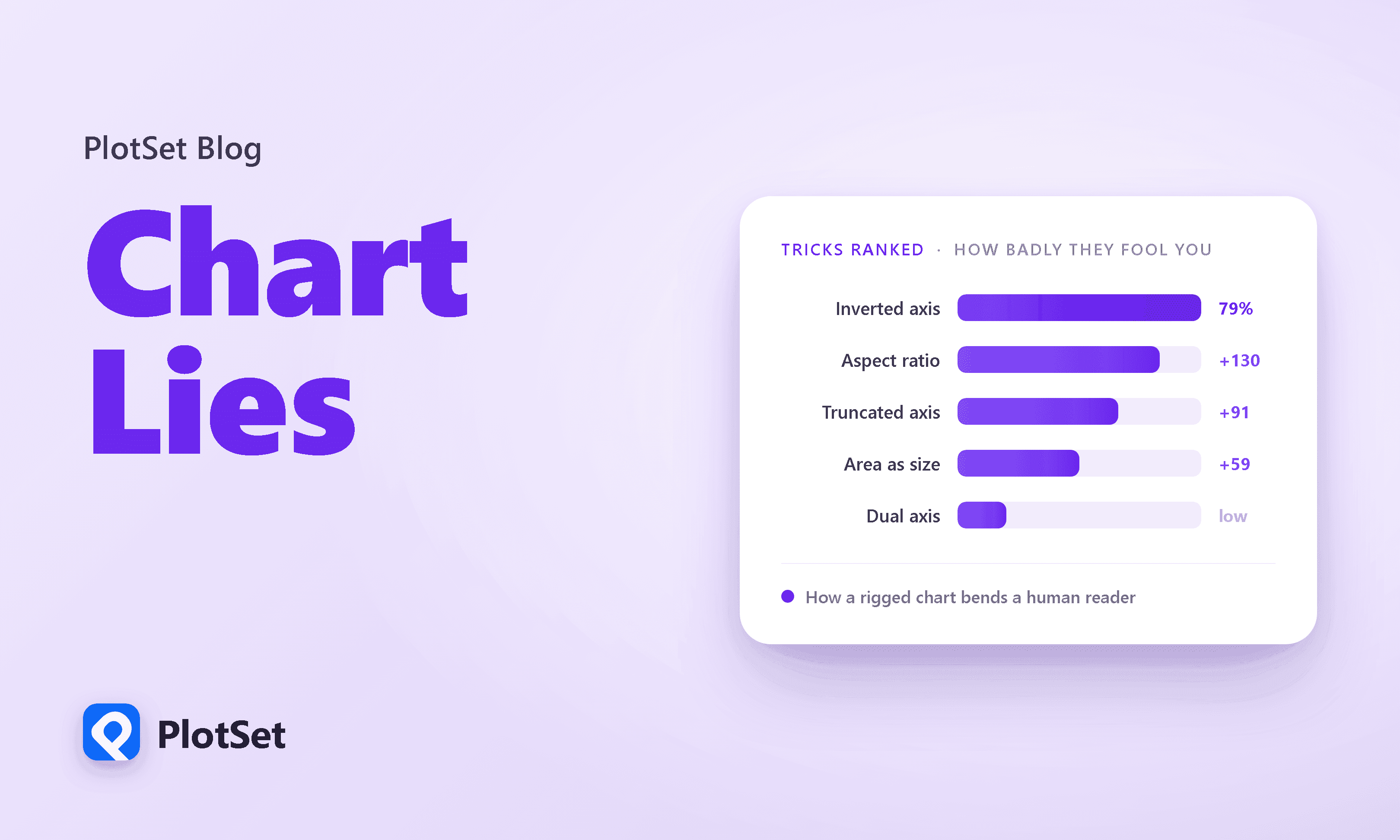
Start with the one deception that wins on every audience. Take a line going up and to the right, then flip the vertical axis so the numbers count down instead of up. The line now slopes the same way but means the opposite. In a controlled experiment, Anshul Pandey and colleagues found that this single move sent 79 percent of viewers to the wrong conclusion. On the honest version of the same chart, only 2.5 percent got it wrong.
The grouped bars above show it plainly. An honest chart and its inverted twin carry the identical data, and yet a reversal that a designer performs in one click flips the reader from almost always right to almost always wrong. There is no numeracy defense against this. The eye reads the slope, the slope is real, and the label doing the lying sits off in the corner where nobody looks.
Ranking the exaggerators
Reversal is the extreme case, a trick that inverts the message outright. Most deceptions are subtler. They do not flip your conclusion, they inflate it, making a small difference feel like a large one. Pandey's team measured that too, asking people to rate how big a difference looked on a one-to-five scale, then comparing an honest chart against a rigged one built from the same numbers.
The dumbbell chart ranks the three by the distance between the honest dot and the rigged one. Winning by a clear margin is the stretched aspect ratio, where you squish a chart tall and thin until a gentle trend spikes. It moved perceived magnitude by about 130 percent. Huff's Gee-Whiz Graph, the truncated axis, came second at 91 percent. Drawing a quantity as the area of a bubble instead of its width came third, at 59. The strongest of the three bends judgment more than twice as hard as the weakest, which is worth sitting with. These are not interchangeable sins, and a style guide that treats "never truncate the axis" as the sum of chart ethics is guarding one door while three others stand open. One caveat keeps this honest: the inverted-axis figure counts wrong answers, while these three measure a felt magnitude on a rating scale. Different rulers, so read each ranking within its own column, not across the two.
The machine ranks them differently
Now watch the list rearrange itself. ChartAttack did not just fool humans; its authors ran the same rigged charts past a wall of vision-language models and measured how many points of accuracy each trick cost. The chart below ranks the tricks by how much accuracy each one strips from a model. If the machines saw charts the way we do, this order would match the human one. It does not.
The worst trick for a model, by a wide margin, is the inappropriate stacked bar, which cost about 42 points of accuracy. Second is 3D perspective, at 31. Neither has ever been measured on humans in a controlled study, and both are the kind of clutter a person mostly shrugs off. The reversal runs the other way too. Missing normalization, showing raw counts where a reader needs rates, is the gentlest trick in the machine's whole ranking, and yet it is one of the most effective on a person. The tricks that gut a model and the tricks that gut a reader barely overlap. Read the two rankings as order, not distance: the human list mixes a wrong-answer rate with a felt-magnitude score, so what carries across is the sequence, not the exact gap.
The one place the two lists plainly agree is the inverted axis, near the top of both. A separate benchmark, tartly titled The Perils of Chart Deception, drives the point home: the inverted axis was the only trick to significantly mislead all ten models its authors tested. The stretched aspect ratio came close, fooling nine of ten, so it too bends both audiences rather than dividing them. The inverted axis is the universal solvent of chart lies, the one move that dissolves human and machine judgment alike.
A field guide, sorted
Put the whole zoo in one place and the mismatch becomes the story. The table below is a field guide to fifteen misleading chart tricks: how each fools a person, how each fools an AI, and how often it actually turns up in the wild. Sort it by any column and the rankings visibly refuse to agree.
Half the rows trace straight back to Huff. The truncated axis is his Gee-Whiz Graph; area distortion is his One-Dimensional Picture, a doubled length drawn as a blob with four times the area. The other half, the inverted axes and 3D effects and stacked bars, are native to the software era, tricks his typewriter could not have drawn. Read the two middle columns against each other and the pattern holds: what fools a person and what fools a model are close to independent. Concealed uncertainty, the quiet deletion of the error bars, is even a case where the machine beats you outright. That thin sliver of overlap between the columns is where the danger lives.
The dangerous ones are not the common ones
There is a second mismatch, and it is arguably worse. The tricks that fool people most are not the tricks you actually meet. Researchers behind the Misviz benchmark hand-annotated more than 2,600 real misleading charts scraped from the open web and counted which distortions showed up.
Misrepresentation, where the drawn sizes simply do not match the labels, accounts for a third of everything. 3D effects and truncated axes fill out the top. And the inverted axis? The trick that sends four in five readers to the wrong conclusion sits near the bottom of the bar chart, down in the low single digits, one to three percent, among the rarest things in the wild. A separate audit of the field, Misinformed by Visualization, reached the same conclusion from a different pile of charts: truncated axes and 3D dominate what people actually publish. The most dangerous trick is rare and the most common trick is middling, which means our collective attention is pointed at the wrong threat. The reason the inverted axis stays rare is probably that no honest designer reaches for it by accident. A machine told to "make this chart mislead" has no such reluctance.
The machine cannot catch what it draws
Here is the part that matters most for anyone deploying these systems. The same models now capable of generating these charts are strikingly bad at spotting them. The gap is cleanest when you separate two skills that sound identical but are not: reading a chart, and catching a chart that is trying to trick you.
Each dot is one chart reader, human or model. The horizontal axis is skill at reading an ordinary chart; the vertical axis is skill at catching a rigged one, drawn from Pandey and Ottley's benchmark. The human and the models were not quizzed on identical questions, so read the gap as directional, but the shape is stark. Look at where Claude lands: as good as a person at reading a chart, and the worst of the group at seeing through one, roughly 22 percent against the human 39. Every model reads well and detects badly, and the human sits alone up top. Being fluent at pulling values off an axis says almost nothing about noticing when the axis is lying. On the Misleading ChartQA benchmark, which spans 21 distortions across 3,000 charts, models average around 40 percent, the best of them about 52, against roughly 90 on the clean charts they usually ace. A second 2026 study found that frontier models, even ones that now outscore humans on chart-reading tests, hallucinate misleaders that are not there and miss the ones that are, on both rigged charts and corrected ones. The machine that can draw the trick cannot reliably see it.
How bad does it get? On the benchmark assembled by Tonglet and colleagues, the average model scored 26.4 percent on misleading charts, barely above the 25.6 percent you would get by guessing at random. The models were, on average, not reading the chart at all.
The fix is to make it read the numbers
The encouraging news is that this specific failure has a cheap patch. When Tonglet's team stopped asking the model to eyeball the picture and instead forced it to read the underlying data table first, then answer, accuracy jumped.
The recovery in the chart above is 15 to 20 points, because a trick that lives in the picture cannot survive contact with the raw table. The distortion is in the drawing, not the data, so when you make the model consult the numbers directly, most of the deception evaporates. That is the practical lesson for anyone shipping an AI that touches charts: never let it grade a chart on looks. Make it reconcile the picture against the numbers, and name the specific trick, because "does this look right" is exactly the question these systems answer wrong.
A few honest asterisks belong here, because the research is young. ChartAttack's human study rested on only twelve participants, so treat that twenty-point drop as a first probe, not a settled fact. No single experiment has yet run the same tricks on the same charts for people and machines side by side, so the two rankings are stitched together from different studies, and the comparison is directional, not surgical. The same caution applies to the headline that a machine cannot catch what it draws: the generating and the detecting were measured on different models in different papers, not on one system tested at both jobs, though the newest work finds the same blind spot inside single frontier systems. And the widely repeated line that AI now makes most of the world's charts is not measured at all. The nearest real number is Gartner's forecast that three quarters of analytics content will lean on generative AI by 2027, which is a prediction about tooling, not a headcount of charts.
Still, the shape of the thing is clear enough. The tricks that beat us are old, Huff catalogued most of them before the transistor. The novelty is a machine that can manufacture them faster than anyone can audit, guided by no instinct that an inverted axis is a dirty move, and unable to catch the very deceptions it produces. The lie factor, Edward Tufte's measure of how far a graphic strays from its data, has not gone anywhere. There is simply a great deal more of it coming, and the one reader who cannot be fooled is still you, holding the chart up against the numbers and asking what the picture is trying to make you feel.
References
- Ortiz-Barajas et al. (arXiv). ChartAttack: Testing the Vulnerability of LLMs to Malicious Prompting in Chart Generation. The automated LLM pipeline that mass-produces eleven misleaders, the 20.2-point human accuracy drop, and the per-trick model drops (stacked 41.5, 3D 30.6).
- arXiv (EMNLP 2025 Main). Unmasking Deceptive Visuals: Benchmarking MLLMs on Misleading Chart Question Answering. The Misleading ChartQA benchmark: 21 misleader types across ~3,000 charts, model accuracy around 40% versus ~90% on clean charts.
- arXiv (preprint). The Perils of Chart Deception: How Misleading Visualizations Affect Vision-Language Models. The inverted axis as the only trick to significantly mislead all ten tested vision-language models.
- Tonglet et al. (arXiv / ACL 2026). Protecting Multimodal LLMs Against Misleading Visualizations. Mean model accuracy of 26% on misleading charts against a 26% random baseline, plus the read-the-table fix worth 15 to 20 points.
- Pandey, Rall, Satterthwaite, Nov & Bertini (ACM CHI 2015). How Deceptive are Deceptive Visualizations?. The primary human experiment: inverted axis 79% wrong vs 2.5% control; aspect ratio, truncated axis and area ranked by exaggeration bias.
- Pandey & Ottley (arXiv / EuroVis 2025). Benchmarking VLMs on Visualization Literacy. The reading-versus-detection split, the 39% human deception baseline, and per-model detection scores (Claude 21.8%, GPT 28.2%).
- Ge, Cui & Kay (ACM CHI 2023). CALVI: Critical Thinking Assessment for Literacy in Visualizations. The deceptive-chart literacy test behind the ~39% human detection baseline.
- Lo, Gupta, Shigyo, Wu, Bertini & Qu (arXiv / EuroVis 2022). Misinformed by Visualization: What Do We Learn From Misinformative Visualizations?. A real-world audit finding truncated axes and 3D the most common misleaders in the wild.
- arXiv (ACL 2026). Is this chart lying to me? Automating the detection of misleading visualizations. The Misviz benchmark of 2,604 annotated real charts: misrepresentation 33%, 3D 14%, truncated axis 9%, inverted axis near the bottom.
- arXiv (preprint). LLMs have Visualization Literacy: Now What? Experiments Exploring LLM Visualization Evaluation Capabilities. Frontier models that outscore humans on reading yet hallucinate misleaders on both rigged and corrected charts.
- Darrell Huff (Wikipedia entry for the 1954 book). How to Lie with Statistics. The original taxonomy, including the Gee-Whiz Graph (truncated axis) and the One-Dimensional Picture (area distortion).
- Edward Tufte (InfoVis-Wiki). Lie Factor. The graphical-integrity measure of how far a chart strays from its underlying data.
- Gartner, Inc. Gartner Predicts 75% of Analytics Content to Use GenAI by 2027. The forecast that three quarters of analytics content will use generative AI, a projection about tooling rather than a measured chart count.