
Colorear cada región
La intensidad del color transporta el valor. La opción correcta para tasas, porcentajes y cifras per cápita, ya ajustadas al tamaño o la población.
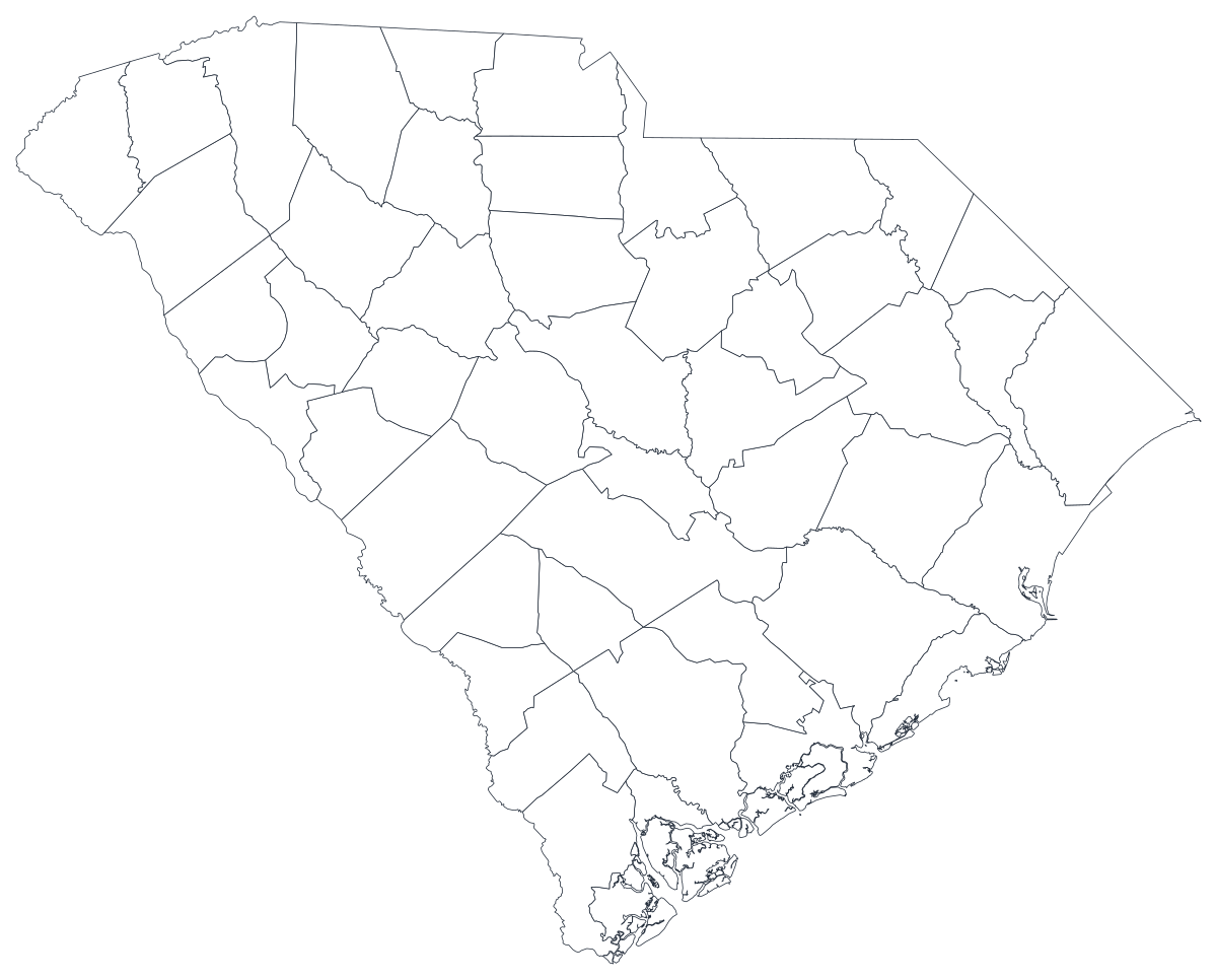
Abrir la plantillaA blank South Carolina county map to print, and a builder to fill it with your own data. Download the free outline of all 46 counties, or upload a spreadsheet and publish an interactive South Carolina map you can embed anywhere.
Los 46 counties, con un trazado limpio. Imprímelo, coloréalo o insértalo en un documento — sin cuenta y sin atribución.
Libre para cualquier uso, incluidos el comercial y el educativo. Generado a partir de los mismos límites que usa el editor.
Descargar SVGSouth Carolina's 46 counties are unusually even in size and unusually uneven in everything else. The state tilts from the Blue Ridge corner down to the Atlantic, and almost every measure you might map tilts with it. Growth clusters in three places: the Upstate along the I-85 corridor through Greenville, Spartanburg and Anderson; the midlands around Columbia in Richland and Lexington; and the coast, where Charleston, Berkeley, Dorchester, Horry and Beaufort have been absorbing new arrivals for two decades. Between the Upstate and the sea runs a band of rural counties along the I-95 corridor — Allendale, Bamberg, Hampton, Marion, Lee, Williamsburg — where population has been falling, median income sits far below the state figure, and county governments run on a fraction of the tax base their neighbours enjoy. That contrast is why so many South Carolina stories are told on a county map: the geography and the disparity line up almost exactly, and 46 similar-sized shapes make the pattern legible at a glance.
Colorea las regiones cuando tu cifra es una tasa; dimensiona un marcador cuando es un recuento. Invertirlo es la forma más común de que un mapa engañe.
La intensidad del color transporta el valor. La opción correcta para tasas, porcentajes y cifras per cápita, ya ajustadas al tamaño o la población.
Abrir la plantillaUn símbolo por región, escalado según el valor. Úsalo para recuentos y totales, donde colorear la superficie solo redibujaría el mapa de población.
Abrir la plantillaCírculos dimensionados por el valor sobre el contorno. Funciona bien cuando unas pocas regiones dominan y las pequeñas se perderían en un color.
Abrir la plantillaState health indicators, Department of Employment and Workforce labour figures, Election Commission returns, Department of Education report cards and the Revenue and Fiscal Affairs Office data sets are all published by county.
Poverty rate, uninsured rate, unemployment rate, share of the vote, median household income. Rates are already adjusted for population, which is what shading a region needs.
Growth along I-85 and the coast against decline along I-95 is the fundamental South Carolina story, and it is a geographic story. A county map states it without a paragraph of setup.
Classroom work, hurricane and evacuation planning, sales territories, colour-by-hand sessions. The free outline above prints cleanly at any size.
Shade by a raw count and Greenville, Richland, Charleston and Horry win every time. Anything that grows simply because more people live there belongs on a sized symbol.
The Charleston metro spans three counties, the Greenville–Spartanburg metro spans several more, and a number of counties still contain more than one school district. Forcing these onto counties misplaces what you are describing.
The smallest counties hold well under ten thousand people, so survey estimates and disease counts are frequently suppressed there. Twenty grey shapes are a worse table than a ranked list of the counties you actually have.
Storm surge, beach erosion and flood zones follow the shore, not county lines. Coastal counties reach far inland, and shading a whole county for a coastal event overstates it badly.
De la hoja de cálculo al mapa publicado, paso a paso.
The free outline above is a plain SVG of all 46 counties — print it, or drop it into a document. To build with data, open the PlotSet South Carolina (counties) template, which comes with sample data already bound.
One row per county: the county name or its five-digit FIPS code in the first column, your number in the second. South Carolina FIPS codes all begin 45.
Import a CSV or Excel file, paste from a spreadsheet, or connect a Google Sheet so the map can be refreshed when the source updates.
Shade the counties for a rate, or switch to symbols or bubbles for a count. Same geography, same data, different encoding.
Sequential for a low-to-high measure, diverging only when a real midpoint exists — the state average, zero change, a 50 per cent line. Four to six steps read more precisely than a smooth gradient.
Publish for a live interactive map with a tooltip on every county, or export a PNG, SVG or PDF for a report or a deck.
Empieza con la plantilla de South Carolina y sus datos de ejemplo, y luego sustitúyelos por los tuyos.
Abrir la plantillaCómo debe ser la columna de lugares y dónde encontrar datos que ya coincidan.
The county appears as "Mc Cormick" in the map's own data, while nearly every state and federal table writes "McCormick". It is the one county in South Carolina that will silently fail a name join, so either normalise the string or match on FIPS.
45001 is Abbeville, 45091 is York. Store the column as text so the leading 4 survives, and note that the county part is odd-numbered rather than sequential.
Columbia is in Richland, Myrtle Beach is in Horry, Hilton Head is in Beaufort, Rock Hill is in York, and Charleston the city sits in Charleston County but its suburbs run well into Berkeley and Dorchester.
The Revenue and Fiscal Affairs Office, the state public health agency, the Department of Employment and Workforce, the Election Commission and the Census Bureau's ACS all publish county-level tables.
A name join drops it and leaves one blank shape in the western corner, with no error to warn you. Check your row count after the join, or match on the five-digit code.
It draws a population map — Greenville, Richland, Charleston and Horry light up and the rural band along I-95 disappears, which is the opposite of what most South Carolina stories are about.
Allendale holds around eight thousand people, and health and survey figures there are often withheld. A suppressed value is not a zero, and colouring it as one is a real error rather than a cosmetic one.
The names do not fit at any reasonable size. Label the counties your argument rests on and let the hover tooltip carry the rest.
Yes. The outline above is a free SVG of all 46 South Carolina counties — right-click to save it, print it, or drop it into a worksheet or document. No account needed.
Sube una hoja de cálculo y publica un mapa interactivo en un par de minutos — gratis y sin tarjeta.