PlotSet LogoPlotSet

How to Create an Arc Map

A step by step walkthrough for turning a sheet of origins and destinations into a published arc map in PlotSet, from placing coordinates to filtering, publishing and embedding.

Unos 8 minutos

One curved line per route, drawn across a world map from your own origins and destinations: that is how to create an arc map from a spreadsheet, with thickness showing volume, colour showing a category, and a filter so viewers can isolate one group. It runs through the same click path any published PlotSet chart takes, with your own routes rather than placeholder rows.

If your sheet already has latitude and longitude for both ends of every route, it takes about eight minutes. Allow longer if you only have place names, since the template needs coordinates and looking them up is the one chore an arc map adds.

Los datos que necesitas

One row per route with six required columns: origin name, origin latitude, origin longitude, destination name, destination latitude, destination longitude. Optional columns add arc size, a colour category and a filter group.

CSV de ejemplo
OriginOrigin latOrigin lngDestinationDestination latDestination lngPassengers (000s)Region
London51.5074-0.1278New York40.7128-74.0060620Transatlantic
London51.5074-0.1278Dubai25.204855.2708550Europe-Middle East
London51.5074-0.1278Singapore1.3521103.8198480Europe-Asia
Tokyo35.6762139.6503Los Angeles34.0522-118.2437410Transpacific
Notas

Use decimal degrees. Latitude runs from -90 to 90 and longitude from -180 to 180; southern and western places are negative.

Do not swap the columns. If a route lands in the ocean or on the wrong continent, latitude and longitude are almost always reversed.

Keep coordinates as plain numbers with no degree symbols or N/S suffixes, or the row cannot be placed.

The size column should be numeric. The colour and filter columns are text categories, so keep the spelling consistent or one group will split in two.

Los pasos

El camino exacto en PlotSet, desde una plantilla en blanco hasta el gráfico terminado.

  1. 01

    Open the Arc Map template

    From the PlotSet dashboard, start a new project and choose Arc Map, listed under Maps. It loads with sample world air routes already bound, so you can see the column layout before using your own file.

    El selector de plantillas de PlotSet: las categorías de gráficos en la columna izquierda, la cuadrícula Bar Charts abierta y la tarjeta de la plantilla Bar Chart con su botón Select visible.
    Todas las guías empiezan aquí. Elige la categoría y luego la plantilla. Es la misma cuadrícula sea cual sea el tipo de gráfico que busques.
  2. 02

    Arrange one route per row

    Put the origin and destination names and coordinates on the same row. If you only have city names, look up their coordinates first and add them as columns.

  3. 03

    Upload the file, or connect it live

    Import a CSV or .xlsx file from the data panel, paste rows from a spreadsheet, or connect a Google Sheet so the map can be refreshed later. The first row is read as the column headers.

    La vista de datos del editor de PlotSet: una hoja de cálculo con las columnas Name, Value y Region llenas de cifras de provincias canadienses, junto al panel Data, que ofrece subida de CSV, Magic Import y sincronización con Google Sheet.
    La vista de datos, aquí en un proyecto de gráfico de barras. Sube un CSV, saca los números de una imagen con Magic Import o sincroniza una Google Sheet. El panel es el mismo en todos los tipos de gráfico.
  4. 04

    Bind the columns

    Confirm which columns are the origin, destination and coordinates. Then bind the optional size column to arc thickness, the category column to colour, and a filter column if you want viewers to isolate a group.

    El panel de datos de PlotSet con las asignaciones de columnas resaltadas: Label/time apuntando a la columna A, Values a la columna B y Filter/color a la columna C, con el botón Auto Binding debajo.
    Las asignaciones deciden qué columna se convierte en la etiqueta, cuál aporta los valores y cuál define el color. Auto Binding las deduce de tus encabezados, así que revísalas en lugar de darlas por buenas.
  5. 05

    Pick a projection and base map

    Open the Map tab to choose a flat Mercator view or a rotatable globe, and a light, dark or muted base map. A quiet base makes the arcs stand out.

    El editor de PlotSet en la pestaña Preview: un gráfico de tipo Arc Map ya terminado en el lienzo y, a la derecha, el panel de ajustes rodeado por un recuadro rojo.
    La pestaña Preview de un gráfico de tipo Arc Map. Todos los controles de estilo están en el panel enmarcado: apariencia, encabezado, pie de página y las opciones propias de este tipo de gráfico, cada grupo en su propia pestaña.
  6. 06

    Style the arcs

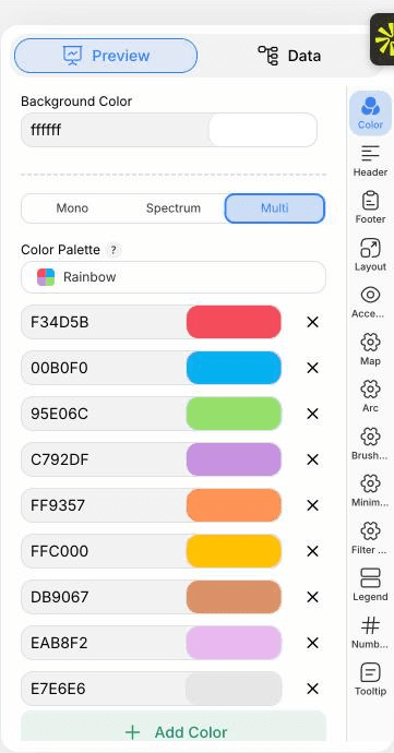
    In the Arc tab set how curved the routes are, how thickness scales with your size column, and whether colour comes from a category or a gradient. Turn on arrowheads if direction matters.

  7. 07

    Add the filter and legend

    Enable the filter control to show a dropdown or buttons, and place the legend so the colour categories are explained.

  8. 08

    Publish it, embed it, or export it

    Publish for a live, zoomable map where hovering an endpoint highlights its routes, copy the embed code for your page, or export a PNG, SVG or PDF for a static image.

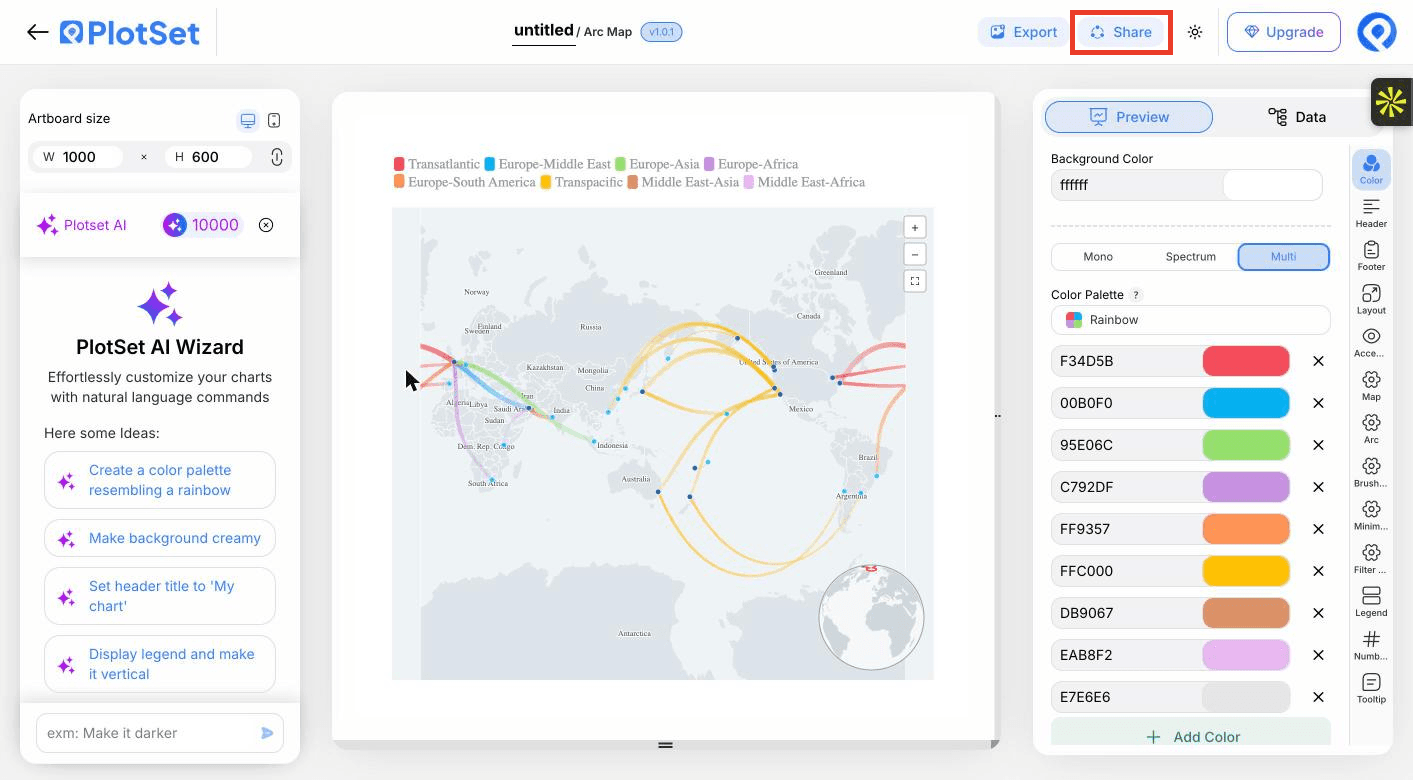
    La barra de herramientas del editor de PlotSet con el botón Share resaltado, justo al lado del botón Export.
    Share es lo que convierte un gráfico terminado en un enlace público y un código de incrustación.

Empieza con la plantilla de Arc Map, que ya trae datos de ejemplo cargados, y sustitúyelos por los tuyos.

Abrir la plantilla

Publícalo, incrústalo o expórtalo

El último tramo es igual en todos los tipos de gráfico: Share convierte el gráfico en un enlace público en vivo y un código de incrustación, y Export lo guarda como un archivo estático.

Share: enlace público y código de incrustación

Al activar el código de incrustación y el enlace público, el gráfico queda publicado. El enlace se lo puedes enviar a cualquiera sin problema, y el código de incrustación se coloca en cualquier página como un iframe que conserva los tooltips al pasar el cursor y toda la interactividad. Si editas el gráfico más adelante, haz clic en Recreate para llevar esos cambios a ambos.

La barra de herramientas del editor de PlotSet con el botón Share resaltado, justo al lado del botón Export.
Share es lo que convierte un gráfico terminado en un enlace público y un código de incrustación.
El diálogo Share de PlotSet: el interruptor que activa el código de incrustación y el enlace público, los botones Link, Embed, Facebook, Reddit, Twitter, LinkedIn y Email, y el enlace público del gráfico con un botón Copy.
Activa el código de incrustación y el enlace público, y después copia el enlace o llévate el iframe. Recreate envía las ediciones posteriores a todos los que ya lo tengan.

Export: SVG, PNG o JPG

Export guarda una copia estática en el tamaño que necesites. El SVG se mantiene nítido a cualquier escala y se puede seguir editando en una herramienta de diseño; PNG y JPG son la opción segura para diapositivas y documentos. El multiplicador de escala es lo que te da una imagen nítida en una pantalla retina.

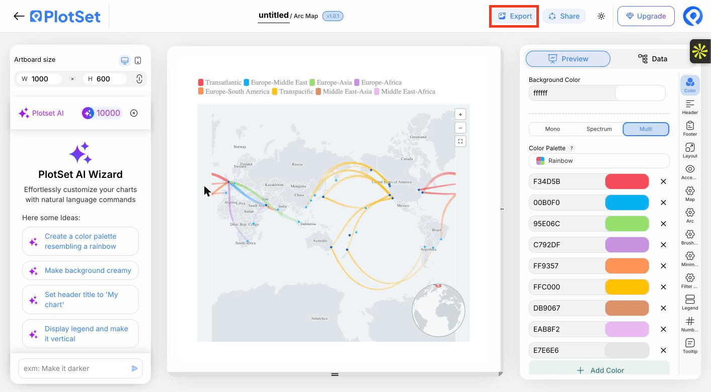
La barra de herramientas del editor de PlotSet con el botón Export resaltado.
Export es el camino hacia un archivo estático para una diapositiva o un informe.
El diálogo Export chart de PlotSet: un selector de escala en 2x, los campos de ancho y alto fijados en 1000 por 600, y el menú de formato abierto con SVG, PNG y JPG.
El SVG se mantiene nítido a cualquier tamaño y se puede seguir editando en una herramienta de diseño; PNG y JPG son la apuesta segura para una presentación. Ajusta la escala antes de exportar para que la imagen se vea nítida en una pantalla retina.

Consejos de estilo para un Arc Map

Let thickness carry the value

Scaling arc width by passengers or tonnes shows which routes matter. Choose a square-root or log scale when a few routes dwarf the rest.

Use a muted base map

A pale, low-contrast base keeps attention on the routes. Save dark bases for light arcs.

Filter instead of thinning the data

Rather than dropping routes, give them a group column and let viewers switch between them.

Say what thickness means

Add a line to the header or legend, such as thickness shows passengers in thousands, so nobody reads width as distance.

Errores comunes al hacer un Arc Map

Routes end up in the ocean

Latitude and longitude are probably swapped. Latitude is the north to south number and must stay between -90 and 90.

Some rows are missing from the map

A coordinate was probably read as text, often from a degree symbol or a stray space. Clean the cell to a plain number and re-upload.

The map is an unreadable tangle

Too many routes at equal weight. Bind a size column, add a filter group, or aggregate to region pairs.

Aprende más sobre el Arc Map

¿No estás seguro de que el Arc Map sea la opción correcta? Descubre qué es, cuándo usarlo y cuándo no.

Sobre el Arc Map

Arc Map: preguntas frecuentes

Origin name, origin latitude and longitude, destination name, and destination latitude and longitude, one route per row. Size, colour and filter columns are optional.

Crea tu Arc Map ahora

Gratis para empezar con más de 300 plantillas. No se necesita tarjeta de crédito.