PlotSet LogoPlotSet

How to Create a Timeline

A step by step walkthrough for turning a list of dated events into a published timeline in PlotSet, from shaping the sheet to exporting or embedding the finished chart.

Unos 7 minutos

This walkthrough covers how to create a timeline in PlotSet out of a sequence of dated events, each carrying a title and just enough context that a reader gets the story without pinging you for the slide deck behind it. Your own milestones go through the same click path a published PlotSet chart takes, from upload to publish, not a demo running on placeholder dates.

Seven minutes is enough once your events already have clean dates and short titles. Still deciding what precision to date things at, or pulling dates out of a spreadsheet that stored them as text, adds another five. Treat the seven minutes below as the target and the rest as buffer.

Los datos que necesitas

Four columns, one row per event: a date, a short title, an optional note, an optional image URL. Only the date and title are required, and one header row.

CSV de ejemplo
DateTitleNoteImage
1961-05-25Kennedy commits to the MoonKennedy tells Congress the US will land a man on the Moon before the decade is out
1966-02-03Luna 9 soft-landsFirst spacecraft to land softly on the Moon
1967-01-27Apollo 1 fireCabin fire during a launch rehearsal kills the three man crew
1968-12-21Apollo 8 launchesFirst crewed mission to leave low Earth orbit and circle the Moon
1969-07-20Apollo 11 landsArmstrong and Aldrin land in the Sea of Tranquilityhttps://example.com/images/apollo-11.jpg
1970-04-11Apollo 13 launchesOxygen tank explosion forces the crew to abort the Moon landing
1972-12-14Apollo 17 endsLast crewed Moon landing mission. Cernan is the last to walk on the Moon
Notas

Keep date precision consistent across every row: all years, or all full dates. PlotSet renders whatever precision you give it, so a chart mixing "1969" with "1969-07-20" reads as sloppy rather than intentional.

Rows do not need to already be in date order before you upload. PlotSet sorts events chronologically once the date column is mapped, so paste them in whatever order your source document used.

The note column is for a sentence or two. Anything longer gets clipped inside the marker card, so put the extra detail in a linked document and use the note for the one line that actually matters.

Image URLs need to be public and stay live. A link into a personal drive folder or a private channel shows a broken image icon on the published chart instead of the picture.

Los pasos

El camino exacto en PlotSet, desde una plantilla en blanco hasta el gráfico terminado.

  1. 01

    Open the Timeline template

    From the PlotSet dashboard, start a new project and choose the Timeline template. It loads with a handful of sample events already bound to a date, a title, a note and an image, so you can see the exact column shape before you touch your own file.

    El selector de plantillas de PlotSet: las categorías de gráficos en la columna izquierda, la cuadrícula Bar Charts abierta y la tarjeta de la plantilla Bar Chart con su botón Select visible.
    Todas las guías empiezan aquí. Elige la categoría y luego la plantilla. Es la misma cuadrícula sea cual sea el tipo de gráfico que busques.
  2. 02

    Shape your sheet into four columns

    Date first, then a short title, then an optional note, then an optional image URL, one row per event. Only the date and title columns are required. If your source is a project doc or a wiki page, pull just those four things out rather than dragging in every field you have.

  3. 03

    Get your events into PlotSet

    Import a CSV or .xlsx file from the data panel, paste rows straight from a spreadsheet, or connect a Google Sheet if you expect to add events later without a re-upload. PlotSet reads the first row as headers automatically.

    La vista de datos del editor de PlotSet: una hoja de cálculo con las columnas Name, Value y Region llenas de cifras de provincias canadienses, junto al panel Data, que ofrece subida de CSV, Magic Import y sincronización con Google Sheet.
    La vista de datos, aquí en un proyecto de gráfico de barras. Sube un CSV, saca los números de una imagen con Magic Import o sincroniza una Google Sheet. El panel es el mismo en todos los tipos de gráfico.
  4. 04

    Map the date, title, note and image columns

    Confirm which column feeds each part of the marker. This is usually automatic when your headers are named clearly, but check it manually if your sheet carries extra columns PlotSet might have guessed wrong on.

    El panel de datos de PlotSet con las asignaciones de columnas resaltadas: Label/time apuntando a la columna A, Values a la columna B y Filter/color a la columna C, con el botón Auto Binding debajo.
    Las asignaciones deciden qué columna se convierte en la etiqueta, cuál aporta los valores y cuál define el color. Auto Binding las deduce de tus encabezados, así que revísalas en lugar de darlas por buenas.
  5. 05

    Check the order and trim to the events that matter

    PlotSet sorts events chronologically once they are mapped, so scan the result for anything that landed in the wrong place, usually a date typed in an inconsistent format. This is also the point to cut anything that does not change the story. Five to twenty events is the range that stays readable.

  6. 06

    Style the spine and markers

    Set the spine to horizontal or vertical depending on where the chart will live, then size the markers: larger for the two or three events that carry the story, default size for the rest. Leave the alternating left-right layout off unless the events are dense enough that labels start to overlap.

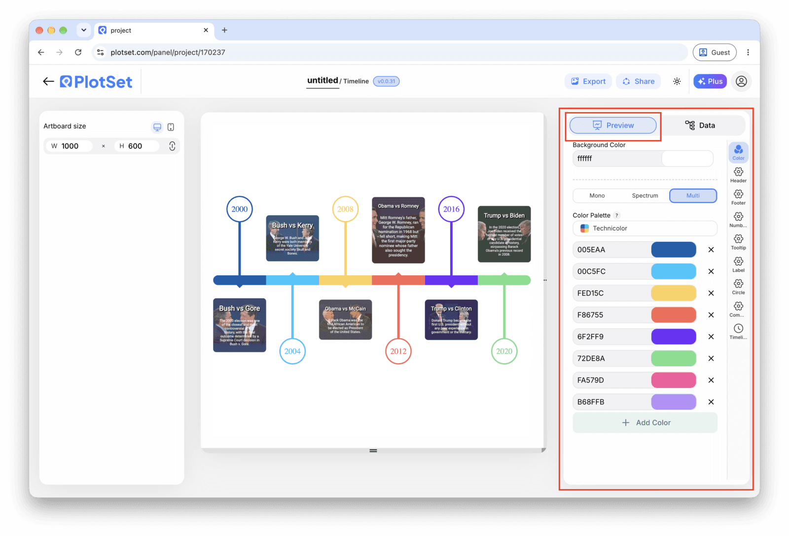
    El editor de PlotSet en la pestaña Preview: un gráfico de tipo Timeline ya terminado en el lienzo y, a la derecha, el panel de ajustes rodeado por un recuadro rojo.
    La pestaña Preview de un gráfico de tipo Timeline. Todos los controles de estilo están en el panel enmarcado: apariencia, encabezado, pie de página y las opciones propias de este tipo de gráfico, cada grupo en su propia pestaña.
  7. 07

    Write the titles like headlines

    Lead each title with what changed, not the date, since the date is already on the axis right next to it. Save the note for the sentence a reader would want if they stopped to read, and leave it blank on rows where there is nothing worth adding.

  8. 08

    Publish, embed or export the timeline

    Publish for a live, interactive timeline where each marker opens its note and image on click, grab the embed code to drop it into a page, or export a PNG, SVG or PDF if you need a static version for a deck or a report.

Empieza con la plantilla de Timeline, que ya trae datos de ejemplo cargados, y sustitúyelos por los tuyos.

Abrir la plantilla

Publícalo, incrústalo o expórtalo

El último tramo es igual en todos los tipos de gráfico: Share convierte el gráfico en un enlace público en vivo y un código de incrustación, y Export lo guarda como un archivo estático.

Share: enlace público y código de incrustación

Al activar el código de incrustación y el enlace público, el gráfico queda publicado. El enlace se lo puedes enviar a cualquiera sin problema, y el código de incrustación se coloca en cualquier página como un iframe que conserva los tooltips al pasar el cursor y toda la interactividad. Si editas el gráfico más adelante, haz clic en Recreate para llevar esos cambios a ambos.

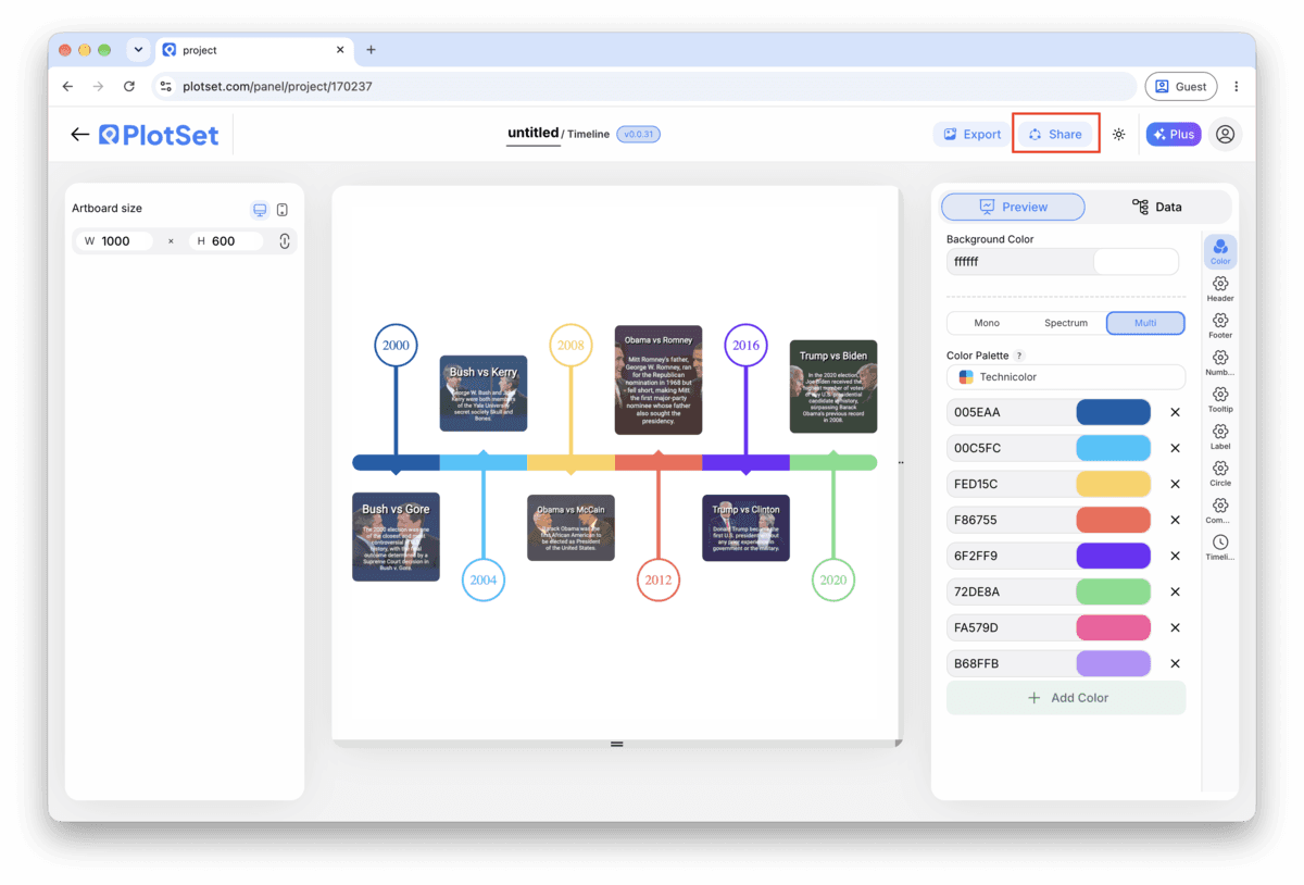
La barra de herramientas del editor de PlotSet con el botón Share resaltado, justo al lado del botón Export.
Share es lo que convierte un gráfico terminado en un enlace público y un código de incrustación.
El diálogo Share de PlotSet: el interruptor que activa el código de incrustación y el enlace público, los botones Link, Embed, Facebook, Reddit, Twitter, LinkedIn y Email, y el enlace público del gráfico con un botón Copy.
Activa el código de incrustación y el enlace público, y después copia el enlace o llévate el iframe. Recreate envía las ediciones posteriores a todos los que ya lo tengan.

Export: SVG, PNG o JPG

Export guarda una copia estática en el tamaño que necesites. El SVG se mantiene nítido a cualquier escala y se puede seguir editando en una herramienta de diseño; PNG y JPG son la opción segura para diapositivas y documentos. El multiplicador de escala es lo que te da una imagen nítida en una pantalla retina.

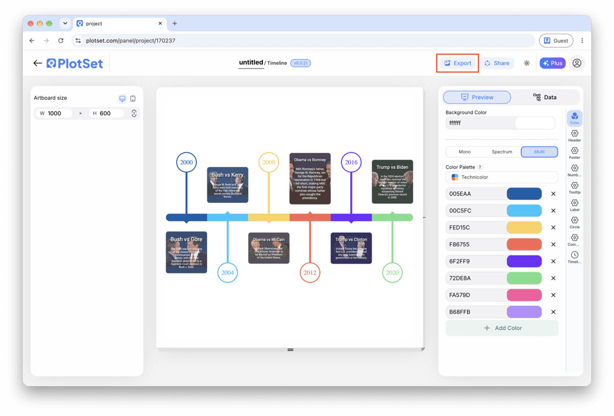
La barra de herramientas del editor de PlotSet con el botón Export resaltado.
Export es el camino hacia un archivo estático para una diapositiva o un informe.
El diálogo Export chart de PlotSet: un selector de escala en 2x, los campos de ancho y alto fijados en 1000 por 600, y el menú de formato abierto con SVG, PNG y JPG.
El SVG se mantiene nítido a cualquier tamaño y se puede seguir editando en una herramienta de diseño; PNG y JPG son la apuesta segura para una presentación. Ajusta la escala antes de exportar para que la imagen se vea nítida en una pantalla retina.

Consejos de estilo para un Timeline

Keep the layout single sided under ten events

The alternating left-right layout earns its place once markers start crowding a single line, but for a short timeline it just adds movement the reader has to track. Turn it on only once labels are genuinely colliding.

Size markers by importance, not decoration

Set a larger marker for the two or three events that actually carry the story and leave the rest at the default size. A reader picks up the hierarchy before they have read a single title.

Save images for the moment they add information

An image on every marker inflates every card to the same height and turns a quick scan into a scroll. Attach one where a photo genuinely tells the reader something the title cannot (a product shot, a diagram, a screenshot) and leave the rest blank.

Match the date format to your actual precision

If your rows are years, set the chart's date format to show years only instead of defaulting to a full date. A timeline that displays a fabricated month and day for an event you only know happened sometime in 1969 is claiming a precision you do not have.

Errores comunes al hacer un Timeline

Two events land on top of each other

This usually means two rows share the same date, or dates close enough together that the markers overlap and the labels collide. Check the data table for duplicate or near-duplicate dates and either merge them into one event or correct the date if the sources actually disagree.

An event goes missing from the chart

A blank cell in the date column gets skipped rather than flagged, so the row disappears with no error. Scroll through PlotSet's data table and check that every row has a date before assuming your sheet uploaded in full.

A title gets cut off mid word

This means the title is running longer than the marker card has room for, not that anything broke. Shorten it to something closer to a headline and move the rest of the sentence into the note field, which has more room to work with.

Aprende más sobre el Timeline

¿No estás seguro de que el Timeline sea la opción correcta? Descubre qué es, cuándo usarlo y cuándo no.

Sobre el Timeline

Timeline: preguntas frecuentes

Four columns with one header row: a date, a short title, and two optional columns, a note and an image URL. Only the date and title are required. CSV and .xlsx both work, and a pasted range from any spreadsheet tool is fine too, as long as the date column parses as an actual date rather than text.

Crea tu Timeline ahora

Gratis para empezar con más de 300 plantillas. No se necesita tarjeta de crédito.