PlotSet LogoPlotSet

How to Create a Marimekko Chart

A step by step walkthrough for turning a segment, subdivision and value spreadsheet into a published Marimekko chart in PlotSet, from shaping the sheet to locking the stack order and exporting.

Unos 8 minutos

Take a spreadsheet shaped as segment, subdivision and value, something like revenue by region and sales channel, and this guide shows how to create a Marimekko chart in PlotSet where the column widths carry as much information as the stacks inside them. You will shape the sheet, upload it, lock the column order and the stacking order, then publish, embed or export the finished chart.

If your data is already three columns, one row per block, this takes about eight minutes, and most of that goes into locking the stacking order so it reads the same in every column rather than fighting the upload. Add another five if you are unpivoting a wide report, one column per channel, into the long format PlotSet expects.


Los datos que necesitas

Three columns, one row per block: the segment name, the subdivision name, then the number. No totals row, no wide pivot table, one header row.

CSV de ejemplo
RegionChannelRevenue
North AmericaDirect420000
North AmericaReseller180000
North AmericaOnline90000
EuropeDirect260000
EuropeReseller140000
EuropeOnline70000
Asia PacificDirect150000
Asia PacificReseller110000
Asia PacificOnline95000
Notas

This is long format: one row per segment-subdivision pair, not one column per subdivision. If your report has a Direct column, a Reseller column and an Online column side by side, restack those into rows before uploading.

Spell each segment name identically on every row. "APAC" on one row and "Asia Pacific" on another reads as two separate segments and splits a total that should be one column.

Delete any totals or subtotals row before uploading. A grand total uploaded as a row becomes a segment of its own and throws off every width.

Keep the value column numeric. A revenue figure stored as text (a stray currency symbol or thousands separator that survived an export) will not sum into the segment total PlotSet uses to calculate column width.

Los pasos

El camino exacto en PlotSet, desde una plantilla en blanco hasta el gráfico terminado.

  1. 01

    Start a new project on the Marimekko Chart template

    From the PlotSet dashboard, start a new project and choose the Marimekko Chart template. It loads with sample data already bound to segment, subdivision and value, so you can see the exact column layout before touching your own file.

    El selector de plantillas de PlotSet: las categorías de gráficos en la columna izquierda, la cuadrícula Bar Charts abierta y la tarjeta de la plantilla Bar Chart con su botón Select visible.
    Todas las guías empiezan aquí. Elige la categoría y luego la plantilla. Es la misma cuadrícula sea cual sea el tipo de gráfico que busques.
  2. 02

    Shape your sheet into three columns

    List one row per block: the segment name first (region), the subdivision name second (channel), and the number third (revenue). This is long format, not the wide pivot table most reporting tools export by default, where each channel gets its own column.

  3. 03

    Unpivot a wide report if that is where you are starting

    If your source is a table with one column per subdivision, say a region row with a Direct, Reseller and Online column each, stack those columns into rows instead: one row per region-channel pair, three columns total. A quick copy-paste rebuild handles this faster than it sounds.

  4. 04

    Upload your file or connect a sheet

    Use the data panel to import a CSV or .xlsx file, paste rows directly from a spreadsheet, or connect a Google Sheet so the chart can pick up later edits without a re-upload. PlotSet reads the first row as headers automatically.

    La vista de datos del editor de PlotSet: una hoja de cálculo con las columnas Name, Value y Region llenas de cifras de provincias canadienses, junto al panel Data, que ofrece subida de CSV, Magic Import y sincronización con Google Sheet.
    La vista de datos, aquí en un proyecto de gráfico de barras. Sube un CSV, saca los números de una imagen con Magic Import o sincroniza una Google Sheet. El panel es el mismo en todos los tipos de gráfico.
  5. 05

    Map the segment, subdivision and value columns

    Confirm which column feeds the column width (segment), which feeds the stack (subdivision), and which feeds the block size (value). Column widths are calculated for you from the segment totals: you never enter a width directly.

    El panel de datos de PlotSet con las asignaciones de columnas resaltadas: Label/time apuntando a la columna A, Values a la columna B y Filter/color a la columna C, con el botón Auto Binding debajo.
    Las asignaciones deciden qué columna se convierte en la etiqueta, cuál aporta los valores y cuál define el color. Auto Binding las deduce de tus encabezados, así que revísalas en lugar de darlas por buenas.
  6. 06

    Order the columns and lock the stacking order

    Sort columns widest to narrowest so the biggest segment reads first, left to right. Then set the subdivision order once and keep it identical in every column: if Direct sits at the bottom in North America, it needs to sit at the bottom in Europe and Asia Pacific too, or the chart stops being comparable across columns.

  7. 07

    Turn on the top axis and value labels

    Switch on the cumulative top axis so the segment widths are readable instead of just implied by eye. Add value or percentage labels to each block; without them a reader has to estimate two dimensions at once, which is the main thing that makes a Marimekko hard to read.

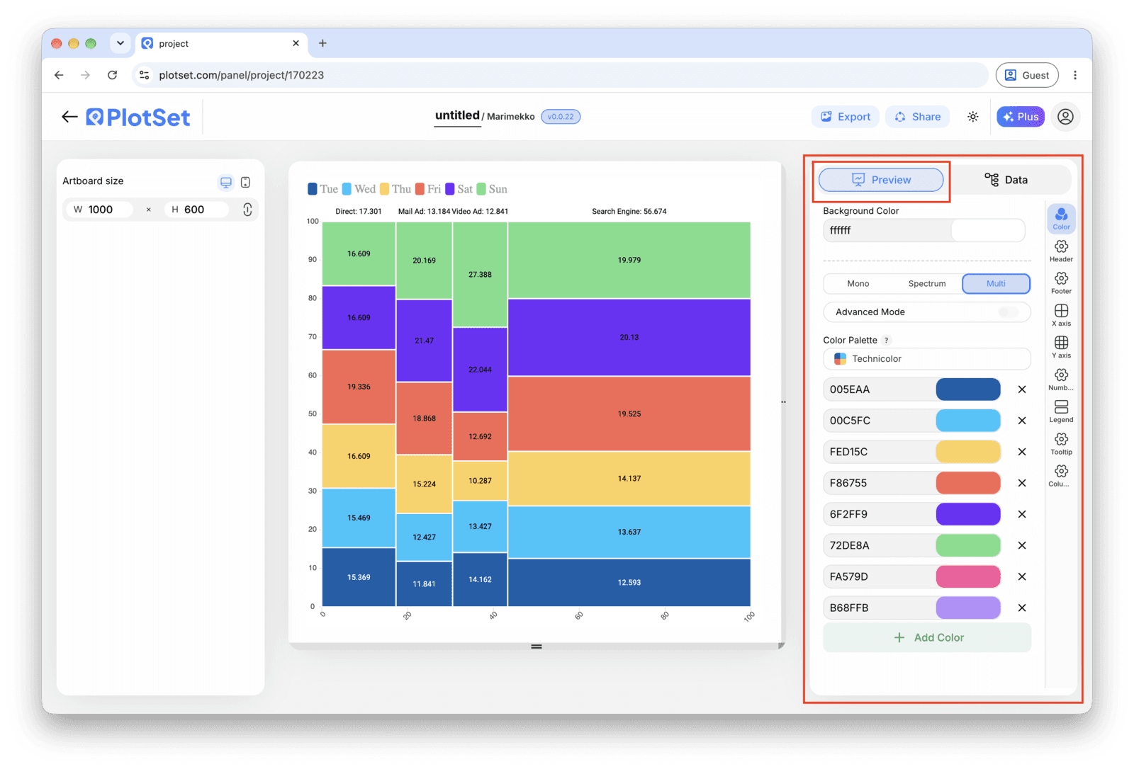
    El editor de PlotSet en la pestaña Preview: un gráfico de tipo Marimekko Chart ya terminado en el lienzo y, a la derecha, el panel de ajustes rodeado por un recuadro rojo.
    La pestaña Preview de un gráfico de tipo Marimekko Chart. Todos los controles de estilo están en el panel enmarcado: apariencia, encabezado, pie de página y las opciones propias de este tipo de gráfico, cada grupo en su propia pestaña.
  8. 08

    Pick colors and publish, embed or export

    Assign one color per subdivision and keep that mapping constant across every column, the same way you kept the stacking order constant. Then publish for a live interactive chart with hover tooltips, grab the embed code for a page, or export a PNG, SVG or PDF for a deck.

Empieza con la plantilla de Marimekko Chart, que ya trae datos de ejemplo cargados, y sustitúyelos por los tuyos.

Abrir la plantilla

Publícalo, incrústalo o expórtalo

El último tramo es igual en todos los tipos de gráfico: Share convierte el gráfico en un enlace público en vivo y un código de incrustación, y Export lo guarda como un archivo estático.

Share: enlace público y código de incrustación

Al activar el código de incrustación y el enlace público, el gráfico queda publicado. El enlace se lo puedes enviar a cualquiera sin problema, y el código de incrustación se coloca en cualquier página como un iframe que conserva los tooltips al pasar el cursor y toda la interactividad. Si editas el gráfico más adelante, haz clic en Recreate para llevar esos cambios a ambos.

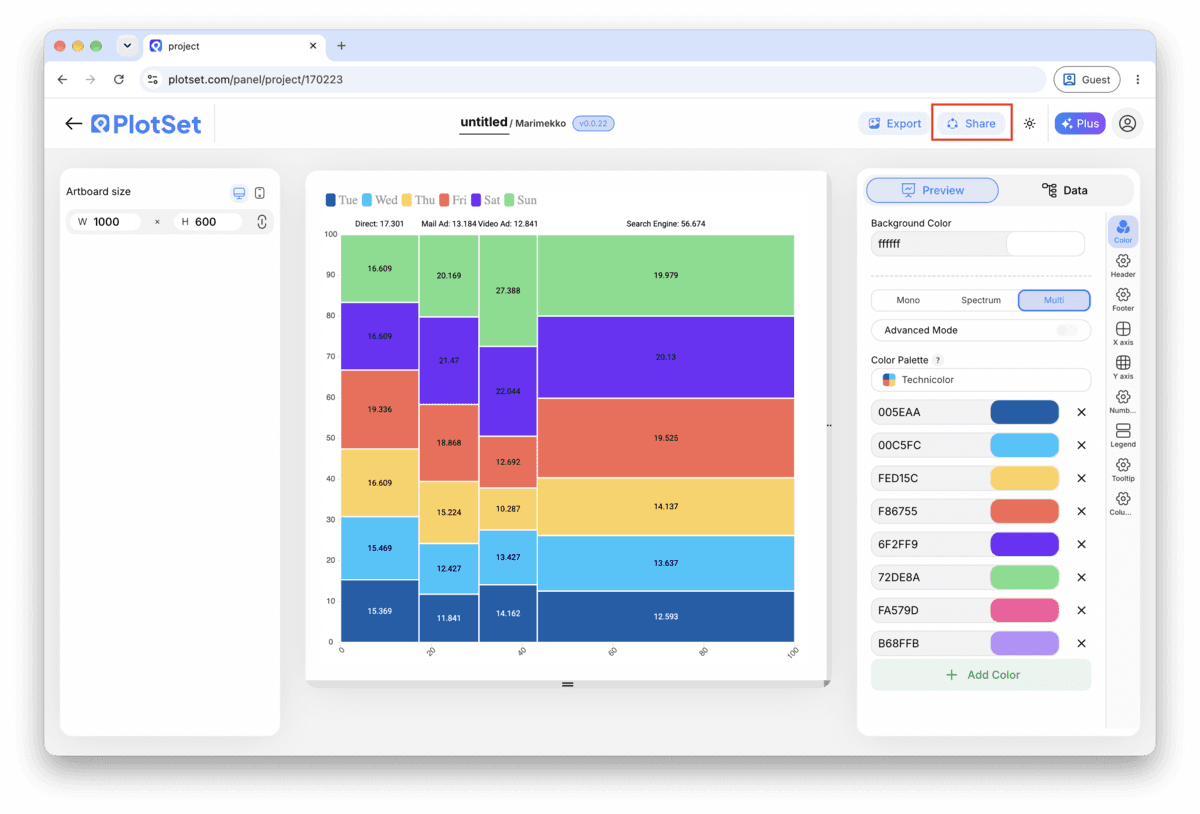
La barra de herramientas del editor de PlotSet con el botón Share resaltado, justo al lado del botón Export.
Share es lo que convierte un gráfico terminado en un enlace público y un código de incrustación.
El diálogo Share de PlotSet: el interruptor que activa el código de incrustación y el enlace público, los botones Link, Embed, Facebook, Reddit, Twitter, LinkedIn y Email, y el enlace público del gráfico con un botón Copy.
Activa el código de incrustación y el enlace público, y después copia el enlace o llévate el iframe. Recreate envía las ediciones posteriores a todos los que ya lo tengan.

Export: SVG, PNG o JPG

Export guarda una copia estática en el tamaño que necesites. El SVG se mantiene nítido a cualquier escala y se puede seguir editando en una herramienta de diseño; PNG y JPG son la opción segura para diapositivas y documentos. El multiplicador de escala es lo que te da una imagen nítida en una pantalla retina.

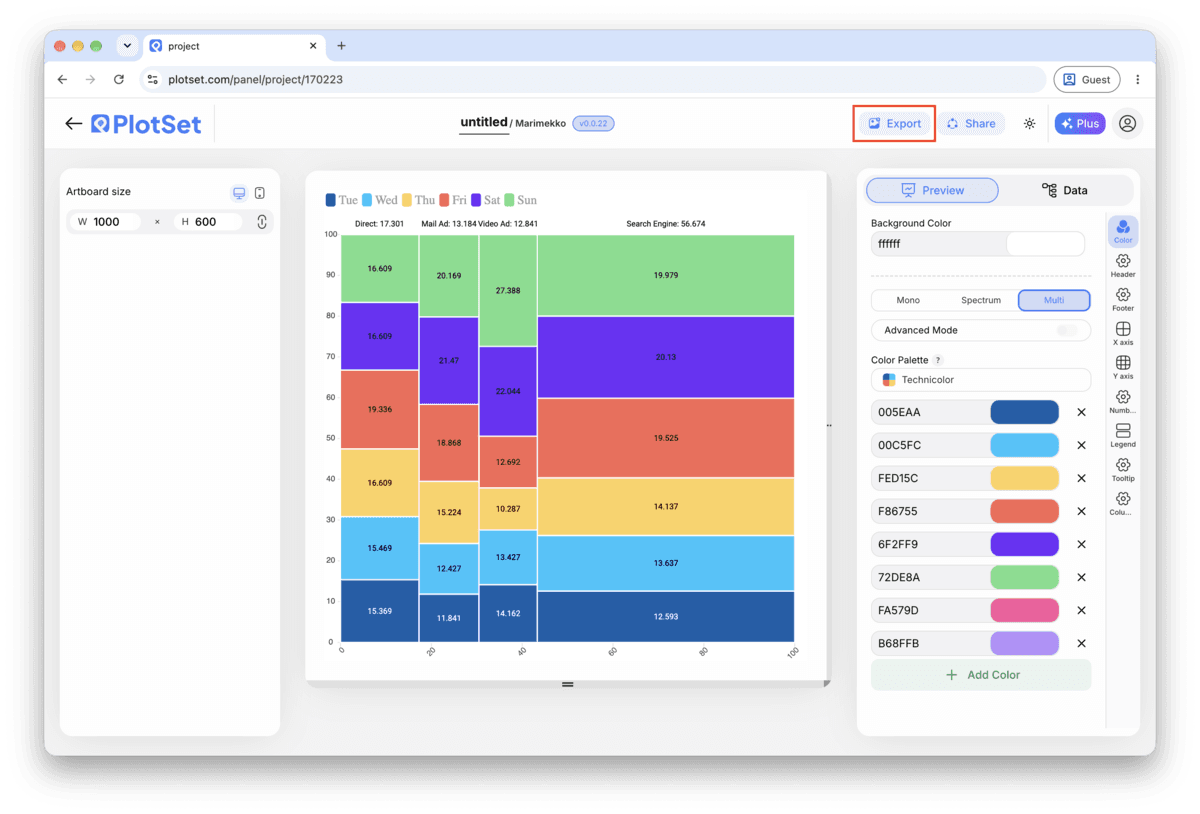
La barra de herramientas del editor de PlotSet con el botón Export resaltado.
Export es el camino hacia un archivo estático para una diapositiva o un informe.
El diálogo Export chart de PlotSet: un selector de escala en 2x, los campos de ancho y alto fijados en 1000 por 600, y el menú de formato abierto con SVG, PNG y JPG.
El SVG se mantiene nítido a cualquier tamaño y se puede seguir editando en una herramienta de diseño; PNG y JPG son la apuesta segura para una presentación. Ajusta la escala antes de exportar para que la imagen se vea nítida en una pantalla retina.

Consejos de estilo para un Marimekko Chart

Label the top axis, not just the blocks

The width of each column is half of what a Marimekko encodes, and it is the half readers miss most often. A cumulative scale along the top turns an implied comparison into one they can actually read.

Lock the subdivision order before you touch color

Set the stacking order once, confirm it holds across every column, and only then start assigning colors. Reordering after coloring means redoing the color mapping too.

Group anything under about five percent into Other

A subdivision too small to get its own labeled sliver just clutters the chart. Fold it into a named Other block per column rather than leaving a row of unreadable slivers.

Keep it to a handful of segments and stacks

Six columns and five stacks is already a lot to compare by area. Past that, filter to the segments that matter (top regions, top categories) and say so in the title or a caption.

Errores comunes al hacer un Marimekko Chart

Every column comes out the same width

This usually means the value column uploaded as text rather than a number, or two rows spelled the segment name differently ("APAC" versus "Asia Pacific") so PlotSet cannot sum them into one segment total. Fix the spelling or the number format in the source sheet and re-upload.

The stacking order flips between columns

Each column is sorting its subdivisions independently, usually by value, instead of using one fixed order. Set the subdivision order explicitly in the chart settings rather than leaving it on automatic, and it will hold across every column.

Blocks are too thin to label

Too many segments, too many subdivisions, or both. Filter the segments to the ones carrying the story and fold small subdivisions into an Other block before uploading again.

Aprende más sobre el Marimekko Chart

¿No estás seguro de que el Marimekko Chart sea la opción correcta? Descubre qué es, cuándo usarlo y cuándo no.

Sobre el Marimekko Chart

Marimekko Chart: preguntas frecuentes

Three: a segment (the column), a subdivision (the stack inside it), and a value. One row per segment-subdivision pair, in long format. PlotSet calculates each column's width from the segment totals, so you never enter a width directly.

Crea tu Marimekko Chart ahora

Gratis para empezar con más de 300 plantillas. No se necesita tarjeta de crédito.