| Service | Month | Rank |
|---|---|---|
| Spotify | Jan | 1 |
| Apple Music | Jan | 2 |
| YouTube Music | Jan | 3 |
| Amazon Music | Jan | 4 |
| Spotify | Feb | 1 |
| Apple Music | Feb | 3 |
| YouTube Music | Feb | 2 |
| Amazon Music | Feb | 4 |
| Spotify | Mar | 2 |
| Apple Music | Mar | 3 |
| YouTube Music | Mar | 1 |
| Amazon Music | Mar | 4 |
| Spotify | Apr | 1 |
| Apple Music | Apr | 2 |
| YouTube Music | Apr | 3 |
| Amazon Music | Apr | 4 |
How to Create a Bump Chart
A step by step walkthrough for turning a ranked spreadsheet into a published bump chart in PlotSet, from shaping the sheet to publishing the finished tracks.
Unos 8 minutosRank instead of raw value is the input here, and how to create a bump chart in PlotSet turns a spreadsheet with an item, a period and a rank column into a published, interactive chart you can embed or export. You will end up with a set of coloured tracks that cross exactly where the underlying ranking actually changed, with names attached at either end and no legend needed to read it.
If your data already has a rank column, this takes about eight minutes. Add another ten if you are starting from raw values and need to rank them within each period first: that step happens in your spreadsheet, before anything is uploaded, and it is the one most people skip by mistake.
Los datos que necesitas
Long format, one row per item per period: the item name, the period label, and that item's rank within the period. Three columns, one header row.
The rank column has to be an integer position (1, 2, 3...), not the raw measure. If you only have subscriber counts or scores, rank them within each period first: a RANK formula in your spreadsheet, sorted per period, does this in one column.
Every item needs a row for every period. A period an item is missing from (a product not yet launched, a team relegated out of the league) leaves a gap in that track rather than a smooth line, so decide up front whether to backfill, drop the period, or leave the gap visible.
Two items cannot share a rank within the same period. A tie uploaded as-is either gets silently broken by PlotSet or draws two tracks on top of each other, so resolve ties in the sheet (alphabetical, or a tiebreaker metric) before uploading.
Keep the period column consistent: all month names, all week numbers, all match dates, not a mix. PlotSet orders periods by reading this column, and a mixed format sorts oddly.
Los pasos
El camino exacto en PlotSet, desde una plantilla en blanco hasta el gráfico terminado.
- 01
Open the Bump Chart template
From the PlotSet dashboard, start a new project and choose the Bump Chart template. It loads with a small ranked dataset already bound to it, so you can see the item, period and rank columns in place before you touch your own file.

Todas las guías empiezan aquí. Elige la categoría y luego la plantilla. Es la misma cuadrícula sea cual sea el tipo de gráfico que busques. - 02
Shape your sheet as item, period, rank
Rework your source data into three columns in long format: one row per item per period, with that item's integer rank for the period in the third column. If you are starting from raw values, rank them within each period in your spreadsheet first.
- 03
Upload your sheet or connect it live
Use the data panel to import a CSV or .xlsx file, paste rows straight from a spreadsheet, or connect a Google Sheet if new periods will keep arriving and you want the chart to pick them up without a re-upload.

La vista de datos, aquí en un proyecto de gráfico de barras. Sube un CSV, saca los números de una imagen con Magic Import o sincroniza una Google Sheet. El panel es el mismo en todos los tipos de gráfico. - 04
Map the item, period and rank columns
Tell PlotSet which column is the item, which is the period, and which is the rank. Clear headers like Service, Month and Rank usually get mapped automatically; check this manually if your sheet carries extra columns PlotSet had to guess between.

Las asignaciones deciden qué columna se convierte en la etiqueta, cuál aporta los valores y cuál define el color. Auto Binding las deduce de tus encabezados, así que revísalas en lugar de darlas por buenas. - 05
Set the period order
Confirm the periods run left to right in the order you intend, not alphabetically. This matters most with month abbreviations or match weeks that do not sort correctly as plain text.
- 06
Label the ends of each track
Turn on end labels so item names sit at the first and last period rather than in a separate legend. With names anchored at both edges, a reader can trace any single track through the crossings in the middle without losing their place.
- 07
Highlight the tracks that matter
Pick one or two items to keep in full colour and set the rest to a muted grey. Past about eight tracks a fully coloured chart turns into a tangle, and a highlighted track reads clearly against a grey field in a way it never does against seven other bright ones.

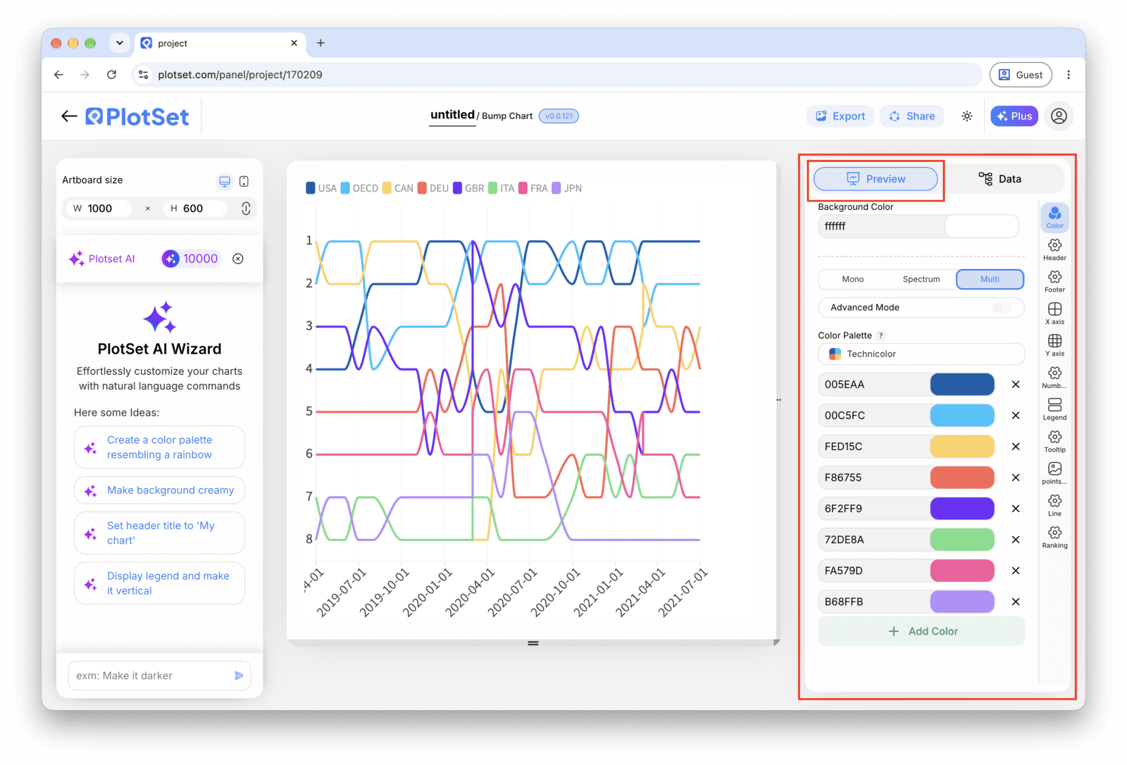
La pestaña Preview de un gráfico de tipo Bump Chart. Todos los controles de estilo están en el panel enmarcado: apariencia, encabezado, pie de página y las opciones propias de este tipo de gráfico, cada grupo en su propia pestaña. - 08
Publish, embed or export the tracks
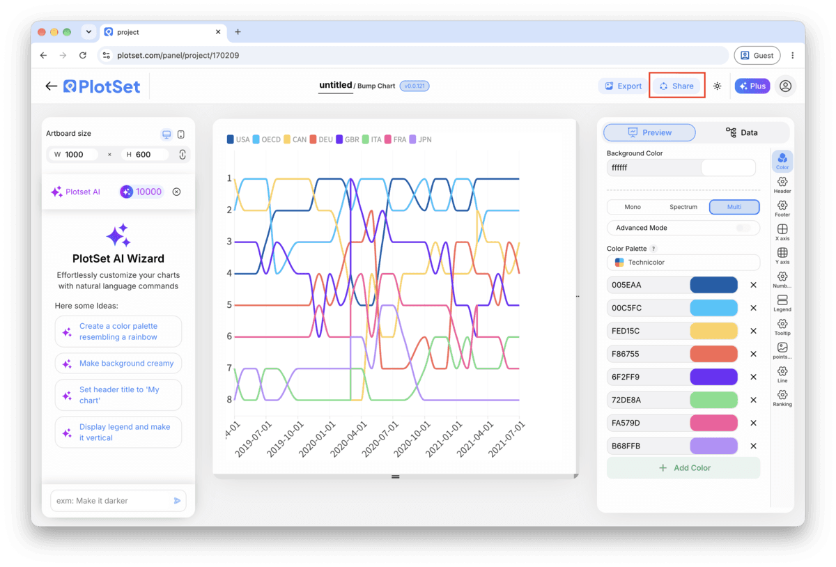
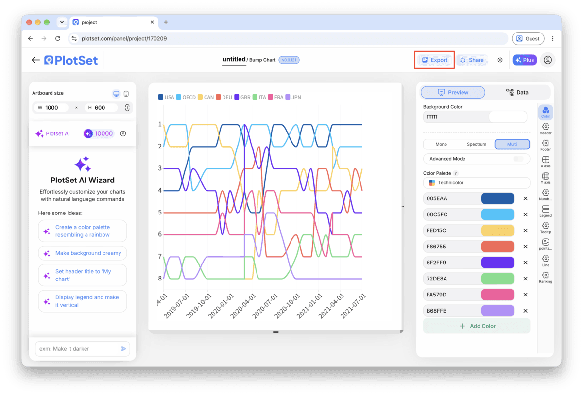
Publish for a live chart where hovering a track highlights it against the rest with a tooltip at each node, grab the embed code to drop it into a page, or export a PNG, SVG or PDF if you need a static image for a deck.
Empieza con la plantilla de Bump Chart, que ya trae datos de ejemplo cargados, y sustitúyelos por los tuyos.
Abrir la plantillaConsejos de estilo para un Bump Chart
Put the real value in the tooltip
Rank alone hides magnitude: first and second can be neck and neck or worlds apart, and the chart looks the same either way. Add the underlying measure (subscribers, points, votes) to the tooltip so a hover fills in what the rank axis cannot show.
Label the top of the rank axis '1st', not '1'
An axis that goes up as rank improves is a convention people have to learn, not one they arrive with. Spelling out 1st at the top removes the one moment a reader might mistake a rise for a fall.
Space periods evenly
Bump charts read the horizontal axis as evenly spaced steps. If your periods are irregular, quarters of different lengths, seasons with byes, gaps read as meaningful when they are just calendar noise. Fill in a placeholder period rather than skip it.
Cap it at two or three highlighted colours
One highlight colour makes a clear point. Two makes a comparison. Past three, even with the rest greyed out, a reader loses track of which line is which by the second crossing.
Errores comunes al hacer un Bump Chart
Two tracks sit exactly on top of each other
This means two items share the same rank in at least one period, usually from an unresolved tie in the source data. Go back to the sheet and break the tie with a secondary sort key, then re-upload.
A track has a visible gap or jumps oddly
A missing row for that item in one period leaves a hole in the line rather than a smooth connection. Check your data table for the period in question and add the missing row, or accept the gap and say so in a caption.
The chart looks huge and jagged instead of clean parallel tracks
This usually means raw values were uploaded into the rank column instead of ranks. Open the sheet, rank each period's values from 1 to N, and replace the value column with the rank before re-uploading.
Aprende más sobre el Bump Chart
¿No estás seguro de que el Bump Chart sea la opción correcta? Descubre qué es, cuándo usarlo y cuándo no.
Bump Chart: preguntas frecuentes
A long-format sheet with one row per item per period: an item column, a period column, and an integer rank column for that item within the period. Three columns and one header row is enough. If you only have raw values, rank them within each period before uploading.
Crea tu Bump Chart ahora
Gratis para empezar con más de 300 plantillas. No se necesita tarjeta de crédito.