
CSV de ejemplo
| KPI | Actual | Target | Poor | Satisfactory | Good |
|---|---|---|---|---|---|
| Revenue ($K) | 275 | 250 | 150 | 225 | 300 |
| Profit Margin (%) | 18 | 22 | 10 | 16 | 24 |
| Marketing ROI (x) | 3.2 | 4.0 | 2 | 3.5 | 5 |
A step by step walkthrough for turning a table of KPIs, targets and thresholds into a published bullet chart scorecard in PlotSet, with target ticks and performance bands.
Unos 6 minutosA column of horizontal bars, each with a target tick and shaded performance bands behind it, one per KPI: that is what you will have. It is a scorecard that shows how each measure compares with its goal and whether the result is poor, fair or good.
If your actuals and targets are already in a spreadsheet, it takes about six minutes. The one thing worth deciding up front is whether your rows share a unit, because that sets the scale mode.
One row per KPI with a name, the actual value, an optional target, and up to three optional band thresholds, each the upper bound of its band.
| KPI | Actual | Target | Poor | Satisfactory | Good |
|---|---|---|---|---|---|
| Revenue ($K) | 275 | 250 | 150 | 225 | 300 |
| Profit Margin (%) | 18 | 22 | 10 | 16 | 24 |
| Marketing ROI (x) | 3.2 | 4.0 | 2 | 3.5 | 5 |
The band columns are upper limits measured from zero, not widths. Poor 150, Satisfactory 225 and Good 300 draw nested bands to 150, 225 and 300.
Use between one and three band columns. The darkest band sits nearest zero.
The target column is optional and draws a vertical tick across the bar.
Keep the row order the way you want it read, since rows appear top to bottom in sheet order.
El camino exacto en PlotSet, desde una plantilla en blanco hasta el gráfico terminado.
From the PlotSet dashboard, start a new project and choose Bullet Chart from the Bar Charts category. It loads with a ten-KPI sample so you can see how each row becomes a bullet.

Put one KPI on each row with its actual value, then a target and band thresholds if you have them. Decide whether the rows share a unit, because that drives the scale.
Import a CSV or .xlsx file from the data panel, paste rows from a spreadsheet, or connect a Google Sheet so the scorecard updates when the sheet does. The first row is read as the headers.

Confirm which column is the label, the value, the target and each band range. This is usually right automatically when the headers are clear.

Open the Value axis tab. Per row, the default, gives each KPI its own scale and suits mixed units. Shared uses one axis and suits rows in the same unit where comparing across them matters.
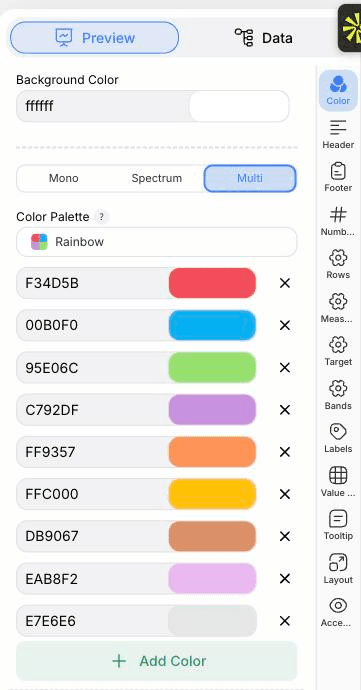
Use the Measure and Target tabs to set bar thickness and tick width, and the Color tab for the bar, target and band colours. The Bands tab can switch the background ranges off.
In the Labels tab choose whether values sit inside the bar, outside it or are hidden. The Rows tab sets row height and the gap between rows.
Publish for an interactive embed with tooltips, or use Export to download a PNG or SVG for a report or slide.
Empieza con la plantilla de Bullet Chart, que ya trae datos de ejemplo cargados, y sustitúyelos por los tuyos.
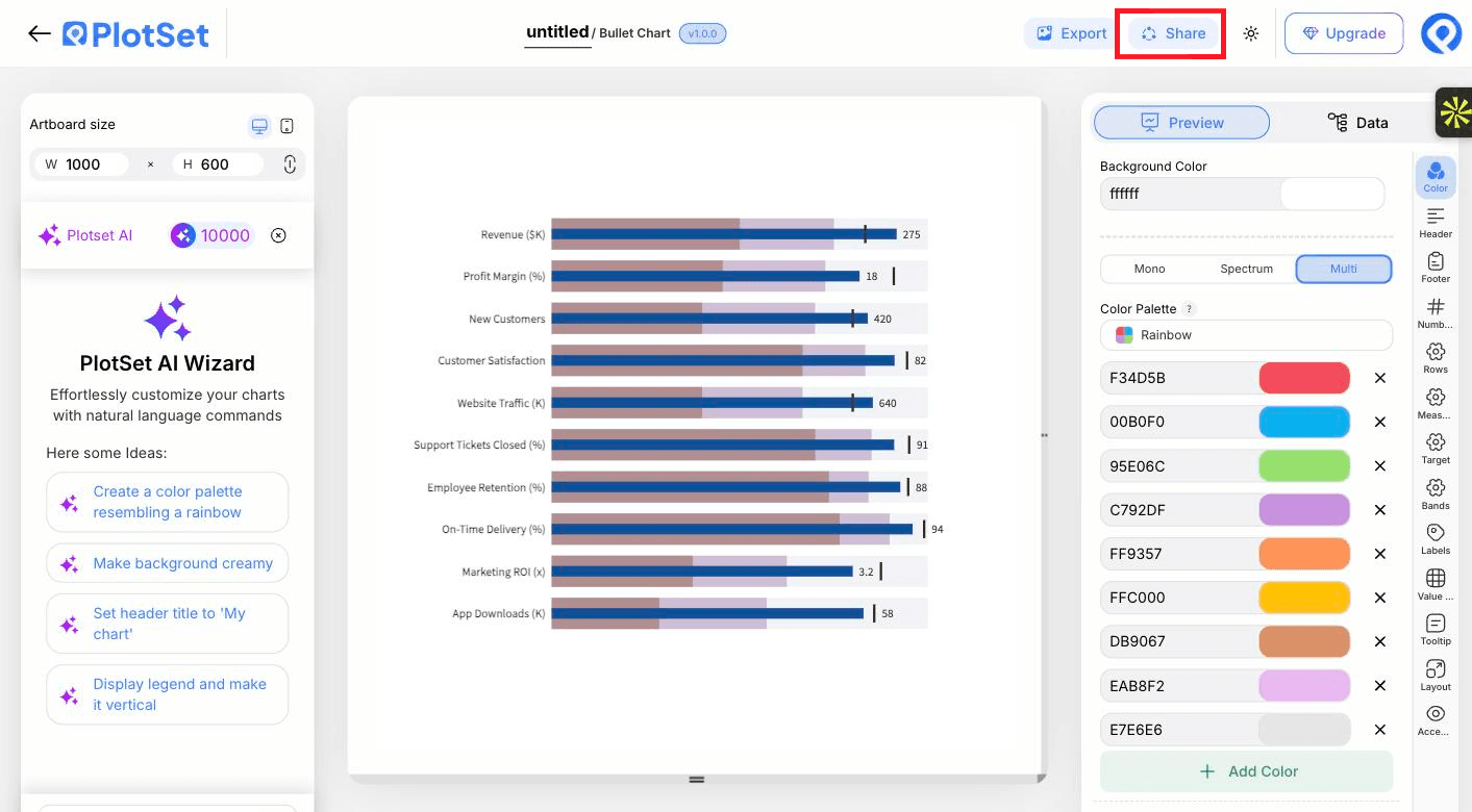
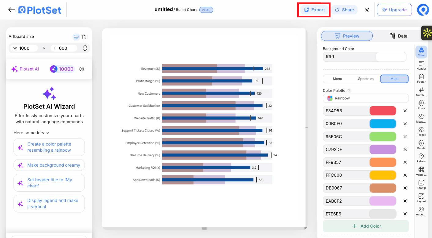
Abrir la plantillaEl último tramo es igual en todos los tipos de gráfico: Share convierte el gráfico en un enlace público en vivo y un código de incrustación, y Export lo guarda como un archivo estático.
Al activar el código de incrustación y el enlace público, el gráfico queda publicado. El enlace se lo puedes enviar a cualquiera sin problema, y el código de incrustación se coloca en cualquier página como un iframe que conserva los tooltips al pasar el cursor y toda la interactividad. Si editas el gráfico más adelante, haz clic en Recreate para llevar esos cambios a ambos.

Export guarda una copia estática en el tamaño que necesites. El SVG se mantiene nítido a cualquier escala y se puede seguir editando en una herramienta de diseño; PNG y JPG son la opción segura para diapositivas y documentos. El multiplicador de escala es lo que te da una imagen nítida en una pantalla retina.

Shades of one colour, darkest nearest zero, keep the bands quiet so the bar and tick stand out.
Add a footer note such as target shown as a vertical tick, so a first-time reader does not have to guess.
Rows read top to bottom in sheet order, so put the KPIs that matter most first.
Ten rows need height. Increase the artboard height or reduce row height before the labels start to shrink.
You are probably on a shared scale with mixed units. Switch Value axis to Per row.
Check that the band columns hold upper bounds, not widths, and that they increase from left to right.
The target column may be unbound or blank for that row, or the Target tab has the tick switched off.
Labels shrink to fit before any are dropped. Shorten the KPI names or give the chart more width.
¿No estás seguro de que el Bullet Chart sea la opción correcta? Descubre qué es, cuándo usarlo y cuándo no.
A name and an actual value for each KPI. A target and up to three band thresholds are optional.
Gratis para empezar con más de 300 plantillas. No se necesita tarjeta de crédito.