
为每个区域填色
颜色深浅代表数值。适合比率、占比和人均指标——这些数字已经消除了面积和人口规模的影响。
打开模板A blank county map to print, and a builder to fill it with your own data. Download the free outline of all 3,000-plus US counties, or upload a spreadsheet and publish an interactive county map you can embed anywhere.
全部 3136 个counties,线条干净的轮廓图。可打印、可填色、可放进文档——无需注册,也无需署名。
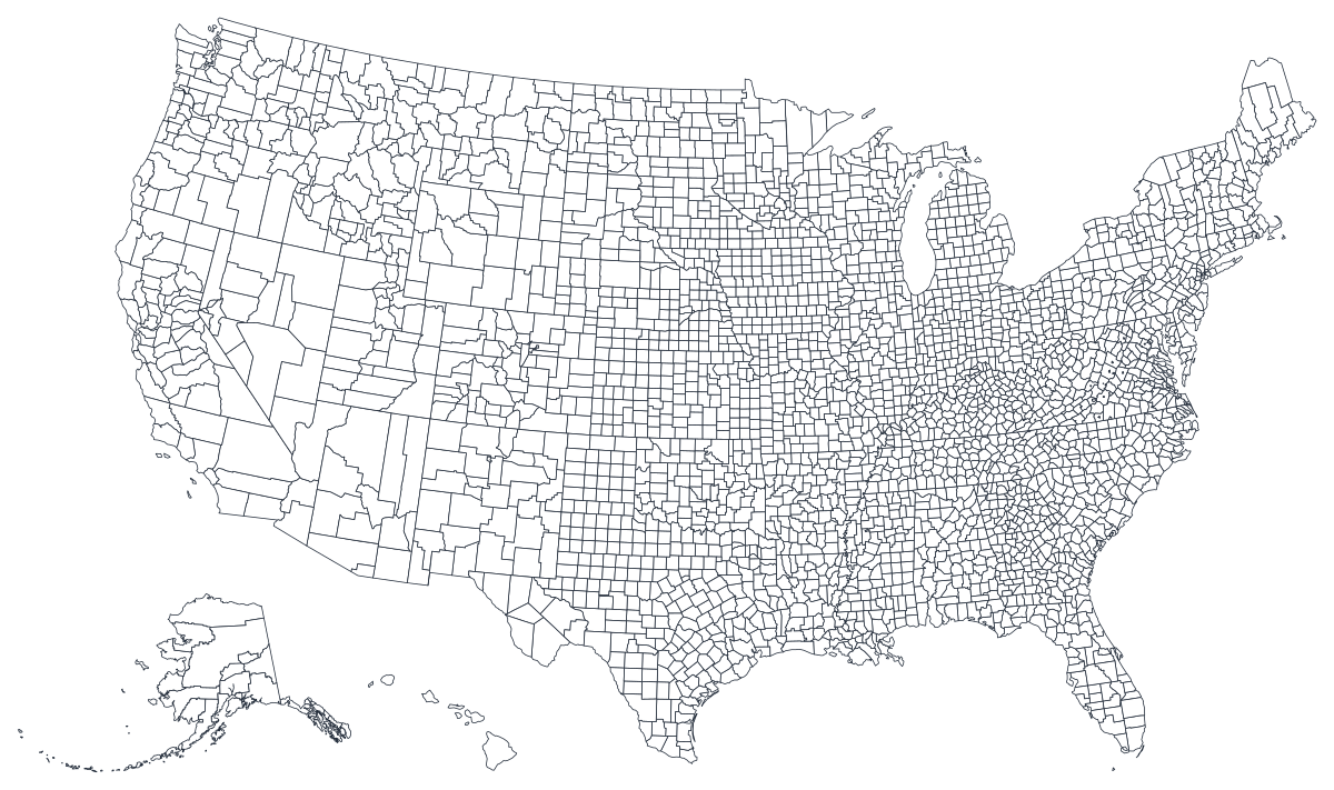
任何用途均可免费使用,包括商用与课堂。由编辑器所用的同一套边界数据生成。
下载 SVGThe county is the smallest geography most American data is published at, and the one where national averages finally break apart into something recognisable. A state-level map of the United States has fifty shapes and tends to show you politics; the same measure drawn across 3,100 counties shows you the Black Belt, the Rio Grande valley, the Appalachian coalfields and the ring of suburbs around every large city. That resolution is the reason to use this map — and also the reason to be careful with it, because counties vary enormously in population and a county map gives every one of them the same visual weight as the land it occupies.
数值是比率时给区域填色,是计数时用大小不同的标记。把这两者用反,是数据地图最常见的误导方式。
Census tables, CDC and BLS releases, election returns and most state agency data all key on county. If your spreadsheet has a FIPS column, this is the map it was made for.
Almost every interesting geographic story in the United States is sub-state. Counties are where an urban/rural split, a border effect or a river valley becomes visible.
Unemployment rates, vaccination shares, median income, turnout percentage. Rates are already adjusted for size, which is exactly what a choropleth needs.
Classroom worksheets, planning sessions and colour-by-hand exercises. The blank outline above is free to download, print and reuse.
Shading counties by total cases or total sales just redraws the population map: Los Angeles County will always be dark. Use a symbol or bubble map, where the circle is sized by the count and the land area stops competing with it.
Counties and metro areas are not the same shape, and in New England they barely relate. If the unit you actually mean is a metro, a point map of cities carries it better.
Rates computed from a handful of events swing wildly in low-population counties, and a county map will show that noise as a bold pattern across the empty middle of the country. Aggregate up, or use a multi-year average.
Do not spread a state figure across its counties to fill the map. Use the US states map instead and say what you actually know.
从表格到发布上线,一步一步来。
The free outline above is a plain SVG — print it, or drop it into a document. To build with data, open the PlotSet USA (counties) template, which comes with sample data already bound.
Five-digit county FIPS codes are the reliable join. County names repeat across states — there are more than thirty Washington Counties — so names alone will silently mismatch.
Import a CSV or Excel file, paste from a spreadsheet, or connect a Google Sheet so the map can be refreshed when the source updates.
Shade the counties for a rate, or switch to symbols or bubbles for a count. It is the same map and the same data; only the encoding changes.
Sequential for a measure that runs low to high, diverging only when there is a real midpoint — a national average, zero change, a 50 per cent line. Stepped scales read more precisely than a continuous gradient at this many regions.
Publish for a live interactive map with hover tooltips on every county, or export a PNG, SVG or PDF for a report.
从已加载示例数据的 US counties 模板开始,再换成你自己的数据。
打开模板地点列应该长什么样,以及去哪里找现成能对上的数据。
The first two digits are the state, the last three the county. Keep it as text: Alabama's counties start 01 and a spreadsheet will happily strip that leading zero and turn 01001 into 1001.
Louisiana has parishes, Alaska has boroughs and census areas, and several states contain independent cities that are counted as county equivalents. All of them are in this map and all of them need a row.
Connecticut replaced its counties with planning regions in 2022 and Alaska redraws boroughs from time to time. If a handful of regions come out blank, a boundary vintage mismatch is usually why.
The Census Bureau's American Community Survey, the CDC's WONDER and PLACES releases, BLS local area unemployment statistics and the USDA's county-level economic data all publish with FIPS codes included.
The most common county-map error, and the one that turns every map into a population map. If the number gets bigger simply because more people live there, size a symbol by it rather than shading the county.
Names are not unique and are not spelled consistently — St. Louis city and St. Louis County, De Kalb and DeKalb, Doña Ana with and without its tilde. Use FIPS.
The largest counties in the west hold the fewest people, and on a choropleth they shout. Say so in the caption, or pair the map with a bar chart of the top counties by population.
Nobody can distinguish nine shades of blue across 3,100 small shapes. Five or six steps is the practical ceiling, and four is often clearer.
Yes. The outline above is a free SVG covering every US county — right-click to save it, print it, or drop it into a document or worksheet. No account needed.
上传表格,几分钟内发布一张交互式地图——免费,无需信用卡。