| Category | Parent | Revenue |
|---|---|---|
| North America | 4200000 | |
| Europe | 3100000 | |
| Asia Pacific | 1800000 | |
| United States | North America | 3300000 |
| Canada | North America | 900000 |
| Germany | Europe | 1400000 |
| France | Europe | 900000 |
| United Kingdom | Europe | 800000 |
| Japan | Asia Pacific | 1100000 |
| Australia | Asia Pacific | 700000 |
How to Create a Treemap
A step by step walkthrough for turning a spreadsheet into a published treemap in PlotSet, from shaping the category and parent columns to exporting or embedding the finished tiles.
约 8 分钟This is how to create a treemap in PlotSet from your own spreadsheet: tiles sized by value, grouped by hierarchy, coloured on purpose, then published as a live embed or exported as an image. Your own rows go through the same upload-to-publish path a real PlotSet treemap takes, including the one column that trips people up: the parent.
If your spreadsheet already has a category, a parent and a value in three columns, eight minutes gets the whole thing done. Pulling the data out of a pivot table first adds another five, since pivot exports usually carry subtotal rows that need to come out before the tiles will size correctly.
你需要的数据
Three columns, one row per tile: the category name, its parent group (blank for a top-level tile), and a positive number. One header row, no subtotal rows.
Leave the parent column blank for a top-level row, not filled with a placeholder like "None" or "Top". A blank cell is how PlotSet knows a tile has no ancestor; a text placeholder gets read as an actual parent name and adds a stray tile.
Every value must be zero or greater. A negative revenue or a loss row will not render as a tile, since a rectangle cannot have negative area, so pull those rows into a separate table before you upload.
If you are working from a pivot table, delete the grand total and subtotal rows first. A "Total" row uploaded alongside real categories becomes a tile of its own, usually the largest one on the page.
A flat treemap with no hierarchy works too: just leave the Parent column out entirely, or leave every cell in it blank, and every row becomes a top-level tile.
Parent names have to match a Category value exactly, including case and spacing. "north america" in the Parent column will not find "North America" in Category, and that child tile gets dropped.
操作步骤
PlotSet 中从空白模板到完成图表的具体点击路径。
- 01
Open the treemap template
From the PlotSet dashboard, start a new project and choose the Treemap template. It loads with sample data already bound, tiled by category, parent and value, so you can see the exact three-column shape before you swap in your own file.

每份指南都从这里开始:先选分类,再选模板,不管你要做哪种图表,用的都是同一个网格。 - 02
Shape your sheet into category, parent and value
One row per tile: its name, the group it sits inside, and its size. If your source is a pivot table or a finance report, pull those three fields out into a plain flat sheet first. No merged cells, no subtotal rows.
- 03
Upload the sheet or connect a live one
Use the data panel to import a CSV or .xlsx file, paste rows straight from a spreadsheet, or connect a Google Sheet so the treemap can be refreshed later without a re-upload. PlotSet reads the first row as headers.

这里的数据视图取自一个条形图项目。你可以上传 CSV、用「Magic Import」从图片里提取数字,或同步 Google Sheet,每种图表类型的面板都一样。 - 04
Map the category, parent and value columns
Confirm which column feeds the tile name, which one feeds the parent group, and which one sizes the tile. PlotSet usually guesses right when your headers are clear, but check it manually if your sheet has extra columns sitting between them.

绑定决定哪一列作标签、哪一列提供数值、哪一列决定颜色。「Auto Binding」(自动绑定)会根据表头推测,所以要核对一遍,别想当然。 - 05
Check the hierarchy renders the way you expect
Look for a top-level tile that is really a stray parent name, or a child tile that vanished because its parent value did not match exactly. Fix mismatches in the source sheet and re-upload rather than patching the chart by hand.
- 06
Colour by group, not by size
Size is already spoken for by the tile's area. Set the colour scale to the parent group so the hierarchy reads at a glance, or switch it to a second numeric column, growth rate or margin, if you want colour to carry a different story than area does.

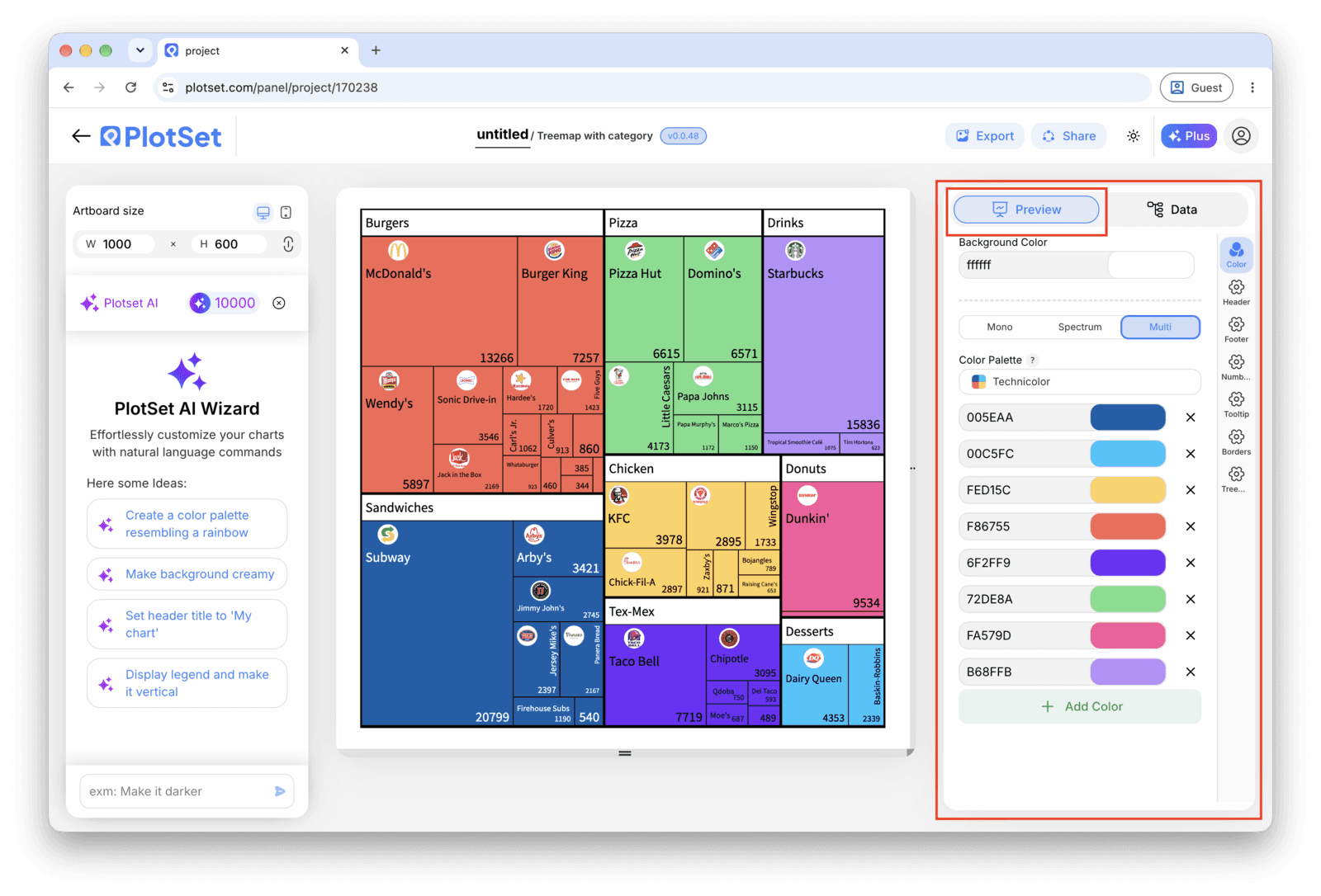
Treemap 的「Preview」标签页。所有样式设置都在红框标出的这个面板里,每个设置各自占一个标签页:外观、标题、脚注,以及这种图表类型特有的选项。 - 07
Turn on labels for the tiles big enough to hold them
PlotSet hides labels automatically once a tile gets too small to fit text without overlapping its neighbours. Leave that behaviour on rather than forcing every tile to label, and rely on the hover tooltip to surface the exact value for the small ones.
- 08
Publish, embed or export the tiles
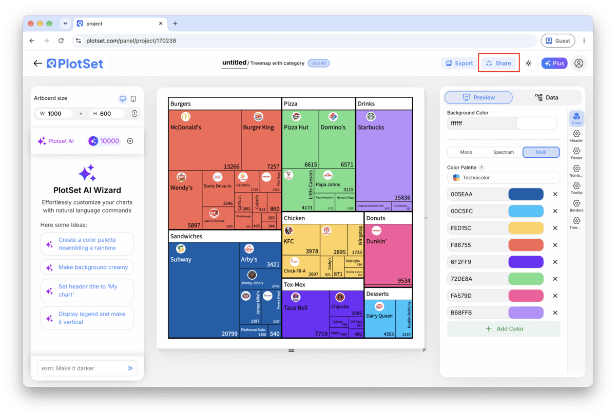
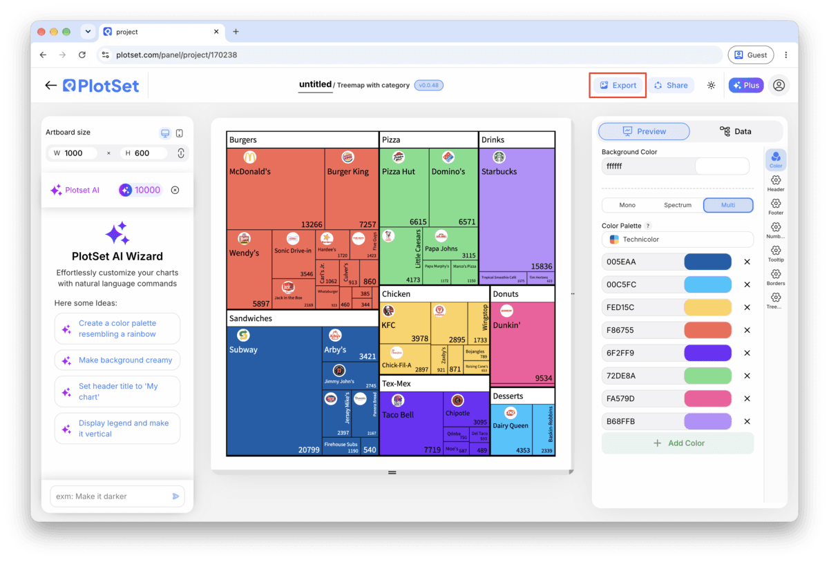
Publish for a live interactive treemap with hover tooltips and a shareable link, grab the embed code to drop it into a page, or export a PNG, SVG or PDF if you need a static image for a deck or a report.
从已加载示例数据的 Treemap 模板开始,再替换成你自己的数据。
打开模板Treemap 的样式提示
Group the long tail into one tile
If your data has three big categories and forty tiny ones, the tiny ones will shrink into unreadable slivers regardless of how you colour them. Sum the small rows into a single "Other" row before upload, and mention in a caption what it covers.
Use colour for the second variable you actually care about
A treemap gives you two channels to work with: area for value, colour for anything else. Wasting colour on the same value the area already shows (a common default) throws away half the chart's power. Try colouring by year-over-year change instead.
Keep the hierarchy to two levels
PlotSet will nest a third level, but by the time tiles are three groups deep, individual rectangles are too small to compare or even see. If your data goes deeper, pick the two levels that matter most to the reader and flatten the rest.
Name the "Other" bucket specifically
"Other" on its own reads as a shrug. "Other: 14 regions under $50k" tells the reader exactly what got folded in and why it is not broken out, without them needing to ask.
制作 Treemap 时的常见错误
A tile is missing even though the row is in the sheet
The parent name in that row almost certainly does not match a category value exactly, often a trailing space or a different capitalisation. Compare the two columns directly in the spreadsheet, fix the mismatch, and re-upload rather than editing inside PlotSet.
One enormous tile dominates the whole treemap
This is usually a subtotal or grand total row from a pivot export that got uploaded as if it were a real category. Scroll to the bottom of the source sheet, delete the totals row, and re-upload.
Half the tiles are unlabelled and it looks broken
It is not broken: PlotSet is hiding labels that would overlap or overflow a small tile. Check the hover tooltip to confirm the value is still there, and if you need more tiles labelled, group the smallest ones into an "Other" tile so the remaining ones have more room.
深入了解 Treemap
不确定 Treemap 是否是正确选择?查看它是什么、何时使用以及何时不使用。
Treemap:常见问题
Three columns: category, parent, and value, with one row per tile. Leave the parent blank for top-level tiles, or drop the column entirely for a flat treemap with no hierarchy. CSV and .xlsx both work.
现在制作你的 Treemap
免费开始,300+ 模板任选。无需信用卡。