| Campaign | Channel | Spend | Revenue |
|---|---|---|---|
| Spring Launch | Paid Search | 4200 | 18900 |
| Summer Sale | Paid Search | 6100 | 24300 |
| Back to School | Paid Social | 3800 | 11200 |
| Holiday Push | Paid Social | 7200 | 19800 |
| Retargeting Q1 | 1200 | 9800 | |
| Newsletter Promo | 900 | 6200 | |
| Influencer Collab | Paid Social | 5400 | 15100 |
| Display Retarget | Paid Search | 2600 | 10400 |
How to Create a Scatter Plot
A step by step walkthrough for plotting two numeric columns from your own spreadsheet in PlotSet, grouping the points by category, and publishing, embedding or exporting the result.
约 7 分钟This guide covers how to create a scatter plot in PlotSet from your own numbers, not a demo dataset: two numeric columns bound to X and Y, an optional category column colouring the points into groups, and axes and labels that actually say what the numbers mean. By the end you will have gone through the same click path a published PlotSet chart takes, from a raw spreadsheet to something you can embed or drop into a deck.
Seven minutes covers it when your sheet already has two clean numeric columns, most of that spent on labelling and styling rather than wrestling the data itself. Pulling numbers out of a wider report, or cleaning up a category column for grouping, adds another five to ten.
你需要的数据
One row per record, with two numeric columns for the axes plus an optional label column and an optional category column for colour grouping. Just one header row, no merged cells.
Both axis columns need to be numbers, not text that merely looks numeric. A currency symbol or a thousands separator left in as text will stop the column from binding to an axis, so strip formatting before uploading.
The label column (here, Campaign) is optional but worth keeping: it is what shows up in the tooltip and in any point labels you turn on later, instead of a bare coordinate.
The category column (here, Channel) is optional too. Skip it for a plain single-colour scatter plot, or keep it if you want the points grouped and coloured by that channel, region or segment.
One row per record, not per aggregate. If your source is already a pivot table of averages, decide whether you actually want the underlying rows plotted or a smaller, pre-aggregated table instead.
操作步骤
PlotSet 中从空白模板到完成图表的具体点击路径。
- 01
Open the scatter plot template
From the PlotSet dashboard, start a new project and choose the Scatter Plot template. It loads as a scatter plot with groups and comes with sample data already bound, so you can see the exact column layout it expects before touching your own file.

每份指南都从这里开始:先选分类,再选模板,不管你要做哪种图表,用的都是同一个网格。 - 02
Shape your sheet into the right columns
Put your two numeric measures in their own columns, add a label column if you want readable tooltips, and add a category column only if you plan to colour the points by group. Drop any subtotal or average row before uploading.
- 03
Bring in your file or link a sheet
Import a CSV or .xlsx file from the data panel, paste rows straight from a spreadsheet, or connect a Google Sheet if you want later edits to flow through without a re-upload. PlotSet reads the first row as headers automatically.

这里的数据视图取自一个条形图项目。你可以上传 CSV、用「Magic Import」从图片里提取数字,或同步 Google Sheet,每种图表类型的面板都一样。 - 04
Map the X and Y columns
Assign one numeric column to the X axis and the other to Y. PlotSet usually guesses correctly when your headers are clear, but check the mapping manually if your sheet carries extra numeric columns it might have picked the wrong one from.

绑定决定哪一列作标签、哪一列提供数值、哪一列决定颜色。「Auto Binding」(自动绑定)会根据表头推测,所以要核对一遍,别想当然。 - 05
Turn on grouping by category
If you included a category column, bind it to colour so each group gets its own shade and its own entry in the legend. Skip this step entirely for a single-series scatter plot: one colour is correct when there is nothing to group.

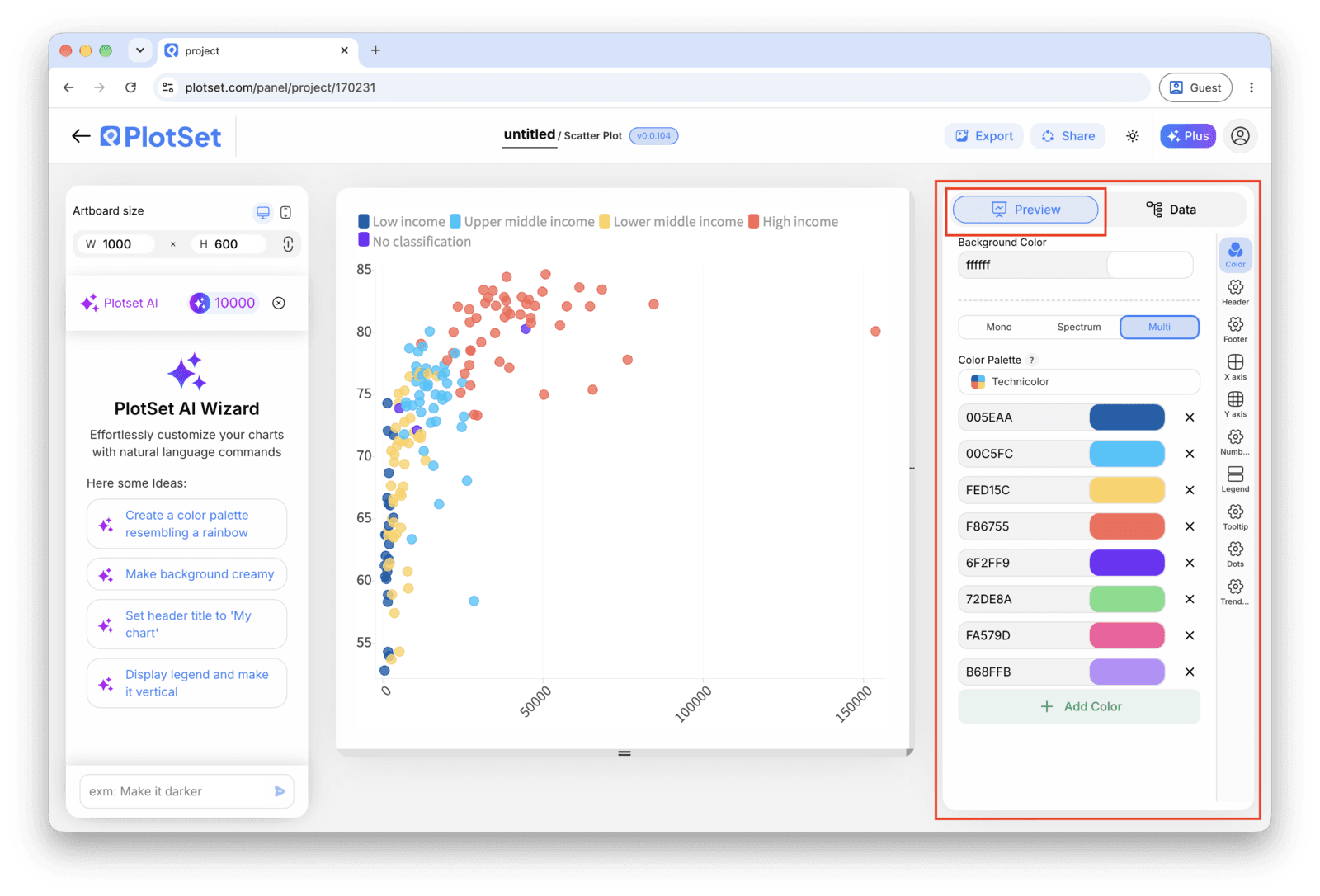
Scatter Plot 的「Preview」标签页。所有样式设置都在红框标出的这个面板里,每个设置各自占一个标签页:外观、标题、脚注,以及这种图表类型特有的选项。 - 06
Label the axes and the outliers
Name both axes with real units, not just the column header. Turn on point labels for the handful of records that matter, usually the outliers, and leave the rest to the hover tooltip so the chart does not turn into a wall of text.
- 07
Adjust point size, opacity and the trend line
Reduce mark size or add transparency if points are stacking into a solid blob. Only turn on the fitted trend line once you have actually looked at the shape of the cloud, since a straight line through a curved or clustered relationship reports a pattern that is not there.
- 08
Publish the chart, or export it as an image
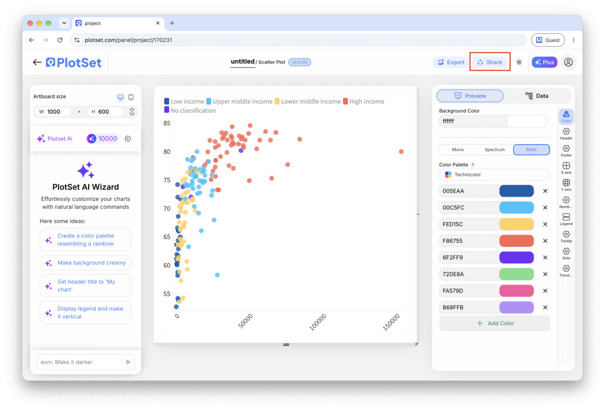
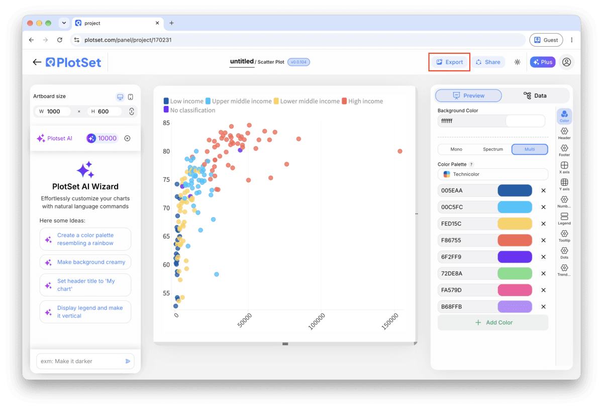
Publish for a live interactive chart with hover tooltips and a shareable link, copy the embed code to drop it into a page, or export a PNG, SVG or PDF if you need a static image for a deck or report.
从已加载示例数据的 Scatter Plot 模板开始,再替换成你自己的数据。
打开模板Scatter Plot 的样式提示
Cap grouping at six or seven colours
Past that, the legend and the eye both lose track of which shade is which. If your category column has more groups than that, filter to the ones that matter for the story or fall back to a single colour and call out one group with a label instead.
Fight overplotting before you fight the layout
If the cloud reads as one dark shape, the fix is almost never a bigger chart. Drop the mark opacity to around 50 to 70 percent, or shrink the point size, so overlapping records show up as darker patches instead of one flat blob.
Let the axis range reflect the real spread
Do not zoom the axis in to make a weak relationship look tighter. Start from the full range of your data and only narrow it if you are explicitly calling out a subset, with a caption saying so.
Label outliers by hand, not by category
The point worth a label is usually the one that breaks the pattern, not every point in a given group. Turn on manual point labels and pick the two or three records that carry the story, leaving the rest to the tooltip.
制作 Scatter Plot 时的常见错误
Every point comes out the same colour despite mapping a category
This usually means the category column was read as a number rather than text, so PlotSet tried to bind it to size or a colour scale instead of discrete groups. Check the column type in the data panel and force it to text if a category name looks like a code or an ID.
The chart is a solid blob with no visible pattern
This is overplotting: too many points landing on top of each other at the resolution you are viewing. Lower the mark opacity, shrink the point size, or filter to a date range or subset before assuming the two variables have no relationship at all.
The trend line does not match what the cloud actually looks like
A linear trend line forces a straight line through data that might be curved, clustered into two groups, or dominated by one outlier. Turn the trend line off, look at the raw shape of the points, and only re-enable it if a straight line is genuinely the right summary.
深入了解 Scatter Plot
不确定 Scatter Plot 是否是正确选择?查看它是什么、何时使用以及何时不使用。
Scatter Plot:常见问题
Two numeric columns, one per axis, with one header row. A label column and a category column are optional additions that drive the tooltip text and the colour grouping. CSV and .xlsx both work, and a pasted range from any spreadsheet tool is fine too.
现在制作你的 Scatter Plot
免费开始,300+ 模板任选。无需信用卡。