
示例 CSV
| Quarter | Revenue |
|---|---|
| Q1 2023 | 182400 |
| Q2 2023 | 205100 |
| Q3 2023 | 198750 |
| Q4 2023 | 241300 |
| Q1 2024 | 229600 |
| Q2 2024 | 256900 |
A step by step walkthrough for turning a spreadsheet into a published column chart in PlotSet, from ordering the rows to exporting or embedding the finished chart.
约 7 分钟Categories in the order you want them, a value axis that starts at zero: how to create a column chart in PlotSet covers exactly that, styled on purpose and either embedded on a page or exported as an image. Not a copy of someone else's demo, your own periods and your own numbers, going through the same click path a real PlotSet chart takes from upload to publish.
If your spreadsheet is already two columns, category and value, with the rows already in the order you want to see, this takes about five minutes. Add a couple more if you're dealing with dates that keep auto-converting into something else, or a totals row you need to strip out first. Budget the seven minutes below and treat the rest as a buffer.
Two columns, one row per category: the category label first, usually a time period, and the number second. Rows should already sit in the order you want the columns to appear, since PlotSet reads them top to bottom.
| Quarter | Revenue |
|---|---|
| Q1 2023 | 182400 |
| Q2 2023 | 205100 |
| Q3 2023 | 198750 |
| Q4 2023 | 241300 |
| Q1 2024 | 229600 |
| Q2 2024 | 256900 |
Keep the category column as plain text, not a date. If a spreadsheet auto-converts "Q1 2023" into a date serial number, PlotSet charts that serial number, not the label you typed.
Row order is chart order. PlotSet lists categories top to bottom exactly as they sit in your sheet, so put Q1 2023 above Q2 2023 rather than relying on a sort step afterward.
One number per category. Comparing this year against last year in the same chart needs an extra column and a grouped or stacked column chart, not this one.
Delete any totals row before uploading. A "Total 2023" row becomes a column of its own, usually the tallest, and breaks the chronological order of everything after it.
PlotSet 中从空白模板到完成图表的具体点击路径。
From the PlotSet dashboard, start a new project and pick the Column Chart template. It loads with sample data already in place so you can see the exact layout, category then value, before you bring your own sheet.

Put the category label in the first column and its number in the second, one row per category, arranged in the order you want the columns to appear. For time periods, that means Q1 sitting above Q2 in the sheet itself, not sorted after upload.
Use the data panel to import a CSV or .xlsx file, paste rows straight from a spreadsheet, or connect a Google Sheet if you want the chart to refresh when the source changes. PlotSet reads the first row as headers automatically.

Confirm which column feeds the horizontal axis and which feeds the column height. PlotSet usually guesses right when your headers are clear, like "Quarter" and "Revenue", but check it manually if your sheet carries extra columns.

PlotSet defaults to ranking columns by value, which is wrong for anything with a natural sequence. Switch the sort control to source order so Q1 2023 through Q2 2024 stay chronological instead of jumping around by size.
Add thousands separators or a currency symbol under number formatting, name the unit on the value axis, and confirm the axis minimum is 0. Set the gap between columns to roughly half a column's width: tight enough to compare, loose enough not to read like a histogram.
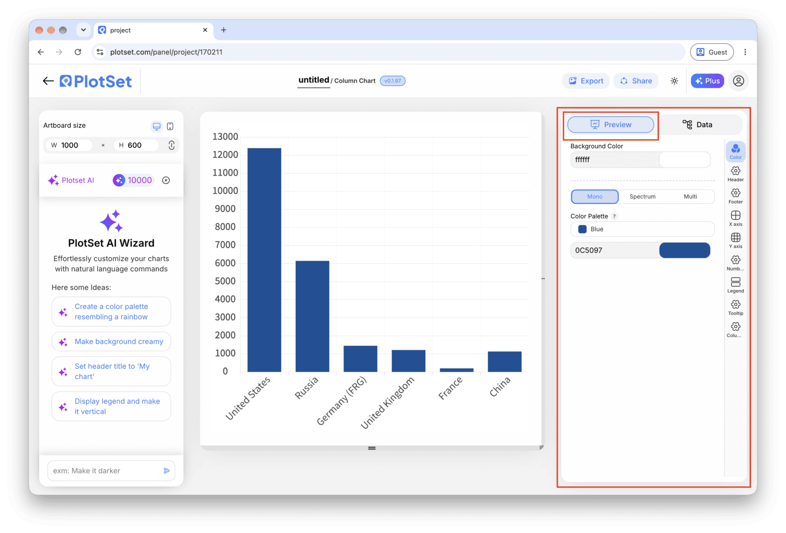
One consistent colour is correct for a single series; save a second colour for the one column you want to highlight, such as the most recent quarter. Add a title that states the comparison, then publish for a live interactive chart, grab the embed code, or export a PNG, SVG or PDF.
从已加载示例数据的 Column Chart 模板开始,再替换成你自己的数据。
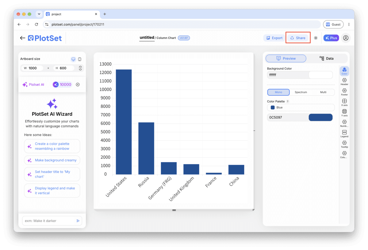
打开模板最后一段路对每种图表都一样:「Share」(分享)把图表变成一个在线的公开链接和一段嵌入代码,「Export」(导出)把它输出成静态文件。
打开嵌入代码和公开链接的开关,图表就发布出去了。链接可以放心发给任何人;嵌入代码以 iframe 的形式放进任意页面,悬停提示和交互效果都会保留。之后修改了图表,点「Recreate」就能把改动同步到链接和嵌入代码两边。

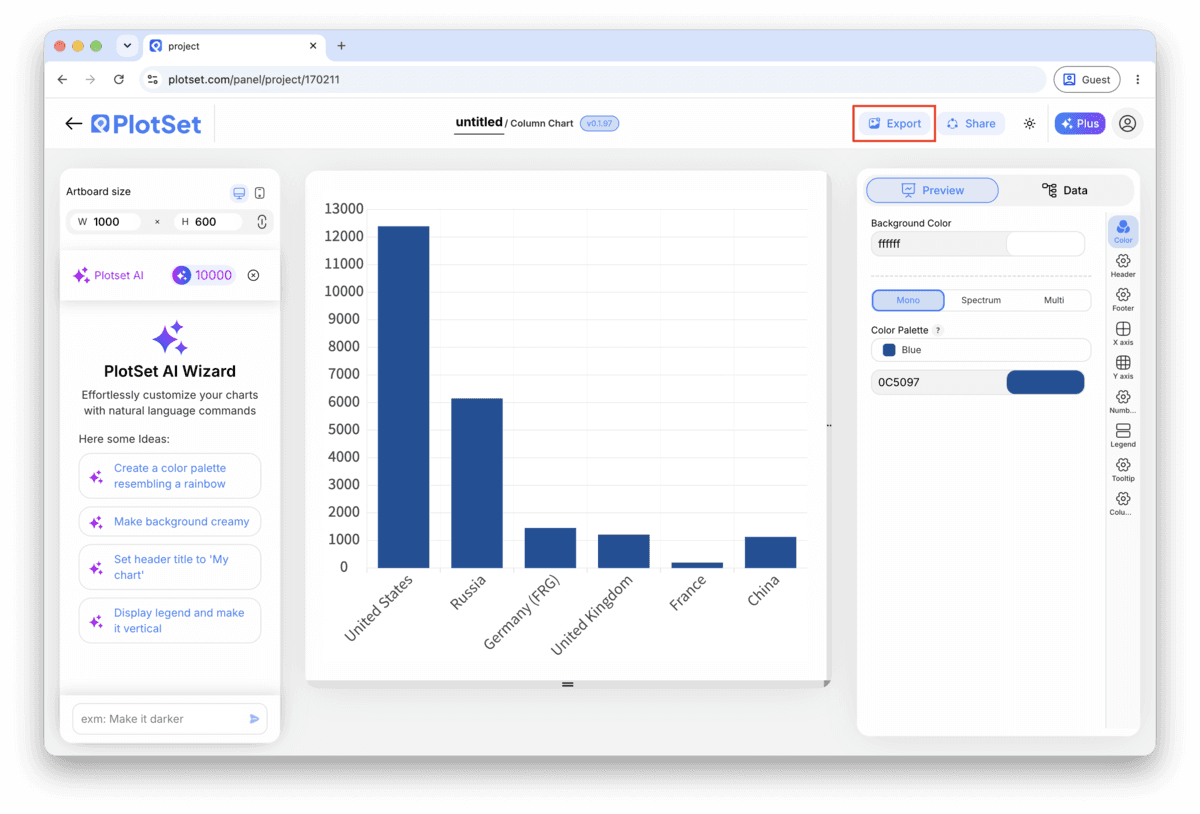
「Export」会按你需要的尺寸输出一份静态副本。SVG 放到多大都清晰,还能在设计工具里继续编辑;幻灯片和文档用 PNG 或 JPG 最稳妥。想让图片在高分屏上够锐利,关键就是那个倍数设置。

If your categories are months, quarters or years, turn off value based sorting entirely. A chronological column chart tells a trend story; a value sorted one scrambles it into a ranking that doesn't exist in time.
Past that, labels start tilting or truncating and the columns thin into a picket fence. Group extra categories into an "Other" bucket, or switch to a horizontal bar chart, which handles a long list better than a column chart ever will.
Too wide and the eye has to travel between columns to compare them; too narrow and the chart starts to look like a histogram, where touching bars mean something different: a continuous number line underneath. Fifty percent of a column's width is a safe middle.
A highlight colour on the current quarter, or the category you're actually discussing, earns its place. A different hue on every column asks the reader to hunt for a grouping that isn't there.
This means the sort control is still set to rank by value or by category name instead of source order. Open the sort setting in the chart panel, switch it to source order, and check that your sheet already lists the periods top to bottom in the sequence you want.
This shows up once you're past ten or so categories, or once a label runs longer than a word or two. Shorten the labels first, "Q1 2024" instead of "First Quarter 2024", and if that's still not enough, take it as the cue to switch to a bar chart instead.
Check the axis minimum. If it's been nudged above zero, by hand or by an auto-scale setting, every column's true height gets compressed and small real differences look identical. Reset the value axis minimum to 0.
不确定 Column Chart 是否是正确选择?查看它是什么、何时使用以及何时不使用。
Two columns and one header row: a category label, usually a time period, in the first column and one number per category in the second. CSV and .xlsx both work, and a pasted range from any spreadsheet tool is fine too.
免费开始,300+ 模板任选。无需信用卡。