PlotSet LogoPlotSet

How to Create a Stream Graph

A step by step walkthrough for turning a spreadsheet of categories over time into a published stream graph in PlotSet, from shaping the sheet to ordering the bands and exporting the result.

Environ 10 minutes

How to create a stream graph in PlotSet starts with a wide CSV of dates and categories, turned into flowing bands ordered so the biggest shift in the data is what a reader notices first. This walks the same click path a real PlotSet stream graph takes from upload to publish, not a demo running on someone else's numbers.

Ten minutes, if your data is already one row per date with a column per category, most of it spent on band order and colour rather than the upload. Reshaping a long format export, one row per date and category rather than one row per date, into the wide layout this chart needs adds another ten.

Les données dont vous avez besoin

Wide format: one row per time point, one column per category, values are the amount for that category at that time. One header row, dates in the first column.

Exemple de CSV
MonthHip-HopRockPopCountryElectronic
2024-0118400152002130091007600
2024-0219100148002190088008200
2024-0320500141002260086009000
2024-0421800136002220083009900
2024-05232001300021700810010800
2024-06246001250021100790011700
Remarques

This is wide format, not long format. If your export instead has one row per date-and-category combination (a "Month, Genre, Streams" shape with repeated months), pivot it in your spreadsheet tool first so each category gets its own column.

Dates need to parse cleanly and stay in order. A first column of "2024-01", "Jan-24" or a real date type all work; a text column that sorts alphabetically instead of chronologically will scramble the bands.

Use even spacing where you can: weekly, monthly, quarterly. Gaps of uneven length between rows still plot, but the interpolation between a wide gap and a narrow one gets visibly less trustworthy.

Blank cells read as zero for that category at that time, not as missing. If a category genuinely did not exist yet, that is usually the correct reading; if it is a data entry gap, fill it in before uploading.


Les étapes

Le parcours exact dans PlotSet, d'un modèle vierge à un graphique terminé.

  1. 01

    Open the stream graph template

    From the PlotSet dashboard, start a new project and choose the Stream Graph template. It loads with sample data already in the wide layout, so you can see exactly how a time column and several category columns turn into bands before you touch your own file.

    Le sélecteur de modèles de PlotSet : les catégories de graphiques listées à gauche, la grille 'Bar Charts' ouverte et la carte du modèle 'Bar Chart' affichant son bouton 'Select'.
    Chaque guide commence ici. Choisissez la catégorie, puis le modèle : c'est la même grille quel que soit le type de graphique visé.
  2. 02

    Shape your sheet into wide format

    Put your time points down the first column and one column per category across the top, with values filling the grid. If your source export is long format, pivot it now: a spreadsheet pivot table with dates as rows and categories as columns gets you there in one step.

  3. 03

    Load your CSV or connect a live sheet

    Use the data panel to import a CSV or .xlsx file, paste rows directly from a spreadsheet, or connect a Google Sheet if you want the graph to refresh when the source changes. PlotSet reads the first row as headers automatically.

    La vue données de l'éditeur PlotSet : une grille de tableur dont les colonnes 'Name', 'Value' et 'Region' sont remplies de chiffres par province canadienne, à côté du panneau 'Data' qui propose l'import d'un CSV, 'Magic Import' et la synchronisation d'une Google Sheet.
    La vue données, ici sur un projet de graphique en barres. Importez un CSV, extrayez les chiffres d'une image avec 'Magic Import' ou synchronisez une Google Sheet. Le panneau est identique pour tous les types de graphique.
  4. 04

    Map the time column and the category columns

    Confirm which column is read as the time axis and which columns feed the individual bands. This is usually automatic when your first column is clearly a date, but check it if PlotSet has picked up an extra column, like an ID or a total, as a band of its own.

    Le panneau de données de PlotSet avec les associations de colonnes mises en évidence : 'Label/time' affecté à la colonne A, 'Values' à la colonne B et 'Filter/color' à la colonne C, et le bouton 'Auto Binding' juste en dessous.
    Les associations déterminent quelle colonne devient l'étiquette, laquelle fournit les valeurs et laquelle pilote la couleur. 'Auto Binding' les devine à partir de vos en-têtes : vérifiez-les plutôt que de les tenir pour acquises.
  5. 05

    Order the bands so the shift reads

    This is the one setting that decides whether the chart tells a story or looks like a tangle. Order by peak time so early risers sit at the outer edges and late risers sit toward the middle, or use the inside-out ordering PlotSet offers if your categories rise and fall in an unclear sequence. Try both and see which one straightens the shape out.

  6. 06

    Style the bands and label what matters

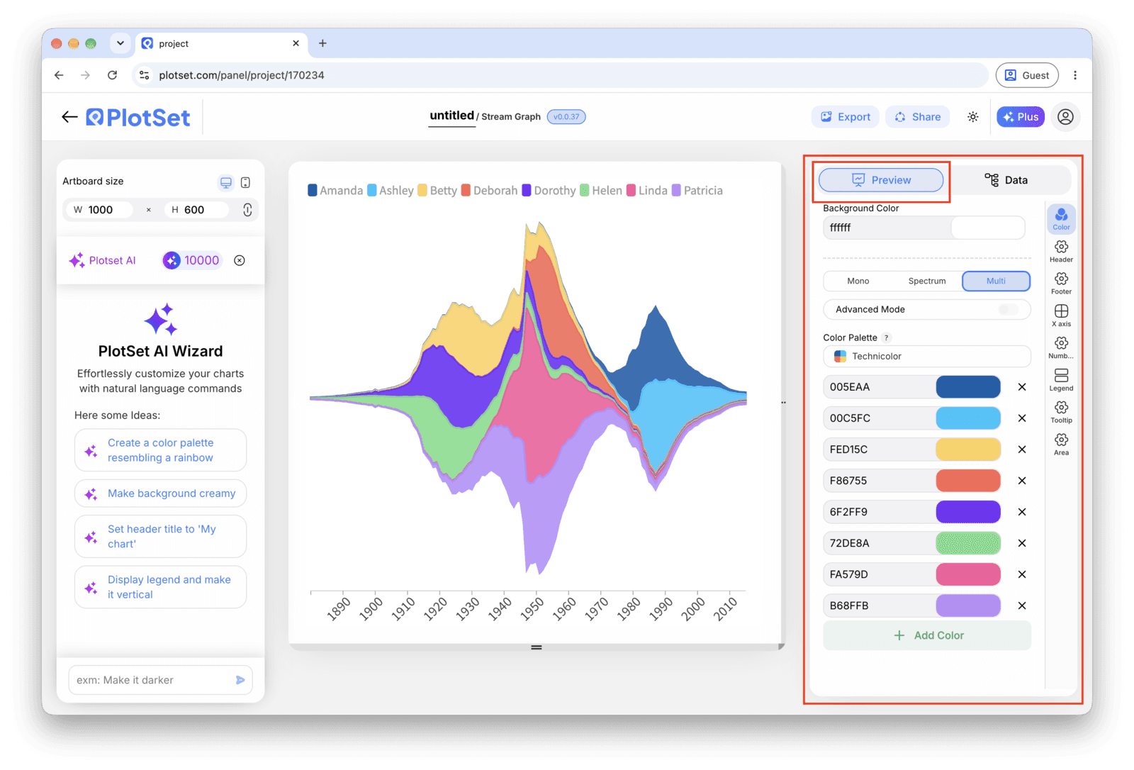
    Pick a colour scheme where related categories sit close in hue rather than a full rainbow, since with more than six or seven bands a categorical palette stops being legible. Turn on the tooltip so hovering a band shows its exact value, and skip axis labels: a stream graph has no baseline to put them against.

    L'éditeur PlotSet sur l'onglet 'Preview' : un graphique Stream Graph terminé sur le canevas, avec le panneau de réglages entouré en rouge le long du bord droit.
    L'onglet 'Preview' pour un graphique Stream Graph. Tous les réglages de style se trouvent dans le panneau entouré en rouge : apparence, en-tête, pied de page et les options propres à ce type de graphique, chacun dans un onglet distinct.
  7. 07

    Add a title that names the shift

    Because the chart has no axis to lean on, the title is doing real work. Name the change itself, for example "Hip-hop overtakes pop in monthly streams", rather than a generic label like "Streams by genre".

  8. 08

    Send it out: publish, embed or export

    Publish for a live, interactive chart where hovering isolates a band and shows its value, grab the embed code to drop it into a page, or export a PNG, SVG or PDF if you need a static image for a deck.

Partez du modèle Stream Graph avec des données d'exemple déjà chargées, puis remplacez-les par les vôtres.

Ouvrir le modèle

Publier, intégrer ou exporter

La dernière ligne droite est la même pour tous les types de graphique : 'Share' transforme le graphique en lien public actif et en code d'intégration, 'Export' l'enregistre sous forme de fichier statique.

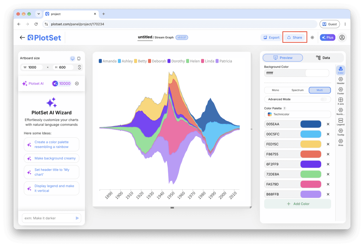
Share : lien public et code d'intégration

Activer le code d'intégration et le lien public revient à publier le graphique. Le lien peut être envoyé à qui vous voulez sans risque, et le code d'intégration s'insère dans n'importe quelle page sous la forme d'une iframe qui conserve les infobulles au survol et l'interactivité. Si vous modifiez le graphique par la suite, cliquez sur 'Recreate' pour répercuter ces changements sur le lien comme sur le code.

La barre d'outils de l'éditeur PlotSet avec le bouton 'Share' mis en évidence, juste à côté du bouton 'Export'.
C'est par 'Share' qu'un graphique terminé devient un lien public et un code d'intégration.
La fenêtre 'Share' de PlotSet : l'interrupteur qui active le code d'intégration et le lien public, les boutons 'Link', 'Embed', Facebook, Reddit, Twitter, LinkedIn et Email, et le lien public du graphique avec un bouton 'Copy'.
Activez le code d'intégration et le lien public, puis copiez le lien ou récupérez l'iframe. 'Recreate' répercute vos modifications ultérieures sur le lien et le code déjà partagés.

Export : SVG, PNG ou JPG

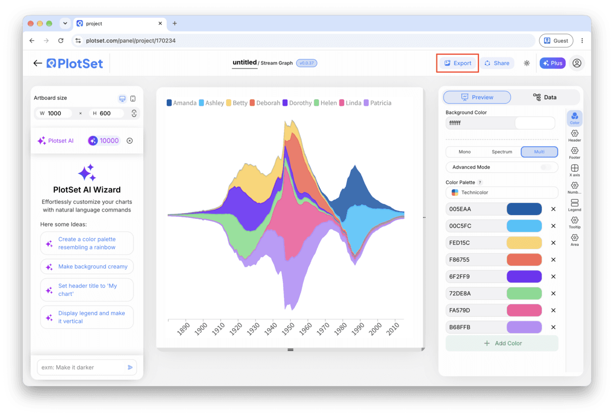
Le bouton 'Export' génère une copie statique à la taille dont vous avez besoin. Le SVG reste net à toutes les échelles et peut encore être modifié dans un outil de design ; PNG et JPG sont les choix sûrs pour les présentations et les documents. C'est le multiplicateur d'échelle qui vous donne une image nette sur un écran retina.

La barre d'outils de l'éditeur PlotSet avec le bouton 'Export' mis en évidence.
C'est par 'Export' que vous obtenez un fichier statique pour une diapositive ou un rapport.
La fenêtre 'Export chart' de PlotSet : un sélecteur d'échelle réglé sur 2x, les champs de largeur et de hauteur à 1000 × 600, et le menu des formats ouvert, affichant SVG, PNG et JPG.
Le SVG reste net à toutes les tailles et modifiable dans un outil de design ; PNG et JPG sont les choix sûrs pour une présentation. Réglez l'échelle avant d'exporter pour que l'image soit nette sur un écran retina.

Conseils de style pour un Stream Graph

Order by peak time first, size second

Ordering categories by when each one peaks (earliest at the edges, latest toward the centre) is what turns a knot of overlapping bands into a readable sequence. Only fall back to ordering by total size if your categories genuinely all peak around the same time.

Group small categories instead of colouring all of them

Past seven or eight bands, individual colours stop being distinguishable at a glance. Combine the smallest categories into an "Other" band before upload, or use a sequential palette within a family (three shades of blue for three related genres) rather than three unrelated hues.

Turn on hover tooltips, always

There is no axis to read a value from, so the tooltip is not a nice-to-have here, it is the only way anyone gets a number off the chart. Publish it interactively rather than exporting a static image whenever the values themselves matter.

Keep the time axis dense and evenly spaced

Weekly or monthly points with no missing periods produce smooth, trustworthy curves. A handful of widely spaced points forces PlotSet to interpolate over a long gap, which can imply a smooth rise or fall that the data never actually measured.

Erreurs courantes en créant un Stream Graph

The bands look like a tangled knot instead of a flow

This is almost always the band order, not the data. Switch from source or alphabetical order to peak-time ordering, or try the inside-out variant. A stream graph with the wrong order is unreadable regardless of how clean the numbers underneath are.

One category shows a flat zero the whole way through

Check whether that column got read from a long-format row rather than a wide column, which leaves every cell but one blank and therefore zero. Re-pivot the source sheet so that category has its own real value at every time point.

The shape spikes sharply between two points for no reason

Look for an uneven gap in your time column, like a monthly series that skips a quarter. PlotSet interpolates across whatever gap exists, and a wide one produces a curve that looks more dramatic than the two real data points support. Fill in the missing period or shorten the interval.

En savoir plus sur le Stream Graph

Vous n'êtes pas sûr que le Stream Graph soit le bon choix ? Découvrez ce que c'est, quand l'utiliser et quand l'éviter.

À propos du Stream Graph

Stream Graph : questions fréquentes

Wide format: one row per time point in the first column, one column per category, and a value in each cell. If your export is long format, one row per date-category pair, pivot it into wide format in your spreadsheet tool before uploading.

Créez votre Stream Graph maintenant

Gratuit pour commencer avec plus de 300 modèles. Aucune carte bancaire requise.