
Exemple de CSV
| Day | Hour | Orders |
|---|---|---|
| Monday | 9 | 12 |
| Monday | 12 | 31 |
| Monday | 15 | 22 |
| Monday | 18 | 45 |
| Tuesday | 9 | 15 |
| Tuesday | 12 | 28 |
| Tuesday | 15 | 19 |
| Tuesday | 18 | 52 |
| Wednesday | 9 | 11 |
| Wednesday | 12 | 24 |
| Wednesday | 15 | 20 |
| Wednesday | 18 | 58 |
A step by step walkthrough for turning a row, column and value sheet into a published heatmap in PlotSet, from shaping the data to picking a colour scale that doesn't lie.
Environ 8 minutesRows and columns you chose, a colour scale that actually matches your data, a chart either embedded on a page or exported as an image: that's what you'll have after this guide on how to create a heatmap in PlotSet, built from your own grid rather than someone else's correlation matrix with your name on it, taken through the same click path a real PlotSet chart takes from upload to publish.
If your data is already three columns, row, column and value, this takes about eight minutes, most of it spent getting the colour scale right rather than the upload itself. Add another five if you're pivoting a wide table (weekdays across the top, hours down the side) into that long shape first. Budget the eight minutes below and treat pivoting as a separate, earlier step.
Three columns, one row per cell: the row category, the column category, and the numeric value at that intersection. One header row, no pre-shaded formatting.
| Day | Hour | Orders |
|---|---|---|
| Monday | 9 | 12 |
| Monday | 12 | 31 |
| Monday | 15 | 22 |
| Monday | 18 | 45 |
| Tuesday | 9 | 15 |
| Tuesday | 12 | 28 |
| Tuesday | 15 | 19 |
| Tuesday | 18 | 52 |
| Wednesday | 9 | 11 |
| Wednesday | 12 | 24 |
| Wednesday | 15 | 20 |
| Wednesday | 18 | 58 |
This is long format, not wide format. If your source is a pivot table with days across the top and hours down the side, unpivot it first: one row per cell, not one column per day. Most spreadsheet tools call this "unpivot" or "melt."
A missing combination (say, Wednesday at 21:00 never happened) doesn't need a zero row. Leave it out and PlotSet renders that cell as empty rather than as a false zero, which matters a lot on a colour scale.
Keep the value column numeric only. If a cell has been formatted as a percentage or currency string in the source sheet, strip the symbol before uploading or PlotSet will treat it as text and the colour scale won't compute.
For a correlation matrix, both the row and column categories are the same list of variables. That's normal, the diagonal (each variable against itself) will read as the maximum value, which is expected and fine to leave in.
Le parcours exact dans PlotSet, d'un modèle vierge à un graphique terminé.
From the PlotSet dashboard, start a new project and choose the Heatmap template. It loads with sample data already bound so you can see the exact three-column shape, row, column, value, before you touch your own file.

One line per cell. If your data currently lives as a wide grid, days across the top as separate columns, unpivot it into this long format first. This is the step people skip and then wonder why the upload doesn't map cleanly.
Use the data panel to import a CSV or .xlsx file, paste rows directly, or connect a Google Sheet if the underlying numbers change on a schedule and you'd rather not re-upload every time.

Tell PlotSet which column feeds the row axis, which feeds the column axis, and which is the numeric value being shaded. Clear headers like "Day", "Hour", "Orders" usually get guessed correctly, but check it when your sheet carries extra columns.

Sequential (light to dark, one hue) for a quantity that only runs from low to high, like order counts. Diverging (two hues either side of a real midpoint like zero) when some values are above a baseline and some are below it, like a correlation matrix or a change-from-average table.
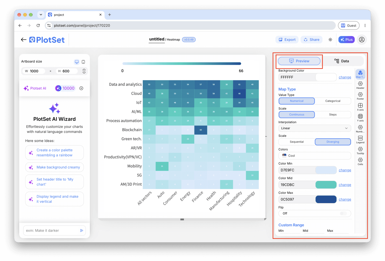
Switch off alphabetical sorting unless the categories already have a natural order, like weekdays or hours. Sort by row total, or group similar rows next to each other, so the pattern (the hot band, the quiet row) is visible instead of scattered across the grid.
Under roughly a fifteen by fifteen grid, showing the number inside each cell costs nothing and lets readers get an exact value without hovering. Past that size, leave the cells blank and rely on the tooltip, printed numbers on a dense grid just become noise.
Publish for a live chart with hover tooltips that show the row, column and exact value, grab the embed code for a page, or export a PNG, SVG or PDF if you need a static image for a deck.
Partez du modèle Heatmap avec des données d'exemple déjà chargées, puis remplacez-les par les vôtres.
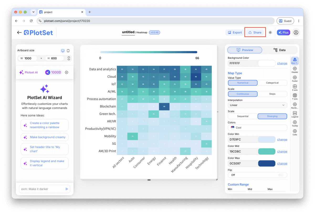
Ouvrir le modèleLa dernière ligne droite est la même pour tous les types de graphique : 'Share' transforme le graphique en lien public actif et en code d'intégration, 'Export' l'enregistre sous forme de fichier statique.
Activer le code d'intégration et le lien public revient à publier le graphique. Le lien peut être envoyé à qui vous voulez sans risque, et le code d'intégration s'insère dans n'importe quelle page sous la forme d'une iframe qui conserve les infobulles au survol et l'interactivité. Si vous modifiez le graphique par la suite, cliquez sur 'Recreate' pour répercuter ces changements sur le lien comme sur le code.

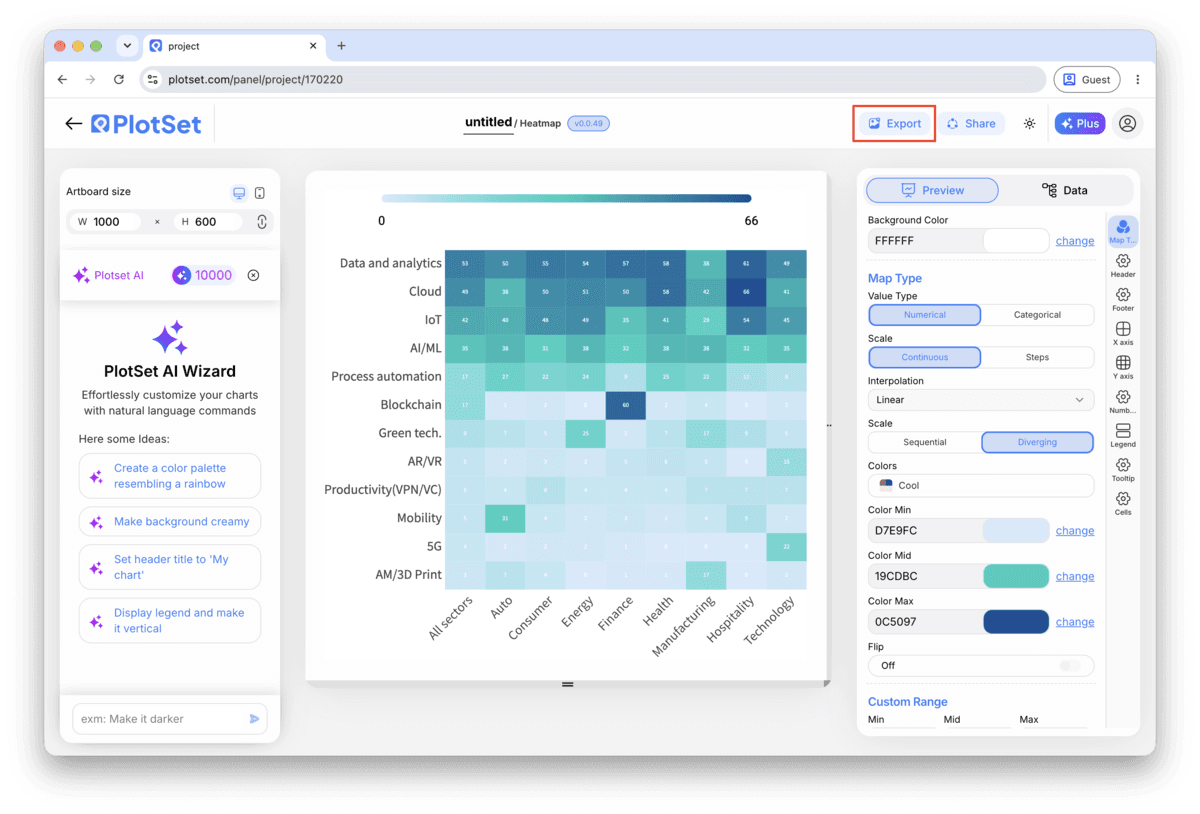
Le bouton 'Export' génère une copie statique à la taille dont vous avez besoin. Le SVG reste net à toutes les échelles et peut encore être modifié dans un outil de design ; PNG et JPG sont les choix sûrs pour les présentations et les documents. C'est le multiplicateur d'échelle qui vous donne une image nette sur un écran retina.

One unusually large cell, a launch-day spike, a data-entry error, pulls every other cell toward the pale end of the scale and the pattern disappears. Cap the scale manually at a sensible ceiling, or fix the outlier at the source, rather than letting the raw maximum decide the range for you.
Zero for a correlation matrix or a change value, the historical average for a performance grid. An arbitrary midpoint (PlotSet defaulting to the middle of your data's range) will shade cells as "above average" and "below average" relative to nothing in particular.
If two rows behave similarly across every column, put them next to each other. Alphabetical order is the single most common reason a heatmap looks like noise when the underlying data actually has a clear block structure.
A spectral scale isn't perceptually ordered, so a reader's eye sees hard edges where the data is actually smooth. A single-hue sequential scale, or a proper two-hue diverging scale, reads correctly at a glance and holds up for colour-blind readers.
This is almost always one extreme value stretching the scale so far that everything else compresses into a narrow band near the low end. Find the outlier cell, decide whether it's real, and either cap the colour scale's maximum manually or exclude the value.
Check that every row/column combination in your source data is spelled and cased consistently. "Monday" and "monday " (with a trailing space) read as two different rows to PlotSet, which fragments what should be one row into two thin, mostly-empty ones.
If the midpoint got set to the middle of the data range instead of a real baseline like zero, half your unremarkable cells will shade as if they're notably below average. Reset the midpoint to the value that actually matters for your data before publishing.
Vous n'êtes pas sûr que le Heatmap soit le bon choix ? Découvrez ce que c'est, quand l'utiliser et quand l'éviter.
Three columns in long format: a row category, a column category, and a numeric value for each combination, one row per cell. A wide pivot table needs to be unpivoted into this shape first. CSV and .xlsx both work, along with a pasted range from any spreadsheet.
Gratuit pour commencer avec plus de 300 modèles. Aucune carte bancaire requise.