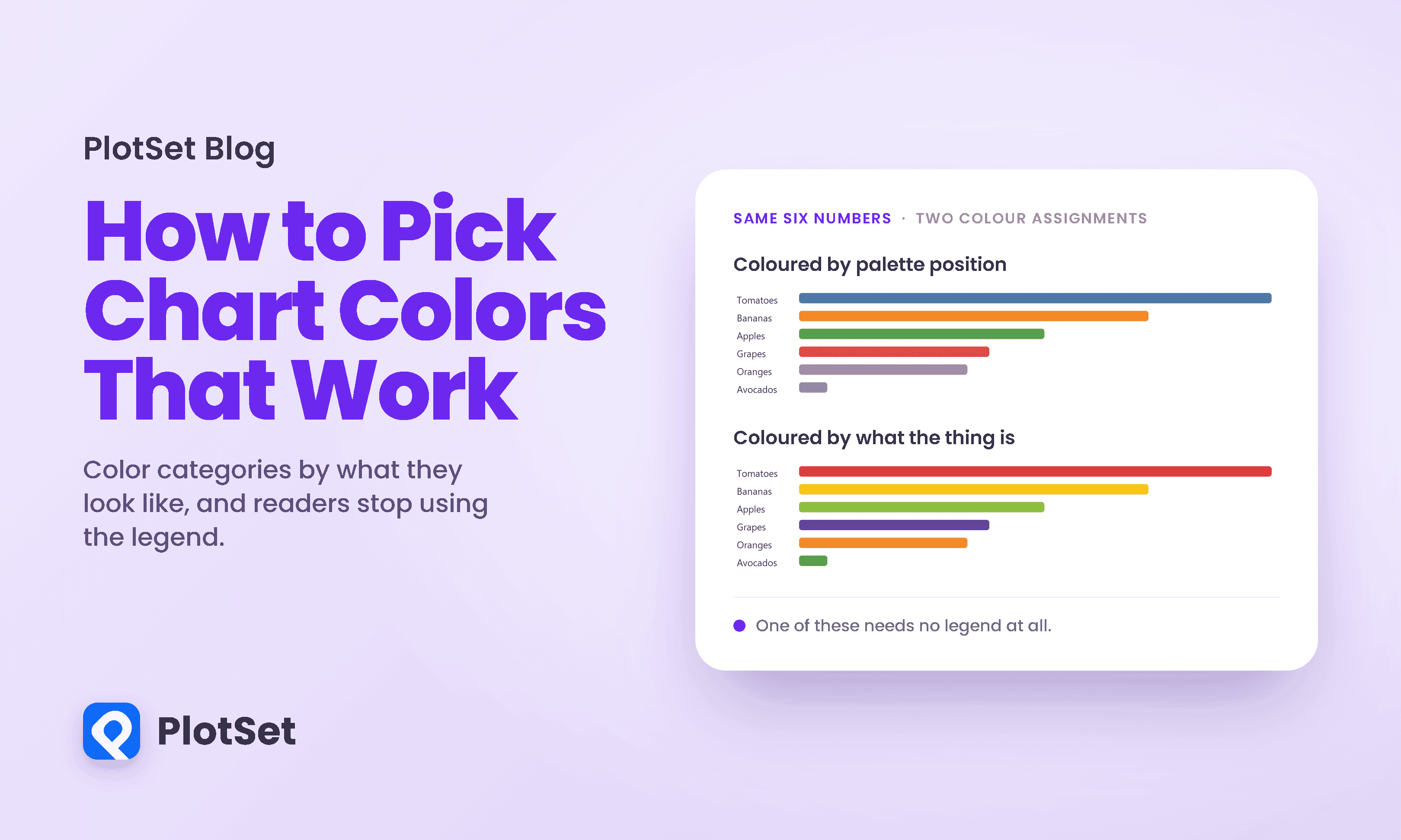
Every charting tool assigns colours the same way: by position. The first category gets the first colour in the palette, the second gets the second, and so on down the list. Nothing about the data enters into it.
Here is what that produces on real numbers, world fruit production for 2024 from the FAO.
Now the identical chart with each bar coloured like the thing it represents.
The second one is easier to read, and there is a study behind that. There is also a great deal of overclaiming built on top of the study, and a widely repeated warning about the technique's dark side that turns out to be about something else entirely.
What was actually measured
Sharon Lin, Julie Fortuna, Chinmay Kulkarni, Maureen Stone and Jeffrey Heer tested this at EuroVis in 2013, in the paper that gave the idea its name. Crowdworkers answered comparison questions on bar charts, and the measure was time. With colours assigned by a colour expert, people averaged 8.1 seconds per task. With the same palette assigned in sequential order, 9.1 seconds. That is 140 analysed participants and a Cohen's d of 0.17.
A second sounds trivial. The authors anticipate that, and their sentence is worth quoting exactly because it is the one everybody cites: "While shaving off 0.5-1 seconds on a graph-reading task may seem small, this represents more than 10% of the task-time. Furthermore, analysts make many such comparisons, which add up."
That is a fair defence of a small effect. Four things about it are usually dropped.
The expert condition was an upper bound, not a fair fight. The paper says plainly that the expert was not restricted to the standard palette: "We did not constrain the expert to choose colors from Tableau 20, so as to determine an approximate upper-bound." So the expert-versus-default comparison varies both the assignment and the available colours. It is the ceiling, not the everyday case.
There is no standalone test of expert versus default. The paper's inferential test pools the expert and algorithmic conditions into a single "resonant" contrast, t(126) = −2.24, p < 0.05. The one expert-specific test compares expert against the algorithm and finds nothing, t(126) = 0.64, p > 0.3. Which is good news for anyone not employing a colour expert: the algorithm was not measurably worse.
The benefit is not evenly spread. The authors are explicit: "Much of these savings come from the concrete categories; iconic categories have little or no effect (approximately 0.25 seconds). This difference is not significant via a Tukey HSD test." Fruit works. Brand logos, where the colour is a convention rather than a property of the thing, mostly do not.
And it is speed, not understanding. Response time was the outcome. Accuracy was recorded only to check that people were doing the task, and no accuracy or comprehension result appears in the paper. Anyone telling you resonant colour helps readers understand charts is adding a claim the study did not test.
The assignment survives a change of chart type, which is a decent sign that it is doing real work rather than decorating bars.
The rule is not "use the intuitive colour"
The follow-up work is usually cited as confirming all this. It does something more interesting: it revises it.
Karen Schloss and colleagues showed that what matters is not how strongly each concept is associated with its colour, but whether the assignment is semantically discriminable across the whole set: each colour pointing towards one concept and away from the others. In their comparison, the system that only maximised association strength was the losing arm.
My own chart has the problem built into it. Apples and tomatoes are both most associated with red.
That is why the semantic chart earlier gives apples green rather than red. Green is a weaker association for apples in isolation and a much better one in this company, which is exactly the finding: viewers will accept a concept's more weakly associated colour when the global assignment demands it. Schloss and colleagues also found that palettes containing no individually resonant colours at all can still be interpreted, as long as the colours are semantically distinguishable from one another. "Resonant versus non-resonant" is not really the axis.
The dark twin, and what it actually says
Here is where this piece was supposed to turn. The obvious worry about colouring by meaning is that some meanings are stereotypes. Pink for women's salaries, blue for men's. If resonance makes a chart faster to read, does it also make a prejudice faster to apply?
Florent Cabric, Margrét Vilborg Bjarnadóttir and Petra Isenberg tested precisely that, showing participants salary scatterplots and asking them to allocate a raise budget. The answer is not the one the framing predicts.
The colours did nothing. In the authors' words: "colors alone did not significantly influence pay decisions," and "we found no evidence of a color effect that would support our first hypothesis." They go further in the discussion: "Our experiments showed no definitive evidence that color alone in data visualization was a cue strong enough to cause stereotype activation and its application."
Something did bias the decision. It was the legend.
Among women shown that their own gender was underpaid, 70 percent moved to close the gap under a neutral yellow-and-green palette, against 65.8 percent under the stereotyped pink and blue. Participants steered money towards their own gender when they could see their own gender was underpaid. That happened just as much with a neutral yellow-and-green palette as with pink and blue. And in the second study, where the legend naming the genders was removed, the in-group effect disappeared altogether, including in the cell where women could have worked out their group from the pink alone.
So the mechanism is the opposite of the one the warning assumes. It was not the colour doing the encoding work. It was the text spelling out which group was which. Naming the groups activated the bias; colouring them did not.
Two caveats, because this is a load-bearing reversal. This is a submission-stage arXiv manuscript, not a peer-reviewed paper: the PDF still carries the IEEE template's placeholder author biographies and a placeholder DOI. And its statistics are estimation-only, with no significance tests. The pooled colour contrast is about 2.3 points on a scale from −100 to +100, with an interval wide enough to rule out a medium effect but not a small one. The authors call their own evidence "still inconclusive" and describe the work as "a first brick." Take the reversal as the best available evidence, not as settled.
What about when you cannot use colour
A May 2025 preprint by Zihan Lu, Tingying He, Jiayi Hong, Lijie Yao and Tobias Isenberg extends the idea to black-and-white patterns. It is worth knowing about, and worth knowing what it is: an unrefereed manuscript contributing a design methodology, built from 441 hand-drawn patterns by 25 participants. It never tests whether readers can decode the results, and the authors say that question is out of scope.
The place where the texture channel was measured is less encouraging. In a peer-reviewed 2024 study, iconic textures, which are semantically resonant by construction, produced no chart-reading speed benefit. Lu and colleagues quote the result themselves: "Although iconic patterns are inherently semantically-resonant, they did not improve chart reading speed as expected." The idea transferred. The measured benefit did not.
What to do
Assign colours by meaning when the categories are concrete things with colours. Fruit, crops, energy sources, metals, sports teams, national flags. That is where the second was found.
Do not expect it from abstract or iconic categories. Brands and product lines showed about a quarter of a second, not significantly different from arbitrary assignment.
Optimise the set, not each category. If two categories want the same colour, one of them has to move, and the research says readers will accept the second-best colour for a concept when it makes the whole palette distinguishable. Apples can be green.
Do not claim it aids comprehension. It was measured as speed. Nobody has shown it improves accuracy.
Worry about your labels more than your hues. The one study of stereotype effects in a real decision found the colours did nothing and the legend did the damage. If you are drawing charts about people, the question to ask is not "is this palette loaded" but "does naming these groups this way change what someone does with the chart."
Building this in PlotSet
Every chart in this article is the same six numbers rendered six ways, which is the point: nothing about the data changed, only the assignment of colour to category. Producing that comparison took one dataset and six palettes.
That is the practical reason chart colors should be assignable by meaning as a first-class control rather than something you fight. Most tools make the palette easy to change and the mapping hard, so the category-to-colour question never gets asked. If switching from position-assigned to meaning-assigned colour is a two-minute job, you will try it and see whether it helps. If it means hand-editing a series at a time, you will ship the default.
What we are not going to tell you is that any palette makes a chart honest, or that resonant colour makes readers understand more. The measured benefit is about a second per task, concentrated in concrete categories, on speed alone. And the most useful finding in this whole literature is the one that has nothing to do with palettes: when a chart is about people, the words naming the groups did the work that everybody assumed the colours were doing.
References
- Computer Graphics Forum (EuroVis). Selecting Semantically-Resonant Colors for Data Visualization. Lin, Fortuna, Kulkarni, Stone & Heer, 32(3pt4):401-410, 2013 — https://idl.cs.washington.edu/files/2013-SemanticColor-EuroVis.pdf
- IEEE TVCG. Semantic Discriminability for Visual Communication. Schloss, Leggon & Lessard, 27(2):1022-1031, 2021 — https://arxiv.org/abs/2009.03171
- IEEE TVCG. Context Matters: A Theory of Semantic Discriminability. Mukherjee, Yin, Sherman, Lessard & Schloss, 28(1):697-706, 2022 — https://arxiv.org/abs/2108.03685
- Cognitive Research. Color inference in visual communication: the meaning of colors in recycling. Schloss, Lessard, Walmsley & Foley, 3(1):5, 2018 — https://doi.org/10.1186/s41235-018-0090-y
- arXiv. Color, Gender, and Bias: Stereotyped Colors in Visualization-Driven Pay Decisions. Cabric, Bjarnadóttir & Isenberg, 2025 — https://arxiv.org/abs/2509.24999
- arXiv. Designing Semantically-Resonant Abstract Patterns for Data Visualization. Lu, He, Hong, Yao & Isenberg, 2025 — https://arxiv.org/abs/2505.14816
- IEEE TVCG. Design Characterization for Black-and-White Textures in Visualization. He, Zhong, Isenberg & Isenberg, 30(1):1019-1029, 2024 — https://doi.org/10.1109/TVCG.2023.3326941
- IEEE TVCG. Estimating Color-Concept Associations from Image Statistics. Rathore, Leggon, Lessard & Schloss, IEEE VIS 2019 — https://doi.org/10.1109/TVCG.2019.2934536
- Cognitive Science. Large language models estimate fine-grained human color-concept associations. Mukherjee, Mohapatra, Rogers & Schloss, 50(6), 2026 — https://doi.org/10.1111/cogs.70219
- PNAS. An ecological valence theory of human color preference. Palmer & Schloss, 107(19):8877-8882, 2010 — https://doi.org/10.1073/pnas.0906172107
- IEEE TVCG. A Linguistic Approach to Categorical Color Assignment for Data Visualization. Setlur & Stone, 22(1):698-707, 2016 — https://doi.org/10.1109/TVCG.2015.2467471
- Color and Imaging Conference. An Engineering Model for Color Difference as a Function of Size. Stone, Albers Szafir & Setlur, 2014 — https://doi.org/10.2352/CIC.2014.22.1.art00044
- ACM CHI. Affective Color in Visualization. Bartram, Patra & Stone, 2017 — https://doi.org/10.1145/3025453.3026041
- Our World in Data. Crop production data (FAO) — https://ourworldindata.org/agricultural-production