Showcasing Revenue Trends: A Guide to Effective Data Visualization

In the world of data, visualization plays a crucial role. If used correctly, a meaningful visualization can transfer the intended message so much better than the raw data. However, there's a catch! You need to know what type of visualization is suitable for your data to get the most out of the result. Choose the wrong one, and you might lose your audience. And you should know perfectly well that in today's day and age, attention is currency if you are to attract an audience.
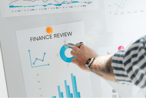
Whether you'd like to use that visualization at a conference, meeting, or simply for a school project, you should learn to use visualizations well. In the following article, we will discuss the Revenue Outlook of the Top 10 US Companies and analyze suitable visualizations for its data. Read on to learn more.

Displaying Revenue
A company's revenue provides a comprehensive overview of its financial performance. This data will help the company in various ways, including
- Performance Evaluation
- Financial Decision-Making
- Investor Confidence
- Market Positioning
- Goal Tracking
- Strategic Planning
- Customer Insights
- Regulatory Compliance
As you can see, this data is necessary for companies to improve their operational efficiency. Suppose you want to discuss the revenues of the top 10 US companies. These companies are from different industries, such as healthcare, retail, energy, technology, etc. You want to use data visualization because you know that visual aids increase your audience's engagement and facilitate fast learning.
You can easily create any kind of chart that you have in mind via PlotSet. Let's take a look at the charts you can use to display the related data.
Connected Dots
A "Connected Dots" chart or "Dot Plot" is a simple and effective way to display data points along a single axis. In this chart type, each data point is represented by a dot positioned horizontally based on its corresponding value. The dots are placed in a line, connecting them to create a visual representation of the data distribution.
Connected Dots charts are commonly used to show the distribution of a single variable or compare the values of different categories. Using this type of visualization, you can display individual data points, trends and patterns, comparisons, and distribution.
In for the company revenues, you can show the context of revenue changes by connecting the dots across time. This visualization can provide insights into the concentration of revenue or potential areas for improvement. If you wish to learn about this chart, visit the following blog post: How to Create a Connected Dots Chart (Revenue Outlook)
Grouped Column Chart
A Grouped Column Chart displays data in columns grouped together based on certain categories. In the context of displaying company revenues, a Grouped Column Chart can provide a visual representation of the revenue generated by different companies over a specific time period.
Here's how a Grouped Column Chart can be used to display company revenues:
The horizontal axis represents the companies, while the vertical axis represents the revenue values. Each company is represented as a separate group of columns.
The columns are grouped together by company, and within each company's group, you'll have individual columns representing revenue for different categories or time periods. This allows for easy comparison of revenue values within and across companies.
Different colors are used to differentiate revenue values for different time periods within each company. This color coding makes it easier to identify and differentiate revenue sources.
In a nutshell, Grouped Column Chart is particularly useful when you want to compare revenue values for different companies and you want to highlight how revenue is distributed across various categories or time periods.
Line Chart
A Line Chart presents data points as a series of individual data markers connected by straight lines. It is commonly used to show the trend or pattern of data over time, making it suitable for visualizing company revenues over different periods. A Line Chart clearly depicts how a company's revenue has changed over time and helps identify trends, fluctuations, and patterns.
In this chart, the horizontal axis represents time, and the vertical axis represents the revenue values. Each data point corresponds to a specific time period and revenue value. Data points are plotted on the chart where the time axis and revenue axis intersect. These points are then connected by straight lines, forming a continuous line representing the revenue trend over time.
Each point on the line represents the revenue generated by the company during a specific time period. As you move along the line from left to right, you can see how the revenue values change over time. The color coding allows you to compare revenue trends across different companies on the same chart.
By observing the line's slope, direction, and shape, you can identify trends and patterns in revenue growth or decline. Steeper inclines may indicate rapid revenue growth, while dips may signify periods of lower revenue. This feature enables you to recognize patterns and trends within the data.
One of the benefits of creating your charts with PlotSet is that all the charts can be interactive, which means you can interact with the chart by hovering over data points to see specific revenue values or clicking to view more detailed information.
A Line Chart is particularly effective when you want to showcase the temporal progression of company revenues (or any similar data). It provides a straightforward way to analyze trends, make comparisons, and derive insights from the data, making it a popular choice for visualizing revenue data over time.
Out of all the possibilities, we have only reviewed a few visualizations. The assumption is that after a while, you'll master the basic knowledge to recognize the best visualization for your data.
Of course, using the best data visualization tool can help you a lot and make your journey a lot easier and more enjoyable. That is why PlotSet can be a great companion for data enthusiasts, scientists, researchers, etc.
Easily visualize your data with PlotSet!

